shape
carat
color
clarity

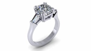
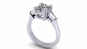
CADs - thoughts?

honor

Rough_Rock
Joined
Apr 3, 2014
Messages
65
Hello Amazing Pricescopers

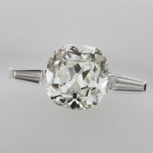
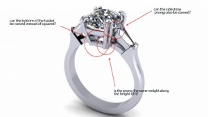
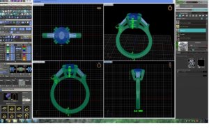
these are the CADs and an image of the stones that ERD sent over:
what are your thoughts, any advice or feedback?
This is my first time around creating a custom ring so I'm at lost of what I should be looking for when it comes to the CADs.
the center stone is a 2.08 chunky cushion - 7.81x7.25x4.97
sides are 2.4 (at the thickest) 1.9mm(at the thinest) x 5.2

what do you think?
thanks
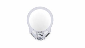
honor_2.jpg

honor_3.jpg

honor.jpg

honor_1.jpg
 
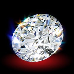
image of stones

3sr-2.jpg
 
Did they give you a head on shot?
 
Classically BEAUTIFUL.. you will love it.

:love: :love:
 
That's interesting! It's almost a vaguely mechanical look, especially with the split prongs. I think it definitely draws the eye to the stone without being overpowering, and still treats the viewer to an impressive manipulation of metal. Neat. :D
 
I think it looks good.
 
I like it!!
 
Gypsy|1403306329|3697565 said:
Did they give you a head on shot?
nope should I request one?
 
SirGuy|1403306815|3697572 said:
That's interesting! It's almost a vaguely mechanical look, especially with the split prongs. I think it definitely draws the eye to the stone without being overpowering, and still treats the viewer to an impressive manipulation of metal. Neat. :D

I really appreciate your feedback, do you suggest that I have him soften up the prongs somehow?
 
Well, I am not a designer! But for what it's worth, my first impression was that it seemed strong and a bit robust. It almost looks like a piston. I think a few little tweaks could keep its boldness but soften its character.

Maybe slightly round the shoulders of the shank as it goes towards the base of the prongs? The edges seem a bit sharp between the sides and the top. I think it's graceful in spirit and a cool design. Less "organic" than some which isn't necessarily a bad thing.
 
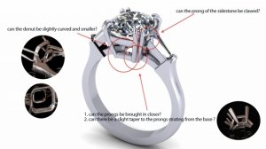
these are some notes I have for ERD, do you think this will soften it a little? I do want a delicate ring

honor_0.jpg
 
It's going to look stunning!! Love the proportions, they have a good eye for sidestone pairings. I would leave the bottom as is as I think it'll look more fluid once polished and done.
 
yes, you should ask for one.
And I agree it looks bulky to me too.
 
Gypsy|1403316358|3697690 said:
yes, you should ask for one.
And I agree it looks bulky to me too.


How do I express to them that it looks bulky without specific direction.
Will mark at red know what to do Ito say I generally think it looks bulky? That's is my biggest fear us that it will feel metal heavy and bulky.
 
Definitely do not like the base of the head sticking out and square. I'll look for a better example.

Base of prongs need to be set closer in with a smaller doughnut and curved outward.
 
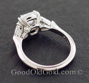
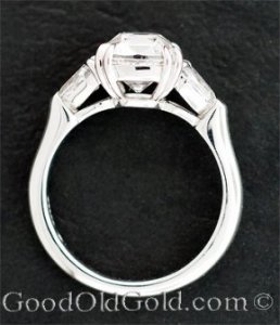
Here's a profile of a ring by Steven Kirsch (for sale at GOG).

This is how the basket should look. It's swoopy and not boxy. Tell them to make the basket like this one.

230-_steven_kirsch_three_stone_eng_ring_with_050cttw_back.jpg

230-_steven_kirsch_three_stone_eng_ring_with_050cttw_side__i.jpg
 
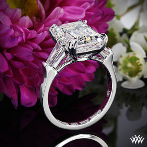
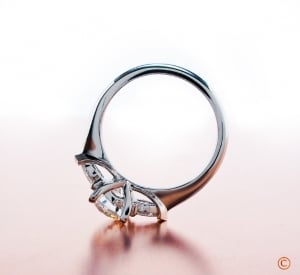
And if you want to allow a flush fit band, there's this look:

BrianGavin_SqHearts2b_070160_0.jpg

IMG_0277_0.jpg
 
Yay, Gypsy!!!!! :appl: Great examples!!!
 
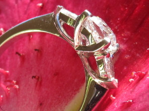
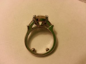
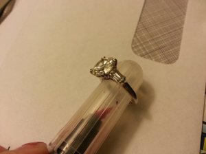
ERD made my ring a few months ago but with bullets. I actually don't like the swoopy basket and I think a straighter basket is more in line with Harry Winston and LM's version. I have pics somewhere of both and the basket is pretty straight. I didn't like SK's version which is why I didn't really pursue him. The prongs holding my side stones are really tiny...I had to use a loupe to see if they were claw or club but they are tiny claws (more triangular) compared to the ones holding the center stone. I would ask to lower the side stones a bit so they start lower on the basket but that's just me. Please ignore the terrible lighting...my cell phone is lime green and I'm using a horrible desk lamp.

1403327163649.jpg

1403327285897.jpg
 
Also, if they moved the bottom of the prongs closer together at the bottom of the basket, it would look less blocky (more like a V shape).
 
jerichosmom|1403330850|3697829 said:
Also, if they moved the bottom of the prongs closer together at the bottom of the basket, it would look less blocky (more like a V shape).
I agree with this as well.
 
jerichosmom|1403327455|3697813 said:
ERD made my ring a few months ago but with bullets. I actually don't like the swoopy basket and I think a straighter basket is more in line with Harry Winston and LM's version. I have pics somewhere of both and the basket is pretty straight. I didn't like SK's version which is why I didn't really pursue him. The prongs holding my side stones are really tiny...I had to use a loupe to see if they were claw or club but they are tiny claws (more triangular) compared to the ones holding the center stone. I would ask to lower the side stones a bit so they start lower on the basket but that's just me. Please ignore the terrible lighting...my cell phone is lime green and I'm using a horrible desk lamp.


I actually would like cross between a straight and slight curve prong, not as much as the ones posted as suggestions in this thread. These are my new notes. I def. think decreasing the size of the donut and rounding its a bit will give it the softness it needs. I love all the suggestions, thank you everyone. Very helpful!

honor_1_copy.jpg
 
also the examples on my notes are for a asscher center, I would ask for the donut to mimic the shape of my cushion.
 
I really don't have anything to add, but I do like the way this is going -- it will be classic and stunning! Can't wait to see it! :appl:
 
here is some additional info about the ring from ERD. Does anything stand out that I should be aware of, It seems ok to me though they have not been shifted to include my notes. thoughts?

honor_1-2.jpg
 
GET 3 FREE HCA RESULTS JOIN THE FORUM. ASK FOR HELP
Top