shape
carat
color
clarity

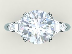
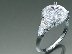
CAD help! 5 stone ring - RB w/traps and bullets

Veltiesmom

Shiny_Rock
Joined
Sep 18, 2015
Messages
165
Hi all,

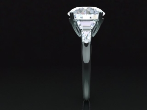
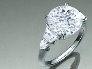
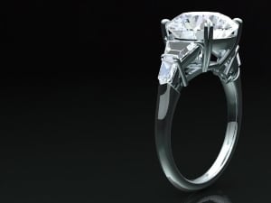
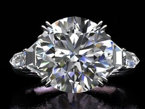
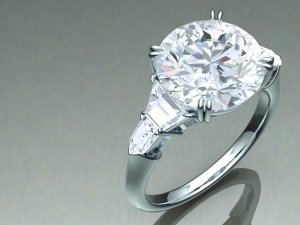
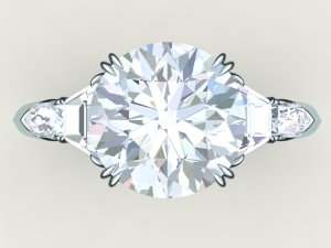
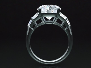
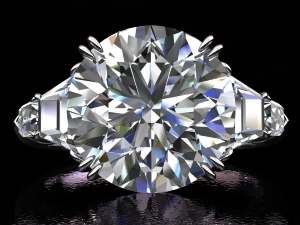
Here are some CADs for my 5 stone ring project. Below the CADs are the inspiration rings. Trying to put my finger on why the CADs don't have the same feel proportions-wise as the inspiration rings - other than, of course, that the center stone is an RB. My thoughts are:

- the traps might need to be taller top to bottom vis-a vis the center stone (meaning on the edge of the trap that meets the center stone). But this could prove challenging because the long edge of the trap might stick out past the curve of the center stone?

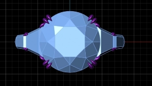
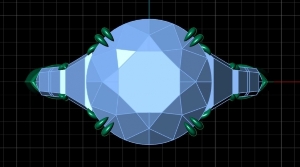
- the bullets may need to be a tad longer (left to right) and thinner (top to bottom) so that the traps and bullets form almost a "martini glass" on each side, when looking at the ring from a straight down view.

- I'd also like to be able to see more of the bullets on the top-down view - on the inspiration rings all 5 stones are visible from that angle. However there may be some limitations due to the size of the center stone (9.5mm) and the size of my finger (4.5).

Any thoughts are much, much appreciated.

cad4_0.jpg
cad3_3.jpg
cad2_4.jpg
cad1_5.jpg

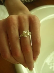
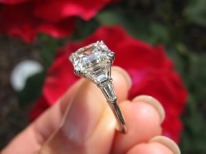
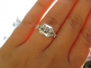
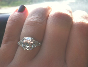
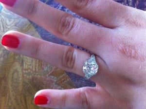
Inspiration rings. See how on these rings the traps are taller, all 5 stones are visible top down, and the traps and bullets form a "martini glass" shape on each side?
img_4301.png
5stone_1.jpg
asscher_5.jpg

asscher7.jpg
asscher6.jpg
asscher4.jpg
 
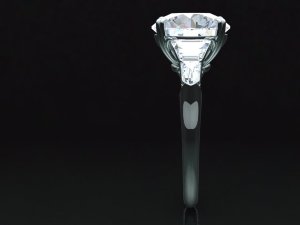
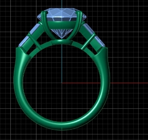
I'm confused about the basket around the center stone. From the picture it doesn't look like the center stone sits in the basket. It looks like the pavilion of the center doesn't touch the basket. Looks like it's only held by the prongs. Shouldn't the center stone set lower in the basket (with shorter prongs) or it seems like the basket needs to come up higher on the center stone. This should also put the traps at more of an angle which I think you are looking for. However, this may all be dictated by the size of your center stone and your tiny fingers (jealous :bigsmile: ).
 
I just wanted to write to say my first impression was simply Wow! Beautiful! After reading your questions and tytys post I also see what you mean. Sorry to say I have no answer and I hope someone will have something to say soon. Just wanted to say I really look forward to seeing what you come up with! Good luck! :wavey: :appl:
 
Feel free to disregard this, but did you consider brilliant cut traps to more closely resemble the facet pattern in the round?
 
I feel like it's the shape of the traps in the CADs. What if you requested traps that were wider where they sit flush to your center stone and tapered in slightly more? That would also give you more of the "martini glass" appearance you mentioned. If you look at your inspiration photos and compare the traps to the ones in your CADs, you can see the outline of the traps are fatter at the top and taper in a bit more. Also like tyty mentioned, if the center stone sat lower in the basket that will help.

As far as the bullets, I wonder if the size of your center in relation to your finger size is going to limit how much bullet you see. You probably wouldn't want the bullets to extend too much or else you risk having them sit between the adjacent fingers which may be uncomfortable.

This is coming along beautifully, I really can't wait to see the final result. Traps and bullets are one of my all time favorite 5 stone combinations!!
 
I think the traps are too wide (left to right) and then the bullets not long enough. I think your round is fatter (greater diameter) than that cushion or the asscher, probably. The basket should not touch the stone. It should be held by the prongs only. Otherwise you couldn't clean the diamond.
 
diamondseeker2006|1458757296|4009922 said:
I think the traps are too wide (left to right) and then the bullets not long enough. I think your round is fatter (greater diameter) than that cushion or the asscher, probably.


I agree.
 
Thanks all. Here is a slightly different rendering of the same version of the ring. This one apparently is a more accurate representation of what the actual mold would look like. I like the proportions in this version better - you can really see the "martini glass" better. However I do think I agree, I will ask to see a version with the traps slightly narrower (L to R) and the bullets slightly longer (L to R).

Regarding step versus brilliant cut - I did consider the latter, but this ring is kind of all about contrast. I think I prefer the contrast of the step cut sides and the brilliant cut center.

Thanks to all of you for your thoughts! If anyone has any other thoughts/suggestions/tweaks, I'd love to hear them.


img_5493.jpg
 
Beautiful new rendering! Your ring will be beautiful. I love the taper, the contrast of the brilliant cut center and the step cut sides.
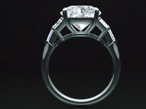
I agree with tyty that the stones seems to sit quite high if you look at the side view. Personally I would have it sit lower and thus shorten the prongs.

Enjoy the creation process :wavey:
 
Revised CADs, to reflect the following:

- Fixed side stone proportions (bullets longer, traps shorter left to right)

- Set stone lower in basket, shorten prongs

- Add a smooth donut to base so that prongs won't rub against wedding band (trap prongs will be finished this way too although CAD does not show that) (thanks DS!)

I think I prefer these proportions as the bullets are more visible from the top down view, giving more of the "martini glass" shape I am after. What do you all think? These CADs are courtesy of the lovely ladies at CVB and LAD, who have been absolutely AMAZING! :love:

img_8529.jpg
img_8537.jpg
img_8535.jpg
img_8533.jpg
img_8532.jpg
img_8531.jpg
img_8528.jpg
img_8536.jpg

The only BUT is that for various reasons related to my center stone size and my ring size vis-a-vis the new proportions of the side stones, to make this ring work the side stones have to be angled down on one straight plane rather than set at slightly different angles that follow the curve of the shank. Trouble is, I think I prefer the stones set at different angles. See comparison below.

Old design (side stones slightly curved, set on different planes):
img_0874.jpg

New design (side stones sharply angled, set on one plane):
img_8532.jpg

I think the problem is that if he traps/bullets are set at different angles/curved to shank, the longer bullets will hit the shank higher and we would have to build up that little metal ridge that forms at the shank where the bullet ends. This could look/feel awkward. Or the bullets could angle down even further, but then they'd be basically invisible from the top down.

It's a dilemma. Any suggestions?
 
I prefer the angles on the former for the bullets, but like the proportions of the later. Can we see a revised CAD that combines the two?
 
Gypsy|1458880638|4010754 said:
I prefer the angles on the former for the bullets, but like the proportions of the later. Can we see a revised CAD that combines the two?

Me too! But apparently because of the way the stones break differently when using shorter traps/longer bullets (and my size 4.5 finger) the side stones can't be angled like they are in the first option without building up that little metal "lip" at the shank. Here's a photo of option 1 overlaid with the roughly the side stone lengths of option #2 (in pink). You can see how the bullet end would hit higher on the shank, requiring the "build up" of the little metal lip:


img_7902.png

Not sure how to avoid this problem!
 
I'd be okay with that. 8)
 
Two possible alternatives. One shown on the left side, one on the right side. Both sides have the shorter trap/longer bullet proportions I like, from version 2 above. They differ in the angle of side stone placement. The right side has the side stones more curved, along the same plane as the shank, a la version 1 above. But it also has a thicker metal piece at the base of the bullets. The left side is less curved (but still not a straight shot as it was in version 2 above), with a smaller metal piece at the base.

revised.jpg

Here is the original version 2 with the side stones placed on one plane, which I didnt like as much.

img_8528.jpg
 
Right side for me.
 
right side for me as well
 
I am okay with either of the last choices but lean toward the right. I like that they are following the curve more. I do need to correct something I said earlier, though. Sometimes stones are supported by the basket rather than solely from the notch in the prongs. I was going by my former basket setting, but someone told me stones sometimes are supported by the basket. It might be more secure for a larger stone. Mine was smaller.
 
I am leaning towards the left option. Very elegant proportions and no extra metal build-up
 
You will need to see each version in top view to decide. The two top views are going to differ, I think, in how the "martini glass" looks.

I think you need to get a bigger finger to support all this gorgeous bling!!
 
Sagefemme|1459025587|4011434 said:
You will need to see each version in top view to decide. The two top views are going to differ, I think, in how the "martini glass" looks.

I think you need to get a bigger finger to support all this gorgeous bling!!

I absolutely agree with this! You can't know if the angle on the right side is enough to justify the difference in the setting.
 
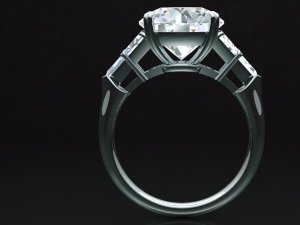
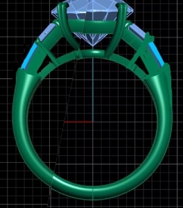
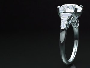
Revised CADs to show the smaller trap/bigger bullet proportions I like (thus seeing more of the bullet from the top-down view) but with the side stones set on different planes instead of one straight slope.

Any thoughts/suggestions before I pull the trigger? My only hesitation is that I don't like settings that sit really high off the finger - I don't *think* this one should, but it's always hard to know from the CADs. (Luckily I will have a wax model made so I can be sure before it's cast.)

Thanks all!
image2_14.jpg
image1_2_0.jpg
image6_1.jpg
image4_4.jpg
image3_10.jpg
 
That is perfection! :love: Center stone couldn't be lower in this or any other setting. It is lower than the shank height.
 
It sure is pretty!!

Just a word of caution, it does look like this is going to be a tall, top-heavy ring. Are you ok with that?
 
I love it now! I think it is going to be stunning!
 
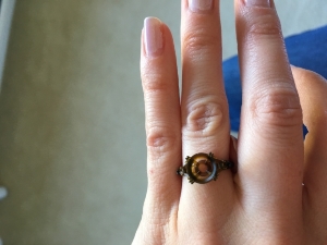
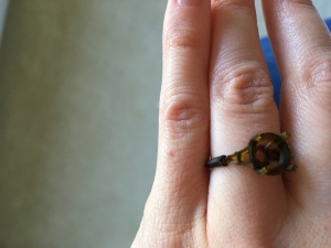
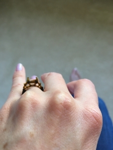
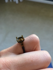
I have an update! Just received a super-cool 3D printed model of my future ring, made from the CADs designed by CvB through LAD! Gotta love technology!

Caysie did a phenomenal job on this design - it's so delicate and elegant. I think the finished product is going to be PERFECT!

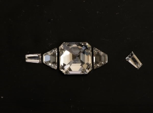
Note - the model is delicate and as you can see in the photos I snapped one side of the shank by accident. Turned out not to matter much since my kids got ahold of it 10 minutes later and now it's in three pieces. :wall:

img_4890_0.jpg
img_4889.jpg
img_4888_0.jpg
img_4886_2.jpgimg_4885_1.jpg
 
It looks fantastic, how exciting! I can't wait to see the finished ring!! :appl:
 
Looks great!! :appl: :wavey:
 
It really does look beautiful - can't wait for the finished ring - bet you can't either - ha!!
 
Very nice!!!
 
The setting looks beautiful, even in plastic :) Excited to see the final piece!
 
GET 3 FREE HCA RESULTS JOIN THE FORUM. ASK FOR HELP
Top