shape
carat
color
clarity

Yssie, I have some questions for you

Dreamer_D

Super_Ideal_Rock
Joined
Dec 16, 2007
Messages
25,368
Comments from the peanut gallery welcome too 8)

OK, I have asked you this before, but I want to ask again: How do you think your butterflies setting would look with a 1.67ct center and .35ct sides? Those proportions are actually very similar to your first incarnation of your ring with your 2ct I Si2... that stone was 8mm and mine is 7.65mm.

My concerns without seeing the ring in person with my size stones: Will the crown center basket get too squishy with my smaller (than yours) center? Will the prongs, particularly the center front and back set, look too prominent on a smaller diameter stone?

I am also wondering if the stock version on WF website is version 2.0 (with your 2.7) or the version 1.0 (with your 2.0) because I believe you raised the stones in version 2.0? What else did you do? I know you have tweaked it. Thinned the prongs? I would want to make sure I got the best version, as I cannot send my ring back and forth accross the border for tweaks ;))

Do you think that the center stone prongs can be made more delicate to be scaled down to my stone?

How wide is your shank and how thick (tall) off the finger?

How do you think it would look with a shared prong or pave (one day) diamond band? Ever tried it? I don't mean "look" like esthetics really, since I know you don't care for the look, but rather "look" as in sit nicely beside one another etc.

Any other comments one your setting now you have lived with it are welcome!
 

yssie

Super_Ideal_Rock
Premium
Joined
Aug 14, 2009
Messages
27,259
Dreamer! Still mulling, huh? Well I am of course more than happy to talk more about my ring :cheeky:

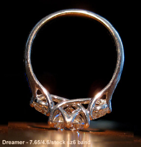
I honestly think a stone the size of yours, with your studs, would be beautiful in this setting. I photoshopped it for you - made it a stock size6, 7.65mm centre, 4.6mm sides, reduced the sidestone angle just a bit, I think it looks really pretty :sun:

DPsd1.png DPsd3.png


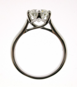
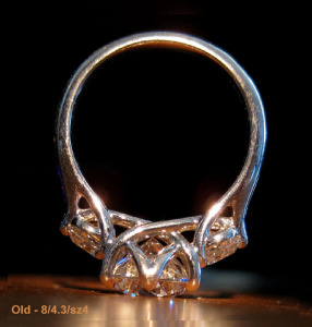
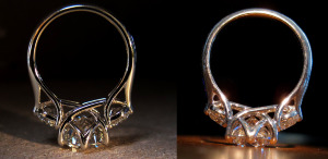
My old ring and my new are almost like two separate designs, in a lot of ways. The old was cozy and the prongs tightly cradled the stone and the whole thing looked so very - comfy. The new one is a lot more "airy" - a lot more space between stone and prongs, larger gallery... You probably remember that I asked for "as low as you can go" with V1 and wound up not liking how squat it looked on the finger, especially when paired with a band - the band covered easily half the stone depth from my POV. That and my gripes w/ the colour and patina of the plat - were the main reasons for the change, and we swung the other way toward too much space, but I'm actually glad it worked out that way - I never wear the ring alone and with a band adjacent the extra height makes everything look nicely proportional IRL. For a standalone ring I would plan it lower.

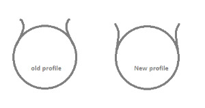
When I discussed w/ WF to create V1 I emphasized again and again how important the "coziness" was - prongs cupping the stone, everything nestled into everything else. The slightly thicker prongs were purposeful - Joe and I decided that thicker prongs, with a visible taper from bottom of trellis to tip of prong, would add to the feeling, as would slightly rounded prong tips and severely angled sidestones... Honestly I think those proportions - the 2ct w/ 0.3 sides - were as big as I could go w/ size4 to get that overall "look" - any larger and the tulip-ness would've disappeared, just because of the widths involved, if that makes sense? Pic -

profile.png

That's what I see in my photoshop of your stones - that *gorgeous* curvy romantic profile that I so miss in V2.0!


Since there was no prayer of going cozy w/ the larger stones we decided to go the other way, which had the advantage of resolving my nitpicks - airy, open, butterflies instead of buttery.. we kept the prongs the same width (which given the extra length and space has the effect of visually thinning them quite a bit, plus they're gold, and I do think the material makes a big difference) - kept the taper from bottom to tip but again it's much less pronounced. Raised the stones quite a bit, clawed the prongs out (and I had them thinned further a few months ago). I also asked for a significant taper in the shoulders and for the underside to be opened a bit more for cleaning.

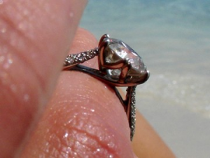
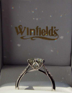
I guess what I'm trying to say is - they're both really, truly beautiful, in different ways. It's just that one is a better match for what I like to see IRL than the other. WF contacted me about making it a stock piece just a few weeks after V2 was made, but the pics look like V1 - I think only one might be of mine. I guess the lower setting is more in-vogue ::) if you go the threestone route I would request it higher, whatever you choose - I think we share feelings on this. Actually the Vatches in those threads are *exactly* what I'm talking about - same design, but so differently executed!

Candle.png


Shank on V2 goes from 2.65mm palm-side (1.8mm deep) to 2.2mm (2.22mm deep) up the cathedral. V1 was 3mm palm-side (1.7ish mm deep) to 2.8mm up the cathedral. V2 table is 7.5mm high, stone is 5.6mm deep. Trellis is 0.9mm thick on the underside.

I was inspired by MGR to try on a channel diamond band after seeing her Tiffany anniversary pics - well, as you said, it looks fabulous on her but it's not for me ;)) DH did say *he* thought it looked good, though when I suggested that it might grow on me he quickly moved on 8) There's a gap but it's not huge - mostly from the taper. I like it!

As for whether I still like it - well, I've had it for a year and no plans or pangs - and given that I went through three rings in the year before... :cheeky:


ETA that was a novel! Hope it helped some :))
 

Dreamer_D

Super_Ideal_Rock
Joined
Dec 16, 2007
Messages
25,368
OK Yssie, you rock and are the bestest PS friend ever!

I need to think about everything you wrote and will reply later or tomorrow. But in the meantime, :appl:
 
Be a part of the community Get 3 HCA Results
Top