shape
carat
color
clarity

Why can''t labs use digital photos on their certs to show inclusions like some vendors here on PS...

Status
Not open for further replies. Please create a new topic or request for this thread to be opened.

Dancing Fire

Super_Ideal_Rock
Premium
Joined
Apr 3, 2004
Messages
33,852
Instead of using plots which is very inconsistant. It can make the stone look worst at times than it actually is. They should show photos on the back of the cert. Something like what GOG use. Including H&A photos. With today''s tech I would assume it can be easily done.
 
You know, it's interesting. For a while I tried just that on my appraisals, using a photo of the inclusions rather than the plot diagram.

Almost unanimously, my clients said they liked the plot diagrams better.

They said with the photos they had a hard time telling what was what, but that with the diagrams it was more clear to them.

Because they weren't used to looking at diamonds, diamond inclusions, reflection patterns, etc, the photos confused them, whereas the plots were easy to "read", especially with a good key to symbols included.
 
All the more reason to use a photo Rich
1.gif

Lets treat them all like mushrooms (keep them in the dark
1.gif
)
 
Hm. Inclusions in pictures are something you really have to learn to read. I would think the only way you could do it to benefit the general public is to blow them up and then also circle all the inclusions. However, the other problem is that the inclusions in real life are in a 3-D object so if there's any overlap from a 2-D point of view it would be also harder to convey via a photo than with the different colors on a plot diagram.
 
Hi Hest88
The problem with plots is that they don't really reflect reality. I've seen plots in my search that look like a minefield, but the stone itself is eye clean. At the same time there are plots that have nothing but a "little" crystal, but as soon as you look at the stone, that is all you see. I think a picture would be worth a thousand words, but nothing beats seeing the actual stone.
my 2 cents
Murph
 
Maybe I should do both.

The problem is, the pictures are sometimes so darn hard to take. You've got the depth problem to deal with- while you're focusing on inclusions at the top of the stone, inclusions at the bottom are out of focus.

An SI stone is no problem photographing, but a VVS inclusion is an elusive bugger to catch on film.

You end up getting obsessed in the photo process, and next thing you know a half an hour has gone by. Who's going to pay for it?
 
Richard how about instead of an inclusion photo include an identification photo.
This would be instead of a shot that is intended to show all the inclusions a photo of how the stones looks under 10x mag as seen thru a loop.
With the most prominant inclusions circled.
This would give someone a basis of varification that they got their diamond back from lets say having the ring in for service.
It would be a lot easier than them having to learn what a feather or crystal looks like to compare it to a plotted diagram which would also be included on the report.

for a vvs stone do it at 30x. 30x loops are commonly available online.
 
There is a technology becoming available that will allow photographic, and automatic creation of clarity plots. Not quite ready today, so it seems.

The problem up to the present has been the missing detail of tiny marks that affect clarity grading and the large size such a photo must be printed to in order for anyone to have a chance to actually see small inclusions.

A clarity plot does nothing for the quality of the diamond. It is an aid to identification, if drawn accurately, completely and properly. The norm is way less than this, even with GIA. It is drawn more for eye appeal and tradition many times more than for a scientific reason. Too many red marks on a diamond deter customers who would readily purchase the stone, except the red lines scare them. Many times this fear is for no good reason. Sometimes it is correct to avoid such a stone.

Part of the problem is placing the inclusions where they belong and not where they are reflected to. This is refraction, such as one sees when a pencil is placed in a glass of water and appears bent to your eye. Also, no one would want reflected inclusions to be plotted more than one time, yet by photography you might get 8 inclusions where only 1 exists. This is not an easy situation, but there will be further resolution to this dilemma in the coming months, I believe.
 
Can anything on those certs remain 'for identification only' without everyone trying to read quality (and price differences) between the lines? Just look at fluorescence - how many think it is bad, good or downright ugly. Wasn't it's mention intended by GIA as an "identification" feature?
 
The day could come when a MRI scan would accompany the cert. 3D would provide perfect identification. How soon would depend on the cost to the product and does the consumer really care enough to want it done. On very high end purchases? Technology is just an idea and a dollar away.
rolleyes.gif
 
well, an mri wouldn't be much good with a diamond. mris work by aligning the hydrogen atoms in your body with a magnetic field. diamonds often have some trace hydrogen, but it's not enough to create an image as you can with a human body that is 95% water.


x-ray topography has shown some promise for imaging diamonds, but there are problems with it since the topographs look different when taken from different directions and you can only get a topograph from certain specific angles.
 
Check out this link for a hint of what is coming down the pike. I know it looks a little crude as depicted, but there is far better coming our way.

http://www.imageminc.com/products/
 
the plotted diagram sometimes allows the vendor some room for maneuvre and allows the buyer for some room for imagination.


also, the diagram is usually a huge enlargement compared to the real size of the stone; now, imagine a cert with that huge photographical image showing a vs-2 or worse, an si-2...i can here all those private customers say "yuk!!!"in front of the counters...


i like to compare a plotted diagram with a map.


when looking at my old geography books, i always loved the symbols and colors on the maps.


of course they don't always reflect reality but we have learnt to interpret these drawings.


other comparaison: technical manuals, those little books that explain how your new dvd-player works, mobile phone and other products; they always put drawings, never photographical images. there must be a reason.


i am convinced the plotted diagrams are better than a photo.


...just an opinion...


robbe
 
----------------
On 5/3/2004 4:04:10 PM oldminer wrote:

Check out this link for a hint of what is coming down the pike. I know it looks a little crude as depicted, but there is far better coming our way.

http://www.imageminc.com/products/----------------
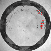

Dave how do you think the market will take to clarity grades made:
1. from immersion in liquid?
2. from the pavilion side (where reflected inclusions are common but they will not be reflected on the crown side)

What i mean is - if a VS2 inclusion is near the culet then face up you can see it 16 or 32 times and it appears as a I3 - and that is how labs currently grade such a stone.
In this image taken under immersion thru the pavilion there are some double up inclusions - this is hard to explain and may have more or less impact face up.

instrument_clarity.gif
 
Also with photography you can align a stone so you can not see inclusions and also so they are really apparent.
 
Status
Not open for further replies. Please create a new topic or request for this thread to be opened.
GET 3 FREE HCA RESULTS JOIN THE FORUM. ASK FOR HELP
Top