shape
carat
color
clarity

What do you think of this e-ring setting?

tenyearanniversary

Shiny_Rock
Joined
Sep 18, 2011
Messages
144
So my appointment in the diamond district have been pushed back to tomorrow.....

But what do you all think of this Kauffman de Suisse double flowing line setting? Do you think it looks good on the RB? (Not that it's a fair comparison because the RB is 3 carats in this photo, and the cushions are 6 and 7....)

(I am upgrading my RB......I thought I wanted a cushion, but didn't like it as much on my hands when I tried it on at Tiffanys. Plus I'd like more spread)
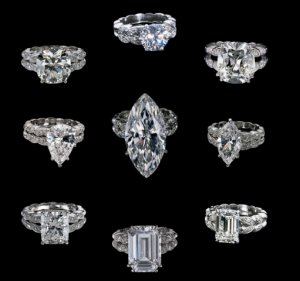
kauffmandoubleflowing.jpg
 
what size RB would you be getting?
 
Between 4 and 5 carats RB?
 
OK, I asked because this setting seems to complement larger diamonds better. Can you try it on? That way you could see how it looks on your hand and if you like it on vs just in pictures.

also do you plan to wear it with another ring? this looks like a standalone ring to me.
 
Unfortunately Kauffman closed their NYC store, so I would need to do it long distance.......

Good point about it being a standalone ring. I have an eternity band, but am not set on wearing it with this as long as it looks like I'm married and not just engaged....which I think this setting accomplishes.....

Do you guys think this setting looks modern enough and not too older Palm Beach crowd? I'm 36 and love fashion. I need the ring to be versatile......but am also contemplating a more unique setting such as this.....
 
Honestly, the setting doesnt do much for me (but then again, the rings not for me :-)). The setting seems kind of distracting
instead of complement the main stone.

If it were me I would do something like this...
http://jewelsbyericagrace.smugmug.com/JbEG-Signature-Settings-and/Plain-and-Pave-Solitaires/The-Julia-Solitaire/12794553_T9nUz#822099885_AiLM5

or this...
http://jewelsbyericagrace.smugmug.com/JbEG-Signature-Settings-and/Plain-and-Pave-Solitaires/The-Lily-Split-Shank/12795589_XX3pg#914522745_Dd7Dg
 
tyty333|1316537454|3021428 said:
Honestly, the setting doesnt do much for me (but then again, the rings not for me :-). The setting seems kind of distracting
instead of complement the main stone.

If it were me I would do something like this...
http://jewelsbyericagrace.smugmug.com/JbEG-Signature-Settings-and/Plain-and-Pave-Solitaires/The-Julia-Solitaire/12794553_T9nUz#822099885_AiLM5

or this...
http://jewelsbyericagrace.smugmug.com/JbEG-Signature-Settings-and/Plain-and-Pave-Solitaires/The-Lily-Split-Shank/12795589_XX3pg#914522745_Dd7Dg
These are gorgeous settings that compliment a large center stone. I am not fond of the chucky settings with a center stone of 4-5 cts. I looks like there's a fight going on for attention and no one's the winner. But that's just my opinion.
 
Thank you! I totally see what you guys are seeing! That is probably true! Thanks!
 
I think even with a large center stone, that kind of setting tends to overwhelm and looks a bit clunky. I personally like a slightly more delicate setting to show off the stone. But if you love it, then that's what counts!
 
GET 3 FREE HCA RESULTS JOIN THE FORUM. ASK FOR HELP
Top