shape
carat
color
clarity

Trip to the jewelry store - Help me pick a setting! (pics)

Status
Not open for further replies. Please create a new topic or request for this thread to be opened.

JDgirl

Shiny_Rock
Joined
Oct 30, 2005
Messages
396
Hi everyone,

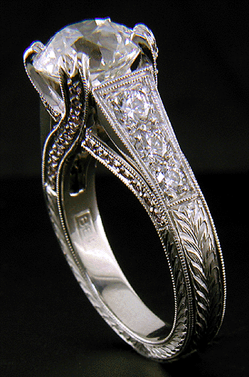
So, my BF is starting to press me to pick a setting ASAP. I went to a local B&M today and tried on some settings. I took pics of the ones I really liked. Which one do you guys prefer? It will be set with an OEC, and I'm having an awful time trying to pick a setting! I had no idea it would be this difficult for me. Please help me decide...here are pics of the two front-runners. Thanks!!!

BTW, they are in opposite order in the rest of the photos after this first one.

DirectComparison.JPG
 
Here they are on my hand...

Comparison1.JPG
 
And another...

Comparing2B.JPG
 
Another...

Comparing3B.JPG
 
One more...

Comparing4B.JPG
 
No question, the one on the left in the later pics (right in the first.) I love that Edwardian/"crown" pave look. Love the "crossover" of the pave on the side view. It is YUMMY!!!!!!

(I know the prongs won''t be so high once the stone''s set on the other option, but it still seems a little clunky to me. But that''s just me!
 
Date: 1/16/2006 6:14:33 PM
Author: blueroses
No question, the one on the left in the later pics (right in the first.) I love that Edwardian/''crown'' pave look. Love the ''crossover'' of the pave on the side view. It is YUMMY!!!!!!

(I know the prongs won''t be so high once the stone''s set on the other option, but it still seems a little clunky to me. But that''s just me!
I agree, just stunning.
30.gif
30.gif
 
I feel like I normally pick the opposite of everyone else, but this time I''m with you guys. The one on the right in the first pic!!! Both are beautiful settings though.
 
Another vote for the one on the left!

I think it makes the stone pop more and the other setting although I know the stone isn''t set looks like it won''t achieve the same effect as much. IMO the one on the left looks more delicate and antiquey if thats the look you are going for hehe.

Yummy thanks for the pictures!
 
Date: 1/16/2006 6:14:33 PM
Author: blueroses
No question, the one on the left in the later pics (right in the first.) I love that Edwardian/''crown'' pave look. Love the ''crossover'' of the pave on the side view. It is YUMMY!!!!!!


(I know the prongs won''t be so high once the stone''s set on the other option, but it still seems a little clunky to me. But that''s just me!

Ditto. I like that one as well. Not crazy about the other one. I agree that it looks a bit chunky. I LOVE the first one and think it would look great with a big ole OEC in it!!
 
I agree with Blue and Kaleigh.....Just gorgeous!!!
30.gif


widget
 
Uh oh, I think I''m just getting more confused!
41.gif


I was originally in love with the one on the left in most of the pics, the one you guys seem to like. Then I tried on the other, less antique, one. It sparkled LIKE MAD! It was the brightest setting I''ve ever seen and put the center stone up in the air a bit, which made the whole thing very bright and noticable from even far away.

My mom suggested maybe putting sapphires in place of the small diamond pears. I think that would make the center stone stand out more. But I do see what you guys are saying. I''m also going to show you a pic of what I originally went in to see. I think it might be too plain for me, though I do love the classic solitaire-ish look.

OECStraight.JPG
 
I am a lemming and agree w/ everyone else. I love the cris-cross pattern of the setting and the claw-like prongs, it will flatter your antique cut immensely.
The other setting looks like it''s made for a princess cut stone- maybe because the prongs seem like corners sticking out to me?
 
I pick the criss cross crown. I agree with Blueroses. Not to crazy about the prongs on the other. And the fact that the stone is OEC I would definately go with the more antique looking setting.
 
I love the one on the right (in the first pics). The crossover prongs are gorgeous and I love how the ring is antique-looking and substantial at the same time. Yum
30.gif
 
I know the prongs look weird, but they would be nice delicate double prongs once the stone was set. I just dropped a CZ into the setting for the pics.

Thanks for all the opinions everyone! Your thoughts are really helpful!
 
I agree with everyone else. I''m not sure sapphire pears would look that good in the other setting. It may make it look to busy and I love sapphires.
 
I have to agree with...everyone! LOVE the crossover prongs!!!
30.gif
30.gif
30.gif
 
I''m with the crowd. There is no question in my mind. I much prefer the setting with the crossover prongs that is shown on the right in your first picture.
 
I''m going to follow the herd on this one! The crossover one, the right one in the first pic. That''s the way to go. Gorgeous!
 
I guess I''m the first one to disagree with everyone. I like the one on the left in the first pic which is the one on the right in the rest of the pics. There''s something about the profile view and the top view that just grabs me. And the pears! YUM!!! I think the other one looks too chunky.

If you were to get that pear side one, I would not suggest putting sapphires in place of the pear diamonds. It will make the ring look too busy.
 
I love the crossover prongs! It is so beautiful and is really unique.

It gets my vote
36.gif
 
Haha, I disagree. I like the one with the pear sidestones. I just think it is much more unique and delicate. Of course I love your mom''s idea of have sapphires replace the diamonds! I just feel like I have seen the criss cross design everywhere lately. IMHO.
 
~~I love the cris-cross setting the most. I think it will be more flattering to your diamond than the others... good luck with your decision!!!
2.gif
 
I''m with the majority - I vote for the X-prong pave antique setting - hands-down!! It really makes your stone POP, and the slightly lower setting is very flattering on your hand!

Can''t wait to hear what you decide ...
 
I am going against the crowd and picking the other one. I like it much better. Actually, i like the 3rd picture the best (the one you said might be too plain). They are all gorgeous. Good luck!
 
I like the pave cross over too! Hands down. I think it is just lovely...although you really can''t go wrong with either one, in my opinion...
 
From the side I like the profile of the cross-prong ring better, but from the top I like the pear ring better. I don''t know how I could make a choice between the two! The profile of the pear ring looks a little odd to me, too busy I think. But the cross prong ring seems really wide from the top view. Either would be beautiful. The third ring you posted is beautiful too, and I wouldn''t let yourself be pressured into thinking you need an antique style setting for a OEC. A more contemporary setting could be fabulous and unexpected.
 
Date: 1/16/2006 6:14:33 PM
Author: blueroses
No question, the one on the left in the later pics (right in the first.) I love that Edwardian/''crown'' pave look. Love the ''crossover'' of the pave on the side view. It is YUMMY!!!!!!


(I know the prongs won''t be so high once the stone''s set on the other option, but it still seems a little clunky to me. But that''s just me!

agree 100%
 
Date: 1/16/2006 6:34:46 PM
Author: JDgirl

I'm also going to show you a pic of what I originally went in to see. I think it might be too plain for me, though I do love the classic solitaire-ish look.

This does look great.

Now, I do like the one on the left as everyone else
9.gif
but the pictures may not do justice to the other setting because the prongs are not finished - once they are cut down the and stone set, it shouldn't be nearly as weird. Perhaps a classic three-stone with a pave shank would have looked better for me, w/o the extra pave lining on the sides & all. But that option is not on the list...
38.gif


On the other hand.. it doesn't look like the setting to the right is meant to keep the stone set up - only that it was meant for a smaller stone, and the easiest ting to do for the jeweler to fit the setting for a larger diamond is to leave the prongs too high. Otherwise, the setting would need to be remade - it seems.

Just an opinion...


Btw. the criss-cross setting reminds me of Something: are these the same? (bar the pink diamonds)


Old-European-cut-Diamond-Ring-27a.gif
 
Status
Not open for further replies. Please create a new topic or request for this thread to be opened.
GET 3 FREE HCA RESULTS JOIN THE FORUM. ASK FOR HELP
Top