shape
carat
color
clarity

Thoughts on these two 3+ct OEC rings: in love with both!

lindy520

Rough_Rock
Joined
Jul 18, 2014
Messages
41
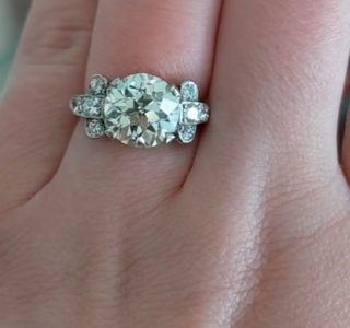
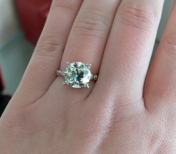
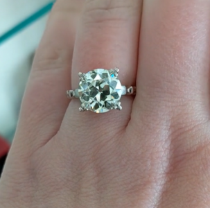
Hi all, I love looking at all of your gorgeous OEC rings! I found two rings, and I love both of them! I have looked at these videos dozens of times, and I've even seen these rings in person, but I have stars in my eyes and can't seem to decide between the two. The rings are very different styles, and I'd buy both if I could. I've uploaded the vendor videos, and I thought maybe some of you may be able to point out features that I'm not seeing, and that would help me to choose ;)2 Would love your feedback!

3.50 GIA O/P VS1 9.25x9.29x6.3 tbl 465 dpth 68%

3.47 Q/R VS1 9.68x9.70x5.63 tlb 53% dpth 58%
 

ac117

Ideal_Rock
Premium
Joined
Apr 28, 2014
Messages
4,064
What a lovely dilemma to have! I vastly prefer the 3.5! The 3.47 has too many facets under the table that go dark all at the same time. The 3.5 has a lovely facet pattern that flick on and off and seems to be very bright and lively, even in the crappy lighting of the video. I also personally prefer the setting of the 3.5 and it looks to be much whiter, although I’m sure they would both show much creaminess when in the right lighting conditions.
 

marymm

Ideal_Rock
Premium
Joined
Apr 21, 2010
Messages
5,533
I also far prefer the 3.50ct OEC ring - to my eyes the stone is a top performer (flashy, chunky, small table, edge to edge action) and the setting is so fabulous and complementary.

The 3.47ct is okay but the facet pattern under the table and the shallow depth are major detractors to the performance/appearance to me.

YMMV.
 

ItsMainelyYou

Ideal_Rock
Joined
Jun 27, 2014
Messages
4,862
The 3.5 is calling my name.
I love the extra puffy crown and small table.

*so to add because a bunch of my comment didn't post!
Others have said it already and better but:
The depth and table on the 3.5 create a wonderful 'disco-ball' effect of light play that is always going to be on and that's just amazing in an oec! The mounting also is a beautiful accent to the center stone while playing up the contrast of the main event. :love:
 
Last edited:

lovedogs

Super_Ideal_Rock
Premium
Joined
Jul 31, 2014
Messages
18,344
The 3.5 is SO much prettier to my eyes. I agree with others that the high crown and "puffiness" of the 3.5 is lovely, and that setting is just TDF. The 3.47 looks dark when viewed face up likely due to how the facets "go dark" at the same time (said above but I want to reiterate here). When all of the facets go dark at the same time, it makes the whole stone look kind of "dead". What you want to see is some facets turn "off" while others turn "on", which gives an overall twinkling/sparkling effect. The 3.5 has exactly that characteristic, and has a lovely floral pattern.
 

lovedogs

Super_Ideal_Rock
Premium
Joined
Jul 31, 2014
Messages
18,344
I took screenshots to show what I (and others) are seeing in case it helps.

3.5 has facets that aren't all "off" at once and has a lovely floral look to the facets when looking from the top down view.
Screenshot 2021-02-10 185752.png

The 3.47 has facets that are less "organized", less "floral", and also tend to all turn "off" at once, which makes the stone look dark even though I'm sure it's lovely IRL
Screenshot 2021-02-10 185830.png Screenshot 2021-02-10 185851.png
 

maita13

Brilliant_Rock
Joined
Aug 17, 2015
Messages
1,429
Another vote here for the OP 3.5! The facet pattern is just yummy❤️
 

lindy520

Rough_Rock
Joined
Jul 18, 2014
Messages
41
What a lovely dilemma to have! I vastly prefer the 3.5! The 3.47 has too many facets under the table that go dark all at the same time. The 3.5 has a lovely facet pattern that flick on and off and seems to be very bright and lively, even in the crappy lighting of the video. I also personally prefer the setting of the 3.5 and it looks to be much whiter, although I’m sure they would both show much creaminess when in the right lighting conditions.

Thanks ac177. The 3.5 does look less warm than the 3.47 in person, as well.
The video of the 3.47 doesn't really do justice to the stone - it is really sparkly irl
I forgot to mention that there is only $150 difference in price between the two rings!
 

lindy520

Rough_Rock
Joined
Jul 18, 2014
Messages
41
I also far prefer the 3.50ct OEC ring - to my eyes the stone is a top performer (flashy, chunky, small table, edge to edge action) and the setting is so fabulous and complementary.

The 3.47ct is okay but the facet pattern under the table and the shallow depth are major detractors to the performance/appearance to me.

YMMV.

Thank you! I was also concerned that the 3.47 might be too shallow...

I wasn't looking for a setting so much as a stone, but you are right about that setting. It is lovely!
 

lindy520

Rough_Rock
Joined
Jul 18, 2014
Messages
41
The 3.5 is calling my name.
I love the extra puffy crown and small table.

*so to add because a bunch of my comment didn't post!
Others have said it already and better but:
The depth and table on the 3.5 create a wonderful 'disco-ball' effect of light play that is always going to be on and that's just amazing in an oec! The mounting also is a beautiful accent to the center stone while playing up the contrast of the main event. :love:

Thank you, thank you for your input. I love that puffy crown, too.So great to have confirmation!
 

lambskin

Ideal_Rock
Premium
Joined
Aug 22, 2012
Messages
3,054
3.5. But what kind of lighting is it seen in? An OP and QR color should appear way warmer than what is shown. viiew those stones elsewhere in other light.
 

munchee

Brilliant_Rock
Joined
Feb 12, 2011
Messages
617
Can we know which vendor after you got it? :D
 

lindy520

Rough_Rock
Joined
Jul 18, 2014
Messages
41
The 3.5 is SO much prettier to my eyes. I agree with others that the high crown and "puffiness" of the 3.5 is lovely, and that setting is just TDF. The 3.47 looks dark when viewed face up likely due to how the facets "go dark" at the same time (said above but I want to reiterate here). When all of the facets go dark at the same time, it makes the whole stone look kind of "dead". What you want to see is some facets turn "off" while others turn "on", which gives an overall twinkling/sparkling effect. The 3.5 has exactly that characteristic, and has a lovely floral pattern.

I am so glad that I posted these videos! The feedback is great! I am definitely seeing differences that weren't as apparent to me earlier. Thank you for explaining the facet "blinking". And, I can now see the flower pattern in the 3.50.
 

lindy520

Rough_Rock
Joined
Jul 18, 2014
Messages
41
I took screenshots to show what I (and others) are seeing in case it helps.

3.5 has facets that aren't all "off" at once and has a lovely floral look to the facets when looking from the top down view.
Screenshot 2021-02-10 185752.png

The 3.47 has facets that are less "organized", less "floral", and also tend to all turn "off" at once, which makes the stone look dark even though I'm sure it's lovely IRL
Screenshot 2021-02-10 185830.png Screenshot 2021-02-10 185851.png

Screenshots are fabulous! Thank you!
 

lindy520

Rough_Rock
Joined
Jul 18, 2014
Messages
41
3.5. But what kind of lighting is it seen in? An OP and QR color should appear way warmer than what is shown. viiew those stones elsewhere in other light.

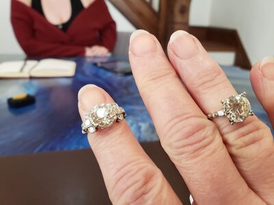
here is a photo of the two on my hand. It's a crappy photo but you can see the color difference. Also, the Q/R shows more color when viewing the pavilion


20210208_153606.jpg
 
Joined
Sep 11, 2013
Messages
2,496
Has wearing them on your hand helped you decide on one or the other?
 

Ionysis

Brilliant_Rock
Joined
Oct 1, 2015
Messages
1,925
I vote the 3.5ct as well!
 

LLJsmom

Super_Ideal_Rock
Premium
Joined
Oct 24, 2012
Messages
12,644
With regard to cut, I prefer the 3.5 slightly.

I can tell the difference in color in the last pic. I would choose the 3.5.
 

ForteKitty

Ideal_Rock
Joined
Oct 7, 2004
Messages
5,239
3.5 is a much, much better performer, has better edge to edge brightness, and generally more pleasing faceting pattern. The 3.47 is too shallow and there's a lot of leakage and while is larger in diameter it feels smaller.
 

Lookinagain

Ideal_Rock
Premium
Joined
May 15, 2014
Messages
4,537
another vote for the 3.5 for all the same reasons already stated.
 

xxxxxx

Brilliant_Rock
Joined
Jan 6, 2019
Messages
821
I'm all for the 3.5 OP! It's beautiful.
 

prs

Brilliant_Rock
Premium
Joined
Dec 26, 2017
Messages
1,883
Welcome to the O-P club! =)2
 

lindy520

Rough_Rock
Joined
Jul 18, 2014
Messages
41
Thank you, all! It is unanimous. I was originally going for a simpler look, but I am convinced that the 3.5 is the way to go! Now, onto the negotiation stage...I will report back!

I have to say that I honestly didn't know if I'd have any responses when I first posted, but this forum has surpassed my expectations. I sound sort of soppy...but really, THANK YOU!
 
Joined
Sep 11, 2013
Messages
2,496
Thank you, all! It is unanimous. I was originally going for a simpler look, but I am convinced that the 3.5 is the way to go! Now, onto the negotiation stage...I will report back!

I have to say that I honestly didn't know if I'd have any responses when I first posted, but this forum has surpassed my expectations. I sound sort of soppy...but really, THANK YOU!

*whispers* Personally I prefer the setting of the 3.47 too!

But the center stone is the star, hence my vote goes to the 3.5 as well. You can always remount the stone to another setting if you end up finding something else you like better!
 
Be a part of the community Get 3 HCA Results
Top