shape
carat
color
clarity

stones from Dana for a three-stone ring

distracts

Ideal_Rock
Premium
Joined
Oct 11, 2011
Messages
6,185
threestone.png

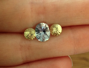
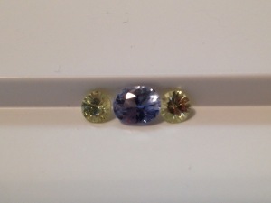
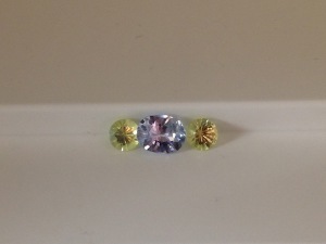
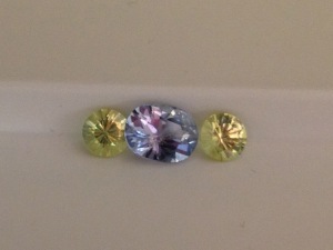
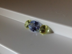
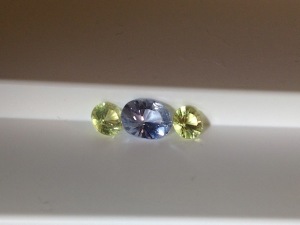
These stones are all from Dana/Mastercut Gems - 7.6x6mm oval sapphire (basic heat only) and 5mm round chrysoberyls. They are very well matched - they just look different in my picture because they're tilted differently. I took like a million pictures but they kept shifting around!

I know some of you are stone-matching savants, so I want to make sure these look as good together as I think they do. I agonized for a couple of days over whether to buy the 5.5mm pair or the 5mm pair, but ultimately I think 5.5 would be too big. I originally wanted pastel yellow or pink, but I think the greeny-yellow the chrysoberyl is a good match. The ring will be very pastel!

I am planning on a swoopy trellisy setting like one of these:
http://www.etsy.com/transaction/53027565
http://www.etsy.com/transaction/58012661
I contacted DanielM for a quote, but would certainly look into other Etsy/Ebay sellers who make three-stone rings... I looked through all the sold items of HoW and Adzia, who are my faves, but Adzia didn't have any three-stones and I didn't like the HoW ones I saw. It'll be in silver or nickel-free white gold, if I can find someone who works in it. I've looked through my Etsy faves but haven't saved anyone else who might be able to make something like this... anyone have any suggestions?
 
I love what you've chosen! I think your cool toned colour combination is a perfect one - it shows well together and they compliment each other beautifully. I like the 5mm stone size as well. Are you thinking of 2 shades of gold like the heart shaped design or solid like the one reserved for athenaworth? I'm drawn to athenaworth's trellis design in the 1 colour.

Will be a gorgeous ring!
 
I just wanted to say that your sapphire IMO is gorgeous. The chrysoberyls compliment the sapphire very well. I love the cool color combo. The three stone ring will be very pretty!!!!
 
I have a three stone ring with chrysoberyls rounds cut like that and a round sapphire in the middle. I think the most important thing in this case is that you have a cool and warm combination, which I prefer, and that the stones are matched for saturation, which again, I prefer in this case. I don't think the stones are taking away from each other too much, for example if you paired a stone of strong saturation against one that has weak saturation. The stones are matched for saturation here.
 
I think the dimensions, shape and colour combo are fine but to me, the saturation seems mismatched. The chrysoberyls are so sparkly and more saturated, drawing my eye away from the center stone.
 
TL, now that I have looked up your ring, I think it must have subconsciously played a part in me deciding on the chrysoberyls. Your ring is more saturated though (and super beautiful!). I bought some diamonds off DB earlier this year to use as sidestones for this sapphire, but the sapphire is so light that there wasn't enough contrast - you could barely tell it was blue when next to them. With the chrysoberyls, it looks more blue.

Enerchi, definitely all white metal! You can't tell in this particular picture, but these stones are really super pale. I think a colored metal would overwhelm them entirely. I like the Athenaworth ring more, but I'm not certain how well the setting will translate to an oval center stone. I am really trying to concentrate on getting these set instead of going off willy-nilly on other projects. The problem is that the gemstones are just so much prettier and easier to buy than the settings...

Chrono, I had wondered about that before I saw the chrysoberyls, when I just had the vendor picture to go on, but irl it doesn't bother me, especially at arms-length. Realistically, in the past four months of searching, they're the least saturated pair in the right size (4mm-5.5mm) In some of my pictures, the chrysoberyls look more saturated, but I think in some of them the sapphire does. I took some pictures today that turned out better so I'll crop and post them in a little bit.

ZestfullyBling, thanks for the comments!
 
Your stones look lovely together! The proportions and colors are great.
 
I think the color combo is very cool and fresh. I cannot wait to see the ring when complete. The bonus is all the stones are very hard and durable.
 
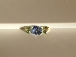
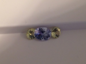
Okay I still couldn't get the stones to stop tilting and wobbling every which way (I needed to put something sticky behind them, but everything I had was dark) but they are sort of propped up in my ipad box... I at least got them in several different lighting environments this time. Evening sunlight, incandescent, and fake sunbox sunlight. There are also really good shots of all the tilt windows, lol. I'm not sure why the sapphire is reflecting so much pink in some of the shots.

IMG_1241.jpg
IMG_1242.jpg
IMG_1245.jpg
IMG_1249.jpg
IMG_1252.jpg
IMG_1253.jpg
IMG_1254.jpg
IMG_1257.jpg

LisaRN|1332727942|3156361 said:
The bonus is all the stones are very hard and durable.

I have a general rule - anything that goes on my ring finger or pinky finger should be durable, as I am clumsy with my hands and those fingers take the brunt of it. I can wear more delicate stones/settings on my index and middle fingers. At any rate, that's what I try to keep it to. Though I really want a variety of cute little stacking rings for my pinky, regardless of durability, because that would be adorable.
 
Thanks for the multiple photos - love how the stones sparkle and twinkle in the different lighting situations. That will be a gorgeous ring! Very excited for you!
 
I love the new photos, they show more color in the stones, and I love the combination, but I am a bit biased towards that combo. ;))
 
So much nicer in these pictures; this combo is a YES for me.
 
I think its a beautiful combo!
 
GET 3 FREE HCA RESULTS JOIN THE FORUM. ASK FOR HELP

Featured Topics

Top