shape
carat
color
clarity

Still obsessing about invitations

Which style do you think looks best?

  • The Silhouette Light

    Votes: 1 100.0%

  • Total voters
    1
  • Poll closed .
Status
Not open for further replies. Please create a new topic or request for this thread to be opened.

fatafelice

Brilliant_Rock
Joined
Jul 26, 2004
Messages
1,757
Okay, I am sure you are all sick of my invitation escapades by now, but I still could use some opinions. I posted these in my invitation wording thread, but I didn't get much response, so I thought I would try again.

I came up with this (poorly rendered) idea for the illustration on my invites, but I have been second guessing myself lately. I want the inites to look fresh, classy, and modern, but with a vintage feel. Tall order, huh? I do not really want the illustrations to look too much like 19th century engravings or some such. A little more up-to-date than that. Think: Edwardian meets Swing (30s/40s, not 60s, you dirty birds
2.gif
).

I am also nervous because I am putting these illutrations into the hands of someone else to create, so I want to be as specific as I can about what I want.

All that being said, which do you like better...The Straightforward, The Silhouette, or The Silhouette Light? Or neither, but _(insert great idea here)_?

Oh, and I should add, the invites are going to be letterpressed. As such, I am not entirely sure if the second two are even viable options (too much coverage).

ETA: My colors are mainly navy and white with some lighter shades of blue mixed in. (and a peachy accent color or two)
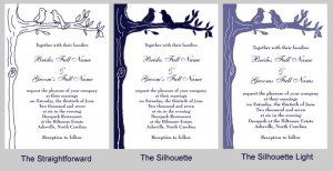
invitedesigncomparison.jpg
 
hum- here''s what i would suggest. go with number one, but make it a bit more filled in with the use of fine lines. fine lines letterpress beautifully. the fine lines would give the artwork more umph without making it all solid. think www.whiteaisle.com invitations.
 
oh, and are these going to be one color?
 
ooh, that''s a good idea Jcrow! I like the lighter one, but putting lines in would get the same type of effect only classier and probably easier for printing!
 
I like the straightforward myself...
 
Jcrow - The only thing I am worried about with number 1 and more lines is it looking too much like an antique engraving. And I was planning on doing one color (all navy ink), but if everyone loved the lighter blue silhouette, I thought I could maybe go with two (lt.blue and navy).

Indie and FG - Thanks for the input guys! I really can''t seem to make up my own mind lately. Or rather, I make it very quickly and then start to second-guess myself.
 
hum, i see what you are saying. maybe you convey freshness with the style of illustration? maybe talk with the illustrator and voice your concerns and see what they suggest. also, 2 color for me was way more costly.
 
Date: 10/24/2006 5:44:26 PM
Author: jcrow
hum, i see what you are saying. maybe you convey freshness with the style of illustration? maybe talk with the illustrator and voice your concerns and see what they suggest. also, 2 color for me was way more costly.
That''s exactly what I want to do, but it is hard to express that to someone without having some examples to back it up.

I am sure that 2 colors would be WAY more expensive, but I was just grasping at straws. (Side note: I have seen some *gorgeous* multicolored letterpressed pieces. They make me drool, but I''m sure I would faint if I knew what they cost!)
 
I like "the straightforward" too because the balance goes all off for me with solid color on the left side only. I also can imagine it working more than the others in letterpress.

Navy will be sweet.
 
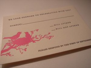
Here''s a "bird on a branch" that I really like -- this is what got me thinking about silhouettes. Well, that and Jcrows avatar!
2.gif


bird silhouette response card.JPG
 
Date: 10/24/2006 5:49:04 PM
Author: fatafelice


Date: 10/24/2006 5:44:26 PM
Author: jcrow
hum, i see what you are saying. maybe you convey freshness with the style of illustration? maybe talk with the illustrator and voice your concerns and see what they suggest. also, 2 color for me was way more costly.
That's exactly what I want to do, but it is hard to express that to someone without having some examples to back it up.

I am sure that 2 colors would be WAY more expensive, but I was just grasping at straws. (Side note: I have seen some *gorgeous* multicolored letterpressed pieces. They make me drool, but I'm sure I would faint if I knew what they cost!)
i am sure you've thought of this, but i'd suggest finding illustration styles that you do like and show them to the illustrator. even if it's not a bird image, i'm sure it will get that feeling across.
 
Date: 10/24/2006 5:52:00 PM
Author: fatafelice
Here's a 'bird on a branch' that I really like -- this is what got me thinking about silhouettes. Well, that and Jcrows avatar!
2.gif

I LOVE that look ... if you want silouette though I'd use it more sparingly, like shown on this example, rather than all along the left side.

Maybe kinda like this ... some on each side??
________________
**
**
**


***
**
_______________**_

Okay it doesn't show up like i want it too ... hmmm... some top left, some bottom right I guess is what I'm trying to illustrate ... for BALANCE.
 
Actually you can do the lighter blue invite as a one color, not a two color. Just use the exact same color navy ink, but just lighter. It''s using more than one hue that''s expensive, using multiple tones of the same hue should cost about the same as using just one color since they are using just one color, only a little less of it in some areas... do you see what I mean? It''s like greyscale is just using black ink, so this is uh navyscale!
9.gif
 
i like the strong color of the silhouette but i dont like how the birds look kind of blobby...so i voted for silhouette light but i'd really like silhouette but with more 'white' detail. i don't like the straightforward at all, i don't know why though! it just looks kind of really pale or washed out or something compared to the others.
 
Date: 10/24/2006 6:00:25 PM
Author: IndieJones
Actually you can do the lighter blue invite as a one color, not a two color. Just use the exact same color navy ink, but just lighter. It''s using more than one hue that''s expensive, using multiple tones of the same hue should cost about the same as using just one color since they are using just one color, only a little less of it in some areas... do you see what I mean? It''s like greyscale is just using black ink, so this is uh navyscale!
9.gif

true, but i know when i inquired about it with my letterpress printer, they would have charged me a separate color fee. they mix their own, so regardless if it''s 100% or 50% of the same color, they still treat it as two individual colors. several places i inquired about said the same thing.
 
Hey

I am fairly new and haven''t read your old invitation thread (if there was one) but since i am choosing an invite with a silhouette as well, I thought i would chime in

I like the straight forward b/c of it''s cripsness, but i know what you are trying to achieve-so the color would look good too.
Have u looked at the designer hello lucky? Really nice stuff but also really expensive (I contacted them directly and a single invite ranges from 18-26 US) but maybe good for some inspiration--has the retro yet fresh thing you may be going for.

here''s the link to the wedding collection
Hello Lucky!
 
Status
Not open for further replies. Please create a new topic or request for this thread to be opened.
GET 3 FREE HCA RESULTS JOIN THE FORUM. ASK FOR HELP
Top