shape
carat
color
clarity

Setting Questions for Mine Cut Diamond

bluberrry

Rough_Rock
Joined
Mar 4, 2020
Messages
2
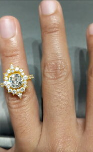
I have an old diamond that has been in my family since the 1880s. It is a cushion-esque shape, nearly square though a bit skewed.

The diamond was reset in sometime in the 1950s-70s and the setting did the stone no favours.

We have since gone through a lengthy design process, but have some questions and are looking for a broader opinion.

I've attached the CAD of the intended design and a wax print with the diamonds gently set atop, but are thinking of a few tweaks.

First, do you appreciate the negative space on the north and south side of the center stone? Or, do you think it will darken things too much?

If we should cast the setting in a yellow gold, would it be strange to have the basket cast in a white and the inner prongs perhaps as well?

I'd love to know what you all think of the design and the ideas here.Screenshot_20200304-090054.png1590.jpeg
 
I’m not a fan of that negative space but why do you like it?
 
Looks unintentional, having the negative space n/s like that, like trying to force a too large, different shape setting.
I don’t think white gold/platinum prongs and or basket looks odd with a yellow shank. Combos of this is seen all the time.

I can appreciate wanting to elongate the square cushion shape with the halo - I’d just go about it differently.
133FEC59-59D3-46E0-9B7F-8D31CC9BC735.jpeg
 
Last edited:
@nala The desire here was to elongate the halo and present something unique. We wanted to incorporate some of the indian / middle eastern artistic motifs into the design and so partly this was inspired by some of the architecture you see in the carved window shade outlines etc.

@Rfisher wow, thank you for taking the time to photoshop that! That's amazing. :D You make a really good point about it looking like trying to force it. Now that you mention it there does seem to be this sort of unfinished seam / inside out sort of look.

My fiancée was looking to style things in a sort of indian meets evil eye sort of style, but that negative space does seem to stick out. Do you think there is any way to achieve that look with a diamond like this, or are we pushing too hard? We were thinking maybe adding the white basket and prongs would help it achieve more of a floating look, but we'd love your honest opinion even if that is "my dudes: it is just fugly".

My only concern with the tighter halos is that they look a little more floral(?) in nature. We want to prevent looking like just another average halo, definitely want to prevent looking like the Princess Di ring that to this day seems to garnet so much attention.

I forgot to post the video before but I'll add it now:
Before the wax print, they took a pass at the ring by hand but really it did not go well, that is the first picture in the rose gold here:

IMG-20200304-WA0000.jpg

We also looked at a couple other designs and I've attached those as well:

IMG-20200304-WA0001.jpg


We'd love to hear your opinions, and thank you so much again for taking the time and effort to do that!


IMG-20200304-WA0000.jpgIMG-20200304-WA0001.jpg
 
It looks like you want a Heidi Gibson style? There is a way to elongate the shape using stones without using so much empty space. It looks like you found a setting for a much larger stone and plopped this one in.
 
My only concern with the tighter halos is that they look a little more floral(?) in nature. We want to prevent looking like just another average halo, definitely want to prevent looking like the Princess Di ring that to this day seems to garnet so much attention.

Got it.
Use your original layout, but set the centerstone askew like a kite?
 
@nala The desire here was to elongate the halo and present something unique. We wanted to incorporate some of the indian / middle eastern artistic motifs into the design and so partly this was inspired by some of the architecture you see in the carved window shade outlines etc.

@Rfisher wow, thank you for taking the time to photoshop that! That's amazing. :D You make a really good point about it looking like trying to force it. Now that you mention it there does seem to be this sort of unfinished seam / inside out sort of look.

My fiancée was looking to style things in a sort of indian meets evil eye sort of style, but that negative space does seem to stick out. Do you think there is any way to achieve that look with a diamond like this, or are we pushing too hard? We were thinking maybe adding the white basket and prongs would help it achieve more of a floating look, but we'd love your honest opinion even if that is "my dudes: it is just fugly".

My only concern with the tighter halos is that they look a little more floral(?) in nature. We want to prevent looking like just another average halo, definitely want to prevent looking like the Princess Di ring that to this day seems to garnet so much attention.

I forgot to post the video before but I'll add it now:
Before the wax print, they took a pass at the ring by hand but really it did not go well, that is the first picture in the rose gold here:

IMG-20200304-WA0000.jpg

We also looked at a couple other designs and I've attached those as well:

IMG-20200304-WA0001.jpg


We'd love to hear your opinions, and thank you so much again for taking the time and effort to do that!


IMG-20200304-WA0000.jpgIMG-20200304-WA0001.jpg

I like the one with the baguettes on the sides. It fits really well.

I have thought about doing something similar to elongate a round stone but I would probably try to fill that space with larger stones or more stones. Here’s one I saved.

0735A13D-E7F1-4E65-80F7-0133B4EAAD3D.png
 
Got it.
Use your original layout, but set the centerstone askew like a kite?

I don’t think it will looks Princess Di if there’s no sapphire. But it will look a bit floral like most halos do.
 
Just tweaked
353E8614-1369-4F89-9230-B645C3593DD4.jpeg
 

Attachments

  • 2D1F34EC-1417-429C-A109-806D0C0137F3.jpeg
    2D1F34EC-1417-429C-A109-806D0C0137F3.jpeg
    62.9 KB · Views: 122
I would do rounds of graduated sizes - small on the sides, larger N & S , and no more. There doesn't seem to be room for larger accent stones also in the E & W positions, unless the smaller ones inbetween get out of proportion - eight too small, four too large...

I would vote for a simple YG band and YG prongs on the cushion, for color contrast. If only the halo stones could be also old style brilliants - @Mamabean is having a diamond halo cut these days, perhaps the same shop can offer such options.

thinking out loud
 
Last edited:
Oh gosh, I love this one ....but maybe use pears as the North/South center stones? I'm not big on the negative space in your first wax. Just makes
it look like the setting is ill-fitting IMO.

Capture.PNG
 
take a look at kristin coffin jewelry, something like this but with the pears at 12 and 6 o'clock would be lovely


1583421367700.png
 
Last thought - lol!

You could include a “mock bezel” to define a navette/eye shape, and include filigree/engraving/other metalwork to fill that void area and complement the design.
C21A630B-B4DC-4532-B8EB-96C99BB2448C.jpeg

All in the correct metal color of your choice of course!
 
I would choose a setting to highlight the shape better.
The one you have makes the center stone look small & wonky- like it doesn't belong there (bec of shape & size)
 
GET 3 FREE HCA RESULTS JOIN THE FORUM. ASK FOR HELP
Top