scandi_queen
Rough_Rock
- Joined
- Jan 24, 2024
- Messages
- 93
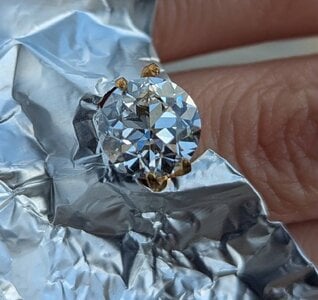
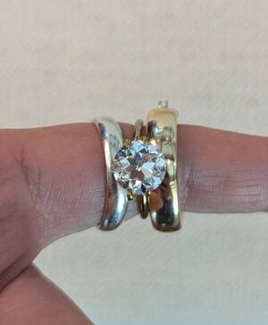
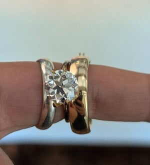
You might have seen the stone I bought back in June and posted about here 3.53 OEC.
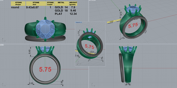
I've been working with DK on a setting and think I have the final version before he makes it. Those of you who've done this before, please have a look and let me know if I'm missing something. I've requested talon prongs as thin as safely possible.
Also, I have been waffling between all platinum or YG with a platinum head (it's all expensive so I'm getting what I want). Initially, I wanted YG for this ring as I've been wearing that a lot more and I think it's so classy. However, I want the stone to shine and there's something about it when I place it with my white gold bands. Please help!
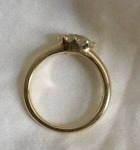
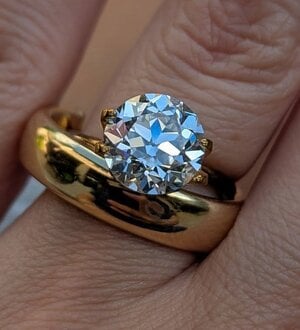
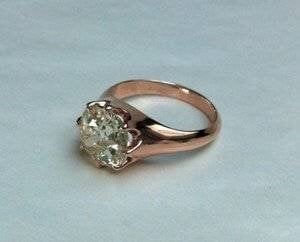
The first two are inspo pics for the basket and I wanted a fairly wide band to balance out the width of the stone. The Tiffany Lucida is one of my favorite rings because it's so minimal and everything looks integrated so I tried to replicate the essence of that band here.
I've been working with DK on a setting and think I have the final version before he makes it. Those of you who've done this before, please have a look and let me know if I'm missing something. I've requested talon prongs as thin as safely possible.
Also, I have been waffling between all platinum or YG with a platinum head (it's all expensive so I'm getting what I want). Initially, I wanted YG for this ring as I've been wearing that a lot more and I think it's so classy. However, I want the stone to shine and there's something about it when I place it with my white gold bands. Please help!
The first two are inspo pics for the basket and I wanted a fairly wide band to balance out the width of the stone. The Tiffany Lucida is one of my favorite rings because it's so minimal and everything looks integrated so I tried to replicate the essence of that band here.
Attachments
-
 low profile 2.jpg12.4 KB · Views: 24
 -
 DK 117681-QUAD-7.png607.9 KB · Views: 24
 -
 PXL_20250706_233453585.jpg134.8 KB · Views: 24
 -
 PXL_20250706_233254784.jpg94.9 KB · Views: 16
 -
 PXL_20250721_204420881.jpg90.7 KB · Views: 14
 -
 PXL_20250721_204407951.jpg93.8 KB · Views: 15
 -
 low profile.jpg8.2 KB · Views: 14


300x240.png)