shape
carat
color
clarity

Preliminary CAD''s from Michael E

packrat

Super_Ideal_Rock
Joined
Dec 12, 2008
Messages
10,614
I asked Michael''s opinion on the stone size b/c I was just pulling my hair out over it. He sent me some preliminary CAD''s today-no prongs or anything, but still gives the general idea! They show 8x6 center and the sides are 7x5 each.

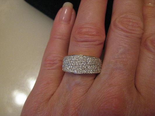
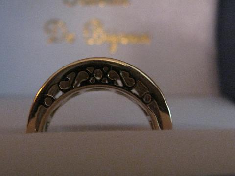
The only thing I''m unsure of is from the profile, it''s only metal, and the pavilions are hidden behind it. I wonder if there''s a way to get around that? It''s one of my favorite things about my ering, tilting it to see the gallery. Maybe it could be more of a bridge style like my ering, so there''s a band underneath that actually sits on the finger and then the stones are raised up and the rails would just go along the top, like the side of a bezel kinda?

I''m nervous about the stone sizes, but he says it will work! I guess I will never be able to complain of shrinkage w/this ring! Michael said the ring would be about 5mm off the finger and then the tops of the stones about 1mm above that.

I''m still thinking yellow gold double claw prongs for the chryso and then single wg claw prongs for the sides.

Anyway, let me know what you think please! Any ideas or thoughts?

3stonepreliminarycad1.jpg
 
And then here''s the top view.

3stonepreliminarycad2.jpg
 
Wow, that top view is simply stunning! It would be a pity to do anything to change it. I wonder if some engraving or other surface detailing on the metal on the sides would make the side view a little more interesting?
 
Another idea - what about a side accent diamond on the band, similar to this idea: http://www.stuller.com/products/products.aspx?cid=6&gid=86326

Instead of being on the basket, it could be right on the side of that nice broad band of yours.
 
Date: 4/12/2010 10:40:42 PM
Author: DistinctionJewelry
Wow, that top view is simply stunning! It would be a pity to do anything to change it. I wonder if some engraving or other surface detailing on the metal on the sides would make the side view a little more interesting?

That seems like a nice idea:)
 
That is starting to look pretty cool. So what are the stones in there?
 
I think the CAD looks great. I think I would prefer to keep it as is; I think a bridge style would make it higher, and because I think a complex gallery would detract from the feel of this particular piece.
 
Wow! That is pretty awesome.

What about doing something to the metal along the lines of hammering or mokume or burnishing or something to make it matte or textured? I think that would look really cool.

I also think that a euro shank would be practical and a cool design element.
 
Cool idea. I would leave the metal polished though. Giving it texture would take away from the cool design elements and the stones. IMO of course.
 
Date: 4/12/2010 10:48:40 PM
Author: chictomato
Date: 4/12/2010 10:40:42 PM

Author: DistinctionJewelry

Wow, that top view is simply stunning! It would be a pity to do anything to change it. I wonder if some engraving or other surface detailing on the metal on the sides would make the side view a little more interesting?


That seems like a nice idea:)
Packrat - If you like the engraving idea do look at Sam Alfano''s work, it is amazing.
http://www.masterengraver.com/jewelry/index.shtml
 
That looks gorgeous packrat!

I remember Gemgirl had a similar situation a few months ago, where she wanted to have some of the gallery open on a necklace. Maybe something like this would be an idea; to create a window to the pavilions, while keeping the clean lines of the ring?

Gemgirl''s gorgeous necklace
 
What about something like this? Sorry for the choppyness, I did it in MS paint haha. But you get the idea. It keeps the smooth lines you are going for, and the more modern look yet lets you view the stones from the side.

ringksps.jpg
 
I believe the size of the stones are just perfect but cannot decide between a covered side or open side. The all enclosed side version is very modern and sleek but I also like the open gallery where you can see part of the pavilion and gives it an airier feel.
 
Date: 4/13/2010 7:38:42 AM
Author: RockHugger
What about something like this? Sorry for the choppyness, I did it in MS paint haha. But you get the idea. It keeps the smooth lines you are going for, and the more modern look yet lets you view the stones from the side.

I like the original but RockHugger''s idea might work too.
 
I love what you''re creating packi.

It''s true, I definitely prefer open galleries for my own pieces and Brian did a beautiful job with my pendant.

This photo of my Sonia Bitton pave'' cigar band might help. The top has a similar shape to the one you''re creating. The open scrolly sides are pretty and make it more interesting.

Mem%20Card%20L2%20135.jpg
Mem%20Card%20L2%20105.jpg
 
Date: 4/13/2010 7:38:42 AM
Author: RockHugger
What about something like this? Sorry for the choppyness, I did it in MS paint haha. But you get the idea. It keeps the smooth lines you are going for, and the more modern look yet lets you view the stones from the side.
This is pretty much what the side of my version of this ring looks like. I like the idea of scroll-y cut outs as well. I don''t overly care for the solid metal look myself.
 
I LOVE the top view, but I think the profile needs a little something.
3.gif
 
I really like the top view! I agree that I think it needs some punch to the sides. I like the idea RH made, I also wonder if it''s possible to do it so that the metal only runs beside the girdle of the stones and is then open to the finger? I can see it in my head...but it looks funny when I write it...
 
Date: 4/13/2010 12:45:50 AM
Author: velouriaL
Wow! That is pretty awesome.

What about doing something to the metal along the lines of hammering or mokume or burnishing or something to make it matte or textured? I think that would look really cool.

I also think that a euro shank would be practical and a cool design element.

VELOURIA!!!!!!!!!!!!!!!!!!!!!!!!!!! SO NICE to see you back again! (You probably remember me as aljdewey.)

Please stick around; we have sorely missed you here!
36.gif
 
Date: 4/13/2010 7:38:42 AM
Author: RockHugger
What about something like this? Sorry for the choppyness, I did it in MS paint haha. But you get the idea. It keeps the smooth lines you are going for, and the more modern look yet lets you view the stones from the side.
This was my first thought too, except that I think the openings should be a bit smaller.

The top down view shows very minimal prong work, though, so I'd ask the designer if there would be any structural compromise by opening the gallery at all.
 
THANKS EVERYONE!!

I like engraving and the different metal textures, like brushing etc, but I think for this ring I''ll just leave the metal polished. klewis, thanks for the engraving link-lots of ideas there for future projects!

IK-the center is chrysoberyl and the sides will either be zircon or topaz.

What''s a euro shank? Is that where it''s kind of squared a little on the bottom, so it doesn''t twirl on your finger? I bet that would be handy on a bigger piece like this right?

Yes, I really like the more open look on the sides, and I like the idea of either cut out deals like Gemgirl''s pendant and the ring she posted (that one resembles my ering and I really like it alot!) or like Kismet''s original and RockHugger''s paint job..thanks for doing that for me!

SCG, Freke suggested what you did too, and I like that as well. It would be completely open then and that would be really pretty methinks. (and hey, how''s your search coming??)

Allison, the sides will have single prongs and the center will be double prongs. Will that be enough do you think to allow for more open sides?

I''ll email Michael and see what I find out!

Thanks again for all the replies! It''s really helpful to have more eyes looking at them and other''s thoughts on ways to improve it!
 
That is going to be gorgeous pack!
36.gif
I love it!!

I too have kismet''s ring saved as inspiration and am going to be working with JKT very soon on a design with my mahenge and demantoids. This design and the one that poshpepper just got done are the two at the top of my list. *sigh* Looks like I''m destined to be a copy cat regardless of which direction I go. My apologies in advance. I swear, I began discussing those two options with JKT months ago.
14.gif
Hope you don''t mind!
 
Date: 4/13/2010 11:08:06 AM
Author: Allison D.
Date: 4/13/2010 7:38:42 AM

Author: RockHugger

What about something like this? Sorry for the choppyness, I did it in MS paint haha. But you get the idea. It keeps the smooth lines you are going for, and the more modern look yet lets you view the stones from the side.

This was my first thought too, except that I think the openings should be a bit smaller.


The top down view shows very minimal prong work, though, so I''d ask the designer if there would be any structural compromise by opening the gallery at all.


I love this idea! I can''t wait to see the finished ring, Packrat. I''m sure it will be gorgeous.
 
Haha Brandy, we''re all copycats! When I first saw the ring last fall on LM''s site, I didn''t know Kismet had one until I posted the LM ring here and she put up the pictures of hers. It means we all have good taste!

Thanks Zoe!

I heard back from Michael, he said no problem! It will be a couple days before new CAD''s are done and I can''t wait!
 
I like Rockhugger's suggestion, or even something with more intricate filigree. Also, I think the sidestones are too large (in proportion to the center) for my taste, but that may just be personal preference.

ETA: BTW, do they have to have prongs? I really like them just as the CADs are, which appears to be tension set or pseudo-tension set.
 
I think the ring is gorgeous packrat - I can''t wait to see any changes you make or the final piece as is - I could go either way on the sides (simple vs. detail) - both have a lot of appeal!
 
I love it!!!!

I do think it would look better if the sides were as open as possible, either in a sleek way or a filigree way.
 
I like the open look a lot, but I think that the filigree would take away from sleek modern look. I''d like it all open, like gemgirl''s without the scrolls or what rockhugger posted except all one section.

I also agree with jstarfireb that it would look awesome with no prongs. Can Michael E psuedo tension set them? Or what about bezeling them within the rails, kinda like the side stones on !this Leon (sorry! connection is being too slow to upload). I''m usually not a fan of mixed metal colors, but I can really imagine yellow center bezel looking nice with the rest white.

Yep, a euroshank is making is squared off on the bottom so it doesn''t slide around. Pretty functional in this size!

Awww thanks Allison! Are you sure you''re not thinking of Valeria? She made a much more significant contribution than I ever did and seems to not come around as much. It''s good to be back, but it just means I''m doing extra procrastination
 
Date: 4/14/2010 1:52:08 AM
Author: velouriaL
I like the open look a lot, but I think that the filigree would take away from sleek modern look. I''d like it all open, like gemgirl''s without the scrolls or what rockhugger posted except all one section.
Ditto, all one large open arch, but not with two parallel curves - I''m thinking more about one of them being deeper and the other one more shallow, meeting at two sharp points. Sort of like a letter "D", but with a curved line instead of a straight one (following the other curved one in a more shallow path).

What about E/W semi bezels for the stones, with open pavillions for extra brilliance?
 
Vel,
Welcome back. I haven’t seen you around for ages and thought you’ve left for good. You helped tremendously with starting and maintaining the coloured stone eye candy thread.
 
GET 3 FREE HCA RESULTS JOIN THE FORUM. ASK FOR HELP

Featured Topics

Top