shape
carat
color
clarity

Poll and way too many pics

Kelli

Ideal_Rock
Joined
May 27, 2008
Messages
5,455
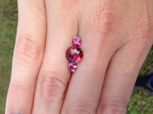
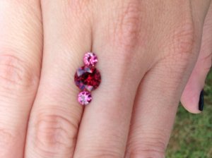
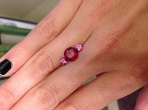
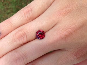
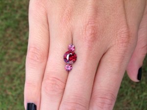
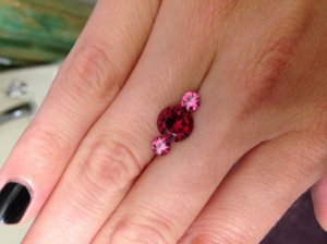
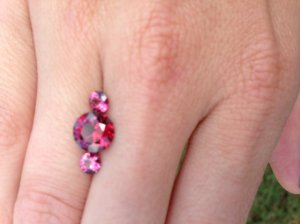
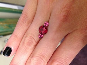
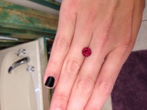
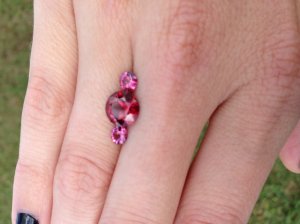
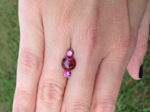
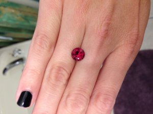
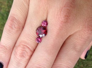
I was the one obsessed with finding a gemstone reminiscent of my most beloved red wine. I got my stone today and I really really like it. As a plus, he sent two extra garnets that don't match the stone, but seem to compliment it beautifully- at least in my opinion.

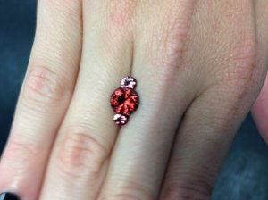
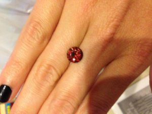
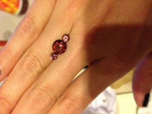
I opened up the package indoors at work under not-so-great lighting. My first reaction was that I really liked it and would definitely keep it, but that it looked a little more mauve than burgundy, especially next to the two extras he sent. I expected it to black out, but if anything it was actually lighter. Still, I really loved the combo and thought I might do a three stone instead of a solitaire.

Later today I got the chance to view it under my kitchen and bathroom lights and outside. Now I see why he called it red! I think putting it next to the pink ones brings out the purple more, but I really like the look of that too. It's almost kinda Valentine's Day-ish which for some reason I'm diggin'. :love:

Anyhow, I'm asking opinions because my original intention was just a solitaire in white gold or even silver (I seem to have a thing for round solitaires- they're all I have), but now I'm thinking a red wine center with rose wine sides sounds delicious too. Please and thank you for any and all input!
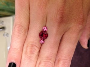
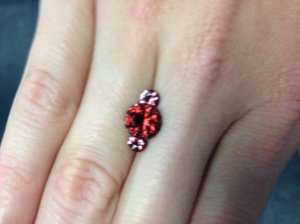
photo_360.jpg

photo_361.jpg

photo_362.jpg
 
I took too many pics and they're in no particular order lighting wise.

photo_363.jpg

photo_364.jpg

photo_365.jpg
 
more

photo_366.jpg

photo_367.jpg

photo_368.jpg
 
still more

photo_369.jpg

photo_3-3.jpg

photo_370.jpg
 
:)

photo_371.jpg

photo_372.jpg

photo_4-3.jpg
 
Last set, I think.

photo_373.jpg

photo_374.jpg

photo_5-2.jpg

photo_375.jpg
 
That's all. Thanks for looking!
 
Well it's a great size on your hand for a stand alone ring. However, pairing it with the side stones gives it an unusual look that you don't see often (normally side stones are diamonds - not on this forum but in general I mean).

What would you wear most? Would having pink side stones make you think it's limited to when you wear it? Do you like the extra finger coverage having the side stones will give? Will it fit as a three stone (allowing for the metal) without looking too big on your hand (I think it will but again, ring size is personal preference).

Sorry that's not more helpful but I really think this boils down to personal preference. If I'm in doubt I tend to do nothing for a while and keep coming back to them to see if inspiration hits!!!!!
 
Love the colors of all three, but especially the big gal. For some reason, it is even nicer than I anticipated it would be. My only thought about the combo is that I can't believe it will fit on your slender fingers unless you make it N/S.
 
It's an eye-catching look with the side stones but I don't think they bring out the best in the beautiful red one. It's personal preference, but I think its great color & saturation have more depth when it's alone. BTW, I love the kind-of rust color it shows in some lights!

Have you thought of setting it -- either with or without the sides -- in yellow gold? The richness would look really nice with both those colors.

You got a gorgeous claret color there, for sure! Really nice.

--- Laurie
 
ok, when I was reading your descriptions I was thinking "no way"........
and then I saw the first picture!
oh, yeah, that could rock!
but remember i'm rather nontraditional in my approach to jewelry and I'm also not a matchy-matchy type of person.
and on top of all that I don't care if a ring "goes with my outfit" kind of person as well....I mean come on I have an orange e-ring that I wear with everything!

so, yeah, go for it! how about 18k red gold?
pricey?
oh, yeah, but so worth it!
alternative: 14k red gold but have it hammered/textured, not shiney.

aren't you glad you went for that stone?!

eta: and how about a silver setting but with the 2 pinks one on top of the other with the red to the side?

:o

seriously, I think it would work.....well, it would work for me.......
 
Gorgeous! I love the garnets, and love it with the pink sidestones. I've come across a few monochromatic looks lately, and really like that the look is unique but subtle.
 
I really like the color of the large wine-red one.
I'd set it alone and save the other two for a future project.

BTW, I just poured a glass of red wine.
Cheers! :)
 
Where's the poll part?

I would have voted for not pink sidestones. In color theory class, they tell you that adjacent colors on the color wheel don't work as well as opposite colors. Opposites on the color wheel work together by enhancing each other. The opposite of red would be yellow. What about yellow sidestones?

But it's a personal preference thing. I saw a ring with a red garnet center set into a purple amethyst halo, so it's all preference.
 
I think you should create a poll!
 
Hi, visiting from your wine-colored thread. I think we bought adjacent stones from Mastercutgems, because before they arrived nobody on the forum could quite believe how RED those garnets were really going to be. I think your round is even redder than my oval!

When I was little, I used to color stripes of those those colors together with my old Crayola crayon box, and grownups would tell me the pink stripes didn't go with the burgundy ones. Guess what, I think they really do. Love the combination, and you sure won't see it coming and going on your way to work every day. I bet a ring would look grand in rose gold.

I wish I could take pictures as good as yours to show off my ovals.
 
I was worried it would be too dark, but it looks like one of those medium-darks that isn't shy: I love that.
 
I love the color combination of those three stones.
 
Just got a cold second opinion from my art teacher friend. Showed her the hand shot with the three stones, no introduction.
"What a great color combination!" she said.
 
Thanks so much everyone! I was away from ps all day yesterday but I kept reading your updates from my phone. I thought I did a poll post, but apparently I didn't do it correctly. Either way, I am grateful for your opinions. As for the decision I'm still struggling with...

I am aware of the color wheel and what usually works best as accent colors, but I guess I've always had different preferences than most- at least as far as colors go. I really liked the crayon comparison- especially because I recently joked on Facebook about wanting a coloring book and got one as a gift. It's intricate body art designs and one of the favorites that I colored is the one I did with all different shades of orange. Not much contrast to the eye until you look closer, then things really start to pop. (Yes, I'm 32 and I color for fun on Saturday nights :lol: .)

When I first opened it up and saw the rusty sort of color (I called it mauve before but rust is much more accurate!) I thought of cinnamon spices and warm autumn decorations and immediately knew I just HAD to have a three stone ring made in rose gold. Those were the pics with the black floor as the background btw, and the colors I see in the pics are pretty spot-on with what I saw in real life. Then I took it home and put it next to some rose gold I had, but NO!!! Under that lighting the stones looked much more pinkish-purplish red with no hint of rust or cinnamon, and the rose gold kind of just killed the beauty of them. I put it next to some 18kt yellow too, but ultimately decided I'd go with some sort of white metal. I think it looks best regardless of what mood the stones seem to be in.

As far as the finger coverage goes, I guess I've seen enough huge blingy three stone diamond rings on this site that it didn't even occur to me it might not all fit. Maybe I'm still wrong, but I was thinking one of those Scott Kay type "crown" (or something) settings where the sidetones are sort of tilted on an angle around the center would look pretty. I'll try to find some pics as I'm sure I'm not describing it right. If I go three stone I'll go for the more traditional look (even though Movie Zombie's two on one side in silver sounds really cool) just because I've always wanted a three stone ring and I don't have one yet. Then again, I already have a solitaire setting I REALLY like all picked out...

I'm not someone who feels the need to match my stones to my outfit, so I don't think the red/pink combo would be limiting. If anything, I think over time I'd end up reaching for it more as the three stone just because it would be more interesting to my eyes and everything else I have is a round solitaire. But again, that's because I REALLY love round solitaires. So I don't know. I keep carrying the stone with me in a box with and without the sidestones to decide but I haven't reached a decision yet. Anyhow, thank you for your opinions and I'd love to hear any more anyone might have!
 
definitely 3-stone - OMG!!!!!!!!!
 
The combo you are suggesting is highly usual so it is definitely going to be an attention grabber. I don't feel that the colours clash at all; they seem to bring out the best in each other yet do not blend too much. This is a combo that I would definitely wear. I think the size will fit your finger if you aren't the type to feel self conscious about size.

What is the total dimension of the stones (pink + red + pink) in mm?
What is your finger size (upper half of your finger in mm)?

Because rings aren't flat across, I'm guessing you might be able to pull of a 3 stone ring with these.
 
Gorgeous stone!! I think it would look best by itself (or with diamond accents) in white gold. I'm just not a fan of that color combo, to be honest.
 
Well, I see the opinions were sort of split, but I went for the three stone. This morning I took them down to the jeweler that made the bezel for my spess. I was still undecided but knew I'd never really make up my mind. Being anxious to get the ring on my finger, I resolved to decide on the way there (I live an hour away). Turns out I didn't even think about it much on the way there. I happened to have them lined up in the box together, and I kinda just walked in without thinking and asked them to whip me up a ring. I can always reset and reuse the setting if I decide I don't like it later on, but the three stone will make it a stand-out in my jewelry box while the solitaire would look just like everything else I already have. I should have it by the end of the week, so I'm pretty excited!!

As a plus, the lady in the shop looked at the three stones (which were taking on the rusty cinnamon color at the time) and said what a beautiful color combination it was for the fall. I love this time of year and that really sealed my decision. Funny how different they all look in different lights. They seem to change together, too.
 
Kelli, I'm excited to see how your creation turns out! :twirl:
 
Thanks! Me too:)
 
Sounds like you are following your gut on this one and I love that. :appl: And just to be clear (though I'm pretty sure you understood the intent of my message) I was not commenting on the blinginess of a three stone (which would be awesome), but really wondering if, with metal and everything, you would have enough room to fit them comfortably across your finger. :))
 
I actually like the combo of those two stones, really nice. I'm a color person, so more color the better!
My only concern would be how to make it a 3 stone that would be comfortable.

Red, red wine...
 
No worries minous I knew what you meant. I think if they were lying flat side by side it would be too much to fit comfortably, but the jeweler said that since the side stones would be tilted out slightly from the higher set center, that it wouldn't be an issue. I really don't have any problem sporting a big ring, I just hope it's not too terribly high that I'll knock it on everything. I'm trying not to get too caught up in little details though. Last time I told them a vague idea of what I wanted and I couldn't have been happier. Fingers crossed they do just as great a job this time!
 
Oh, and thank you part gypsy! :)
 
GET 3 FREE HCA RESULTS JOIN THE FORUM. ASK FOR HELP

Featured Topics

Top