shape
carat
color
clarity

Plz help me fine tune my custom e-ring :P

stlc

Rough_Rock
Joined
Apr 6, 2011
Messages
89
Hi there Everyone! :wavey:
I've been working my way through all the amazing info on this site and it always seems to be that the day i need to find something out and I look around I find myself in enmeshed in topics all about it! My brain is absorbing a crazy amount of info on here :read: :tongue:

I will introduce myself in the thread Ladies in Waiting =)
So for now this is my custom ring making journey which I really need your guys help on :naughty: .

Main inspiration ideas:
This is where it all started from:

Poshpepper
[URL='https://www.pricescope.com/community/threads/update-yellow-sapphire-ering.66465/']https://www.pricescope.com/community/threads/update-yellow-sapphire-ering.66465/[/URL]
(loooooooooooove your ring!)

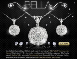
bella: soft cushion shape


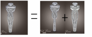
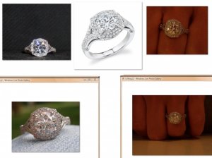
Combo pic
I can't seem to find the user who it belongs too, I think its LV but when I do a search I don't come up with anything. (links with above Bella)
aaah okay found it! [URL='https://www.pricescope.com/community/threads/more-pics-of-my-new-bling.125911/']https://www.pricescope.com/community/threads/more-pics-of-my-new-bling.125911/[/URL]

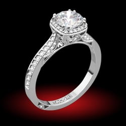
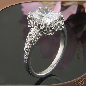
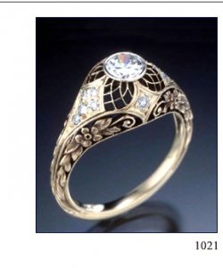
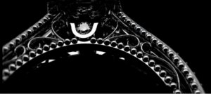
Verragio also had my heart pumping for awhile... I like this image ... gotta love that fine filigree. This image inspired the design I wanted in the shank.

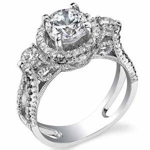
This lady really got my creative juices flowing: https://www.pricescope.com/gallery/pricescope-gallery/vendors-eye-candy/engagement-rings-direct/allison_37-5000k-pl-e
-------------------------------------------------------------------------------------------------------------------------------
edl really messed up my huge plans with his display of gorgeous and had me seriously rethinking my grand plan.
[URL='https://www.pricescope.com/community/threads/van-craeynest-484-584.99732/']https://www.pricescope.com/community/threads/van-craeynest-484-584.99732/[/URL]

alloamie had me swooning with her thread on rose gold... omg I am sooo in love with her combo. I am now trying to see if rose gold fits my skin tone... I dont think it does but I can always train my mind into thinking otherwise heehee.
[URL='https://www.pricescope.com/community/threads/my-new-set-does-this-look-ok.115349/']https://www.pricescope.com/community/threads/my-new-set-does-this-look-ok.115349/[/URL]
-------------------------------------------------------------------------------------------------------------------------------
Bella.jpg

curly halo combo.jpg

verragio1.jpg

CMD - TSR28.jpg
 

tyty333

Super_Ideal_Rock
Premium
Joined
Dec 17, 2008
Messages
27,237
Hi stlc,
Here are some of my thoughts (take them or leave them :bigsmile: )

--first ring and a few of the others are too busy for my taste
--the sapphire ring is pretty...it is busy but the fact that it has a yellow stone in it keeps bringing your eye back
to the center (which I like)
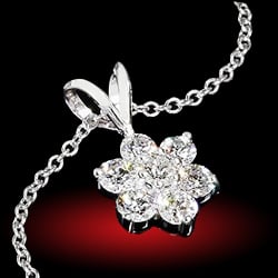
--my all time favorite is LVFdoll's ring (try searching on that name). Its really lovely. Love the bella necklace which
seems like a pendant version of LVFdolls ring.
--allison ring is pretty but too busy for me...love the 3 stone idea but all the engraving is just too detailed
(I know thats usually a good thing)
--I do like the Van C if you are going for an older feel...it is simpler but still has detail
--I think you can incorporate rose gold into any ring (either the whole thing or maybe just some if it doesnt
go with your skin).

Bottom line, what really matters is what you like. I would pick out the ring that you like the most and start
modifing from there.

Are you going with a round stone or cushion? How large?

tyty
 

stlc

Rough_Rock
Joined
Apr 6, 2011
Messages
89
So with all this I approached a place in my neck of the woods (South Africa), I looked around and around and I came across Craig marks Diamonds. From there I enquired about the design (first pic) asking if they did custom and well then I met Lindsay.
We chatted about all the things I wanted and we came up with 2 ideas.
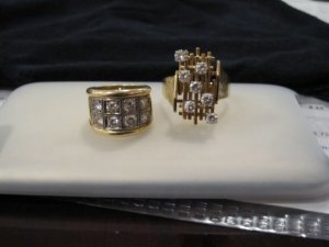
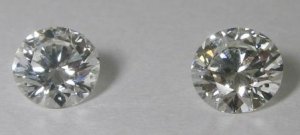
My sister and I inherited some diamonds from our grandmother.


I have chosen 6 of the ones on the right side as they are a tad smaller (0.17ct G/H ~ this also set the bar on the centre stone)

Me and FI then found out that CraigMark Diamonds are reeeaaaallly reasonable! :bigsmile: So we decided to buy the centre stone from them. RSA is also diamond and gold country heehee :naughty:
Looking at our budget, also the fact that the sides stones are quite high up on the colour grade, and with the guidance of Lindsay she found us the most perfect stone ever!!
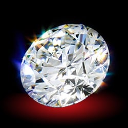
1.226ct H VS1 Blue fluorescence (MINE!) and the left and a 1.24ct I VS1 on the right.
(there are unfort lots of greasy fingerprints on it when they took this pic for me boooooo)

Its really difficult to see the difference in the two, until I actually went there! OMG! the one of the left was like sooooo much whiter and sparklier than the one on the right. When I compared them to grandmom's stones the 'I' showed up the diff quite alot.
To the eye the Blue fluorescence one looks like a F :Up_to_something: sooo not complaining... :tongue:

So now me and Future hubby are proud owners of 1 centre and 6 side stones. :appl: :bigsmile: :bigsmile:
-------------------------------------------------------------------------------------------------------------------------------
The only sucky thing is that I left the country the next week (dont live in RSA permantly anymore ) so I kissed my stones goodbye and I have not seen them in person since. Oh the paaaiiiinnn ;(
Lindsay was going to keep them safe for me while we start the design process =)

020.jpg

FakeLight2.jpg
 

stlc

Rough_Rock
Joined
Apr 6, 2011
Messages
89
ohh wow! Thank you so much for responding tyty333! Its great to have opinions when you really have to pick and choose every single detail =) thank you!

There is quite some work that has been done already so I will post all the stuff I have... keep tuned! :twirl:
 

tyty333

Super_Ideal_Rock
Premium
Joined
Dec 17, 2008
Messages
27,237
Ok, so you want to incorporate the 6-17 pointers into your ring? Hmm, they are pretty big unless you did something like a
5 stone (which is nothing like you posted).

What about using 2 of the bigger stones (from the other ring) for side stones?
 

stlc

Rough_Rock
Joined
Apr 6, 2011
Messages
89
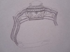
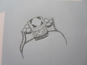
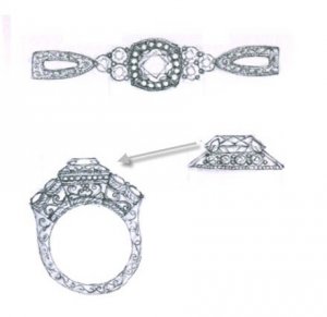
okay let me post my own little design scribbles that I drew =)


(badly drawn but just wanted to get a semi idea)

the design in the side shank came from this image:

3 dots.jpg

view from the topIMG_2929.jpg

mydesigns2021.jpg

rg2708-2.jpg
 

stlc

Rough_Rock
Joined
Apr 6, 2011
Messages
89
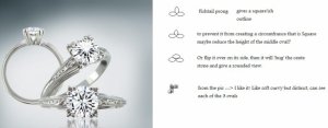
The prongs I wanted like this:


But THEN I came across this: (I'm a total sucker for creative prongs)


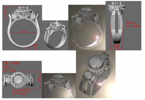
At this point one of the ideas Lindsay had come up with was that we distribute the stones into the side, here was the CAD she came up with:

Must say - great idea but it just didn't pull any heart strings and that was right at the begin when I didn't know about LFVDoll's amazing halo.
Then there was a huge prob at Craig Marks Diamonds, there lead CAD designer got really really ill and has been for the last 3 weeks (she's in hospital :()
But I was dying at this point and I think the main main things that are NB for me is Light and not too metally, I love the antique vibe.
Being a small company I just didn't know if they would be able to get the fine detailed work done.
So I looked around here on PS and I found GreenLake :appl: :appl:
Me lovvveess detail! :D
So I then approached them with all my ideas so far and we spoke about sizes etc and space was the biggest factor. We decided to not do the double row pave around the halo as having the 6 x0.17 ct took up alooot of space.

Susan: "Ok so I made a sketch to hopefully sum up everything you wanted. I definitely think you should do one row of diamonds on the halo to leave room on top and I used 1.25 mm stones. On the top of the band, there really isn’t room for all the intricate piercings you referenced from the antique ring. Also antique rings were very thin because they pressed the metal into metal forms instead of carving waxes and casting like we do. We are not able to replicate the look of an antique ring because that is sort of a lost art. Though I do love that look. Once I drew out the proportions, I’m thinking you should just leave that space open.

Onto the side faces of you ring. I drew in the channel set stones (size 1mm) in the side and then slightly simplified the filigree in the middle sections. On all the other surfaces I added engraving and mililgrain. I think you had asked what if you should do miligrain around the channel set diamonds, and I say yes. In this style ring, I’m more of an all or nothing kind of gall.

As for the engraving, we could do a scroll on the top and bottom sides and then around the settings (middle side section) we could do a half wheat pattern. See the post above. You had a post of darkened engraving which is a relief engraving with darkened background. The engraving has to be carved deeply for this to work. Since you have such thin spaces that would be engraved, we can’t carve them deep enough, so the coloring wouldn’t hold very well. If the band had no piercing then you would have the room. "


she just sent me this image:

we updated this by adding melee under all the stones so it corresponds more to the doodles that I drew up. (she hasn't drawn an update yet)
She also did creative prongs!!! yay!!!! *happydance*


So this is where we are at this point.
There are many things that still need to be thought about.... ie) Ring size!!! see my post here: [URL='https://www.pricescope.com/community/threads/ring-size-q.161025/']https://www.pricescope.com/community/threads/ring-size-q.161025/[/URL]

I also REALLY REALLY want to have something pretty in the sides of the bands....and this is where I am going to need alot of thoughts, ideas, inspiration from you guys =)
Susan is in the process of coming up with some ideas in that department so I will post more when I have more info.

(also really busy at the moment - in my final year psych exams :read: )

fishtail_victory_.jpg

55415.jpg

CADDesign1.png

olivia20110524034406.JPG
 

stlc

Rough_Rock
Joined
Apr 6, 2011
Messages
89
Hey!
Ok now that all is more quiet, finished the exams and have a short break before the next and final term starts :read: .

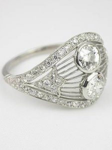
I used the famous VanCraeynest as inspiration to think of ideas to fill up the gaps in the side bands:


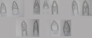
Here is some scribbles I did the other day.:)
(Very very def not to proportion and not good either in terms of shape of the bands)


A: just a simple form of the 'net'
B: upside down version of the VC net ~ just don't know how it would end.

C:
1 & 2: I started high up
3: I started lower down at the widest part

D: started high in the one, started low in the other, I played with the lines in this one, to create diff dimensions of the net.

E: old version
F: playing with net ideas
G: simplified version of the net, makes it look more elongated
H: same as B but just smaller.


My darling SO decided to get all creative and he came up with this heehee I love it!
But I really wanted to stick with the reverse taper (which actually makes things rather complicated)


I got some feedback from the lady at greenlake and this is what she said:

"Hi Olivia,

I finally took a look at your side sketches and came up with a few of my own. What you had drawn were really pretty and I liked just about all of them, though some were a little two complicated. Even with 10mm width of the sides at the widest point doesn't leave you a ton of room for elaborate filigree work. We can get filigree very small but I think with all the overlapping of your designs it would make more sense to cast the filigree along with the rest of the ring.
I tapered the sides because I thought that might be more comfortable. If you don't mind the wide width, then I can rethink the designs with a straight band.
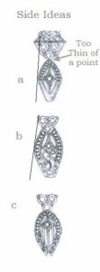
And lastly the spot that connects the sides with your grandmothers diamonds is kinda small and not a good structural point. We need to round that off a bit or bring the sides up and around the 3 larger diamonds as in "b" or "c". What do you think?
Thanks,
Susan "


Personally, It was a toss up between a,c,d.
a: really loved the cleanness of it and the inside design is to die for.
c: just so so so amazing, was just concerned if it is too busy? but it does go with the theme.
d: great mix of everything but was concerned if the lines were too str?
:)
After a few days of looking and I even cut them out and put them on my finger :D I think the best one is c.
But I am totally open to suggestions!
I dont take offence easily so plz send in your crits :)

My only real niggling question is, I see that it is 1cm wide, thats not bad, but I see it has a Bow shape?
What do you think about this look?
Inorder to fit in the detail in the sides I think we had to go to 10mm, but then that makes the bands wider than the 3 grandmoms stones, creating the bow look.
That also kinda messes up my plans to have the eternity fit nice and snug....

MIX.png

VanCraeynest_p-lg_1021.jpg

olivias side views20110604014121.JPG

mixofVCdoodles.jpg
 

stlc

Rough_Rock
Joined
Apr 6, 2011
Messages
89
I then decided to play around with only the ones I liked,
This is what I ended up with :tongue:


edit: My eyes keep on getting drawn to A, I think its because its all more in-line with one another... I have sent a request about this aspect to Susan, basically asking if we can't somehow shave off a few mm's somewhere in B to get the bands a tiiiinnny bit narrower so that it looks more in-line with the grandmom's stones. I think it would look alot better :?:
I know that if I didn't go for the milgrain edging then I would loose a few mm's but I Luffff milgrain!
Looking forward to the response from her :appl:

olivia20110524034406_1.jpg
 

diamondseeker2006

Super_Ideal_Rock
Premium
Joined
Jan 11, 2006
Messages
58,547
A or D. I think the sides of B and C are too big for your center section. I'd probably make A a little thinner, too.
 

mrssalvo

Super_Ideal_Rock
Joined
Jan 3, 2005
Messages
19,132
D gets my vote..
 

tyty333

Super_Ideal_Rock
Premium
Joined
Dec 17, 2008
Messages
27,237
I like D also!
 

stlc

Rough_Rock
Joined
Apr 6, 2011
Messages
89
Thanx so much for the feedback :bigsmile:
D is great, certainly with the proportions but I just really really wanted to have "something" in the gaps.

Thats the inspiration why I went down the road of all the major detail in the side bands...
But I am only going to go for it if it looks right.
Otherwise less is more.
I really dont like a major Bow shape. A slight/moderate one is great!


With this image you can see how the curly one is really wide, I have to figure out a way to reduce that angle.

Also with my choice of the top (6x 0.17 and the centre with halo), thats going to really cover most of the top of my finger, so only when I move my fingers will I be able to see the inside designs (and others), but I like that. Its like a little surprise.

I have given the go ahead with the CAD and so lets see what the curly one looks like, its a start.
I gotta start somewhere :halo:

Will keep you guys informed.
Thanx again.
I really appreciate it.

olivias side views20110604014121dimensions.jpg
 
Be a part of the community Get 3 HCA Results
Top