shape
carat
color
clarity

Photos of my purple spinel and chartreuse chrysobery!

  • Thread starter Thread starter Lula
  • Start date Start date
L

Lula

Guest
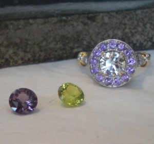
I received the stones! Both of these are cut by Richard Homer. They are both incredible -- the colors are amazing. I love precision cut stones, so the cutting is wonderful to my eyes. And I very much like the portuguese cutting style on the chrysoberyl. I wish I could set that one upside down in a ring to show off the cut :love:

I have decided to keep both stones, but I need to choose one of the two to be set in my existing purple sapphire halo (replacing the center diamond).

Here's my original thread about that:
https://www.pricescope.com/communit...ow-wearable-is-chartreuse-chrysoberyl.154669/

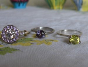
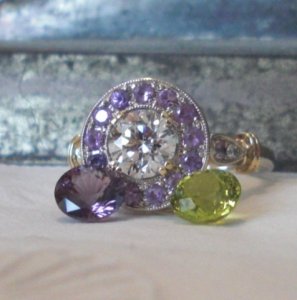
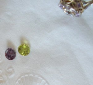
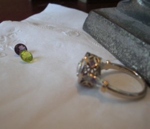
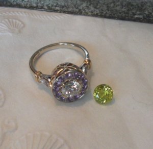
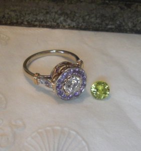
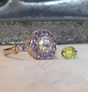
I took some photos to show you the stones next to my halo. Photographing colored stones is really, really difficult. When I got the color of the spinel correct (a very intense, true purple) the chrysoberyl looked wrong. When I got the color of the chrysoberyl correct (a true spring-like green-yellow with no browns or grays) the spinel looked reddish.

They both work with my halo, but I keep going back and forth. Opinions? Comments? Suggestions?
Thanks!
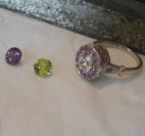
CIMG1897.JPG
 
different angle... diffused daylight underneath incandescent lightbulb in shaded lamp...

CIMG1893.JPG
 
Trying to give you a better sense of the true color...a vintage tablecloth with golden yellow print...vintage pottery in the background with light blues and yellows...

CIMG1865.JPG
 
Last ones...very close up...and at a distance...different angles...

CIMG1882.JPG

CIMG1905.JPG

CIMG1906.JPG
 
Pretty stones. Can you take some indirect sunlight shots outside or near a window on a sunny day?

I think the chrysoberyl would be much more eye popping in that setting. The spinel would get lost since there's purple surrounding purple.
 
Here are a few photos of the chrysoberyl without the spinel...this stone is intense and these photos show only a little bit of the brilliant color of this stone.

CIMG1912.JPG

CIMG1911.JPG

CIMG1915.JPG
 
tourmaline_lover|1294688991|2819063 said:
Pretty stones. Can you take some indirect sunlight shots outside or near a window on a sunny day?

I think the chrysoberyl would be much more eye popping in that setting. The spinel would get lost since there's purple surrounding purple.

Hi, TL, It's snowing here (and the forecast calls for snow tomorrow, too!). I am sending these to Wink this week and he said he'd take some photos.

I just can't capture the color -- it looks washed out in the photos.

I do have to say that I've never, ever seen anything as amazing as the color of the chrysoberyl. And you were right, even though it's an intense color, it is a flattering color with my skin.
 
Lulu, the stones are amazing. The color of chrysoberyl is totally fantastic! Congratulations on such a great stone!

I never knew that chartreuse looks green. This stone is green-green, transparent... a total beauty. Can't wait to see how you are going to set it.
 
Lula|1294689486|2819072 said:
tourmaline_lover|1294688991|2819063 said:
Pretty stones. Can you take some indirect sunlight shots outside or near a window on a sunny day?

I think the chrysoberyl would be much more eye popping in that setting. The spinel would get lost since there's purple surrounding purple.

Hi, TL, It's snowing here (and the forecast calls for snow tomorrow, too!). I am sending these to Wink this week and he said he'd take some photos.

I just can't capture the color -- it looks washed out in the photos.

I do have to say that I've never, ever seen anything as amazing as the color of the chrysoberyl. And you were right, even though it's an intense color, it is a flattering color with my skin.

Thanks for the better photos, especially the last two. I definitely think the chrysoberyl will look eye popping in the ring. Can't wait to see the finished piece. Lovely!!
 
Welcome to our club ............. the "this is impossible to capture in a photograph" club! It's even worse when you try to photograph 2 gems and get the colour right with both!

Which one to set with the purple halo? Either will look stunning. The purple Spinel will be a safer bet as you'll be able to wear it and co-ordinate with more things. However, the Chryso will be a fantastic statement piece and a great combination of colour. Will it be easy to wear/co-ordinate for you?

If you're more conservative then the Spinel is the easy option. If you're flamboyant with your jewellery then it has to be the Chryso.

I think this will come down to personal choice because both will be gorgeous.
 
The chrysoberyl is the hands down winner for me, not only because it pops more than the purple spinel but the combo is just perfect.
 
Do you have any gemstone tweezers? If so, put the ring on and then balance each gemstone above it in the tweezers. That'll give you an idea of how it will look. (Taking a photograph for us is mandatory also! :bigsmile: However, you may need somebody to take the photos unless you have a third hand)!

If you don't have anybody to help with the photos, put the ring on and then turn the gem upside down on the central stone (then take photos for us ........... oh and for you too!). Not as good as the other way though!
 
crasru|1294690184|2819079 said:
Lulu, the stones are amazing. The color of chrysoberyl is totally fantastic! Congratulations on such a great stone!

I never knew that chartreuse looks green. This stone is green-green, transparent... a total beauty. Can't wait to see how you are going to set it.

Hi, crasru -- thanks so much. Yes, the chrysoberyl is green-green, with just a touch of yellow. In the sunlight, which we had for a few hours yesterday, it just glows. It's a very transparent stone, you are correct. The extra facets of the portuguese cut give it an interesting shimmer around the edges of the stone, too.
 
tourmaline_lover|1294690383|2819081 said:
Lula|1294689486|2819072 said:
tourmaline_lover|1294688991|2819063 said:
Pretty stones. Can you take some indirect sunlight shots outside or near a window on a sunny day?

I think the chrysoberyl would be much more eye popping in that setting. The spinel would get lost since there's purple surrounding purple.

Hi, TL, It's snowing here (and the forecast calls for snow tomorrow, too!). I am sending these to Wink this week and he said he'd take some photos.

I just can't capture the color -- it looks washed out in the photos.

I do have to say that I've never, ever seen anything as amazing as the color of the chrysoberyl. And you were right, even though it's an intense color, it is a flattering color with my skin.

Thanks for the better photos, especially the last two. I definitely think the chrysoberyl will look eye popping in the ring. Can't wait to see the finished piece. Lovely!!

Thanks, TL, the photos that show the "shimmer" around the edge of the stone are much closer to what I see, even in this weak, winter daylight!
 
LovingDiamonds|1294691245|2819098 said:
Welcome to our club ............. the "this is impossible to capture in a photograph" club! It's even worse when you try to photograph 2 gems and get the colour right with both!

Which one to set with the purple halo? Either will look stunning. The purple Spinel will be a safer bet as you'll be able to wear it and co-ordinate with more things. However, the Chryso will be a fantastic statement piece and a great combination of colour. Will it be easy to wear/co-ordinate for you?

If you're more conservative then the Spinel is the easy option. If you're flamboyant with your jewellery then it has to be the Chryso.

I think this will come down to personal choice because both will be gorgeous.

Oh, you are so right about the photos, LD -- I tried and tried to capture what I was seeing. Thanks for the photography tips in your other response. I will try to take some more photos using your suggestions. I did seem to get better results when I separated the stones instead of trying to photograph them together -- they don't play well together in the sandbox!

I have a very boring, conservative wardrobe, but I do like detailed and colorful jewelry. I wear a lot of black, white, cream, grey. I've been trying to get away from wearing all black and grey. I'm not a goth, I swear -- I'm too old! But I travel a lot and need basics that don't show spots!. I do occasionally wear blue, green, and purple, but just as an accessory color -- a purse, a cardigan, a t-shirt, a scarf. So the more colorful ring would actually stand out against my pretty boring wardrobe, which is okay.
 
Chrono|1294692010|2819105 said:
The chrysoberyl is the hands down winner for me, not only because it pops more than the purple spinel but the combo is just perfect.

Thanks, Chrono. The chrysoberyl does pop, and the other amazing thing about it is how it changes in different lighting conditions. The spinel has a more "constant" appearance to it, if that makes sense. The chrysoberyl also has a higher crown, so it would be more visible from the side/profile view, which is what I see most of the time when I'm wearing a ring.

I did read that chrysoberyl was popular in Victorian and Edwardian times (though I don't believe this color was available then) and my setting has elements from those time periods.
 
Lula|1294693587|2819130 said:
LovingDiamonds|1294691245|2819098 said:
Welcome to our club ............. the "this is impossible to capture in a photograph" club! It's even worse when you try to photograph 2 gems and get the colour right with both!

Which one to set with the purple halo? Either will look stunning. The purple Spinel will be a safer bet as you'll be able to wear it and co-ordinate with more things. However, the Chryso will be a fantastic statement piece and a great combination of colour. Will it be easy to wear/co-ordinate for you?

If you're more conservative then the Spinel is the easy option. If you're flamboyant with your jewellery then it has to be the Chryso.

I think this will come down to personal choice because both will be gorgeous.

Oh, you are so right about the photos, LD -- I tried and tried to capture what I was seeing. Thanks for the photography tips in your other response. I will try to take some more photos using your suggestions. I did seem to get better results when I separated the stones instead of trying to photograph them together -- they don't play well together in the sandbox!

I have a very boring, conservative wardrobe, but I do like detailed and colorful jewelry. I wear a lot of black, white, cream, grey. I've been trying to get away from wearing all black and grey. I'm not a goth, I swear -- I'm too old! But I travel a lot and need basics that don't show spots!. I do occasionally wear blue, green, and purple, but just as an accessory color -- a purse, a cardigan, a t-shirt, a scarf. So the more colorful ring would actually stand out against my pretty boring wardrobe, which is okay.

Way to go! Also, the more the better! :lol:
 
GET 3 FREE HCA RESULTS JOIN THE FORUM. ASK FOR HELP

Featured Topics

Top