shape
carat
color
clarity

Wedding Opinions please!

Status
Not open for further replies. Please create a new topic or request for this thread to be opened.

buttercup80

Shiny_Rock
Joined
Aug 12, 2006
Messages
451
We got our very first wedding gift today!
36.gif
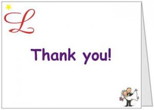
Our wedding is not until October - but it got me thinking about our thank you cards - I was not planning on getting them to match the invites so that''s not a problem. . . Obviously, I will not be able to get new thank you cards to acknowledge this specific gift, but I want to get some soon - What do you guys think of these? The L in the upper left corner echoes our cake topper and the font and the little bride and groom were on our Save the Dates. . .
webthankyou.jpg
 
i think it's cute that the initial and little picture mimic what the guests have already seen, but i have to be honest that i'm not crazy about the font. it looks a little elementary school.
40.gif

also, would you maybe consider using just one of the other graphics and enlarging it?

are you having them made or are you DIY'n it in Word or something?
 
I agree with what Mimzy said.
 
Thanks mimzy!

It''s so funny that you say it seems elementary school - I know it''s not for everyone, but FI and I are both teachers so it fits us
1.gif


If I were to pick between the 2 graphics, I would prefer the monogram - do you think that would look odd?
 
I''m getting them done with VistaPrint. . .It didn''t even occur to me to use Word although that''s a really good idea!
 
Date: 4/18/2008 3:51:10 PM
Author: buttercup80
Thanks mimzy!


It''s so funny that you say it seems elementary school - I know it''s not for everyone, but FI and I are both teachers so it fits us
1.gif


If I were to pick between the 2 graphics, I would prefer the monogram - do you think that would look odd?

haha i could have almost guessed that too. when i did my student teaching in an kindergarten classroom EVERYTHING was in that font.

honestly, if you were to choose the monogram, i would make the font a script font also and put them in different colors because it might look a little strange with the fancy L and then the kiddie "thank you".
 
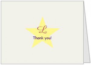
What about this one?

webthankyou2.jpg
 
okay i''ve tried to type this out about a dozen times and each time it sounds like i am being a meanie
40.gif
so please please just trust that i am doing this with the best of intentions. i like this one better, but unless you had a star themed wedding i still think you could do better. i think it says "student of the month" a little too much. vistaprint can do some really nice designs, and you should take advantage of that!

can you show us what your invitations looked like? maybe you could take a design element from those and incorporate it into the thank yous. you could even upload a picture of you two from the wedding and use that with overlaying text to add ''thank you''.

but totally take all that with a grain of salt. if the design is perfectly fitting for the two of them then by all means go with it! (but make it bigger, it''s pretty small
2.gif
)
 
we do have stars, but you''re totally right - it does look student of the week! I think it also looks like a star on the walk of fame or something - not my favorite. . . I''m going to keep looking in the premade designs, but none of them are really speaking to me.

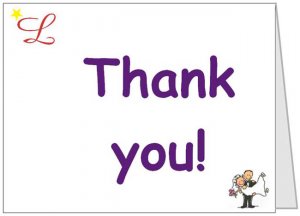
Here''s one more version of the first one: Any better? Thanks for all your feedback!

webthankyou3.jpg
 
Sorry - I completely ignored the questions about our invites. . . I don''t have the proofs yet, but they are purple with a light yellow layer/text area and purple ink. There is a red suede leaf in the upper left corner. I know they sound weird, but they''re really nice. I swear!

I love the idea of our photo on a card, but I don''t want to have to wait for our pics after the wedding. . .plus I think most of them are a little too pricey. ..
 
hey buttercup, i like your theme! it is fun and cute and sounds like it describes the both of you so well!

i got inspired and was thinking what about something like this? and in the inside you can stick on a gold star for your guest or put a gold star on the front somewhere. i think it would be totally cute to use the actual gold stars that we used to get in grammar school.

i got the clip art from ms word so you can of course use a pic you prefer and i just picked a font so you can use the font of your choosing. just an idea

thankyou_pencil.JPG
 
ringster, I love that idea! How did you get the guidance lines? (where the "thank you" is written). . . very cute! Now I want to break out my gold stars and stick them on everything - which had completely not occurred to me (now I see them on of placecards, favors tags, hmmmmm - you may have created a monster!)

36.gif
 
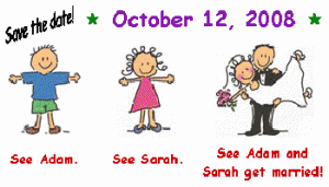
For a reference point here are our DIY save the dates - I printed them out on glossy photo paper and stuck business card magnets onto them. They also had the address of our website on the bottom:

webstd.gif
 
Date: 4/18/2008 5:00:10 PM
Author: buttercup80
ringster, I love that idea! How did you get the guidance lines? (where the ''thank you'' is written). . . very cute! Now I want to break out my gold stars and stick them on everything - which had completely not occurred to me (now I see them on of placecards, favors tags, hmmmmm - you may have created a monster!)


36.gif

i''m glad you like it! i just used ms word for the whole thing. i used the line thingie in the Draw toolbar. then for the dotted line, it is just a plain line that i change the properties of so that it is dashed.

if you are familiar with ms word you shouldn''t have any problems doing it. it was suprisingly simple! let me know if you need any help

i love the idea of using the gold stars!! can''t wait to see what you come up with! hey you could have apples for teacher incorporated somehow in your wedding. i remember seeing someplace where the bride used apples as placecard holders/favors.
 
Date: 4/18/2008 5:03:48 PM
Author: buttercup80
For a reference point here are our DIY save the dates - I printed them out on glossy photo paper and stuck business card magnets onto them. They also had the address of our website on the bottom:

those are sooo cute! great job!
 
I like it. The style should reflect your personalities, I think.
 
Date: 4/18/2008 6:38:49 PM
Author: AmyBride
I like it. The style should reflect your personalities, I think.
Thanks Amy!
 
Status
Not open for further replies. Please create a new topic or request for this thread to be opened.
GET 3 FREE HCA RESULTS JOIN THE FORUM. ASK FOR HELP
Top