- Joined
- Jul 17, 2008
- Messages
- 13,352
 pebbleandpolish.com
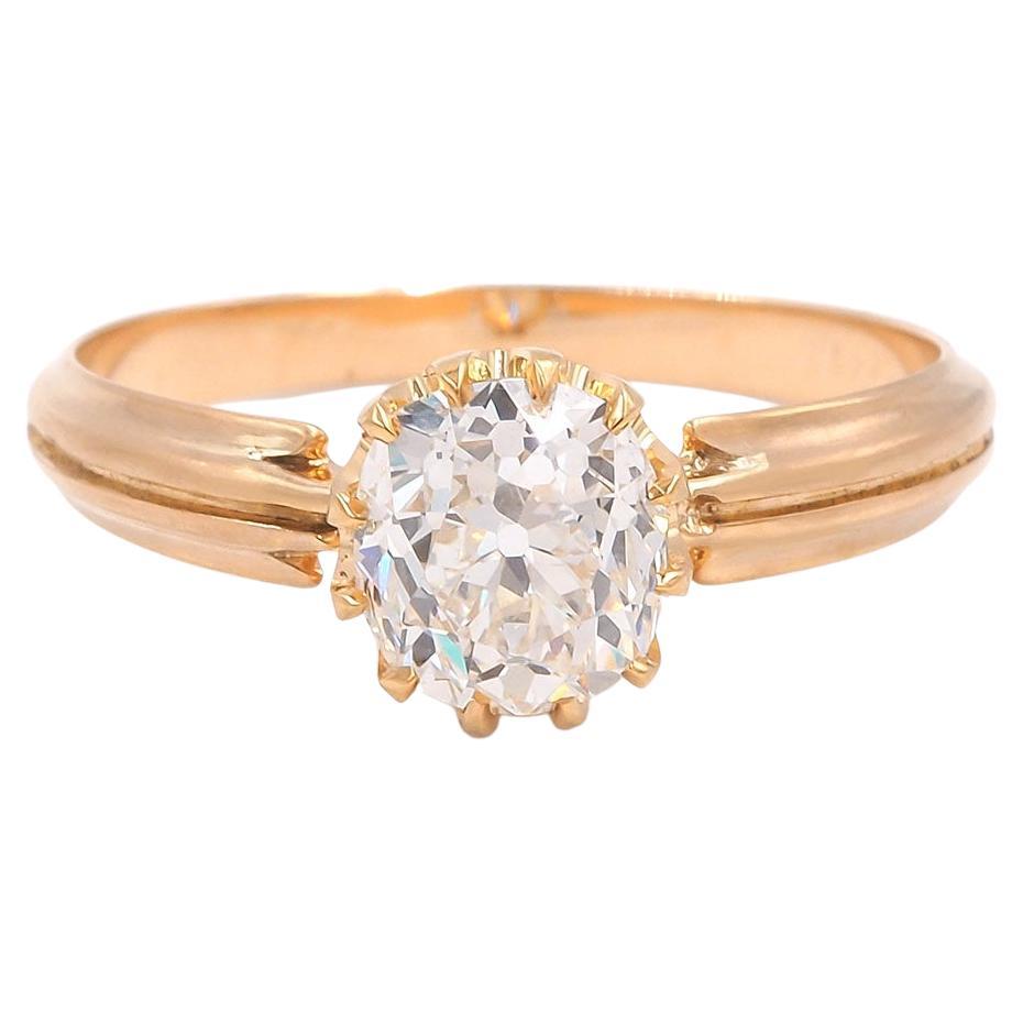
I think it’s beautiful and a great price. The depth may bother me, as you lose the beautiful Maltese cross that is characteristic of the peruzzi. But this comes down to personal preference
This is not as good of a deal, and it’s very tinted, but I actually prefer the cut on this one
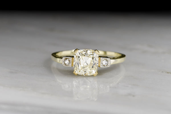
Antique German c. 1920s Engagement Ring with a GIA 2.02 Old Mine Cut Diamond Center
Antique post- Victorian engagement ring; estate engagement ring from Berlin, Germany in green gold Old Mine Cut diamond 2 carat 2.00 GIA certified yellow diamond champagne VS clarity solitaire women's diamond ring vintage antique jewelry wedding ring 1800 1900 1910 1920 1930 1940 hallmark stamp...
I think it’s beautiful and a great price. The depth may bother me, as you lose the beautiful Maltese cross that is characteristic of the peruzzi. But this comes down to personal preference
This is not as good of a deal, and it’s very tinted, but I actually prefer the cut on this one
Antique German c. 1920s Engagement Ring with a GIA 2.02 Old Mine Cut Diamond Center
Antique post- Victorian engagement ring; estate engagement ring from Berlin, Germany in green gold Old Mine Cut diamond 2 carat 2.00 GIA certified yellow diamond champagne VS clarity solitaire women's diamond ring vintage antique jewelry wedding ring 1800 1900 1910 1920 1930 1940 hallmark stamp...
Oh, I like that very much.
I LOVE Pebble & Polish and their eye. The owner has been really transparent and forthcoming in the two times I've inquired about a ring. There's a rose cut ring with a metal laurel wreath halo that I've been thinking about for at least a year now, or for however long they've had it. I also love this setting and how architectural the details are - was very tempted - but my concern was that I am also yellow/olive tinted and didn't think it'd be a flattering color: https://pebbleandpolish.com/product...-a-gia-1-50-carat-old-mine-cut-diamond-center.
That stone is gorgeous - the cross! I need to figure out if purer yellow/brown tints in lower colors work for me.
Oh, I like that very much.
I don't care about the carbon spots. They don't distract at all.
Without the height/depth it wouldn't be a Peruzzi, that's the main difference between this and a squared old mine cut. Those steep angles are it's hallmarks, so for a Peruzzi- it's a good one. They don't come up that often, you're very lucky to get to decide!
it's really a pretty one. love that it's nestled in a paper crane
agree with @ItsMainelyYou - those carbon inclusions don't do anything to hurt the beauty of this stone for me personally - do you find your eye being drawn to them at all @Artemisia?
ugh and its SO white! yummmm. a near colorless peruzzi is a very rare combo.
i actually love it against the yellow gold too - the contrast is super pretty
I knew as soon as I saw it that I would have to be talked out of keeping it! I'm glad I'm not alone in finding it lovely.
I don't mind or notice the carbon spots at all. I actually kind of like them? As ridiculous as that might sound. Little fingerprints. I had to hold the stone up to the light and look close and carefully to see them, which isn't going to happen in daily wear.
I love the depth and the shape and the stone's dimensionality. It's a stone! It's close to how it looked when nature finished her work!
Thank you @Cerulean for your thoughtful comments on how the depth changes what kinds of settings would be most practical. Do you think a buttercup would be too unprotected, or do you have other setting styles that you'd suggest? I'd like to be able to see the profile and the Pebble & Polish inspiration setting with the basket that comes up to a faux-bezel would obscure that view, even with the cutouts. Unrelated, I love the Unicorn Tapestries as well!


This post is like a masterclass in beautiful but protective settings!I'm so excited for you! If you knew it was love at first sight, that's 'nuff said! And I'm with you on inclusions. I sorta find them fascinating.
As far as settings go...it's tough, and I don't have a silver bullet solution. It also comes down to your risk tolerance, your aesthetic preferences and your own lifestyle.
I'm too nervous to expose too much of the girdle, and my stone is an SI1 with some inclusions/cavities perilously on the edge of the stone. I'm not the best at reading plot charts (and appreciated inclusions that matter or don't) - but mine is sorta similar to yours (except worse, lol).
So, a lot of buttercup settings are 6 prongs, and really flare out, leaving the girdle unprotected. Is 6 prongs with exposed girdle fine? Could be! Might not be, too! If your stone was totally clean at the edges, it may be less problematic. But it's got some action in the plot chart, in addition to a crispy girdle.
Some ideas
I actually think this is a very cool, modern take on a buttercup...and it would protect more, sorta like a halo. It looks like a pretty small stone, so you could easily carve out more of the petals and have them come up a little higher to get a better profile view. This and the next are from here
This ultra prongy ring from Platt Boutique...would protect plenty!
Or something sleek and modern, where there is a bar sort of hugging the underside of the girdle. I think the pave is too fussy, but that's just me.
I also think this stone would be really beautiful in a bezel like this J Albrecht ring, but it depends on what you like.
Hancocks does a lot of vintage looking settings, like this one...you can see there is a bar wrapping around under the girdle. Might need to creep up higher for your stone, but you get the idea.
Caysie at CVB Designs...queen of the faux bezel. She's got a ton of different takes on this look. I am SURE she could cook up something to show off the profile.

This post is like a masterclass in beautiful but protective settings!
I’m intrigued to see your stone set @Artemisia - what an exciting journey!


I'm too nervous to expose too much of the girdle, and my stone is an SI1 with some inclusions/cavities perilously on the edge of the stone. I'm not the best at reading plot charts (and appreciated inclusions that matter or don't) - but mine is sorta similar to yours (except worse, lol).
So, a lot of buttercup settings are 6 prongs, and really flare out, leaving the girdle unprotected. Is 6 prongs with exposed girdle fine? Could be! Might not be, too! If your stone was totally clean at the edges, it may be less problematic. But it's got some action in the plot chart, in addition to a crispy girdle.

To be totally honest, I have no idea how to read a plot chart. My only two criteria are "do these inclusions interfere with the look of the diamond" (no for me, yes for some) and "do these inclusions structurally compromise the diamond," but I'm not sure on the latter. Is there anything super concerning that I should take into account when designing the setting or flag to whoever sets it?
Soooo I really wasnt going to choose a regular round (except for #5 with the thick arrows), but omg. I dont think I've seen a stone this perfect outside of super ideals in a while
Aretemesia, did you buy this diamond? If you've settled on it, I'd like to ask where you got it. Because . . . now I want one.

300x240.png)


