shape
carat
color
clarity

Opinion''s of these photo''s please?

Status
Not open for further replies. Please create a new topic or request for this thread to be opened.

Garry H (Cut Nut)

Super_Ideal_Rock
Trade
Joined
Aug 15, 2000
Messages
19,107
They are not numbered - but say they are 1 to 9 in rows from top left to bottom right.

We would really appreciate everyones opinion.
(Wink they are real photo''s with no backlighting)

diff shots.jpg
 
Best to worst, top left to bottom right? (Mostly extrapolating from some patterns...)

First row, arrows well defined
Second row and third row colors added in the center (and elsewhere for third row)
Third row, arrows less defined.

(edited to add...could also be the same diamond?...I'm thinking the differences are subtle).

Hopefully you'll soon get a non-Regular Guy opinion...

Best,
 
Surely they are the same stone
 
The arrow heads misalign exactly the same way in all the shots. Arrow thickness, table size, etc etc seem the same. Apart from colour and contrast, seems to be the same view.

Must be more to it than this, as I know you love trick questions!
 
I''m glad you said that PS.. as i was thinking along the same lines...
 
Not sure what to say... maybe #7 ?

All are terribly alike to start with. As if this wasn't just the same stone photographed repeatedly but the same picture doctored somehow.

Let me guess: this is one diamond pictured in the same position three times but with different lighting. Each row is a set of "right eye & left eye" photos superimposed to yield the centre...

Anyway, how do I know which gray spot is reflection and which your dark background ?

To avoid confusion, less darkness is better, but that doesnt tell much about the diamond (like your 'scope does).


These seem to be somewhere inbetween the the ideal scope pics that make a cleaner "analitic" statement even if they do not look like diamonds, and the eye catching but non-technical stuff put forth by DBL and others.

If there was a "none of the above" choice, I would have went for it.
 
Maybe it''s my eyes - but they look like the same stone - but perhaps in different background or lighting. The first looks white, second row yellow - third bluish.
 
Uh, Garry, what kind of opinion do you want? Which one is more pleasing?
 
Yes they are the same stone.
No tricks.

Which is the most pleasing / appealing photo?
We are experimenting with different lighing etc.
AND
If you dont like any of them then please say so.
 
Okay, then my fav is #6--the last one in the 2nd row. The colors give it a lively "firey" effect, and yet the pattern is still crisp.
 
My eyes went directly to #3 (maybe I''m more used to seeing the symmetry photos at WF that look like that one?) but I also like #8, #9 because the pictures are pretty. Blue is my favorite color.
3.gif
 
Gary
I am attracted to #3

Johan
 
I like the blue hue in the last set; but, I think the first set is more generally pleasing. It shows a nice stone. I do not like the second row because it makes all the stones appear yellow.
 
#3 based on the strong contrast. The symmetry speaks for itself. I''m also with F&I regarding the yellow tint.
 
Any of the three in the top row speak to me moreso than the bottom 6 pictures. As others have said, the color in the second row doesn''t agree with me, and I don''t think the stone looks as nice (arrows, etc) in the bottom row.
 
#7

I don''t know why, but that picture seemed to have more action to my eye. Maybe it''s the colors? The colors are really nice in the last row of pictures, especially blue, and I prefer picture #7 because the yellow and brown are a little more subtle than in #8 or #9.
 
HI:

#''s 1, 3 & 2 in that order.

cheers--Sharon
 
I''m with Sharon #1,3 & 2.
 
#1 (though I would go with any from the first row)
 
Don''t really care for the ones that look yellow.....like #3.....Where do the other colors come from...reflection?
 
Numero uno - differences in contrast, transparency?
 
I like #1 and #7. #1 seems brighter and whiter with dark arrows and #7 seems brighter and whiter with lighter arrows.
 
Thanks, keep them coming folks.
We are making a tally.

Are the images too flat? to ''computer generated''?
 
I''d say the pic that most closelly resembles its natural appearance and only the photographer knows which one that is.
 
The left half of 1 and 3.
The arrow heads are too faded on the right side of all of them.
to much light from one side or a tilted stone.
 
Like the blue......
 
Date: 4/18/2005 9:19:17 PM
Author: Garry H (Cut Nut)
Thanks, keep them coming folks.

We are making a tally.


Are the images too flat? to ''computer generated''?
They are flat looking.
The computer generated ones usualy have more even lighting and look even flatter.

Overall Id rate the picture quality as fair at best.
 
They don''t have a lot of "life"...l
 
OK this is my take on them, the first three are crisp a little computer generated, but crisp. The second row isn''t as crisp and the third row is washed out, IMHO. Just my 0.2.
 
Date: 4/18/2005 9:19:47 PM
Author: Rhino
I''d say the pic that most closelly resembles its natural appearance and only the photographer knows which one that is.
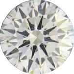
The photographer is often not quite impartial Rhino
31.gif

We would like to also show that where there is laekage in the diamond - that it is actually dark in that area.

Does having no background change things?

no background.jpg
 
Status
Not open for further replies. Please create a new topic or request for this thread to be opened.
GET 3 FREE HCA RESULTS JOIN THE FORUM. ASK FOR HELP
Top