fridays_child
Shiny_Rock
- Joined
- Mar 3, 2012
- Messages
- 230
When I was doing obsessive PS research on OECs, one of my big questions was how low in color to go and I ran across a pic on my computer the other day that I thought was a good color "comparison" - so I thought I would post it here. I know it is really hard to accurately reflect real life color on computer screens, but I find that pictures where you have an appropriate neutral reference do help me. And of course, every old stone performs so differently from each other and in different lighting situations, so take this comparison as you like.
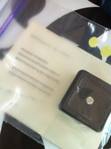
Anyway here is the picture, sorry it's a crappy iphone pic:
A K-colored OEC (EGL USA) in a black velvet stone box, sitting on top of Stardream Opal paper (which also has a layer of tape and plastic over it). That Opal paper is sitting on top a placemat which has truer white in it . Everything is sitting on a table (so it's facing upwards) on a cloudy day.
As I was looking at the image, I was struck by how closely the face up color of the stone sitting in the black box matches the Opal paper, and you can see its's no nowhere near the stark white. If anyone else out there is also into paper crafting, you've probably seen this metallic paper. Stardream is very popular for wedding invites, holiday cards, etc. So if you want to get a general/broad color feeling of a K/L stone, and have access to a paper store, I would go out and look at Stardream Opal! (I usually get mine here :http://www.paper-source.com/ or google it).
Incidentally, Stardream also makes a "whiter" color called Quartz. While I have bought Opal many, many times over the years I've made invitations/stationary for others and for myself (it's a staple color for me), I have only used Quartz a couple of times. I guess I am naturally drawn to the warm creaminess.
Here is another picture of the Opal paper - this time next to a stark white envelope and white some other objects as a color reference. The grey/white thingamabob is a special "grey card" which I use sometimes to help make sure my photos are color neutral.
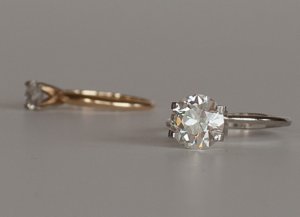
And here are a couple of other reference pics. The stone next to a 14k gold ring.
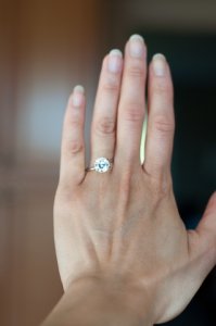
The stone on my medium tan-olive skin facing a bright sunny window - looks pretty darn white cause of the sunshine.



300x240.png)