shape
carat
color
clarity

New side stones and setting for my 3 stone ring *sigh*

geisha_gyrl

Shiny_Rock
Joined
Jan 21, 2011
Messages
199
Hi all,

So, about 6 weeks ago, I made a post about feeling uneasy with my 3 stone oval ER. Originally, I was told by the jeweler they would match my center - 1.07 ct G VS1 with .25-.30 ct G VS2. Well, after a month or so, I finally received my ring. The sides were smaller than expected and they were G and H SI1. (I clearly noticed the warmth of the H.) They apologized and promptly replaced the sides with the correct ct. size. It looked much better. However, when I took it to the independent appraiser, he said my sides were F and H SI2. Again, I noticed the H displayed a warm tone compared to my center. I will say none of my friends could tell - even my supposed color sensitive friend that has a HUGE D VVS marquise. At times, it was easily seen by my squinty eyes and others not so much. Anyway, after talking with the jeweler, he explained the trouble with finding matching ovals. Another challenge was that my G center was extremely white. (He swears if it were regraded, it would be an F.) So finding a pair that looked good with the center wasn't easy. He continued to say at this point, I needed to consider certified sides. He said this is the only guaranteed way of knowing what the side stones are.

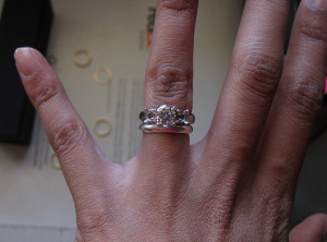
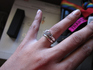
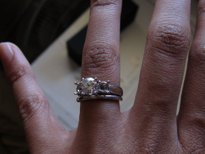
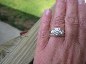
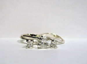
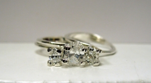
So the hunt began...At first, I tried to stick to F/G sides but had absolutely no luck finding matching pairs. I'd find one but nothing with the same proportions to match. I then moved to E/F and again nothing. My jeweler started searching higher clarity such as VVS1 but even then I'd find one I liked but nothing matched it. Finally, my jeweler suggested .29 ct D and E SI1 which happened to have almost identical proportions. I was really skeptical since my center is a G so he had the sides shipped in for evaluation. He emailed me to say that he was happy with their appearance and felt the color difference would not be discernible. They shipped all 3 stones to me for approval. I was bracing myself for there to be an obvious difference but was surprised. I can tell the D is a bit brighter than my center but very little. I have to concentrate on it for a while. I'm actually a bit shocked because I figured D-G would be OMG noticeable. Anyway, I showed 2 of my co workers - 1 couldn't tell at all and the other said the D seemed a bit brigher and the E seemed a bit yellower than my center. However, he said that's with a fair amount of staring. My FH said he thought the D and G looked the same at first but then said all three looked the same the next day. :confused: Anyway, I took a couple of pics for you to see. I know it's hard to tell in photos and the lighting isn't necessarily the best.

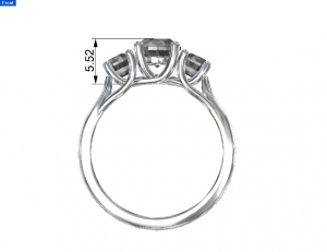
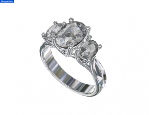
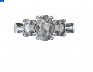
PS: I'm also having a new setting built because I was unhappy with the original. I've posted the renderings. Let me know what you think about the stones and the setting. Thank you all in advance. You guys have been so helpful.
Finally%20015.jpg

Finally%20011.jpg

Front1.jpg

Perspective1_0.jpg

Tina-Top1_0.jpg
 
To my very untrained eye, the left and center stones look good together, but the right stone looks a little darker.
 
Glad you have found options that you're happy with! Ultimately it's what your eyes - and your FI's - can see, not what's written on the GIA report, that's important :))


One comment on the new setting - the prong tips, are they supposed to be a small stone set into the tip, surrounded by milgrain? If so - have you seen examples of this design executed by this designer IRL, or real-world pictures of a finished piece? I ask because the two rings with this prong tip style that I've seen IRL were both incredibly bulky and indelicate - too much metal required to hold that tiny stone atop the prong, definitely not prongs I'd want to burden a 1ct with. Obviously I don't know who you're working with, and I don't know the quality of the pieces I saw, but I think it must be a difficult thing to make, proportions-wise, and one that I definitely think needs a very skilled artisan who can tell you if the prongs can be made to the proportions of those drawings, which look delicate and dainty to me
 
right stone looks yellower to me - is that the one?
 
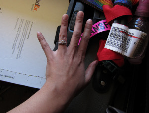
Jaebond and Cehrabehra, the stone on the left is a D and the one on the left is an E. So, you're right in saying the right is a bit darker. They don't look that yellow IRL. The flourescent lighting cast a yellow tint on the stones. However, the D at times appears to look like my center and other times just a tad whiter. At times, the E does appear darker than my G center which I find odd. The sides are not completely straight in the temp settings so I think the angle is affecting how it plays off the light. I took them out the other day and laid them completely flat on a white background. It was really hard to tell the difference between the 3. My FI couldn't see any difference but I could - although just a slight difference. I I think that could also be a mind trick since I know which is which. Anyway, I promise they look better than these photos. I took some other photos so hopefully they look better. If so, I'll post those later.

Hi Yssie, I see that you've been creating new pieces for your collection - very nice.
I've come to the conclusion and made peace with the fact there are no perfect matches when it comes to ovals. I picked a rare shape and this comes with the territory. If I wanted perfect matches, I should have chosen round brilliant. I do feel better about these stones due to peace of mind. They are all GIA certified so there isn't room to dispute what I'm getting. (Is it really an F or H side? Are they SI2?) Also, they happen to have almost identical proportions that are a better match in the lenghth/width raito of my center. My center is 1.42 and the two previous sides were 1.47 and 1.55. I could tell one was rounder than the other. Of course, no one else could really tell as you can see from the SMTB photos. These new sides are both 1.40 and only off by a couple 1/100 mm in overall dimensions. The color isn't exact matches but like I said it's difficult to tell unless you're concentrating on it. I think the main reason I can tell is I know what they are and I'm hyper sensitive now. Of the 5 people I've shown the stones to, only one said he could tell the difference with time focusing on it. The average person wouldn't be staring at it within inches of their face. So, all that was to say, I've made a decision and made peace with it, time to move on..... If not, I can be doing this forever!

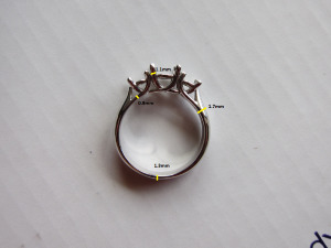
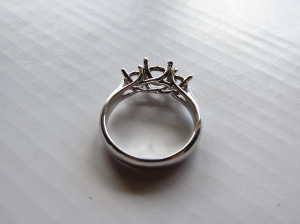
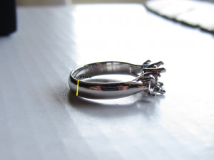
As for the setting, no there isn't a stone set in the prong. I think it's just the way they drew it. It's going to be slightly thicker than my last setting. 3.4 mm vs 3.1 mm. I don't know if they felt it needed to be wider for overall balance or stability but the shank will taper in. I'm new to this design bit so maybe you have an idea as to why it seems a bit bulkier than the last. On the other hand, I don't mind. I think a thicker band will allow a wedding band to sit a little closer. Or am I incorrect?

Now, I feel a bit worried......
 
geisha_gyrl|1309319177|2957643 said:
Jaebond and Cehrabehra, the stone on the left is a D and the one on the left is an E. So, you're right in saying the right is a bit darker. They don't look that yellow IRL. The flourescent lighting cast a yellow tint on the stones. However, the D at times appears to look like my center and other times just a tad whiter. At times, the E does appear darker than my G center which I find odd. The sides are not completely straight in the temp settings so I think the angle is affecting how it plays off the light. I took them out the other day and laid them completely flat on a white background. It was really hard to tell the difference between the 3. My FI couldn't see any difference but I could - although just a slight difference. I I think that could also be a mind trick since I know which is which. Anyway, I promise they look better than these photos. I took some other photos so hopefully they look better. If so, I'll post those later.

Hi Yssie, I see that you've been creating new pieces for your collection - very nice.
I've come to the conclusion and made peace with the fact there are no perfect matches when it comes to ovals. I picked a rare shape and this comes with the territory. If I wanted perfect matches, I should have chosen round brilliant. I do feel better about these stones due to peace of mind. They are all GIA certified so there isn't room to dispute what I'm getting. (Is it really an F or H side? Are they SI2?) Also, they happen to have almost identical proportions that are a better match in the lenghth/width raito of my center. My center is 1.42 and the two previous sides were 1.47 and 1.55. I could tell one was rounder than the other. Of course, no one else could really tell as you can see from the SMTB photos. These new sides are both 1.40 and only off by a couple 1/100 mm in overall dimensions. The color isn't exact matches but like I said it's difficult to tell unless you're concentrating on it. I think the main reason I can tell is I know what they are and I'm hyper sensitive now. Of the 5 people I've shown the stones to, only one said he could tell the difference with time focusing on it. The average person wouldn't be staring at it within inches of their face. So, all that was to say, I've made a decision and made peace with it, time to move on..... If not, I can be doing this forever!

As for the setting, no there isn't a stone set in the prong. I think it's just the way they drew it. It's going to be slightly thicker than my last setting. 3.4 mm vs 3.1 mm. I don't know if they felt it needed to be wider for overall balance or stability but the shank will taper in. I'm new to this design bit so maybe you have an idea as to why it seems a bit bulkier than the last. On the other hand, I don't mind. I think a thicker band will allow a wedding band to sit a little closer. Or am I incorrect?

Now, I feel a bit worried......

Oh! Well, in that case, I wouldn't worry about it at all. I was concerned because I've personally never seen the diamond-on-the-prong-tip executed well - always overly bulky, well beyond "thicker" or "comfortably plump" or "chunky". But if that's not the design - then there's nothing to worry about on that front!

I can imagine that it's hard to match ovals - and if you're happy who's to say you shouldn't be? They *sound* like a good match, from your description! I didn't mean to worry you, I promise. I agree that if there are differences - they definitely aren't going to be visible to the casual admirer. It looks like a really lovely design, the way the sidestones tuck under and face outward, like flower petals - but I am partial to trellis threestones ::)

And - thank you :))
 
Yssie|1309322129|2957697 said:
Oh! Well, in that case, I wouldn't worry about it at all. I was concerned because I've personally never seen the diamond-on-the-prong-tip executed well - always overly bulky, well beyond "thicker" or "comfortably plump" or "chunky". But if that's not the design - then there's nothing to worry about on that front!

I can imagine that it's hard to match ovals - and if you're happy who's to say you shouldn't be? They *sound* like a good match, from your description! I didn't mean to worry you, I promise. I agree that if there are differences - they definitely aren't going to be visible to the casual admirer. It looks like a really lovely design, the way the sidestones tuck under and face outward, like flower petals - but I am partial to trellis threestones ::)

And - thank you :))

You're right. It's about what my FI and I see and like. But lately, we've been noticing every ER and have seen quite a few that just didn't have any fire, didn't like the design, etc....I don't want someone to look at my ring and say "Eww...she has ugly diamonds....do you see that?" I know people won't be able to tell but my knowledge taunts me a bit. You know the saying ignorance is bliss. Maybe I should have totally left the ring up to FI. Anyway, it's time to focus on other things like the ring being completed in time for his family reunion. It's 2.5 weeks away! We are planning to announce the engagement with the entire family present. I'm so nervous!!!!

I know you are partial to trellis three stones.....you have the best one out there! :love: You helped make my decision to go three stone. FI wanted a halo. You're awesome Yssie. Thanks!!
 
aww, thank you! I loved yours when you first posted it, so I'm glad you're sticking with the theme - it's so romantic and unique (and I mean that in the best way!)
 
I am glad to see that you found sidestones that you are pleased with! I just wanted to comment that unless you have specifically asked for the band to be wider, I would tell them to keep it a 3.0mm. Since it tapers in anyway, I see no reason for them to widen the shank. If you have very long fingers, it won't matter, but I wouldn't want the e-ring that wide especially if you plan to wear a wedding band. If you don't, then it wouldn't really matter.
 
Hi all,

Here's a close up picture of the diamonds. For some reason, the lighting still cast yellow tone. :confused: I was using indirect sunlight. Anyway, I promise they look whiter in person.

IMG_7379.jpg

Hi DiamondSeeker! Yes, I'm ready for my ring to be completed and on my finger! I do have tiny fingers. So, I did ask them to slim it down a bit but changed my mind. I remember talking to another jeweler while I had the original, she said a wedding band would sit closer with a thicker ER. I'm already going to have trouble getting a band close with the trellis. I thought a wider band would help close the gap. It's only .3 mm thicker and I plan wearing a 2-2.5 mm band with it so it won't be terribly thick. Is this logic wrong?
 
Geisha - my old trellis was also 3.4mm thick on the shank, I can take a couple of pics w/ some bands of different widths if you like?

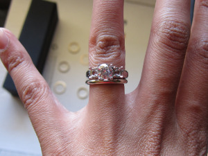
The old trellis *does* sit virtually flush with a band, my new ring has a much larger gap. Probably some combination of the shape of the trellis (it's like yours), the smaller size of the stones it held (it was made for a 1ct centre, 0,3 sides), the thickness of the prongs and gallery itself...
 
Yssie please take pictures of it. I would really appreciate it!
 
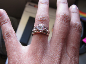
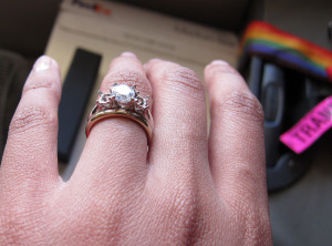
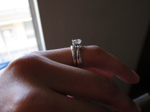
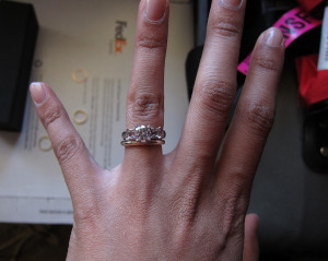
Okay, I took a bunch -

first up - proportions. Made for a 1ct RB centre, 0.33 RB each sides, 18k wg (I dropped in a loose 0.8ct in some of the pics)

A1.pngA2.pngA3.png


Yours will be more delicate if those pictures are CADs - when they polish the cast piece it is thinned out a little, so if a part is 1.1mm thick in the CAD diagram it'll be a little bit thinner than that IRL. Not sure if your dimensions are in CAD or for anticipated product?
 
w/ a 2mm plain band - from different angles to show the gap. The gap is visible up close, but it's really not obvious from a normal viewing distance I think. Not *flush* though - asymmetric trellis prong design. Something like the BGD truth, w/ the symmetric prong design, I imagine would be more flush -

B-2mm-3A.pngB-2mm-3B.pngB-2mm-3C.png


More visible in this one - but my shank tapers a bit, so that just exaggerates it!

B-2mm-2.png
 
2.3mm band

B-2.3mm-1.png


3mm band

B-3mm-1.pngB-3mm-2.png


1.5mm band

B-1.5mm-1.pngB-1.5mm-2.png


Wow. That's a lot of pics.
Well - hope it helps!
 
Yssie, you are awesome! The pictures are very helpful and I like how it minimizes the gap. I really like the look of the 2 mm and 2.3 mm bands. Are these low dome bands or normal height? Since I don't have nearly as much bling as you, I was thinking of pairing it with a channel set or pave 2mm. I'll have to see which types of bands I like once the ring is complete. Thanks again!
 
np :)) Good luck!!

Both the 2 & 2.3mm bands are from e-weddingbands.com - 18K White Gold Domed Wedding Bands, Comfort-Fit apparently. The 2mm (1.65mm deep/high off finger) is straight from stock, the 2.3 was a custom job (1.8mm deep)


I have to say MissGotRocks' new channel anniversary band looks *stunning* with her threestone - and of course your ovals are probably about that long or even longer!
file.jpg
[URL='https://www.pricescope.com/community/threads/a-tiffany-anniversary.161038/page-2']https://www.pricescope.com/community/threads/a-tiffany-anniversary.161038/page-2[/URL]
 
Yssie|1309392317|2958491 said:
np :)) Good luck!!

Both the 2 & 2.3mm bands are from e-weddingbands.com - 18K White Gold Domed Wedding Bands, Comfort-Fit apparently. The 2mm (1.65mm deep/high off finger) is straight from stock, the 2.3 was a custom job (1.8mm deep)


I have to say MissGotRocks' new channel anniversary band looks *stunning* with her threestone - and of course your ovals are probably about that long or even longer!
file.jpg
[URL='https://www.pricescope.com/community/threads/a-tiffany-anniversary.161038/page-2']https://www.pricescope.com/community/threads/a-tiffany-anniversary.161038/page-2[/URL]

That's good to know. I thought I would need to request a low dome to make it sit as "flush" as yours. Now, I know it's not the case.

I love MissGotRock's set. Funny that she has the Tiffany channel set band....I really liked the way that same band looked paired with my original ring. :)

Thanks again for everything Yssie! You've been extremely helpful.
 
Glad I can help ::) Good luck :bigsmile:
 
GET 3 FREE HCA RESULTS JOIN THE FORUM. ASK FOR HELP
Top