shape
carat
color
clarity

need your help fellow pricescopers

PreCiouSJeWeL920

Rough_Rock
Joined
Oct 24, 2003
Messages
60
Hi all, it has been a long time since that I looked for a diamond. I recently stopped by Tiffany's and fall in love with their Seleste ring. But with their high price, I thought I could get a better and bigger diamond with your help. So here I am.

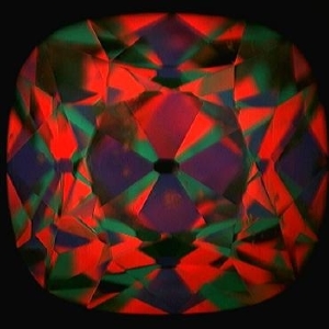
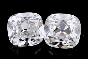
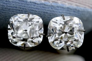
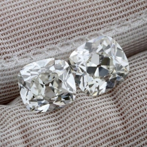
I am looking at two antique style cushsions. Here are the ASET pictures and I also asked the vendor put two together to see if I could prefer one over the other. I will name them A and B.

ASET for A:
1042a_1_1_.jpg

ASET B:
7128a_1_1_.jpg

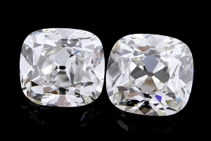
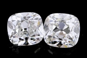
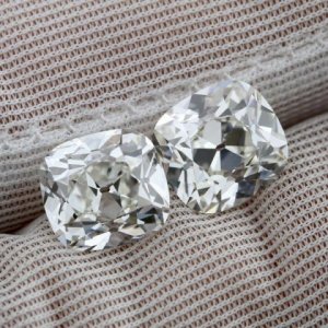
side by side pictures A and B:
_7498.jpg
_7499.jpg

The A with 68.4% depth and 53% table. the B is 68% depth and 46% table.

Please let me know which one is pleasing to your eyes.

Thank you in advance!
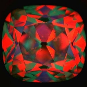
1042a_1_1_.jpg

7128a_1_1_.jpg

_7498.jpg

_7499.jpg
 
They are very similar, but my eye is drawn a little more to B. I do like a smaller table better, for one thing. Sounds like a fun project! About what size are these stones?
 
Hi DS, thank you for your opinion. They are about 2.5 cts. You don't think the B has the Maltese cross? Which one is more brilliant? The B has moe contrast? Do they look good to you? Thanks!
 
A looks like the brighter stone but B is more appealing to me. I like to see the maltese cross. Do most people not want to see it?

Edit - Honestly, I dont think you could go wrong with either stone. They both look like nice cushions...you just have to figure out
what personality you like best. Did you ask the vendor to review them for you side-by-side to tell you what they see? Do they have
a favorite?
 
Have you seen the two stones in person? If not ask for a video perhaps and see which one your eye likes the best. Some people (me included) like tiny table, high crown combo and like the contrast (maltese cross) in stone 2 other people don't like the contrast as much and prefer the centre area to be more "on" or lit up like stone 1. They are both nice stones so it comes down to actually seeing them and deciding which one you like better.
 
The vendor think B is brighter. Does it show a little more color? B color is one grade higher than A. A look better on paper. Wish I could see them with my own eyes. Thank you for chiming in. Please comment away!

I wish I could get to see both of them. At this price point, I couldn't get them both to sent to me. I might have to see if there is something could be worked out. Thanks
 
I much prefer the look of A myself...

Does your vendor have both of these in stock or did he call them in? If he has them in stock, maybe you could buy the one you favor and have it shipped to you - you should know fairly quick whether it is the right diamond for you. If not, return it in exchange for other. Of course, you'll have to keep your fingers crossed no one else is interested in the stone at the store, but maybe you could request first refusal rights while you're in your return period with the stone you purchased?

If he called them both in, then all I can suggest is that you choose the one that *speaks* to you the most - once it is in hand, if it is not the one, return it for refund and start the search again.
 
I'm a beginner when it comes to cushions but I prefer B. They are both very beautiful!
 
Both stones have similar facet patterns. If I have found the correct stones, B is a color grade lower than A. But I think the color grade of B is plenty high enough for an antique cushion. In fact, I would be fine with a grade lower than that. B is also slightly larger than A. So there are many reasons I would choose it over the other. I really think you should have the stones reserved, though, and then people could see the links with the videos, etc.
 
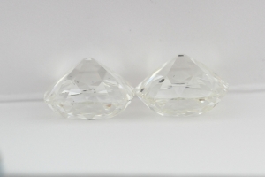
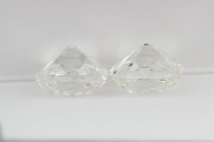
Hi DS, thank you very much for taking your time finding the stones. I will post the links for people to see the videos once I have them put on hold. They are small videos but I guess will give you the prospect how it look like in real life. Here are some more pictures that I requested from the vendor.
As before, the left is A and right is B
Pavilion
pavilion_0.jpg

_7524.jpg

GIA plots for A and B


Let me know what you all think.

Thank you so much. :love:

_7524.jpg

pavilion.jpg
 

Attachments

Still B for me. I love it!!! It would be a stone I would like to own!
 
I am not a cushion expert but I much prefer stone A. I am one who isn't so much a fan of the maltese cross though and I like the overall brightness that stone A seems to have more than the higher contrast of stone B. It seems as though I'm in the minority on this one though!
 
Thank you ladies.

That is ok Stargurl. I have not seen an antique cushion in real life. So it is new for me too! But I trust our Pricescope experts though. Lol
 
I'm surprised no one has commented yet but the maltese cross on B is very dark- totally deal breaker for me. In every single picture at least 3 out of the 4 sides are dark. OP can you ask the vendor if they flash on and off or get more pictures of it? That would be my main concern and if they are always dark I would cross this one off the list.

Ideally for well cut cushion you want the pavilion mains/ maltese cross to flash from light to dark as it moves. Dreamer did a great post about it awhile ago explaining it has a slight domino affect that 3 should light up while the 4th goes dark as the diamond moves around. However, the ones that arent' very well cut will always look dark or have 0,1, or 2 pavilion mains light up.

If this is a serious contender for you I would have to say see it in person or have a video taken of it. My cushion I know is horrible with pictures. My cross always looks dark in photos but in RL it acts as a well cut cushion with only 1 pavilion darken as I turn it side to side etc. So I understand pictures are misleading, but still wanted to bring this to your attention as a dark maltese cross just ruins the overall look of the diamond to me- like I said it would be an immediate deal breaker for me.

EDIT: I went back and looked at your pictures some more and will say on further reflection the pavilioins don't look as dark as I first thought- perhaps it is just the black background? I would still want to see more pictures, perferably against the hand, to see how the pavilions perform.
 
I must firstly say, I am NO expert by any definition!!!!

But gosh, I do really like B. :appl: I have no idea why, but I much prefer it visually over A. :loopy:

Good luck in your search for the stone that sings to you :wavey: :)
 
I looked at the videos over and over again. It looks like A is less lively than B, do we all agree? :read:
 
PreCiouSJeWeL920|1372253592|3472594 said:
SB, Thank you for your thoughts.

Here are the links to the stones. Could you take a look at the videos to see if you still have the same thoughts?

Mark said the B actually is more brilliant than A.

thanks
A
http://www.engagementringsdirect.com/2.52-carat-g-vs2-a-cut-beyond-cushion-cut-diamond-gid-108132.html
B
http://www.engagementringsdirect.com/2.61-carat-h-vs1-a-cut-beyond-cushion-cut-diamond-gid-123463.html

Why the black background????! Totally throws me off. I wish dreamer would see this thread and comment as I don't want to be an alarmist and I always defer to her as everything I have learned about cushions during my own search was advise given by her.

Ok my honest thoughts- I love the shape of this cushion. The high crown is beautiful which is what I think attracts alot of the attention to this one away from A. I also think the facets have a crisper pattern making it more bright/ bold flashes etc. This would also be my ideal shape for a cushion with the pillow-y corners.

After looking at the video it is still hard for me to tell as I'm at work and looking at it on a tiny screen. There are moments where I do see the flash in 3 pavilions but then there are moments where 3 pavilions look dark. Like I said I wish dreamer would comment and set me straight. Can you ask mark for a video of it on the hand? I think that would clear it up right away. I'm leaning towards saying it is not great, but not as bad as I initally thought either. It seems you really love it so if that is the case then go ahead. Mark has a return policey so if you see it in person and it bothers you then return it. You might see it in person and it will be a great performer (just lousy in pictures).
 
The thing is, when worn, a diamond is never really in a static position. The flashes of those center facets will be on and off as the stone moves. They are cut with the maltese cross pattern like some antique cushions were. However, I will say that with all but ideal cut rounds, perhaps, you really have to see all other fancy cut stones in person to know if you really love it. I would have it sent to me to look at before setting.
 
Got another picture. But I am no closer to make any decisions! Why the B is more dark in the center than A?

somebody enlighter me? Maybe I should pass on it and keep looking? :confused:

2_52_2_61.jpg

2_52_2_61.jpg
 
PreCiouSJeWeL920|1372201369|3472279 said:
Hi DS, thank you for your opinion. They are about 2.5 cts. You don't think the B has the Maltese cross? Which one is more brilliant? The B has moe contrast? Do they look good to you? Thanks!

Both will show a maltese cross to an extent, its just the facet pattern.

Can't really judge brilliance, which is simply white light return, but I suspect they are the same.

I think B has more contrast and more distinct under-table faceting. Cushion A appears to have more under-table haze, which creates a bit of a washed out or imprecise look to the faceting which is not my preference.

I like Cushion B better by a long shot.
 
Thank you Dreamer and everybody that have taken your time and offered your honest opionions. I have not seen enough cushions to know what I prefer. But with your experts thought, it is going to make a lot easier for me!

So Dreamer, if you don't mind, would you say the B is a superior cut as far as antique cushion goes?
Thank you so much :read:
 
What you are seeing as darkness in Cushion B is camera obstruction, same thing that causes arrows in a well cut stone. We don't complain about those ::)

In a poorly cut stone, like many antiques, everything you say SB is true and many stones will go overly dark in the center. But it is a little different evaluating the performance of the mains in an antique style cushion compared to an OEC type of cut with more visible pavilion mains under the table (8 rather than 4). Such stones photograph quite differently.

I can tell looking at these images that Cushion B is not overly obstructed IMO. Typically when you have an issue of an over deep diamond or too much obstruction, the areas between the maltese cross will also go dark when obstructed. LIke a black hole. See below. With cushion B you do see 2-3 pavilion mains going dark at the same time in some pics, but the areas between the mains are light -- the way that arrows in an MRB are dark against a white background. To be sure, I would ask Mark if Stone B goes dark at norml viewing, and ask him if the pavilion mains seem over-dark or show too much obstruction. I highly doubt it given the proportions and the images you have posted.

Stone A looks "brighter" because the mains all look white all the time. But no contrast = a lazy boring looking stone. From a cut perspective I really think B is better.

Bad obstruction -- see how its all black?

_2269.jpg

PS: thanks for the shout outs SD :)) Glad my ramblings help.
 
PreCiouSJeWeL920|1372278490|3472796 said:
Thank you Dreamer and everybody that have taken your time and offered your honest opionions. I have not seen enough cushions to know what I prefer. But with your experts thought, it is going to make a lot easier for me!

So Dreamer, if you don't mind, would you say the B is a superior cut as far as antique cushion goes?
Thank you so much :read:

I am not a cushion expert, so I can't say if Cushion B is superior compared to ALL cushions out there, but I do think it is better than Cushion A because it has crisper more distinct faceting. I really dislike when the center looks "hazy" and imprecise, like all the facets are one. Such a look does eliminate the maltese cross effect. But its at too high a cost for me, optically. Some others seem to disagree. My preference for you would be to compare these two stones in person so you can make a decision based on what YOU like. I don't think either if these diamonds is a dog... my preference for B may be more esthetic than "objective" (whatever that means when evaluating diamonds).

The fact that ERD tells you B is better means a lot to me.

I have seen an AVC in person -- I know these are not AVCs, but the AVC is an example of a very well cut antique style cushion -- and can say it was very contrasty but the maltese cross was never all dark. Its like in an MRB -- you know the arrows are never DARK in person! They glint silver and flash. Same with the maltese cross in a nicely cut antique style cushion.

ETA: Re the maltese cross -- the dark is reflection of a camera, so now imagine that instead of a dark camera you have all sorts of environmental colors reflecting in the cross :love:

ETA2: Here is an AVC, which is no doubt optically awesome, and you can see in many of these static pics a similar pattern on the pavilion mains to that seen on Cushion B. Not saying they are identical, but I think this shows how photos of cushions can make the cross look rather obviouswhen in person, its moving and on off on off all the time: [URL='https://www.pricescope.com/community/threads/i-cant-believe-this-used-to-be-an-o-avc.190579/']https://www.pricescope.com/community/threads/i-cant-believe-this-used-to-be-an-o-avc.190579/[/URL]
 
Thank you again Dreamer and SB for bring you over to this thread. I greatly appreciate your help. Now we will wait and see what Mark says:)
 
I hope I'm not thread jacking OP!!!

Dreamer do you think the maltese cross is more apparent in whiter cushions? When I was shopping around several of the vendors (non PS) mentioned that it is more significant (perhaps apparent is a better word) in H and above. And it seems that most examples I have seen of excellent pavilion facets/MC have been on much lowered colored diamonds like the once you pictured. I was just wondering if you think this is associated or just coincidental of the examples on PS?
 
GET 3 FREE HCA RESULTS JOIN THE FORUM. ASK FOR HELP
Top