shape
carat
color
clarity

Need Opinions about this Bezel Setting (includes photos)

Status
Not open for further replies. Please create a new topic or request for this thread to be opened.

GemView

Shiny_Rock
Joined
Jul 25, 2005
Messages
242
Hello!

It's been quite some time since my previous post on PriceScope, but now I'm here in search of some friendly advice on upgrading my original e-ring setting. I have a specific ring in mind, but first some relevant background info.

At the time my original wedding set was purchased we put a lot of effort into selecting an ideal 1.04CT colorless diamond, whereas we chose the setting somewhat impulsively for its style only to realize over the past year or so that I could not overcome the fact that the diamonds are not a good color match for the center stone. We've opted to begin shopping for a new setting since the cost and labor involved with upgrading the setting diamonds would equal or exceed the original price of the setting. Last time I didn't spend enough time analyzing the setting, and this time I'm trying to be cautious, and as a result I would really appreciate your thoughts/opinions.

My original setting had a tiffany style head. It snags EVERYTHING. The prongs are somewhat rough/sharp and inevitably, despite daily cleaning, filled with lint. The other thing I did not consider the first time around — and now have the opportunity to correct — is the color. We put everything toward the diamond and so I originally opted for yellow gold e-ring setting for fear that I might develop a skin reaction to white gold with daily wear (that and we could not spring for a platinum setting after putting the bulk of the budget toward a bigger/better diamond, thanks to all the education we received reading PS :-).

In my current setting the tiffany style head is white gold, but the rest is yellow gold. The white gold head reflects the yellow, so the predominant look is yellow gold. Meanwhile, the jewelry collection I have built up over the years is roughly 1/3 silver, 1/3 white gold, 1/3 yellow gold (with the rest being "other"). So there are two considerations that I have, one being a more comfortable and less snag-prone replacement setting (possibly a bezel setting), and, preferably, a two-tone setting so that my set will better mix and match with my existing jewelry collection.

What I have found in my replacement setting search so far is that trying to find a basic bezel setting isn't terribly hard. Trying to find two-tone setting, though, is another thing entirely. And trying to find something with vintage detailing coupled with a modern bezel setting is even more difficult yet. I've been browsing the Web for weeks, and I've come up mostly empty handed. As a result, I decided to visit a local B&M.

At the B&M I found what the owner described as a Tiffany-inspired design. It happens to be done in two-tone 18K gold, while the center stone is bezel set in white gold. Better yet, it features milgrain detailing which I also like because I am also a fan of the vintage look.

In looking at the photos I took at the store — which in my opinion don't do the design much justice — I have a handful of specific questions/concerns:


• What is your opinion of the design/look? I realize it is not a traditional look for an engagement ring, but what I'm questioning is whether or not it has a designer flare, or merely a fashion look? Also, the stones are vastly improved in color compared to the side stones in my original e-ring setting, but in looking under a loupe I noticed that the pave stones are not all that great of a cut. Is it normal that the pave stones aren't cut quite as well simply because they are so small? Taking the setting outdoors, I also noted that while most of the pave stones sparkle, about four of them look a bit dull (although none are terribly cloudy/included). Should I be concerned — or would you?

• My understanding is that many rings, particularly designer settings, show just as much attention to detail finishing off the inside/back of the shank as there is on the outside. BUT… is it fairly common for the design to actually make it difficult to get a cleaning brush to the back of the center diamond? The reason I ask this is that in looking at the second image that shows how the back of the ring is finished off, it would appear that it would be tricky if not impractical to clean the back of the stone with a conventional jewelry cleaning brush (that or the brush will fray within a matter of days). And since it is bezel and not prong set, I won't have side or top access, either. Is this normal with many bezel-type settings or does it strike you as evidence of a design mistake? Given that I clean my ring every day, should I be concerned?

• For those of you with pave e-rings, would you do it all over again? I ask because I realize the pave diamond prongs are incredibly small and hard to see — so potentially more likely to lose stones?


So now you have it… Thanks for bearing with me through this lengthy post! I very much appreciate your feedback.

GemView_NewSetting.jpg
 
Honestly? It''s really really busy. I''d barely notice the center stone what with all the colored metal, the millegraining, the pave...do you want people to notice your stone, or the ring? Not a criticism, just a question to consider. As for your question about fashion vs. eriny, it looks more like a fashion cocktail ring to my eyes. I''m not sure it looks antique either because that sort of Jack Kelege type of styling is billed as "antique/vintage" styling but to be honest, I''ve rarely seen actual antique rings of that style. I think it''s a marketing ploy.

Anyway, I can understand you wanting a different style that doesn''t snag on everything but...have you gone through every single page on the SMTR thread to see if there are any other options that you like? If not, I''d do that. Personally, I dont like two tone jewelry and I dont think it''s wrong to have a white metal wedding set and wear gold jewelry sometimes. Perfectly okay! Good luck with your search...
 
GemView,

I cannot answer many of the technical questions you have asked about pavé stones and cleaning, but I can tell my opinion of the ring. I think it is just beautiful! Usually my taste runs to the extremely simple, so it is unusual for me to like a piece of jewelry that someone else has just described as "busy"! All I can say is that I think the design is beautiful. If you do not find a technical reason that makes the ring impractical, I hope that I will get to see it on your finger with your diamond in it!

Keep us posted!

Best of luck,
Deborah
34.gif
 
Hello Gemview, and welcome back from your brief hiatus!!
35.gif


To answer your questions...

Question 1: Opinion/Design/Pave stones?
- I think the detail is very nice, the millgraining, the pave. The sideview of the setting is very interesting with the scrollwork under the halo! However, as Surfgirl mentioned - it does have a very "busy" feel to it. Perhaps it''s just me, but all the yellow goldwork seems to take away from the main event, which would be your glorious stone! (A 1.04 knockout, congrats!) Maybe if the halo was in white gold it would sing differently to me. This is just my .02 though, YOU and yours need to find something that you both are happy with, after all - you get to look at it everyday!

- On the pave, I feel that it is VERY important to have good quality stones when it comes to pave and melee. When the stones are so small, the cutting is especially important because those little guys need to be giving it their all. You want your piece to be bright, and have the glittery look - I think dull pave hinders that. I may be a little OCD about sparkle, but if this is the setting that you have your heart set on, perhaps your jeweler could swap out the dull ones for some brighter ones?

Question 2: Cleaning...
- I think it is a very nice touch when designers add that "flair" on the underside! To clean it I would invest in a good ultrasonic cleaner, they are pretty safe for most jewelry I believe! (Coming from a girl who really should get herself one as well! lol!)

Question 3: Pave durability...
- Pave can really hold up to a lot of things. It''s just like any other piece though, you want to have your items checked often to avoid losing stones. I have some vintage pave pieces that I really adore, but I am very careful as to what I activities I will be doing while sporting them..... No bricklaying for Evelynn!
28.gif
If you are pretty good with your hands (ie no heavy construction work, no DAILY ground-digging etc) you should be fine.

Really in the end it is up to you! You know what you like, and what other pieces you have to mix and match with your new ring. Have fun with it, after all, jewelry is a reflection of us - you should get what YOU like!

Hope that helps! Good luck with the search, and keep us posted! With pics, of course!
1.gif
 
Thanks for sharing your opinions!

I forgot to mention that the ring pictured is a 6.5 and I wear a 5. I''m assuming that if it were sized it would sit a bit more flush on the sides. Even so, this ring is indeed a bigger look than I would normally wear — only because my fingers are small and not because it would be a large setting by everyone''s standards, though. The problem in looking at something like this more than once on the hand is that the brain begins to "shrink" (or acclimate to) the appearance, which makes it difficult to remain objective. In any event, I suppose the good news is that this setting would never be overshadowed by anything I ever wore on my right hand, LOL.

I also neglected to mention that initially the store owner provided a diamond for me to look at in the setting, but upon returning the next week with my camera I forgot to ask for him to pull out the diamond again in order to get pictures that would represent how it looked with a center stone. Because the white gold bezel is raised in the setting it still popped next to the side stones (those are only 1.5 points apiece so very small next to the 1 carat center stone). Without the center stone in place, the picture tends to make the setting appear even flatter than it does in person (My bad…).

I am a real fan of the antique/retro look (engraving, filigree, milgrain, etc.). At the same time, I''m a bit on the hard-to-please side because I like modern design elements too (the comfort of a bezel settings, for example). On the surface of things this ring sort of melds a bit of both worlds: It offers a two tone look coupled to milgrain detailing that contrasts with the smooth WG center-stone bezel. On the other hand, I am scrutinizing the side stones because that''s what got me in trouble the first time — not feeling like the side stones in my current setting flattered the center stone. As a result, I''m trying to err on the side of caution. Plus, there is still that issue that the setting pictured is just so much bolder than anything I''m used to. Nontraditional doesn''t really bother me since I''m a big supporter of individuality and expressing one''s own personal style — but having a setting that strikes most as nothing more than gaudy would be a problem.

As far as Pricescope is concerned, I''ve been through probably 90 percent of the ring images I could find in the ever-growing "Show Me the Ring" thread (my "old" setting is posted in there somewhere, BTW). I''ve also performed a couple of searches for "bezel" and "two-tone settings" here on PS. Many of the designs pictured on PS are gorgeous; however, in looking at designer Web sites as well as large retailers such as Solomon Brothers, Robbins Brothers and Pearlman''s Web sites, I have noticed that the variety of styles/choices that have collected here on PS over the years are not fully represented. I suppose that is because ring designers make a setting for a year or two and then update their collections such that you don''t see that exact same settings saturate the market year after year (referring to the somewhat unique looks that I am inclined toward, anyhow). As a result, I''m trying to choose from among what is currently available on the market.

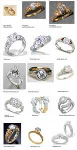
With that in mind, and in no particular order, here are some examples of designs that intrigue me for one reason or another:

GemView_DesignInterests.jpg
 
Date: 10/11/2007 3:50:39 PM
Author: AGBF


GemView,


… Usually my taste runs to the extremely simple, so it is unusual for me to like a piece of jewelry that someone else has just described as ''busy''! All I can say is that I think the design is beautiful. …

Keep us posted!


Best of luck,

Deborah

34.gif


My thoughts exactly, Deb! I don''t normally wear rings that make such a strong first impression, yet there''s a certain uniqueness and a certain balance with the yellow and white gold mirrored on either side the way it is. So on the one hand, I like the design because it looks as if a lot of thought went into creating all that detail. On the other hand, I am not a fan of the big "bling" look, and I don''t want it to come across as if that was the intent. If I didn''t have such small fingers I don''t think it would be such a big question mark, but as things are I am not sure if I can pull this size setting/design off. It will probably come down to whether or not I have a chance to examine the setting stones again soon, and whether or not the consensus is that it has a designer flare to it as opposed to merely looking gaudy. What I''ll try to do in the meantime is to get another photo with a diamond in it.

Thanks again!

1.gif
 
Date: 10/11/2007 5:11:54 PM
Author: Evelynn
Hello Gemview, and welcome back from your brief hiatus!!

35.gif

Thank you for the welcome back, Evelynn! I appreciate the feedback!
35.gif
 
Date: 10/11/2007 1:42:50 PM
Author: surfgirl
Do you want people to notice your stone, or the ring? Not a criticism, just a question to consider. As for your question about fashion vs. eriny, it looks more like a fashion cocktail ring to my eyes. …


Hi SurfGirl!

I do appreciate your honest impressions. I want something that has a designer flare, but not something that looks over the top. With many designer rings I''ve noticed that there is a swing towards extremes — modern, sleek or architectural on one side of the coin vs. intricate, detailed and ornate on the other. Meanwhile, most traditional solitaire settings fall somewhere in between. What are more difficult to find are "hybrid" designs that attempt to bridge the style gap by incorporating some vintage aspects with modern design elements. Since I can appreciate minimalist, sleek and contemporary designs as well as unusual and intricate vintage pieces of jewelry, I am constantly pulled in two directions — which is why my ideal upgrade setting would incorporate the best of both worlds.
19.gif


With the yellow gold halo portion set lower and not flush against the white gold bezel, my impression was that the center diamond was not competing quite as much with the setting as was my first impression before the jeweler got out a diamond for me to place in the center for reference. Unfortunately, I didn''t have my camera that first day, which is why it isn''t pictured. When I get a picture of the diamond in the center, I''ll post it, though.

I would completely agree that this setting is busy compared to what I normally wear, however. I understand the dangers of an overly busy design because I have a background in graphic art, LOL. As such, my first impression of this ring was "too big". But my second impression was that I shouldn''t dismiss it so quickly because it has all the elements I had been looking for — two-tone, a touch of retro-looking milgrain, a bezel setting for the main stone, and a unique overall appearance. Just the same, I''m keeping my eyes open to all the alternatives.
34.gif


Thanks again for weighing in!
 
Date: 10/11/2007 8:04:51 PM
Author: SanDiegoLady
I love it..


Thank you for sharing your impression, SanDiegoLady!
 
Below is the photo I promised with an example of a 1 carat center stone in the setting for which I started this topic. The diamond pictured is not my stone and has not been set; instead it has been placed in the setting as an example.

I realize this isn''t going to appeal to those who prefer simple solitaires, but the question is whether or not the style portrays a unique designer flare or simply a gaudy look. I don''t mind attention getting in a ring
30.gif
, but I don''t want it to cross the line into merely looking gaudy
23.gif
.

Thanks again! New opinions are still needed & welcome!

Gemview_twotonesetting.jpg
 
Hmmm, I''m not sure even with the stone in it how to think about it. I might have skimmed your post too quickly, not knowing if you prefer 2-tone or not. I think it would look less fussy if you were to keep it one colour metal, either yellow or white. I''m a white metal girl so I would gravitate to all white. Plus, would really make that center stone look huge.
2.gif


Judy
:-)
 
Hi Judy,

I very much appreciate the quick reply!

Yes, I was looking specifically for a two tone upgrade setting. About 1/3 of my jewelry is gold and another 1/3 white gold so my intent was to have a match for whatever I happen to be wearing.

Meanwhile, I spoke to yet another jeweler today who said that yellow gold is making a comeback. My original setting was yellow gold with the exception of the prongs (I didn't want yellow gold holding the center stone). With a more even split on the two colors in this present setting, I figure at least half of it will be in vogue at any given time
5.gif
. Speaking of which… I would be curious to know how many people wear one color metal on their engagement and wedding ring and another entirely for their right hand ring, pendant or earrings? Or do most simply decide to get rid of whatever metal has fallen out of favor so that they can match their e-ring or wedding band?

With respect to the style and overall look, is it the two tone color that makes the ring appear busy, or is it simply too big relative to my size 5 fingers (and somewhat short fingers at that)? I ask because I see a lot of big rings holding very big rocks on this site — and many quite attractive and well received nevertheless. On the other hand, I am a believer that some size stones and settings are more flattering than others depending on one's hand size and finger length. As such, I feel I need much more input.

Thanks again!
 
Good Morning,

I realized this morning what was nagging at me with your ring, it reminds me of my 40th birthday present. It''s not the same setting, but mine looks much like it does on your finger. Only thing though, mine''s a right hand ring. I know my sapphire would look *off* if I were to wear it on my left hand. I dont know how else to say it. I know you''re looking for personal opinions so I''ll say it straight, it looks like a cocktail ring to me. There are some huge rings out there, but I still think they look ok because the metal is one colour. I''m not sure, but the yellow just seems so yellow, similar in colour to something along the lines of 24 ct.

At the end of the day though, it''s really what **you** love. If I come across any in a bezel, I''ll point them out to you. Since most on the market are prong set, you may have to look at getting something custom made. Looking at that perspective can be both exilerating & yet promote feelings of apprehension. Still...would be the best wouldnt it? LOL Maybe keep the bezel around the stone a white metal, & the side profile of the crown yellow. I guess go through the gazillion pages of "show me the ring" thread for ideas. I remember Reena''s ring was quite elaborate on the side.

Judy
:-)
 
I actually really like the ring! I''ve always been really short and so my mom would tell me that large watches and jewelry would look disproportional on me and I shouldn''t get them. But I completely disagree! I love larger accessories on everyone. And as for yellow gold coming back, I have a future cousin-in-law who has a shiny new gold wedding set (to match her Aggie ring, WHOOP!) and its goegeous in the style she has. Normally I don''t like yellow gold but I think the style really makes the difference. What is your lifestyle like? I think that would be a determining factor in getting this ornate a ring.
 
Hey Gemview...

Was just on Pearlman''s site & was looking at Beaudry, Spark & Durnell.. They all seem to have some lovely intricate pave mounts, with Beaudry having the most selection of course. The other option is to contact Maytal (oh geez, fgorgot her last name, someone will know it!) as she used to work for Beaudry & can create a custom peice for you. I recall reading on here that she is reasonably priced. Thats an idea.

In looking at some similar designs, I found that I liked the white metal around the center stone, made it look bigger, and even with yellow on the shoulders was still ok, cause the stone was surrounded by white.

You have a lovely dilemma. :-) Either way, if you go for this ring, it''s going to be gorgeous no doubt about it. :-)

Judy
:-)
 
Hi Judy,

Thanks again for following up.

I noticed that there is something not quite right about the color in the photos. The ring is 18K white and yellow gold and I suspect the white balance on my digital camera was a bit off under the store lights such that it has taken on a slightly greenish cast. The yellow color *should* look more like the Scott Kay 19K gold ring coloring.

So it looks more like a right hand ring that should have a colored gemstone? That would not be entirely unexpected, come to think of it. The Tiffany ring upon which this style was based was apparently a single color metal featuring a colored gemstone (according to my initial discussion with the store owner). Perhaps some of that is still carrying through…

SurfGirl was the first to mention "cocktail ring", so it happens that when I went to the store the other day to take the promised photo with a diamond in the center, I asked to see examples of cocktail rings (without going into any detail about why I wanted to see cocktail rings). The shop owner, who is third generation in the jewelry trade, said that a cocktail ring is traditionally one that does not have a single larger stone at the center but rather a BIG diamond cluster style ring. I also found some interesting history on cocktail rings at a site called "WiseGeek.com" in which the author talks about the popularity of cocktail rings during Prohibition in the US (http://www.wisegeek.com/what-is-a-cocktail-ring.htm). The author writes "If one is purchasing a loose stone for a cocktail ring, one should consider a stone of at least three carats, and preferably five or more carats. The general rule is that the bigger the stone, the better. The cocktail ring is supposed to catch and dazzle the eye. It is also supposed to be opulent and overdone."

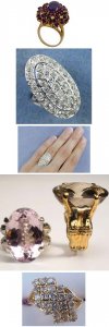
By the store owner''s definition virtually no would appear to own a diamond cocktail ring here on PS, but by the definition in the "Wise Geek" article anyone who wears a ring with a center stone over three carats could double it as a cocktail ring. With that in mind, I would have to say that while I am concerned that the setting I am contemplating may be too big for my hand — and therefore gaudy looking — I don''t believe it looks like a cocktail ring (if only because the center bezel holds a 6.5mm 1 carat stone, not a gargantuan rock). For example, the following are a couple of estate rings — not CZ reproductions — that came up under a search for cocktail ring. The last ring pictured is merely 1 carat, but represents what comes to my mind when picturing a "modern" diamond cocktail/cluster ring.

GemView_cocktailrings.jpg
 
Date: 10/17/2007 12:32:12 PM
Author: oobiecoo
I actually really like the ring! I've always been really short and so my mom would tell me that large watches and jewelry would look disproportional on me and I shouldn't get them. But I completely disagree! I love larger accessories on everyone. And as for yellow gold coming back, I have a future cousin-in-law who has a shiny new gold wedding set (to match her Aggie ring, WHOOP!) and its gorgeous in the style she has. Normally I don't like yellow gold but I think the style really makes the difference. What is your lifestyle like? I think that would be a determining factor in getting this ornate a ring.


Thanks for offering your opinion, oobiecoo. With respect to lifestyle, I'm pretty easy on rings. I still have rings that were given to me when I was 11, LOL. I clean my rings every day and they spend the night in a jewelry box.

I have to admit that this would be the largest "look" I've ever worn, yet it seems to combine a lot of elements I've been looking for. Plus, the white gold bezel around the 1 carat center stone makes the diamond look even larger — never a bad thing, IMHO!
1.gif
 
HI:

I have been looking and looking at this setting and have finally figured out why I cannot say "I love it"; and IMHO it is the yellow halo. If ithe halo were white and the sides/shank only yellow then I would
36.gif
, but it just seems to have too much yellow at the focal point for my taste.

Have you seen this one? I know it probably isn''t antiquey enough for you, but I thought I''d post it anyway. Holds a 1 carat stone and represents a great value.

http://www.pearlmansjewelers.com/jewelry-specials/closeout-jewelry/rings/27N1/48/

cheers--Sharon
 
Before I read the other post about not usually liking "busy" things, but liking *this ring* ... I thought THE SAME THING.

Especially now that I've seen the pictures WITH a diamond in it, and more in scale with your hand. It's lovely & unusual & seemingly very, very *you*.

HOWEVER -- As an owner a bead-set pave e-ring & w-band ... I would NOT advise using an Ultrasonic Cleaner. I've heard bad things about stones wiggling right on out of their bead-settings. You can get a Steam Cleaner or just use old-fashioned hot water & ammonia etc.


ETA: Ooooh Sharon ... that Richard Krementz is lovely too ... bezel, two tone, pave ... you're GOOD!
 
Date: 10/17/2007 3:45:16 PM
Author: ccuheartnurse
Hey Gemview...


Was just on Pearlman''s site & was looking at Beaudry, Spark & Durnell.. They all seem to have some lovely intricate pave mounts, with Beaudry having the most selection of course. The other option is to contact Maytal (oh geez, fgorgot her last name, someone will know it!) as she used to work for Beaudry & can create a custom peice for you. I recall reading on here that she is reasonably priced. Thats an idea.


In looking at some similar designs, I found that I liked the white metal around the center stone, made it look bigger, and even with yellow on the shoulders was still ok, cause the stone was surrounded by white.


You have a lovely dilemma. :-) Either way, if you go for this ring, it''s going to be gorgeous no doubt about it. :-)


Judy

:-)


I tried looking up Maytal when I stumbled across the reference in another thread, and didn''t turn anything up. Does Maytal have a Web site?


I too agree… I prefer white metal around the center stone because it helps it look a bit larger, and also because white metal doesn''t reflect yellow on the diamond. I don''t know if it comes across in the pictures I posted, but the bezel and center of the shank is white gold and the yellow gold is on the outer rims as a sort of "frame". The yellow gold portions are also set lower on the ring whereas the white gold portions are "taller". I''m open minded to a variety of looks and styles, but one thing that does bother me from a personal standpoint is a shank that rises sharply and then makes a sharp right angle along the shoulders. I prefer a low profile look that either hugs the finger or a gradual domed profile.

In any event, this IS a pleasant dilemma to be in!
9.gif
 
Date: 10/17/2007 5:39:42 PM
Author: canuk-gal


Have you seen this one? I know it probably isn''t antiquey enough for you, but I thought I''d post it anyway. Holds a 1 carat stone and represents a great value.


http://www.pearlmansjewelers.com/jewelry-specials/closeout-jewelry/rings/27N1/48/


cheers--Sharon


Thanks for the link, Sharon. As it so happens, I stumbled across that exact ring about a week ago and spent a fair amount of time seriously considering it. (We must be on the same wavelength, LOL.) Ultimately, I decided that I want white metal around the center stone so that it will look a bit larger and won''t appear to lose a color grade or two due to a yellow gold bezel. By contrast, I would prefer that the lower half of the shank be yellow so that there is less white gold exposed to the skin and less that may require rhodium touch ups. For some reason, though, most of the two tone rings I''ve seen — with the exception of the one I started this thread about — are exactly the opposite: yellow gold around the stone, and white gold around the finger.

I''m still interested in opinions & alternative designs!
34.gif
 
Date: 10/17/2007 5:48:24 PM
Author: decodelighted
ETA: Ooooh Sharon ... that Richard Krementz is lovely too ... bezel, two tone, pave ... you're GOOD!
HI:

Heehhe thanks deco....

Gemview: here is an ultra modern ring--polar opposite from your design--but you DID ask for alternate opinions!!
9.gif
Much of this designers work is two tone...

http://www.pearlmansjewelers.com/jewelry-designers/eddie-sakamoto-jewelry/rings/41T1/0/

Here is another; again no antiquey look and some monotone, but there are some stunning settings here

http://www.pearlmansjewelers.com/jewelry-designers/great-additions-jewelry/rings/22I1/0/

cheers--Sharon
 
Date: 10/17/2007 5:48:24 PM
Author: decodelighted


… As an owner a bead-set pave e-ring & w-band ... I would NOT advise using an Ultrasonic Cleaner. I've heard bad things about stones wiggling right on out of their bead-settings. You can get a Steam Cleaner or just use old-fashioned hot water & ammonia etc.

...


Thanks for sharing your take on this setting, decodelighted!

I have had a couple of pave pendants lose stones in my ultrasonic cleaner so my general habit is to rely on a conventional brush & jewelry cleaner. But because the back of this setting isn't completely open — other than trying to shove a cleaning brush through the flower pattern — I think it would be difficult to clean, if not virtually impossible to reach the back of the diamond once it is set. Consequently, I asked another jewelery store owner about that yesterday — not with the ring photos with me, however — and based on my description he said that a bezel set design without easy access for cleaning through the back of the shank would necessitate ultrasonic cleaning for up to an hour!
32.gif
Ultimately this decision may rest upon what professional jewelers on PS have to say about whether or not they believe I will be able clean this on my own or not.
 
I have to say I like the two tone look of most jewelry, however, there is something about this ring that I"m not crazy about. It could be the larger size of the halo (I prefer smaller delicate halos), or the color of the yellow gold as others have mentioned. I just can''t get past the business of the setting to see the diamond for it''s beauty. The ring itself definately is beatiful in it''s own right and the workmanship looks very impressive, just not my style I guess. I do go for more simple styles.

I wear both yellow and white colored jewelry so I understand wanting to have both in the ring. My mother in law has an antique oec with a platinum bezel in a yellow gold setting. It is absolutely gorgeous! It is the original setting I believe but you don''t see settings like that too often. I like the look of platinum or white gold bezel against the stone as well.

I''m sure you''ve probably checked out this website but I like his designs

http://www.jamesmeyerjewelry.com/pieces_enga_rings.htm

I do like the annmckay designs you posted.

Bottom line is you have to get something that you like and are in love with! Sometimes you just know when you see a design if it''s for you. If you''re not sure and the setting doesn''t make you giddy everytime you look at it, keep looking around. This is a setting you''ll be looking at every day and you don''t want something which you don''t love.
 
Thanks for sharing your impression, diamondsrock!

In a nutshell, my main concern at the outset was whether or not the pave stones would be high risk/maintenance (meaning I should expect to replace lost stones sooner or later); whether or not brush cleaning would be virtually impossible due to the back of the bezel setting being finished off with the flower pattern shown above; and finally the question as to whether it may appear gaudy on my hand due to it being wide setting relative to my relatively short, size 5 finger.

I see tons of larger-than-average rocks/rings here on PS as well as smaller or more average size rings that feature a lot of intricate detail sans the busy or "cocktail like" impression. Also, just about any Art Deco era antique ring is going to be even bigger and bolder than this setting. With that in mind, I suspect that what some are reacting to is the 50/50 two-tone split.

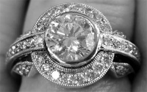
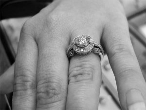
To test my theory that the unique ring styling may not be as great of a problem as perhaps a dislike for how the two tone has been done (or overdone, LOL), I've attached a B&W version of the photo. I would be curious if seeing it in what would appear to be all white metal might make it appear less busy:

GemView_BW_SETTING.jpg
 
And here''s a hand/profile view minus the two tone look:

GemView_BWSETTING.jpg
 
HI:

Yup, confirms my hypothesis about the yellow bezel......I prefer it white.....

cheers--Sharon
 
I like it much better in all one metal color. It''s still busy for me, though. I wear a size 5 3/4 and there''s no way I coud pull off that look and not feel like the ring would get in the way of my daily activities. It just looks so big. However, I am the simple type! Plus I wouldn''t want to worry about the pave.
I almost feel like if that setting were shrunk a little bit in size I would like it a lot better, if that makes any sense.
emsmilep.gif
 
The only thing that really matters is that YOU like it.
12.gif
My personal preference is that I like it better in one tone. But you want 2 tone with a gold shank, so that''s what you should have. You obviously really love the ring, otherwise you wouldn''t be defending it. To me that means it must be the right ring for you. At least you''ve actually seen it and tried it on and that''s something none of us can experience just by looking at pictures. Go for it.
11.gif
 
Date: 10/19/2007 6:36:48 PM
Author: diamondsrock
I like it much better in all one metal color. It''s still busy for me, though. I wear a size 5 3/4 and there''s no way I coud pull off that look and not feel like the ring would get in the way of my daily activities. It just looks so big. However, I am the simple type! Plus I wouldn''t want to worry about the pave.

I almost feel like if that setting were shrunk a little bit in size I would like it a lot better, if that makes any sense.
emsmilep.gif


My thoughts exactly. If the setting were just a bit smaller I don''t think I would hesitate. My current setting has a Tiffany style six-prong head and it seems to get in the way of daily activities. I can''t wear it with gloves; I have to worry about it catching lint if I reach into the pockets on my jeans; and before I got in the habit of taking it off I managed to snag sweaters, nylons, etc. On the up side, I suppose if I ever had to defend myself, I could put somebody''s eye out with my current setting, LOL. In any event, that''s a big reason why I''m in the process of searching for an upgrade setting — and preferably a bezel of some type. The problem with so many bezel settings, however, is that the designs tend to be very basic, and selections are limited. For example, I visited Robbins Brothers and most of the rings there, with the exception of some of the halo designs, are prong set in the center. I generally like halos, but I''ve noticed that if the halo sits flush with the center stone it can look a bit like a flying saucer. So that is one reason why the setting I started this post with appeals to me — because it raises the center stone above the halo just a bit while at the same time not rising too high off the finger. As it stands, however, my general impression from looking at Robbins Brothers and some of the large jewelry sites like Pearlmans is that designers seem to favor what I would consider to be very high profiles — which is exactly what I''m trying to get away from. By contrast, here are some photos of my favorite bezel-set tanzanite RHR, which really hugs the finger and is very comfortable to wear:

GemView_TANZANITE_BEZEL.jpg
 
Status
Not open for further replies. Please create a new topic or request for this thread to be opened.
GET 3 FREE HCA RESULTS JOIN THE FORUM. ASK FOR HELP
Top