shape
carat
color
clarity

My wedding invitation prototype... yay or nay?

Status
Not open for further replies. Please create a new topic or request for this thread to be opened.

merrymunky

Brilliant_Rock
Joined
Oct 17, 2008
Messages
1,069
So I have been gathering materials ready to make our wedding invitation cards. I have ALMOST everything I need. Hopefully tomorrow I will have the rest of the things I need so tonight I had a go at making a prototype card to see how it is going to look.

This is only a rough job so please excuse the creases and uneven lines and messy bow etc. Once I get down to business properly it will be done accurately.

The basic components are:

-White pearlescent card blanks
-Red satin ribbon
-Black organza ribbon with silver edging
-Red and black pearlescent card cut to measure (the following example is made using matt card though...waiting on the pearlescent to arrive tomorrow)
-Ready made "wedding invitation" tags
-Assorted red and clear stick on diamantes
-Red diamante hearts
-White card inserts to print the actual invitation details on. (obv not visible in pic)


Presenting to you...our wedding invitation prototype. What do you all think? Please bear in mind this is a fairly low key UK wedding, so we're not going over the top formal with the invitations etc.
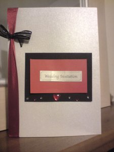
aweddinginviteprototype.JPG
 

merrymunky

Brilliant_Rock
Joined
Oct 17, 2008
Messages
1,069
The silence is kind of worrying!

LOL
 

Haven

Super_Ideal_Rock
Joined
Feb 15, 2007
Messages
13,166
Don't despair, merry!

I like the idea of the invites. The colors are very striking, I like them and I think they work well together.
My only criticism is that the bows and the diamantes make the invites look young to me. for some reason, I would go with one or the other, but not both.

*However, I'm really the less-is-more type, so I'm never much for embellishments, so I may not be the best person to give feedback.
 

meresal

Ideal_Rock
Joined
Nov 13, 2007
Messages
5,720
merry, I like the ribbon along the left, but I think the black is too much... and not really liking the cutesy embelishments. It makes it look more like a Valentine's Day card.

Can you take off the extras and see what it would look like, if it were a little more simple?
 

merrymunky

Brilliant_Rock
Joined
Oct 17, 2008
Messages
1,069
Yikes...ok, no wonder no one was commenting then!

Hmm, I certainly take on board what you both are saying. This is only a first attempt.

I used the red and black because that is the colour scheme for the wedding. My shoes are red and black, my flowers will be red...the decorations will be in red and black too. It''s a personal choice thing for my fiance and I. We both like the colour scheme.

Looks like I will have to have another go at the card making though.

Initially the black organza ribbon was supposed to layer up over the red one. The red is wider...but when I added it that way, it looked wrong. I was just trying something out with the bow, so I understand if you think that looks a little off.
 

PilsnPinkysMom

Brilliant_Rock
Joined
Oct 11, 2008
Messages
1,878
I see where you''re going, with the colors matching the wedding, but something isn''t quite cohesive about the look just yet.

For me, I think it may be the silvery/pearly card? If you had a red/burgundy card with black/red details I may like it more... Or the pearly card with just red details?

I''m also not digging the "wedding invitation" tag... I don''t know why... It''s not the tag itself, it''s the "wedding invitation" part. I don''t think I''ve seen a wedding invite in the US that expressly said "wedding invite" on the outside... maybe that''s why?? I think a really cute monogram or initial (you could get a stamp, perhaps? Or buy decals, but I stamp is more cost-effective) and stamp your FI''s last initial on it?

I hope I haven''t given too much constructive criticism... those were just my first thoughts when I thought about some things I''d switch around... You''ve got a good foundation to work with, though, and a fun color palate
1.gif


Keep us updated and show pics if you come up with different versions!
 

PilsnPinkysMom

Brilliant_Rock
Joined
Oct 11, 2008
Messages
1,878
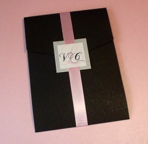
Oooooh have you thought about not doing a folded card and just one piece of cardstock instead? For a DIY invite gal, that saves a lot on resources... and personally... I like to simple look (though I may be biased... that''s how my invites are
3.gif
)

d85011563d3001ff62827484a330b778_t.jpeg
 

PilsnPinkysMom

Brilliant_Rock
Joined
Oct 11, 2008
Messages
1,878
Or... similar to the materials you''re using, just moved around differently..

d5d73afc0a884b8dd35cac8058dea521_m.jpeg
 

lliang_chi

Ideal_Rock
Joined
Mar 13, 2008
Messages
3,740
I really like the color scheme :) Red & Black looks very classic together.

As an alternative to PilsenPinky''s suggestion, can you put "You''re Invited" instead of Wedding invitation.

I think the embellishments on the black card draw the eyes away from the tag, so I''d maybe skip them or put them on the part of the card that has the invitation wording.
 

oobiecoo

Ideal_Rock
Joined
Sep 10, 2007
Messages
2,264
I didn''t want to be the first to say anything... but they do look a little more like a crafty v-day card than a professionally done wedding invite. Are you really wanting the "card" that opens up? I think one improvement would be to just make it one page so the invitation is on the outside or tucked into a little pocket or something. Its a good first try so just take what the ladies here have said and perfect it!
1.gif
 

merrymunky

Brilliant_Rock
Joined
Oct 17, 2008
Messages
1,069
Ouch!

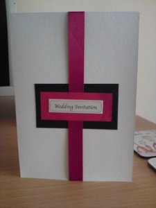
Ok, I made another version based on one of the ideas PilsnPinkysMom posted. I think it is much better.

ABCD0001.jpg
 

merrymunky

Brilliant_Rock
Joined
Oct 17, 2008
Messages
1,069
And to answer a few queries/give you all a little bit of insight into my chosen ideas:

-Yes I want to keep it as a card that opens up.

-While the "wedding invitation" tag on the front may not be common in the US, here in England it is often used. All the invites I have ever recieved have had it on the front.


-I would go all out and spend more to make more professional looking cards, or just have them made for me, but this is a low key wedding as it is. We are not spending a massive fortune on this so I don't see why the invites should cost a lot of money.

-The wedding is a simple registry office ceremony (albeit in a beauiful building and room) followed by a family meal and evening party for friends.

-I wantedto lt the invites have a very personal feel to them. Red and black are MY colours if you know what I mean. I think people will appreciate the personal taste of them.
 

Hudson_Hawk

Super_Ideal_Rock
Joined
Nov 2, 2006
Messages
10,541
merry-please don''t be offended or take these comments to heart. We''re a virtual board of strangers, but more importantly, you asked for opinions. You had to expect to receive both good and bad.

I understand your feelings about your wedding and what you want to convey through the invitation (low-key, all about you), however I think with a little concentration you could come up with a really nice invitation that reads low-key but elegant through it''s simplicity, versus through ribbons, bows, decals, and clashing colors/finishes. it''s just too much right now and it''s not reading "personal." It''s reading homemade valentine''s day card.

I think the second version is a good start.
 

violet3

Ideal_Rock
Premium
Joined
Dec 18, 2007
Messages
3,793
Date: 4/10/2009 1:03:57 PM
Author: merrymunky
Ouch!

Ok, I made another version based on one of the ideas PilsnPinkysMom posted. I think it is much better.
I really like this one - I like the clean lines of the ribbon and the center "wedding invitation placement" now. It''s very pretty and i love the silver background!
 

PilsnPinkysMom

Brilliant_Rock
Joined
Oct 11, 2008
Messages
1,878
Merry


7.gif
I really, really, really hope I didn''t offend you... There was nothing wrong with the first invite, there were just things that I, as a bride thinking of my own style, would play around with. No hard feelings, I hope! Even when we want advice, sometimes its not very pleasant to read/hear when we''ve put time/thought into a project and like it as-is.

Side note... Absolutely digging version #2.
31.gif
Something about that style makes me swoon. Very chic & clean & simple.

Then again, only go that route if YOUUUU love it. Your opinion is more important than anyone elses!
 

Clairitek

Ideal_Rock
Joined
Jul 21, 2008
Messages
4,881
I really love your second version! I wouldn''t change anything about it!

Thanks for explaining the whole "wedding invitation" thing. I thought it was strange too but chalked it up to a cultural difference. Makes a whole lot more sense now. I like how you used the pearly paper for the label.
 

merrymunky

Brilliant_Rock
Joined
Oct 17, 2008
Messages
1,069
Date: 4/10/2009 1:27:12 PM
Author: Hudson_Hawk
merry-please don't be offended or take these comments to heart. We're a virtual board of strangers, but more importantly, you asked for opinions. You had to expect to receive both good and bad.

I understand your feelings about your wedding and what you want to convey through the invitation (low-key, all about you), however I think with a little concentration you could come up with a really nice invitation that reads low-key but elegant through it's simplicity, versus through ribbons, bows, decals, and clashing colors/finishes. it's just too much right now and it's not reading 'personal.' It's reading homemade valentine's day card.

I think the second version is a good start.

I'm not offended. I was just a little disheartened to see that SO many people weren't keen. The whole point of me posting it was to get honest feedback. I was fully prepared for good and bad comments. I appreciate the honesty of everyone who replied. Having read and digested those comments I can TOTALLY see where people were coming from in their critiques.

I certainly don't want to be sending out invitations that read "young", "Valentine's Day", or anything that takes away from the value of the invitation.

However, I DO want people to see that they are homemade, but in a good way. I want them to see that thought and time has gone into producing something I am proud enough of to send out to my guests. I want them to recognise elements of my personality in them. Everyone who knows me knows that I am off beat with mainstream culture, from the music I listen to, to the way I dress etc. The same goes for my FI too...we both live outside of mainstream culture in that sense. It's that individuality I want to create in this invitation whilst keeping it elegant and suitable for a wedding invite.

I know black is a somewhat untraditional colour option for weddings (although it IS gaining more in popularity these days) but that's exactly why I still intend to include some black in there. The main colour WILL be red (apart from my dress of course) but the black will be in edging and accents etc throughout the accessories and decorations. That's why there is only one black detail in the second invite attempt.

Hopefully once the red and black pearlescent card arrives I can make an even better version. Of course it wont look coherent when the red and black in the prototype are matt paper and card used as a stand in just to see what the card may look like. I don't want a mess of different fabrics and materials. I have decided to leave the black organza ribbon out of the invite altogether as it DID clash with the satin look of the card.

It was only a first attempt so it was bound to require changes.
 

meresal

Ideal_Rock
Joined
Nov 13, 2007
Messages
5,720
Merry, that scond one looks great!! Is it something that YOU like, or is it something that you think WE will like?

These are your invitations, do what YOU want.
4.gif


ETA: I'm sorry, I had never seen "wedding invitation" on an invite, but I just found this website of homemade invitations from the UK. I like the first one with the present, it's whimsical, and you could replace the white ribbon with red? You could also use a block of paper with "Wedding Invitation" printed on it, instead of hand written, or just have it printed directly onto the card?
http://www.cheap-wedding-success.co.uk/homemade-wedding-invitations-ideas.html
 

merrymunky

Brilliant_Rock
Joined
Oct 17, 2008
Messages
1,069
Date: 4/10/2009 2:22:08 PM
Author: meresal

Merry, that scond one looks great!! Is it something that YOU like, or is it something that you think WE will like?

These are your invitations, do what YOU want.
4.gif


ETA: I''m sorry, I had never seen ''wedding invitation'' on an invite, but I just found this website of homemade invitations from the UK. I like the first one with the present, it''s whimsical, and you could replace the white ribbon with red? You could also use a block of paper with ''Wedding Invitation'' printed on it, instead of hand written, or just have it printed directly onto the card?
http://www.cheap-wedding-success.co.uk/homemade-wedding-invitations-ideas.html

I do like it meresal. It was a thought that popped through my head last night before I went to sleep. Seeing PilsnPinkysMom visually SHOW it in the thread this morning when I came to look at the thread confirmed that maybe I should try that kind of look.

I think once I have the actual red and black card it will look even better. The layers will be cut to size more accurately too. I have a personal paper trimmer so I can ensure it will be even and neat when I make the real thing.

I think I maybe got carried away with the sparkly bits etc. I am a sucker for "bling" I guess. But I do see how in this case, a less is more approach may be worth keeping in mind.

Oh, and I was only looking at the same website yesterday!! :)
 

EricaR

Ideal_Rock
Joined
Dec 3, 2007
Messages
2,392
Hey MM,

As someone who does a lot of paper crafting and card making I know it can take a while to get your layout *perfect*. I do have a few suggestions:

1. Even though this is just a prototype, try and get your layers perfectly even and square. It makes an amazing difference! Do you know anyone that quilts? The see-through rules that quilters use are GREAT for layering. If not, grab yourself a few regular rules and go to town.

2. You have a large space to fill up. What about doing the "Wedding Invitation" wording in a larger font and stacking the words on top of each other? If it is in more of a square shape, rather than the long, skinny rectangle it will take up more space and be more pleasing to the eye.

3. Some bling might be OK. What about a single sparkly heart right under the wording?

To get some layout ideas why don''t you check out Splitcoast Stampers. This link goes right to the card gallery. Most of the projects are for cards made with rubber stamps, but you can scroll through there and get some layout ideas. Do a search for "wedding invitation" and see what turns up.
 

AmberGretchen

Ideal_Rock
Joined
Jan 6, 2005
Messages
7,770
MM, I really like the second version better than the first.

One thought I had though - don''t your shoes have some cute lacy detail? I wonder if you could find a way to incorporate something black with a lacy texture - I feel like that would really make them look like what I remember your shoes/concept being, and really make them unique and "yours."
 

EricaR

Ideal_Rock
Joined
Dec 3, 2007
Messages
2,392
GREAT idea Amber. MM - I''m not sure if these are available where you live but maybe? Fiskars makes a line of great punches that make decorative edges. Fiskars Punches I really love the Threading Water punch and think it looks elegant.

Then you could leave your back layer (red, in your case) a bit longer and have it decorative. Check the DIY thread at the top of the forum and look for my post on the last page. I posted a link to some cards I made for my welcome baskets where I used a decorative edge punch to simulate water.
 

merrymunky

Brilliant_Rock
Joined
Oct 17, 2008
Messages
1,069
Date: 4/10/2009 2:46:31 PM
Author: EricaR
Hey MM,

As someone who does a lot of paper crafting and card making I know it can take a while to get your layout *perfect*. I do have a few suggestions:

1. Even though this is just a prototype, try and get your layers perfectly even and square. It makes an amazing difference! Do you know anyone that quilts? The see-through rules that quilters use are GREAT for layering. If not, grab yourself a few regular rules and go to town.

2. You have a large space to fill up. What about doing the ''Wedding Invitation'' wording in a larger font and stacking the words on top of each other? If it is in more of a square shape, rather than the long, skinny rectangle it will take up more space and be more pleasing to the eye.

3. Some bling might be OK. What about a single sparkly heart right under the wording?

To get some layout ideas why don''t you check out Splitcoast Stampers. This link goes right to the card gallery. Most of the projects are for cards made with rubber stamps, but you can scroll through there and get some layout ideas. Do a search for ''wedding invitation'' and see what turns up.

Thanks for the suggestions.

With respect to number 2 on your list...the tags used are ready made ones I bought online from a craft store. I might have a look around to see if I can find any bigger ones or maybe try what you suggested.

I will certainly take a peek at that link for ideas too.

Amber - You are indeed correct. The shoes are red satin, with black frill detail and bow. I was wondering earlier on about maybe making that black layer more "frilly" somehow. Not sure how, but there may be a way!
 

brandy_z28

Brilliant_Rock
Joined
May 23, 2008
Messages
1,934
I
30.gif
#2! Looks great! I''m partial to the red and black myself.
2.gif
For reference these are the invites we went with as I couldn''t come up with something I really loved either. I ended up having to use about 10 of my homemade version as we went over 40 invitees. I love what you have though in #2.
9.gif


77587L77587.jpg
 

mrscushion

Ideal_Rock
Joined
Nov 15, 2008
Messages
3,309
I really like version 2, merrymunky!
 

ash313

Brilliant_Rock
Joined
Jun 24, 2008
Messages
535
Hi MM! I like number 2 as well, and was thinking about your request to make the black layer "frilly" somehow (to go with your cool, vampy shoes!)

I found this lace tape online, is there a way you could incorporate it??

http://www.oboiler.com/tape/tape.html

I think it''s way cool! Was thinking about buying it to wrap around votive holders or something...
 

oobiecoo

Ideal_Rock
Joined
Sep 10, 2007
Messages
2,264
I think your second invitation looks very nice!
36.gif
 

Italiahaircolor

Ideal_Rock
Joined
Dec 16, 2007
Messages
5,184
I much prefer the 2nd option...but I''m not crazy about the "Wedding Invitation" tag...sorry
 

VRBeauty

Super_Ideal_Rock
Premium
Joined
Apr 2, 2006
Messages
11,210
I like your second sample a lot! I''d suggest you play around with proportions a bit -- a more of the red paper and a thin black border, perhaps, or a wider red ribbon. I also like the idea of incorporating black lace somehow if you can. I was thinking there must be a vellum with black lace paper print paper somewhere, but even if there were, it would probably be hard to find! Or a lace motif rubber stamp that you could use on the red paper?

Anyhow, I think you''re on the right track!
 
Status
Not open for further replies. Please create a new topic or request for this thread to be opened.
Be a part of the community Get 3 HCA Results
Top