shape
carat
color
clarity

My first gemstone...

Status
Not open for further replies. Please create a new topic or request for this thread to be opened.

enbcfsobe

Brilliant_Rock
Joined
Jan 17, 2007
Messages
1,154
I''m so glad I had the mint tourmaline I orderd from Daniel Stairs delivered to my office -- I needed some serious incentive to drag myself to work on a Sunday. Ugh.
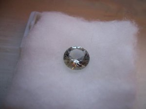
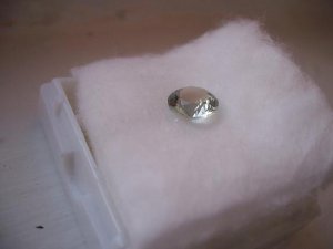
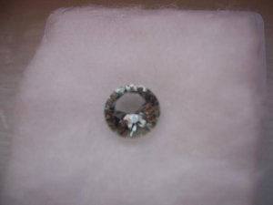
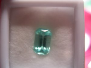
But back to the important part -- this is my very first loose gemstone purchase, and I am so psyched! I didn''t want to play with it too much in the office (my desk is a mess and I don''t have tweezers), but from what I''ve seen so far it is amazing!! It is much sparklier than I expected. It has just the slightest hint of minty blue-green color -- very pale, but very evenly distributed. It gives back lots of lovely flashes of light (at least under the flourescents). I really didn''t expect it to be anywhere near this sparkly! I''m so excited to take it home and play with it some more under different lights. I will get some pictures up as soon as I can!
For now, though, its back to work.
8.gif
 
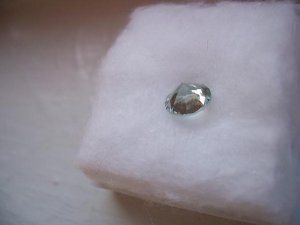
PICTURES...

jlgminttourm.JPG
 
more...

jlgminttourm2.JPG
 
still more... can you see the skyline reflection in the top here? that was unintentional but came out cool...

jlgminttourm3.JPG
 
...

jlgminttourm4.JPG
 
...

jlgminttourm5.JPG
 
Very nice encbfsobe! (Is that an acronym???) I can''t wait to see more pics
2.gif
.
 
...

jlgminttourm6.JPG
 
thanks, love in bloom. it is an acronym
 
I haven''t got much to compare this to, but I like it so far!
 
All right! It''s fun to buy gemstones, huh? Your tourmaline looks pretty.
 
It is fun. Its much less nerve wracking playing with this ''pet rock'' than with my e-ring stone, which I''m constantly worried about. The tourmaline is much more pale than I expected, but I think that''s a good place for me to start, and I can work my way into brighter, richer colors. It is quite fun to play with -- it shows much more color in low lighting. In brighter lights it is paler, with a bluer or greener look depending on the kind of light. In bright sunlight it has what appears to me to be a bit of ''fire'', throwing off bright flashes, especially around the edges. I think I need to play with it next to both white and yellow gold before making a final call on the setting.
 
Welcome to the world of gemstone collecting, and serious addiction!! Why couldn''t I be addicted to other hobbies such as old newspaper clippings???

Nice tourmaline, enjoy your first born, it''s not likely to be your last!!
 
It is an addiction... But much less messy than newspaper clippings. And you really can''t wear newspaper clippings in public (not that I''ve tried).

Do you think this has enough color to it? It is definitely a bit paler than I expected. While it is obviously blue-green next to my diamond, from head-on it doesn''t have all that much color. I''m not sure if that''s good or bad...
 
From the pictures, it doesn''t look blue, but it''s sometimes hard to tell from a photograph. It looks like a light yellowish green. It also looks light in saturation.
 
It is definitely light in saturation (assuming that means it is a pale color). Is that bad or does it depend on what kind of look you're going for? The yellow-green I think is just your computer -- the pics as the showed on my camera and computer are definitely more blue even than green (partly reflecting the blue sky, though).
 
I think with any colored gemstone, saturation should never be too light, nor should it be too dark. If it''s too light, you don''t have the color you want, but if you set it in a bezel, or yellow gold, it might help bring out some more color. However, if it''s too dark, it could "black out" which is what happens with overly saturated gems. I just got a mint tourmaline and I think it''s kind of light in saturation, so I''m thinking about setting it in yellow gold. Here''s a picture. The color is nice, but the saturation is a bit too light. With tourmaline, I think medium saturation is ideal since this is a gemstone species that tends to black out when it''s overly saturated as some indicolites (blue tourmaline) do.

minttourmaline103483974.jpg
 
wow, twodoor2, that''s a lot darker than mine. after seeing it in person, i was re-thinking the idea of white gold. it seems like yellow gold might work better. this is definitely pretty, just a lot different from the other tourmalines i have seen. not sure what to make of it.
 
td2, is that one a paraiba? would that make a difference in how saturated it appears?
 
It has copper in it, but I don''t call it a paraiba because I think paraibas should have more saturation of color. Therefore it''s mint green to me (just my personal preference). It is light in saturation, but not so light that it''s white like some light colored aquas. I forgot to mention that stones also look more saturated when they''re larger in size. I''m not sure how large your tourmaline is, but if it were 5 times the size, it would probably look a bit more saturated.

As for your question about paraibas, I think like any tourmaline, too light is too light, and too dark is not good either. Paraibas tend to be their best, IMO, in a medium saturation, like most tourmaline.

Whenever I purchase any gemstone, I always ask about the saturation, the color (if I want more of a certain color, I ask how much blue is in it, for example), and the clarity. Cutting is something you can gage from a picture much more than color and saturation, espeically if you have a picture of the gemstone at all angles and it''s measurements. I also ask about zoning (bands of areas in the stone with less saturation) if I''m purchasing a gemstone prone to zoning like amethyst or sapphire.

I think in your case, from what you''re telling me, yellow gold would be a good idea.
 
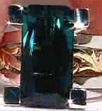
Here''s an example of an indicolite tourmaline, like so many, that are too saturated. There are tons of lights shining on this stone, but it still looks black, yuck!! I rather have something pale, at least you can see the sparkle!!

uglybluetourmaline.JPG
 
Date: 6/24/2007 11:04:04 PM
Author: twodoor2
It has copper in it, but I don''t call it a paraiba because I think paraibas should have more saturation of color. Therefore it''s mint green to me (just my personal preference). It is light in saturation, but not so light that it''s white like some light colored aquas. I forgot to mention that stones also look more saturated when they''re larger in size. I''m not sure how large your tourmaline is, but if it were 5 times the size, it would probably look a bit more saturated.

As for your question about paraibas, I think like any tourmaline, too light is too light, and too dark is not good either. Paraibas tend to be their best, IMO, in a medium saturation, like most tourmaline.

Whenever I purchase any gemstone, I always ask about the saturation, the color (if I want more of a certain color, I ask how much blue is in it, for example), and the clarity. Cutting is something you can gage from a picture much more than color and saturation, espeically if you have a picture of the gemstone at all angles and it''s measurements. I also ask about zoning (bands of areas in the stone with less saturation) if I''m purchasing a gemstone prone to zoning like amethyst or sapphire.

I think in your case, from what you''re telling me, yellow gold would be a good idea.
I think this one is pretty close to that description. It''s not actually white, but it sometimes looks more white than blue or green. To give an idea of size, this is about 7 mm in diameter.
 
It does sparkle a lot, which is good. I was afraid of both it being to colorful (and me therefore not wearing it too often) and being to "flat" compared to a diamond in terms of sparkliness.
ETA: That dark one is way too dark. I'm not a fan either.
 
Well I think in your case, you seem to be very happy with the gemstone, and that''s the most important thing. I always say, "does the gem speak to you?" And if it does, then it''s meant to be. I hope you enjoy it for many years to come. Just be careful with it if you decide to set it in a ring. Tourmalines are prone to chipping, even though they are durable, they''re kind of brittle. Congratulations on your first purchase
36.gif
, and as I said before, I''m sure it won''t be your last.
22.gif
 
Thanks, td2 -- I am still learning!! I really appreciate your insights. I think this stone is good for a first project for me. It will be a pendant, so I''m hoping that will be less of a chipping issue. I guess the bezel option would also offer more protection. Thanks again!
 
You''re welcome, and thank YOU, I love talking about gemstones!!
 
Very nice looking stone; Dan is a skilled cutter. It does look very light though - I would say it is more of a personal preference whether you prefer dark, medium or lighter stones. I know the trade likes medium or medium dark stuff though, so if you like lighter coloured stones, then you''ll pay much less for what you will enjoy!
 
Congratulations on your first!! It looks very sparkly.
 
thanks for supporting the beginning of a new habit...

any thoughts on settings? i''m rethinking this a bit now that i see just how lightly colored the stone is. here is what i initially picked:

jlgvertpend.JPG


but there seems to be suggestions that a bezel might bring out more color. at the same time, i don''t want it to lose its sparkliness by being covered up around the edges. there seems to be a split on whether white or yellow gold will help bring out the color (based on discussions in another thread).

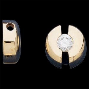
here are some other settings (other than a plain bezel) that looked interesting...
 
maybe too chunky?

stuller slide.JPG
 
Status
Not open for further replies. Please create a new topic or request for this thread to be opened.
GET 3 FREE HCA RESULTS JOIN THE FORUM. ASK FOR HELP

Featured Topics

Top