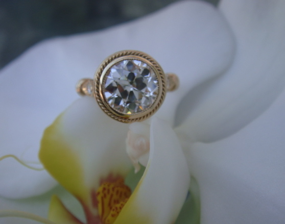
Here's a bad photoshop mock up. Though I think I'd want 14k rose gold instead of yellow.
I'm also on the fence about the rope accent. I think I would like it if it didn't look so chunky and thick. It's kind of reminding me of a cruller, lol. Maybe it looks more delicate in person? Or maybe I should just make it a plain accent ring like in the photoshop?
Wow, that is a gorgeous stone - such a pretty color! I don''t know what color gold would mask the grey the best. It will look great in that setting though. Doesn''t seem like bezeling will hurt that it because it seems so bright.
I agree that two-tone is the way to go. Plain white would probably do a poor job of masking the grey, and while the other two metals might be better in that regard, using either of them alone could alter the stone''s color in a way you might not like. So white with yellow or rose is the best in my opinion. Bezeling probably won''t darken it too much cause it''s precision cut.
I''m no help with the setting, but the stone is a beauty!
Would you do white gold with a tiny yellow gold rope accent on the bezel? The color of Sally''s YG is really rich, but maybe consider 18k yg for the accents?
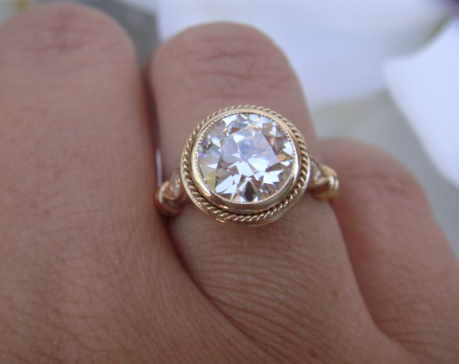
Your spinel is gorgeous! I love the thinner rope accent on that ring. I think you might be right with the rose gold although yellow wouldn''t be a bad choice either. I don''t think I''d go all white gold.
I don''t have any pics off hand, but I''ve seen rose/white together in settings and I LOVE it. One place I can think of has funky ring settings..gooohhhh..the name escapes me. Oh, and Claude Thibaudeau
I really love the look of your spinel, such a nice blue. And freefly''s ring is gorgeous.
I may be tempted to prong this one though as they can tend toward darkness these spinel, no?
Actually, that was something I''ve been meaning to ask you - you may recall I''m having JKT make me a 5 stone bracelet. I''ve purchased all 5 but am unsure about one.
These spinels from BB could fit the bill, however the last time I ordered a blue from him it ended up just way too dark for my needs.
Is yours just like your photos IRL?
I would love to hear your impression of it in different lighting etc?
The color can change and shift pretty wildly. Even in the above photos you can see it in light blue moods to darker medium blues. And it color shifts to periwinkle to violet purple.
With the colour shifting all the time, I’m inclined to suggest going with a 2 stone (some yellow gold to mask any gray it might show sometimes) and also prong set. I like the thin rope bezel but I worry that since it sometimes becomes a little darker, it might become too dark for you (but I know you aren’t as fussed about dark stones) and might highlight the gray contrast too much? Have you tried cupping the stone to see how it simulates an enclosed setting?
I would go with Chrono''s advise - and if you find a good prong setting, can you please post it here? I am still struggling with setting for my CC garnet, can''t find exactly what I want.
I would set it with prongs instead of a bezel because I really love the color and wouldn''t want to darken it. I really like Sally''s freefly with the thinner halo.
Status
Not open for further replies. Please create a new topic or request for this thread to be opened.

300x240.png)