shape
carat
color
clarity

Mark Morrell CAD images: Take two

Status
Not open for further replies. Please create a new topic or request for this thread to be opened.

Kerbear560

Shiny_Rock
Joined
May 29, 2004
Messages
439
Thanks for all of your input everyone! I emailed Mark last night around 8pm with my concerns (he gave me exactly what I asked for, but after seeing it I wasn''t so sure). I asked if we could do anything different to make the design look more balanced in relation to the center stone. I checked my mail before I left for work this morning at 7am, and he had already sent me updated CAD images (at around midnight)! He has been great to work with so far!
9.gif


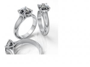
Here is the version without the side stones:
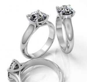
Markcad1.JPG
 
Farther away for perspective:

Markcad2.JPG
 
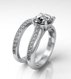
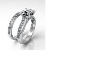
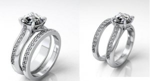
With side stones:

Markcad3.JPG
 
...and again, farther away for perspective:
 
Kearbear, I love those. I think they look incredible and much better...

I still vote for the plain shank
2.gif
 
What do you all think?
 
Oops...here''s the one with side stones from farther away!

Markcad4.JPG
 
The version without stones looks much better, could even be a bit thinner. But definetly is more in proportion to the stone. I also like the one with stones. So I guess I''m no help at all. Which one do you like??
 
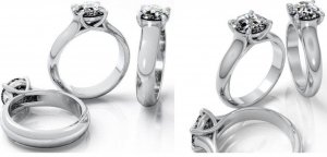
Here are some pictures I put together for easy comparison. Here is the version without side stones. The initial version is on the left, updated version is on the right:

cad1vscad2.JPG
 
And here is the version with side stones. Once again, the initial version is on the left and the updated version is on the right:

cad1cad2.JPG
 
I''m really loving the updated versions of both rings! They look much more balanced to me! The only problem is I''m having sooo much trouble deciding between the version with side stones and the one without!
 
Much better!!
36.gif


And I won''t be of much help, because I like them both!
2.gif
3.gif
 
I like the ones without the sidestones much better.
 
Honestly to me it just looks like the pictures have been scaled down. The width of the band seems consistent.
 
it looks much better!! both versions look great. one comment is that why are there no head on straight down shots aka the way you look at it on your hand? to me that is the most important shot especially in terms of how the diamond looks size wise to band etc. can you get shots of that from him?
 
Date: 11/13/2005 12:19:58 AM
Author: Mara
it looks much better!! both versions look great. one comment is that why are there no head on straight down shots aka the way you look at it on your hand? to me that is the most important shot especially in terms of how the diamond looks size wise to band etc. can you get shots of that from him?

I wondered the same thing Mara! I''m going to ask him if he can do a CAD showing both versions straight down. I think that would definitely help me in my decision making process!
 
I think having a straight down shot will be the money shot. I would love to see that as right now I''m 50/50.
 
Glad things are going as planned with your MM project! Both images look great to me. Which do you prefer?
 
Hi I am new to this thread...I am staring at all of these, and can''t decipher where and what was done in the change. I would love to know to help train my eye to recognize proper scale. Won''t someone explain it please?

I do love them all. Th
 
I vote plain, still. I love the plain.
 
Date: 11/13/2005 1:00:46 AM
Author: door knob solitaire
Hi I am new to this thread...I am staring at all of these, and can''t decipher where and what was done in the change. I would love to know to help train my eye to recognize proper scale. Won''t someone explain it please?

I do love them all. Th
Here is the email that Mark wrote me explaining the updated CAD images (hopefully this will help
1.gif
):


After I did the layouts for your ring according to your notes, I sensed that a slightly less wide ring shank with a taper toward the back of the ring would look better than what I was seeing. I made mention of this on the web page that I put together for you.

I''ve taken some time this evening to change the ring shank to what I believe is a more appealing look. I''ve made some images of tonight''s changes and have also made smaller versions of the new images to give a better sense of over all scale. Sometimes my big images can be a bit overwhelming.

Do the attached revisions of your ring look to be more appropriate?

Best

Mark Morrell
 
The new finer bands looks beautiful. I think the top down shot will be the clincher. Do you think the side diamonds version, still looks a bit stripey?
Anika
 
I too vote for the plain shank. His polish work is always so wonderful - those diamonds in the shank take away that look - just my opinion!
 
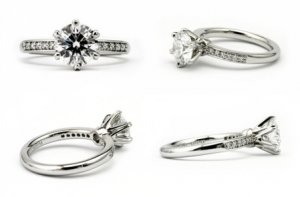
Here''s a pic off Mark''s WEbsite that is of a ring very similar to kearbears with the sidestones...maybe that will help see what the final ring will look like..


p.s. i still vote plain shank
2.gif
3.gif


mmsidestripe...jpg
 
Author: mrssalvo
Kearbear, I love those. I think they look incredible and much better...

I still vote for the plain shank
2.gif
What she said!

I too much prefer the plain shank. I think the side "stripe" detracts from the lovely liquid flow of the ring..

widget
 
I also vote for plain.
 
Plain vote for me too!
 
I love both styles...hard to choose a favorite!
 
Definitely the plain shank. I think the new version is definitely better proportioned too...
 
Voting for plain shank this time around! It''s much more in proportion, though even a bit thinner would be nice too.
 
Status
Not open for further replies. Please create a new topic or request for this thread to be opened.
GET 3 FREE HCA RESULTS JOIN THE FORUM. ASK FOR HELP
Top