shape
carat
color
clarity

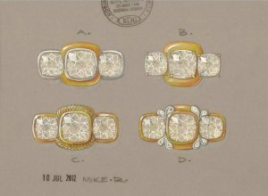
Initial sketches from Mike for three stone AVC

packrat

Super_Ideal_Rock
Joined
Dec 12, 2008
Messages
10,614
Got these from Mike (http://www.rdgnz.com/) tonight! Just starting the process so just the top down view, haven't done anything w/the shank yet. These are ideas on making the center look bigger w/out having to buy a bigger one.

My eyes were drawn to A. However, I would tweak it a tish..bezel the remaining sides on the end stones and have the yg second bezel on the center be smaller. I'm looking for something similar to Coati's ring, only in either white or unplated, with yg accents so I have two options of band colors to wear w/it.

Thoughts/opinions? I don't want to force anything just to get it done, but I don't want to have 47 different ideas/directions to go in my head either. He also does amazing prongs, yet I will be working w/kids and think bezels would be the smarter move.

Someone posted recently a pic of a cushion solitaire w/a super thin bezel-I could see something like that also, around the three stones w/a second thin bezel in yg around the center. ETA [URL='https://www.pricescope.com/community/threads/2-7c-cushion-in-rose-gold-milgrain-bezel-setting-from-erd.176615/']https://www.pricescope.com/community/threads/2-7c-cushion-in-rose-gold-milgrain-bezel-setting-from-erd.176615/[/URL]

It's about 3 hours past my bedtime now and I've got to get up early but I'll be back on tomorrow if you guys want to shoot some ideas at me!
_168.jpg
 
I like D the best. C is my second choice.
 
I agree with Andelain - D is my favorite, followed by C. I don't really like A or B.

Mike's sketches always look so nice.
 
I love rope/cable designs, so I like that about C. I wouldn't want all yellow gold, though. And I am not sure I like any of the side stones. I think my hesitation on all of them is that they are pretty contemporary styles and you have antique style stones and that is a little hard for me to put together.
 
I love D, it's gorgeous!
 
Hm...I don't quite love any of them. Not imaginative enough to tell you why though. :sick:

Maybe too much going on. D is visually interesting to me but I may tire of it. Are you looking for something timeless or a bit different?
 
I'll be the outlier, A gets my vote! I shall call it "modern elegance". However, I think it would look better with yellow gold for the side-stones.
 
I like A best, followed by C and then D. Not keen on B.
 
I love A and think it is the nearest to your inspiration ring, Coati's (which I also adore :love: )

However, I also love D having seen Zahra's stunner. Not sure that it ties in with your inspiration ring,though.

B and C do nothing for me.

I look forward to seeing your final pick!!!! :love: :love: :love:

:wavey:
 
I LOVE D! Gorgeous!
 
I love A! It's similar to your inspiration piece (coati's ring) and just from reading your posts and getting to *know* you here on PS, that version just seems to suit you somehow - it just seems to be "you"!
 
I think A has a lot of potential. If it were me, (and because they are vintage style stones) I would try a milgrain edge around all three stones, but only on the white gold portion. So leave the YG plain, but milgrain the WG edge inside of it and the two side stones. That keeps a clean look, but adds a little "antiquey" feel.

Good luck! Let us know what you decide!
 
I like A because it has the two tones making it so easy to pair with other stuff. It is simple and classic.

D if you like a bit of a twist to it - not sure if I'd like the little scrolly things for the long haul though.
 
Although, I personally love D, I think it makes the center stone look smaller than the other designs and it is nothing like the inspiration ring.If I was having Mike design my ring I would want something a little more unusual like D as it is his creative talent that he is known for. But with that said Ring A is closest to your inspiration ring and if that is the look you want than that is the direction you should stay with.
 
Beautiful! You can't go wrong with any of these but if it were me I'd pick C. I love the rope detail and I think it achieves your goal of enhancing the center stone the most. I'd fully bezel the side stones as you mentioned and probably add a super delicate milgrain to the bezels (not the twist rope one obviously!). What a fun project!
 
pinkjewel|1341918405|3231515 said:
Although, I personally love D, I think it makes the center stone look smaller than the other designs and it is nothing like the inspiration ring.If I was having Mike design my ring I would want something a little more unusual like D as it is his creative talent that he is known for. But with that said Ring A is closest to your inspiration ring and if that is the look you want than that is the direction you should stay with.

This.
 
I like A. the best
 
I love them all!!! Hard to choose... but I'm leaning towards D but perhaps switch up the centre stone slightly - keep the inner gold bezel in YG and have the outer 'plate' bezel in WG to match the swirls - I think that would give the centre more "POP" if you are looking to make it seem larger.

Gorgeous ideas!! MikeR is amazing in his creativity!!! I hope he puts out a coffee table book of his drawings - I'd buy one! :appl:
 
I love D, and A is a close second. B is just okay and I don't care for C at all. A seems like it is the closest to your inspiration ring but I feel like if you are going with Mike, you need to add some sort of that beautiful creative flare that he does so perfectly. Otherwise, if you're going with A, why not pay less and go with a vendor like ERD...
 
Dougsgirl|1341902693|3231479 said:
I think A has a lot of potential. If it were me, (and because they are vintage style stones) I would try a milgrain edge around all three stones, but only on the white gold portion. So leave the YG plain, but milgrain the WG edge inside of it and the two side stones. That keeps a clean look, but adds a little "antiquey" feel.

Good luck! Let us know what you decide!

Yes, I could go with this...milgrain all three on the white metal bezels.
 
Oh, I think all four are lovely! If you are leaning toward A, I think that's the one you should have Mike tweak a bit more. Some ideas: have the side stones in full white gold bezels (right now, it looks like the girdles touch the white gold bezel of the center stone), add some milgrain to the inner bezel on the center stone (and/or the sides?), or possibly add the roping design from C. to the side stones. These do look contemporary, as one poster said, but I like the mix of antique-style stones and contemporary bezels, plus we haven't seen a side view and that might add a different feel to the whole thing. :naughty:
 
diamondseeker2006|1341927275|3231558 said:
Dougsgirl|1341902693|3231479 said:
I think A has a lot of potential. If it were me, (and because they are vintage style stones) I would try a milgrain edge around all three stones, but only on the white gold portion. So leave the YG plain, but milgrain the WG edge inside of it and the two side stones. That keeps a clean look, but adds a little "antiquey" feel.

Good luck! Let us know what you decide!

Yes, I could go with this...milgrain all three on the white metal bezels.

Love this idea.
 
I like A the best if you tweak it in the way that you suggest, Packrat.
 
I reaaly like D...its got personality! I also like C but I would put the side stones in white gold to mix it up some.
 
D then C
 
Yay for help! Thanks guys! :appl: :wavey:

Was going to get on here earlier but we installed an outside water meter and have been trying to figure out how to set up the sprinklers effectively. We're about 2 months behind on rain so the yard doesn't look as good as it should and I can't get yard pictures and brag until it looks nice!

I like the idea of having vintage looking stones in a more modern setting w/little touches of vintage. I do want milgrain. The gallery/profile view hasn't been determined or talked about yet, we're just starting w/the top down view.

Don't go so much for rope, so that rules C out. I dig Mike's prongs, but working w/kids I think bezels would be best, so rule out B. I like D, it looks like paisleys..but I think it's too much for me in the top down view. I am such a plain girl. Plain but different, that's me. I would do something fun like petal-paisleys or leaves or swoops in the gallery. It will have the pinched Euroshank, and thinking to put pinches on top where the shank meets the side stones. That stuff will all be coming next.

That leaves A. Like the idea of milgrain on the white bezels. Finish the bezels on the interior sides there of the side stones. Smaller yg bezel w/no milgrain. After seeing the sketches, I just want a little bit of yellow on the ring I think, or even just all white/unplated instead. I'd wanted originally to go full yellow like Coati's but I think that would be too much for me now. Seems like having the temp prong setting in all yellow gold satisfied my want of it.

I do want to utilize Mike's creativity, for sure. I just need to have Packrat-sized creativity..Z's ring is amazing, and it would be killer to wear it for a day and cheese out..but I'm more of a wallflower.
 
My eye keeps going to A too! Something else I notice about that design is that it's the one where my eye is most drawn to the center stone (and the one where the center looks the largest, too). I'm thinking that the unfinished side bezels is what does that - I would consider that design feature a little more before opting to finish them off. If you do, there's a chance that area will be much bolder and *that* will draw your eye (where the double bezels meet) instead of the center stone.
 
I'm not super in love with any design just as they are, but maybe you could merge A and B to get the bezels you like, and the prongs that you also commented on... I'm envisioning swapping the bezels on the side stones for prongs, and keeping the WG/YG bezel on the center stone. That would enhance the size of the center, keep the ring fairly practical, and maybe you could incorporate Mike's artistic flair on the gallery?

ETA: you could milgrain the WG inner bezel on the center too, and then you get everything you want without it being too busy.
 
If I were doing this project, I'd want to utilize his creativity too - however I'm also fairly conservative when it comes to jewelry. Therefore I'd probably do a more conservative top down view and let him have a lot of fun in the gallery.
 
A gets my vote! My eye is drawn to the clean lines and the bezel adds some nice coverage.
 
GET 3 FREE HCA RESULTS JOIN THE FORUM. ASK FOR HELP
Top