shape
carat
color
clarity

How do you think a round would look instead of Marquise

Status
Not open for further replies. Please create a new topic or request for this thread to be opened.

woobug02

Ideal_Rock
Joined
Nov 12, 2004
Messages
2,153
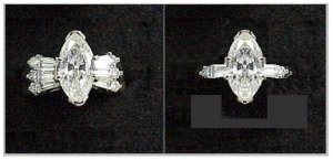
I love my marquise but am looking upgrading to a better stone. How do you think a 1.5 round would look in this setting or do you think I should stick with a marquise???

thanks

MVC-set23S.JPG
 
Well, it depends on the diameter of the round. Your marquise stone looks balanced in that setting because the center portion is bigger than the "flare" of the bagettes to each side.

If you get a smaller center stone - smaller than that flare.. I''m not sure how that''ll look - but I"m sure someone can photoshop you a picture really quick.

If you get one at the same width of the flares.. I think it would look quite nice.

Have you measured - or do you know the meaurements of the widest part of your ring?
 
Ok this is terrible.. but an attempt to show ...

badpicture001.JPG
 
Another bad attempt

badpicture002.JPG
 
And last bad attempt

badpicture003.JPG
 
WOW. That is so neat!!!! I am thrilled you showed me this... I think I like the marquise better :)
 
Well the bigger stone looks really nice......
 
Do you intend to keep this setting ? then... not sure what to say. Assuming it could be a new one but with just one set of baguettes and small rounds on the edge - than the round would be at home, IMO.
 
I agree with valeria. Depending on how big you can reasonably go with the center.. (I think bigger makes it look more balanced..) You may want to consider using your stones in a different configuration.

Like baguette smallround BIG ROUND smallround baguette - o O o -

Or side by side bagette, side by side small round.. BIG ROUND... etcc =8 O 8 =

Your wedding band is plan and classic and would go with either...
 
This is what I was trying to describe in the previous post. The relative siye of the round diamont took into account that it wil be 1.5 cts and that the tcw. of the five stone ring is also 1.5cts (30 pts or so each).

eSch.JPG
 
''Guess I got slightly carries away...
2.gif


eSchii.JPG
 
OOh very nice. I like both #3''s...

I really should be working...
2.gif
 
~~My favorite is the third ring in the first collage that valeria did. To me, the round looks most balanced in that setting.
 
OH MY, I love the #3....WOWOWOW!! Now my mind is running wild.
 
Could you put the marquise on #3 so I could see how it would look...PLEASE
 
How about an oval?
 
methinks that a regular round would be lost in the existing setting because those side bags are so overpowering to a round, you''d need something like a 5c round to work with the setting as is. with the marquis it looks size appropriate. but with a round, removing some of the bags makes sense. or i really like the one that val posted that had rounds shared prongs like your w-ring. really pretty.
 
Ooooo!
First set of Ana's photoshop magic, far right. Very pretty!
Small Round Baguette 1.5 Round Baguette Small Round.
Love that, it's very Deco!

Scintillating...
 
I have to agree too - unless you had a really large round stone it wouldn''t look as good as it does with the marquis. . . but I really like both #3''s - one uses one of the baguettes you currently have and one uses rounds which means a whole new setting - guess it depends on how much change you are willing to go for! Let us know what you decide. . .

And Laney, LOVE your new avatar!
 
I like the marquise with that set. It looks like it was designed for a marquise center stone. BTW, that is a beautiful marquise in there now!
 
Thank you for all of the input :) I think I will stick with a marquise since I can''t afford a 5ct. round :)
 
Date: 8/31/2005 12:01:56 PM
Author: woobug02
Could you put the marquise on #3 so I could see how it would look...PLEASE
I''ve seen this too late... but...

here it is. And I went on to assume the marquise is actually symmetrical in person and the original picture was slanted somehow making it look worse.

altavia.JPG
 
Thank you so much.... :)
 
Woobug - what were you thoughts on this last Ana Photoshop?

Scintillating...
 
Date: 9/8/2005 12:51:36 AM
Author: Scintillating
Woobug - what were you thoughts on this last Ana Photoshop?

Scintillating...

I know I give it a thumbs up!

I also LOVE the 1st #3 pic as well!
 
Date: 8/31/2005 11:41:49 AM
Author: bling*diva*
~~My favorite is the third ring in the first collage that valeria did. To me, the round looks most balanced in that setting.


that''s my vote too. looks well proportioned and most dynamic.
 
I really like the last one. It is not so busy!!!!
 
Status
Not open for further replies. Please create a new topic or request for this thread to be opened.
GET 3 FREE HCA RESULTS JOIN THE FORUM. ASK FOR HELP
Top