shape
carat
color
clarity

High contrast in ideal cut diamonds and effect on appearance?

Lula

Ideal_Rock
Joined
Apr 5, 2009
Messages
4,624
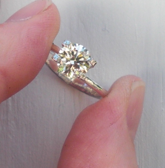
Disclaimer: I do not know the answer to the question(s) I'm about to pose. What I'm hoping for is a (civilized) discussion about something I've noted in the short time I've owned super-ideal cut diamonds.

Recently on PS, I've noticed several threads where an OP posts photos of a recently received/purchased AGS 0 or GIA triple Ex diamond and asks about it looking "dark" or tinted. Typically the stone is has a color grade in the near colorless range. Typically the stone is set, sometimes in a solitaire setting, but more often the question comes up when comparing the center stone to the melee in the setting.

Photos are posted. Suggestions are given. Sometimes the OP keeps the diamond; sometimes the OP decides the diamond is too low on the color scale and the diamond is returned in favor of a diamond with a higher color grade.

Something I've wondered about since coming to PS is if what the OPs in these threads are seeing is the additional contrast that well-cut stones show. Often contrast is depicted as analogous to a black and white checkerboard (e.g., see the information from the Knowledge section on PS on brilliance, fire and scintillation link).

I'm asking because when comparing my diamond (AGS 0) I color, to the majority of diamonds I see on a daily basis, whether in stores or on people's fingers, I notice that diamonds of "average" cut do not show this intense on-off contrast that my diamond does. And I wonder, if a person is used to seeing stones that are cut for size, not performance, would a well-cut stone appear "darker" because of the additional contrast?

Reading this over, I'm not sure if I'm clear, but here goes...
 

TakingthePlunge

Rough_Rock
Joined
May 14, 2010
Messages
94
Diamonds basically just reflect the light from their surroundings. If the particular facet is aimed towards a dark spot then it will be dark, if its pointed towards a light source it will be lit up. Most often when you see contrast (the classic being arrows) they are reflecting back yourself while the area around them is reflecting the light behind you. Well cut diamonds make use of the lighting angles better than lesser cut diamonds so it stands to reason that they will have better contrast.

I found this post rather difficult to explain in text without going off on tangents about ASETs and the like so someone please correct me if im wrong.
 

oldminer

Ideal_Rock
Trade
Joined
Sep 3, 2000
Messages
6,691
I think that many people would mistake the darkness of distinct "contrast" for a dark "tint" instead of contrast. You might be seeing such an effect or someone else might. Getting clearly understood definitions of these terms is illusive and often disputes arise when the discussion gets sidetracked or reduced to other agendas. Maybe someone else might have some opinion to offer which keeps to the topic.
 

Hest88

Ideal_Rock
Joined
Jan 22, 2003
Messages
4,357
SaraPJ, it''s possible, but not without talking to the diamond owner in person I think. There''s certainly a huge difference between a dark area of contrast and a warmish yellowish tint that someone might see. Mostly, when these threads up come up, I get the impression they *are* more about yellow than, like, the dark gray of a mirror''s beveled edge. However, you''re right that in some cases if we aren''t able to probe very deeply, the real issue may not be color.
 

Lula

Ideal_Rock
Joined
Apr 5, 2009
Messages
4,624
Date: 6/10/2010 11:22:06 AM
Author: Hest88
SaraPJ, it''s possible, but not without talking to the diamond owner in person I think. There''s certainly a huge difference between a dark area of contrast and a warmish yellowish tint that someone might see. Mostly, when these threads up come up, I get the impression they *are* more about yellow than, like, the dark gray of a mirror''s beveled edge. However, you''re right that in some cases if we aren''t able to probe very deeply, the real issue may not be color.

Thanks for the replies, everyone. Yes, Hest88, this is exactly what I''m talking about -- color/tint due to the body color of the diamond versus colored areas of the stone due to contrast (seen in well-cut diamonds -- forget about "ideal" or "super-ideal" labels for the moment, thanks oldminer, for your reference to the problem with universal terms for these phenomena). I believe that the additional contrast seen in well-cut diamonds can easily be mistaken for overall body color, especially when the nature of the contrast changes depending on angle, light source, light type, light strength, etc.

Here are some photos to illustrate what I see in a well-cut stone I used to own, my beloved 1.0 carat M color diamond. Note -- I bought the stone for its tint, so don''t worry about offending me if you say you see yellow in it!


The diamond is in a ring holder (not a real setting) in the three photos:

First photo is a bit blurry, but that''s okay because it demonstrates what I see as "tint" to the stone, i.e., overall body color, with some darker areas of contrast mixed in:

tintA1a.jpg
 

Lula

Ideal_Rock
Joined
Apr 5, 2009
Messages
4,624
The second photo is of the same stone against a white wall. I still see the body color of the diamond, but I also see more "contrast" in this photo:

tintpluscontrast.jpg
 

Lula

Ideal_Rock
Joined
Apr 5, 2009
Messages
4,624
Finally, in the third photo, the contrast (and the different angle and a bit of obstruction) makes the stone's body color look even darker than it appears in real life.

ETA: I believe that the added contrast that well-cut diamonds display makes them look much more "3-D" in appearance, rather than the flat and dull appearance of less well-cut diamonds. I also think the additional contrast makes the diamond much more responsive to changes in lighting conditions and this changeability can be disconcerting if you are expecting the diamond to look the same at different angles and in different lighting conditions.

tintpluscontraststrong.jpg
 

clgwli

Brilliant_Rock
Joined
Sep 24, 2009
Messages
902
I know for me I wouldn''t confuse body tint to contrast. I am not a fan of the patterning of H&A cut stones (doesn''t matter the grade, I just hate seeing the arrows that severely) but the over all color of these stones doesn''t look less because I see it. Is that what you are talking about?

I am color sensitive though and if some of these people are like me, to go below a G is bad when you want a "white" stone. I love lower colors, but some Hs and pretty much anything I-K I normally do not like.

Per the link you posted, it should actually be the opposite of what you are implying. The darker should give contrast and make it feel brighter. I have a feeling (without knowing what posts you are speaking of) that these people may just be color sensitive and not like the hue. I have an H colored stone and it bugs me to see the yellowish tint in some lighting. I know for me I cannot tolerate a lot of Hs out there.
 

Dreamer_D

Super_Ideal_Rock
Joined
Dec 16, 2007
Messages
25,234
Date: 6/10/2010 12:46:03 PM
Author: sarap333
Finally, in the third photo, the contrast (and the different angle and a bit of obstruction) makes the stone''s body color look even darker than it appears in real life.

ETA: I believe that the added contrast that well-cut diamonds display makes them look much more ''3-D'' in appearance, rather than the flat and dull appearance of less well-cut diamonds. I also think the additional contrast makes the diamond much more responsive to changes in lighting conditions and this changeability can be disconcerting if you are expecting the diamond to look the same at different angles and in different lighting conditions.
I have made this observation as well.

Most diamonds I see look like matte white circles. As they move around, there is no "life" to them. If they are a colorless stone you see a bright white circle, and more tinted stones can just look like matte tinted circles.

The number one comment I get about my diamond is that it always looks "Sparkly". This is due to the high contrast scintillation that you see in an ideally proportioned stone.

BUT as to the issue you are referring, I don''t recall any specific threads so my comments are not directed at any one person, but I think it boils down to most people just not knowing what a well cut diamond looks like and expecting a matte white circle. As we know, in halogen lighting or bright sunlight the diamond will go "dark" and look grey or brown with fire flashes. In diffuse flat lighting even an ideally cut stone will look pretty dull. But if you have never seen an ideally cut stone and don''t know about diamonds "personality" then thise could be disconcerting. And if you opt to examine your diamond for the first time in your bathroom, as one guy did to me recollection, then you will probably be disappointed if the lighting in there is not good for diamonds!

Anyways, I don''t know if it is the contrast that leads people to think their F colored (or whatever) stone is "tinted", or the lighting as I actually suspect, but whatever it is I think it is born of lack of exposure to well cut diamonds and unrealistic expectations based on reading PS. There is just no way that a properly graded F color stone is visibly tinted -- something else is accounting for that perception.
 

oldminer

Ideal_Rock
Trade
Joined
Sep 3, 2000
Messages
6,691
Are you wearing yellow or greenish yellow? Is there something in the near background with this color? I see that in the diamond and don''t think it is fire or the diamond''s body color.
 

RaiKai

Brilliant_Rock
Joined
Mar 8, 2010
Messages
1,255
Date: 6/10/2010 1:02:10 PM
Author: dreamer_d
Date: 6/10/2010 12:46:03 PM

Author: sarap333

Finally, in the third photo, the contrast (and the different angle and a bit of obstruction) makes the stone''s body color look even darker than it appears in real life.


ETA: I believe that the added contrast that well-cut diamonds display makes them look much more ''3-D'' in appearance, rather than the flat and dull appearance of less well-cut diamonds. I also think the additional contrast makes the diamond much more responsive to changes in lighting conditions and this changeability can be disconcerting if you are expecting the diamond to look the same at different angles and in different lighting conditions.

I have made this observation as well.


Most diamonds I see look like matte white circles. As they move around, there is no ''life'' to them. If they are a colorless stone you see a bright white circle, and more tinted stones can just look like matte tinted circles.


The number one comment I get about my diamond is that it always looks ''Sparkly''. This is due to the high contrast scintillation that you see in an ideally proportioned stone.


BUT as to the issue you are referring, I don''t recall any specific threads so my comments are not directed at any one person, but I think it boils down to most people just not knowing what a well cut diamond looks like and expecting a matte white circle. As we know, in halogen lighting or bright sunlight the diamond will go ''dark'' and look grey or brown with fire flashes. In diffuse flat lighting even an ideally cut stone will look pretty dull. But if you have never seen an ideally cut stone and don''t know about diamonds ''personality'' then thise could be disconcerting. And if you opt to examine your diamond for the first time in your bathroom, as one guy did to me recollection, then you will probably be disappointed if the lighting in there is not good for diamonds!


Anyways, I don''t know if it is the contrast that leads people to think their F colored (or whatever) stone is ''tinted'', or the lighting as I actually suspect, but whatever it is I think it is born of lack of exposure to well cut diamonds and unrealistic expectations based on reading PS. There is just no way that a properly graded F color stone is visibly tinted -- something else is accounting for that perception.
[/b]

I remember that guy in the bathroom too! I am still curious what happened...

I do think a lot of people do not know what to "expect" with a diamond, especially if they have not had a lot of exposure aside from being told diamonds are white and sparkly. I do think many people - aside from PS - are not aware how diamonds work (i.e. they reflect light...and thus need a proper light source to do so, and that different light sources have a different result!).

So, I think a lot of it comes down to just not being informed about the properties of diamonds themselves, and not being able to communicate what they see (i.e. if the stone is opened in the bathroom and looks "dark" they then communicate that on here as it being a "bad lifeless stone" and don''t even state until the end of the thread they opened it in their office bathroom and we can see that the proportions are fantastic and it should be a great performer!).
 

RaiKai

Brilliant_Rock
Joined
Mar 8, 2010
Messages
1,255
Settings also have an affect. If the stone is set, and someone comes on here talking about how it looks "dark" I wonder often how much of it may be the setting and how that is being reflected (i.e. the metal choice, how it is set, and so on). GOG has a good video comparing how comparable stones look in different settings.
 

Lula

Ideal_Rock
Joined
Apr 5, 2009
Messages
4,624
Date: 6/10/2010 1:16:40 PM
Author: oldminer
Are you wearing yellow or greenish yellow? Is there something in the near background with this color? I see that in the diamond and don''t think it is fire or the diamond''s body color.

I''m wearing a black t-shirt in all photos. The photo on my had was taken indoors. The walls of the room are "ceylon ivory" a warm deep ivory color. The only lighting in the room was natural daylight, late-August day in the Midwest. The other two photos were taken outside on my white deck, mid-afternoon on the same day that the indoor picture was taken; trees are fully leafed out (green).
 

Lula

Ideal_Rock
Joined
Apr 5, 2009
Messages
4,624
Date: 6/10/2010 1:01:01 PM
Author: clgwli
I know for me I wouldn''t confuse body tint to contrast. I am not a fan of the patterning of H&A cut stones (doesn''t matter the grade, I just hate seeing the arrows that severely) but the over all color of these stones doesn''t look less because I see it. Is that what you are talking about?

It''s not just the H&A patterning; it''s more of the "3-D" effect. In fact, I see this effect the most in the vintage cuts. I am having some transitional cut diamonds made into earrings. I see this effect very much in the "checkerboard" patterning in those stones, even though they are small carat weight (@.30 carats each).

I am color sensitive though and if some of these people are like me, to go below a G is bad when you want a ''white'' stone. I love lower colors, but some Hs and pretty much anything I-K I normally do not like.


Per the link you posted, it should actually be the opposite of what you are implying. The darker should give contrast and make it feel brighter. yes, you are correct, but I think that the reason the stone appears "brighter" is due to the on-off scintillation, which includes more dark areas. Dreamer nailed it when she said people comment that her stone sparkles all the time I have a feeling (without knowing what posts you are speaking of) that these people may just be color sensitive and not like the hue. I have an H colored stone and it bugs me to see the yellowish tint in some lighting. I know for me I cannot tolerate a lot of Hs out there.

And this is the crux of it, cigwli, I agree. I think without knowing more -- "probing" as Hest put it -- we can''t be sure if it''s an issue of color sensitivity or if it''s simply an unfamiliarity with the appearance of well-cut stones.
 

Lula

Ideal_Rock
Joined
Apr 5, 2009
Messages
4,624
Date: 6/10/2010 1:21:00 PM
Author: RaiKai
Date: 6/10/2010 1:02:10 PM

Author: dreamer_d

Date: 6/10/2010 12:46:03 PM


Author: sarap333


Finally, in the third photo, the contrast (and the different angle and a bit of obstruction) makes the stone''s body color look even darker than it appears in real life.


ETA: I believe that the added contrast that well-cut diamonds display makes them look much more ''3-D'' in appearance, rather than the flat and dull appearance of less well-cut diamonds. I also think the additional contrast makes the diamond much more responsive to changes in lighting conditions and this changeability can be disconcerting if you are expecting the diamond to look the same at different angles and in different lighting conditions.


I have made this observation as well.


Most diamonds I see look like matte white circles. As they move around, there is no ''life'' to them. If they are a colorless stone you see a bright white circle, and more tinted stones can just look like matte tinted circles.


The number one comment I get about my diamond is that it always looks ''Sparkly''. This is due to the high contrast scintillation that you see in an ideally proportioned stone.


BUT as to the issue you are referring, I don''t recall any specific threads so my comments are not directed at any one person, but I think it boils down to most people just not knowing what a well cut diamond looks like and expecting a matte white circle. As we know, in halogen lighting or bright sunlight the diamond will go ''dark'' and look grey or brown with fire flashes. In diffuse flat lighting even an ideally cut stone will look pretty dull. But if you have never seen an ideally cut stone and don''t know about diamonds ''personality'' then thise could be disconcerting. And if you opt to examine your diamond for the first time in your bathroom, as one guy did to me recollection, then you will probably be disappointed if the lighting in there is not good for diamonds!


Anyways, I don''t know if it is the contrast that leads people to think their F colored (or whatever) stone is ''tinted'', or the lighting as I actually suspect, but whatever it is I think it is born of lack of exposure to well cut diamonds and unrealistic expectations based on reading PS. There is just no way that a properly graded F color stone is visibly tinted -- something else is accounting for that perception.

[/b]


I remember that guy in the bathroom too! I am still curious what happened...


I do think a lot of people do not know what to ''expect'' with a diamond, especially if they have not had a lot of exposure aside from being told diamonds are white and sparkly. I do think many people - aside from PS - are not aware how diamonds work (i.e. they reflect light...and thus need a proper light source to do so, and that different light sources have a different result!).


So, I think a lot of it comes down to just not being informed about the properties of diamonds themselves, and not being able to communicate what they see (i.e. if the stone is opened in the bathroom and looks ''dark'' they then communicate that on here as it being a ''bad lifeless stone'' and don''t even state until the end of the thread they opened it in their office bathroom and we can see that the proportions are fantastic and it should be a great performer!).

Ditto this, Dreamer and Raikai. This is exactly my concern -- it is so hard to tell what people are seeing when they describe being upset about the stone not matching their expectations.

I do think "flat disk" vs. "3-D" appearance more closely captures what I''m seeing. "Contrast" may not be the right term here. But, yes, most of the average cut diamonds I see have a very flat look to them, and are not as complex, interesting, and changeable as well-cut stones.
 

clgwli

Brilliant_Rock
Joined
Sep 24, 2009
Messages
902
Date: 6/10/2010 1:32:05 PM
Author: sarap333


Date: 6/10/2010 1:01:01 PM
Author: clgwli
I know for me I wouldn't confuse body tint to contrast. I am not a fan of the patterning of H&A cut stones (doesn't matter the grade, I just hate seeing the arrows that severely) but the over all color of these stones doesn't look less because I see it. Is that what you are talking about?

It's not just the H&A patterning; it's more of the '3-D' effect. In fact, I see this effect the most in the vintage cuts. I am having some transitional cut diamonds made into earrings. I see this effect very much in the 'checkerboard' patterning in those stones, even though they are small carat weight (@.30 carats each).

I am color sensitive though and if some of these people are like me, to go below a G is bad when you want a 'white' stone. I love lower colors, but some Hs and pretty much anything I-K I normally do not like.


Per the link you posted, it should actually be the opposite of what you are implying. The darker should give contrast and make it feel brighter. yes, you are correct, but I think that the reason the stone appears 'brighter' is due to the on-off scintillation, which includes more dark areas. Dreamer nailed it when she said people comment that her stone sparkles all the time I have a feeling (without knowing what posts you are speaking of) that these people may just be color sensitive and not like the hue. I have an H colored stone and it bugs me to see the yellowish tint in some lighting. I know for me I cannot tolerate a lot of Hs out there.

And this is the crux of it, cigwli, I agree. I think without knowing more -- 'probing' as Hest put it -- we can't be sure if it's an issue of color sensitivity or if it's simply an unfamiliarity with the appearance of well-cut stones.
I don't want to pick on you but I find it interesting that you compare the modern "ideal" with a transitional. I find them to be totally different. I own 2 transitional cuts (one from early 20s and the other from early 30s) and I love them to pieces. I do agree that they have great contrast in the patterns, but they are totally different patters to me (even though very similar). One thing that I notice is that the transitionals do reflect the pastels from the environment better than modern cuts do. I don't own huge "ideal" cuts (as in they are small earrings) and they how sparkle and contrast differently but appear much whiter in all conditions.

I do agree that there is a big "3D" look to all of my "ideal" and transitional cuts. I decided for my next pair of earrings to go with a VG cut and I agree they aren't near as 3D looking. They aren't quite as bright white as my others even though they are the same color. And as a strange comparison, my radiant looks FAR more 3D in appearance than my VG cut earrings. It's yellow so I can't speak for bright whiteness as that is not something you want out of a colored diamond LOL I do see bright flashes and a lot more depth to it than the okay cut earrings. Definitely far more fire in all three ("ideals", transitional cut and radiant) than in the VG cuts. In that case of the radiant, it is like watching many layers of facets on top of each other. I feel similarly about my transitional cuts. Just that you can almost picture all the facets (virtual or real) piling on top of each other. The biggest difference is that the "ideals" sparkle more often than the transitional cuts. The VG rarely sparkles in low lighting and almost no fire in general. The radiant also sparkles in almost all lighting conditions I've been in too (again to toss in a totally odd comparison)

How that relates to your thoughts? I dunno really. I definitely can tell a difference in "ideals" vs just a good or VG cut (and mine are on the lower end of VG but I wanted it that way), but I don't know how it would relate to perceived color.

I wish I knew about this bathroom person though. It interests me.

I'm also interested in if the cuts make them feel differently about the color or if it is just simply the color. My guess would be color. Though I truly understand why some people might want a different look in RB to the "ideals" out there. Not putting down "ideals" just understanding the "different strokes for different folks" thought. It would be nice if people had an opportunity to compare multiple cuts side by side. One local jeweler actually had an AGS0 next to a H&A which was next to a Tolkowsky ideal in their case. Not often you find stores in person who offer that kind of comparison.
 

yssie

Super_Ideal_Rock
Premium
Joined
Aug 14, 2009
Messages
27,239
Some interesting thoughts and observations in this thread. I'd like to add my own:

1. When dirty my diamond looks like a matte disc. Makes sense, dirt changes the surface properties)
2. The larger the diamond, the more contrast I see (the smaller the stone, the more it looks like a flat white contrast-less disc).
Specifically, the larger the facets on the diamond, the more contrast one sees, and large diamonds have larger facets than smaller stones of the same shape. Again, makes sense - the VFs on my centrestone are much, much bigger than those for my sidestones - the outputs of those primary refractions on the sidestones are for the most part too small for the eye to discern. On that theme, I have noticed that my OEC studs always show much more contrast and dispersion than my RB sidestones of the same colour (Is and Js), ct wt, and dimensions, because of the larger facets, therefore larger VFs, therefore less frequent, larger, stronger output flashes that my human eyes can actually make out. This is the reason I prefer shorter LGFs in smaller stones - they're already so brilliant, white, dot-like and twinkly, I like something to balance that and give the stones potential for some colour and bold flash.

I reason the fact that in a larger stone the eye isn't perpetually assaulted by bright white twinkle is the reason a centrestone will always look "less bright" or "darker" than any melee in the band, assuming brightness and darkness are defined as functions of visible light output colour. M/N/O/P melee would look like pale yellow dots instead of white dots.. so contrast is in truth an independent entity from body colour (at least in the colourless/near-colourless/faintly-coloured spectrum), though without defining the terms precisely it's easy enough to muddle them together.
 

Dreamer_D

Super_Ideal_Rock
Joined
Dec 16, 2007
Messages
25,234
Date: 6/10/2010 3:53:09 PM
Author: yssie
Some interesting thoughts and observations in this thread. I''d like to add my own:

1. When dirty my diamond looks like a matte disc. Makes sense, dirt changes the surface properties)
2. The larger the diamond, the more contrast I see (the smaller the stone, the more it looks like a flat white contrast-less disc).
Specifically, the larger the facets on the diamond, the more contrast one sees, and large diamonds have larger facets than smaller stones of the same shape. Again, makes sense - the VFs on my centrestone are much, much bigger than those for my sidestones - the outputs of those primary refractions on the sidestones are for the most part too small for the eye to discern. On that theme, I have noticed that my OEC studs always show much more contrast and dispersion than my RB sidestones of the same colour (Is and Js), ct wt, and dimensions, because of the larger facets, therefore larger VFs, therefore less frequent, larger, stronger output flashes that my human eyes can actually make out. This is the reason I prefer shorter LGFs in smaller stones - they''re already so brilliant, white, dot-like and twinkly, I like something to balance that and give the stones potential for some colour and bold flash.

I reason the fact that in a larger stone the eye isn''t perpetually assaulted by bright white twinkle is the reason a centrestone will always look ''less bright'' or ''darker'' than any melee in the band, assuming brightness and darkness are defined as functions of visible light output colour. M/N/O/P melee would look like pale yellow dots instead of white dots.. so contrast is in truth an independent entity from body colour (at least in the colourless/near-colourless/faintly-coloured spectrum), though without defining the terms precisely it''s easy enough to muddle them together.

Great observation Yssie. And I think this point right here supports the hypothesis that Sara is putting forth -- it could indeed be the greater bolder contrast in a well cut stone that might make it look "darker" compared to less well cut stones, if we can draw a parallel between the bigger/smaller difference in optics and well-cut/poorly cut differences in optics.


yssie

Super_Ideal_Rock
Premium
Joined
Aug 14, 2009
Messages
27,239
Date: 6/10/2010 4:05:18 PM
Author: dreamer_d

Date: 6/10/2010 3:53:09 PM
Author: yssie
Some interesting thoughts and observations in this thread. I'd like to add my own:

1. When dirty my diamond looks like a matte disc. Makes sense, dirt changes the surface properties)
2. The larger the diamond, the more contrast I see (the smaller the stone, the more it looks like a flat white contrast-less disc).
Specifically, the larger the facets on the diamond, the more contrast one sees, and large diamonds have larger facets than smaller stones of the same shape. Again, makes sense - the VFs on my centrestone are much, much bigger than those for my sidestones - the outputs of those primary refractions on the sidestones are for the most part too small for the eye to discern. On that theme, I have noticed that my OEC studs always show much more contrast and dispersion than my RB sidestones of the same colour (Is and Js), ct wt, and dimensions, because of the larger facets, therefore larger VFs, therefore less frequent, larger, stronger output flashes that my human eyes can actually make out. This is the reason I prefer shorter LGFs in smaller stones - they're already so brilliant, white, dot-like and twinkly, I like something to balance that and give the stones potential for some colour and bold flash.

I reason the fact that in a larger stone the eye isn't perpetually assaulted by bright white twinkle is the reason a centrestone will always look 'less bright' or 'darker' than any melee in the band, assuming brightness and darkness are defined as functions of visible light output colour. M/N/O/P melee would look like pale yellow dots instead of white dots.. so contrast is in truth an independent entity from body colour (at least in the colourless/near-colourless/faintly-coloured spectrum), though without defining the terms precisely it's easy enough to muddle them together.

Great observation Yssie. And I think this point right here supports the hypothesis that Sara is putting forth -- it could indeed be the greater bolder contrast in a well cut stone that might make it look 'darker' compared to less well cut stones, if we can draw a parallel between the bigger/smaller difference in optics and well-cut/poorly cut differences in optics.

We sure can. A quick demo:


Take three mirrors, and stand in front of a slit of bright sunshine (like a cracked window or skylight). Position the mirrors so that mirror A fully reflects that slit onto mirror B, and B fully onto C, and mirror C reflects fully into your eyes (well, actually, don't aim right at your eyes..).

You have created three large reflecting facets in a well-cut stone. If you were to add a prism or two to disperse that light, you'd have large facets reflecting "fire" too. The key here is that the three large 'facets' are well-cut, well-polished, and well-aligned so that the flash can fully reflect (and refract, though we're not modelling that here) within and out of the diamond.

A very small trio of mirrors in the same ("well-cut") configuration would yield small flashes (or small-width, though still complete, colour spectrums) that the eye may or may not make out as individual rays or rainbows, especially accounting for the fact that people have two eyes capable of melding two rays incident at slightly different angles into a single one.

Now rearrange the large mirrors into "poorly cut stone" orientation so that mirror A reflects a portion of the sunlight slit onto mirror B, which then reflects a portion of the slit onto mirror C, which reflects a portion into your eyes. The final beam in your eye is weaker and "twinklier" than in a "well-cut" stone of the same size. BUT a diamond isn't just three mirrors and a prism, it's hundreds of actual and virtual facets, and so the remainder of the sunlight slit that didn't make it onto mirror A reflected instead off mirror D, which sent it toward mirrors E, F, and G... so instead of one big bold flash you've got dozens of weaker, smaller flashes that mimic the light output of a much smaller stone. And a side-effect of that missing network of large cohesive facets is loss of contrast on a single-facet level, though there could still be areas in the diamond where a group of facets is working together to provide contrast either by obstruction or leakage.


Obviously an incomplete example, but if my understand is correct it makes the point
1.gif
 

yssie

Super_Ideal_Rock
Premium
Joined
Aug 14, 2009
Messages
27,239
Pic - my new J against an E (0.79 VS2, gia ex, and not my stone sadly!)

Stones are big enough that still contrast is about the same despite the body tint (and grubbiness, unfortunately). My P&S balances overblue.

Compare-JE1.jpg
 

Lula

Ideal_Rock
Joined
Apr 5, 2009
Messages
4,624
Thanks, yssie, great examples, and exactly the phenomenon I was trying to describe but didn't have the words for. The white "twinkle" of melee is distinctly different in appearance to the bold, 3-D white and colored flashes of larger, well-cut diamonds. And I liked your description of what M-N-O-P melee would look like -- yellow dots. I sometimes wonder if the posters who are concerned about the difference in whiteness between their main stone and their melee realized that going too dark in melee color would result in "yellow dots."

Thanks, Dreamer, Your comment, clipped and placed in bold here
And I think this point right here supports the hypothesis that Sara is putting forth -- it could indeed be the greater bolder contrast in a well cut stone that might make it look "darker" compared to less well cut stones, if we can draw a parallel between the bigger/smaller difference in optics and well-cut/poorly cut differences in optics.
explains the relationship between contrast and lightness/darkness that I see in my well-cut diamonds. It's what makes a stone appealing to me.

And, cigwli, I don't meant to compare H&A patterning to OEC or transitional cut diamond patterning at all; they are two different animals. Many of us own both types of stones and love them for their individual characteristics. However, I do think the on-off contrast patterns in each type of stone are enhanced by good cut. And it is possible to find flat white discs (due to poor cut) in any cut. Well-cut stones are "lively" stones and that's what I respond to -- no matter what the facet pattern is.

I think this "liveliness" was what took me by surprise the first time I saw a well-cut stone. And to my eye, this liveliness results in a stone that appears more 3-D, reflects more colors in its environment, and is very changeable -- well-cut diamonds are always doing "something" visually. Poorly cut diamonds have a much more flat, consistent appearance -- the "white disc" look. I often wonder if newbies have a hard time sorting out what the "true" color of the diamond is when they first receive the stone and confuse the on-off scintillation of the diamond with "darkness."
 

clgwli

Brilliant_Rock
Joined
Sep 24, 2009
Messages
902
Date: 6/11/2010 8:43:20 AM
Author: sarap333
Thanks, yssie, great examples, and exactly the phenomenon I was trying to describe but didn''t have the words for. The white ''twinkle'' of melee is distinctly different in appearance to the bold, 3-D white and colored flashes of larger, well-cut diamonds. And I liked your description of what M-N-O-P melee would look like -- yellow dots. I sometimes wonder if the posters who are concerned about the difference in whiteness between their main stone and their melee realized that going too dark in melee color would result in ''yellow dots.''

Thanks, Dreamer, Your comment, clipped and placed in bold here
And I think this point right here supports the hypothesis that Sara is putting forth -- it could indeed be the greater bolder contrast in a well cut stone that might make it look ''darker'' compared to less well cut stones, if we can draw a parallel between the bigger/smaller difference in optics and well-cut/poorly cut differences in optics.
explains the relationship between contrast and lightness/darkness that I see in my well-cut diamonds. It''s what makes a stone appealing to me.

And, cigwli, I don''t meant to compare H&A patterning to OEC or transitional cut diamond patterning at all; they are two different animals. Many of us own both types of stones and love them for their individual characteristics. However, I do think the on-off contrast patterns in each type of stone are enhanced by good cut. And it is possible to find flat white discs (due to poor cut) in any cut. Well-cut stones are ''lively'' stones and that''s what I respond to -- no matter what the facet pattern is.

I think this ''liveliness'' was what took me by surprise the first time I saw a well-cut stone. And to my eye, this liveliness results in a stone that appears more 3-D, reflects more colors in its environment, and is very changeable -- well-cut diamonds are always doing ''something'' visually. Poorly cut diamonds have a much more flat, consistent appearance -- the ''white disc'' look. I often wonder if newbies have a hard time sorting out what the ''true'' color of the diamond is when they first receive the stone and confuse the on-off scintillation of the diamond with ''darkness.''
Sarap333 I wasn''t meaning it in a negative way. Just odd since usually the older cuts are not usaully rated as the better cuts by modern standards. I can''t say anything about the quality of the two I own since they are mounted and I don''t wish to (at this time) unmount them to get a better look at how they are cut. I am considering making one of them into a pendant and would do it then just for fun.

I do agree about the cuts in general. I find that with my small earrings I prefer a flat white disc look if that makes sense. None of mine are large enough for ideal cuts to matter since the distance I see them at the size they are, they just look like white dots no matter what. I hope that makes sense.

So I totally can see a difference in what you are talking about and I agree. A well cut stone is more lively to me. Even this said I still am not sure I agree with you on the color thing, but I only say that as someone who owns multiple kinds of cuts in rounds. Granted I can''t speak for size difference as none of mine are above a half a carat. But I will say again if you put my okay cut diamond earrings next to my ideal or near ideal (I have a pair of each) even being graded the same color, the okay cuts do look LESS white to my eyes. So I agree with many here who say that an excellent cut diamond will face up whiter than a not so well cut counter part.
 

Karl_K

Super_Ideal_Rock
Trade
Joined
Aug 4, 2008
Messages
14,627
There are several different things that can be going on one that I am researching is secondary light sources.

Remember that the 5 most important things with diamond performance are:
lighting
lighting
lighting
lighting
lighting

Example 1:
Most of the light is in the green zone in ASET
The areas that are green will show light return the rest will not.

noRedAset.jpg
 

Karl_K

Super_Ideal_Rock
Trade
Joined
Aug 4, 2008
Messages
14,627
That is what is happening in this picture, there is little red zone lighting.
You can see the stars stand out as being dark just like they do in the image above just not as much because there is some red zone lighting.
This can be caused by high obstruction but it can also be just because there isn't much light in the red zone.
This is not that uncommon in the home. (side lamp, no ceiling light, standing up)
tintpluscontrast.jpg
 

Karl_K

Super_Ideal_Rock
Trade
Joined
Aug 4, 2008
Messages
14,627
look familiar? :}

greenzoneonly-with-tilt.jpg
 

Dreamer_D

Super_Ideal_Rock
Joined
Dec 16, 2007
Messages
25,234
Date: 6/11/2010 11:28:25 AM
Author: Karl_K
That is what is happening in this picture, there is little red zone lighting.
You can see the stars stand out as being dark just like they do in the image above just not as much because there is some red zone lighting.
This can be caused by high obstruction but it can also be just because there isn''t much light in the red zone.
This is not that uncommon in the home. (side lamp, no ceiling light, standing up)
tintpluscontrast.jpg
Karl, so if I am understanding you correctly, what is being seen optically here is that there is little light being reflected from above/through the table in this picture and instead the light is being "drawn in" from the outer circumphrence of the diamond?
 

Karl_K

Super_Ideal_Rock
Trade
Joined
Aug 4, 2008
Messages
14,627
Date: 6/11/2010 12:06:36 PM
Author: dreamer_d


Karl, so if I am understanding you correctly, what is being seen optically here is that there is little light being reflected from above/through the table in this picture and instead the light is being ''drawn in'' from the outer circumphrence of the diamond?
correct
 

Karl_K

Super_Ideal_Rock
Trade
Joined
Aug 4, 2008
Messages
14,627
In contrast this picture if you look around the edges of the diamond you can see that the light is almost all in the red zone and little obstruction.

tintA1a.jpg
 

Lula

Ideal_Rock
Joined
Apr 5, 2009
Messages
4,624
Thanks, Karl, for these descriptions and photos. Your descriptions match what I see in real life. Perhaps this is why the photo of the ring on my hand, to me, shows the actual color (M) of the stone the best -- because the stone is getting "red zone" lighting?

(People, please ignore and forgive the red, scaly gardening hands in the photos). I took these photos not as glamour shots, but as reference photos for my own use to help me decide on the setting -- notice how I''ve got a piece of white paper wrapped around the base of the diamond? I believe that''s a Karl trick that I read about on PS to simulate the effect of a bezel on the stone.
 

Karl_K

Super_Ideal_Rock
Trade
Joined
Aug 4, 2008
Messages
14,627
Date: 6/11/2010 12:54:49 PM
Author: sarap333
Thanks, Karl, for these descriptions and photos. Your descriptions match what I see in real life. Perhaps this is why the photo of the ring on my hand, to me, shows the actual color (M) of the stone the best -- because the stone is getting ''red zone'' lighting?
Every stone is different in which lighting it will most show the body color.
That''s why color is graded face down in non-fancy colors.

The lighting that body color shows best in photographs is often not the lighting that it will show best to the eye.
They operate is different ways.
cameras almost always clip the highlights and show the midtones if left in auto mode.
That''s because people are mid-tones and they are calibrated to take pictures of people.
The eye on the other had reacts most to highlights (the brightest light in an area).
The human brain makes them do that so they are not damaged by bright lights and to avoid pain.
 
Be a part of the community Get 3 HCA Results
Top