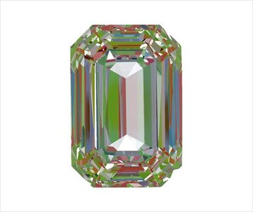
I recently purchased a 1.4ct emerald cut stone. The seller took some ASET images in house before sending the stone to me. I’m not super familiar with ASET but know roughly that more red is better (?)
The other 3 images are digital from 3D scans of the diamond and indicate a big light loss through the white areas in the center. The actual photo is not as bad but the symmetry is way off.
Garry (and other PS diamond experts) are far more equipped to help you in this respect, but I just wanted to share this link from Beyond 4Cs. Scroll down for the emerald cut section. This site, and its creator Paul Gian, were very helpful when buying my diamond. Good luck with whichever stone you ultimately choose!
Here's a quick ASET color guide:
• Red: intense light return – red is generally what you want to see.
• Blue: contrast – important for contrast and scintillation. Blue areas should be as symmetrical as possible.
• Green: less intense light return – keep green areas minimal.
• Black/White: light leakage – keep black/white areas minimal.
In less than 5 minutes, you can evaluate your diamond's light performance and cut quality by making comparisons against the ASET reference images here.
To be honest we probably would not recommend this stone. We like to see more red in the aset images. Do you have a link to
An upclose video of the stone? That will tell more of the picture.