You are using an out of date browser. It may not display this or other websites correctly.
You should upgrade or use an alternative browser.
You should upgrade or use an alternative browser.
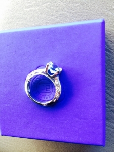
Had a ring made but not quite happy with it. (Pics)
- Thread starter ILLSMOQ
- Start date
- Joined
- Jun 17, 2009
- Messages
- 14,323
- Joined
- Apr 2, 2006
- Messages
- 11,402
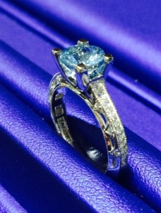
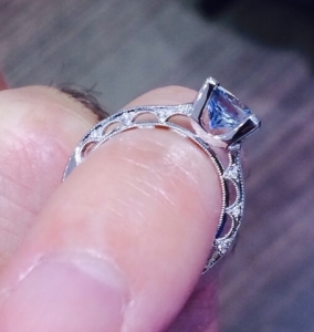
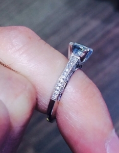
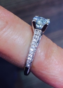
Is it the juxtaposition of the square prongs with the round stone and the rounded interior arches in the shank, by any chance? To me, the side view - where I can see only the flat profile of the shank and the square head - looks great. It's when I see the arches and the square prong tips together that it looks like something might be incongruent.
- Joined
- May 11, 2012
- Messages
- 9,801
- Joined
- Apr 21, 2010
- Messages
- 5,612
junebug17|1433613473|3886003 said:It's a very pretty ring and the setting looks good to me, I really can't see anything wrong with it. Could you be a little more specific as to what area of the ring is bothering you?
+1 to junebug17's post.
OP - please do elaborate on why the setting does not please you; you are the only one who can see it in real life, close-up and distance views, and you are the only one who knows what was discussed with the jeweler in terms of design.
As to the prongs, I took a quick look at the Tacori settings on the Whiteflash website and saw several settings with prominent prongs very similar to your setting - did your jeweler actually modify an existing Tacori setting, or did he create a new setting "inspired" by Tacori?
- Joined
- Jun 17, 2009
- Messages
- 14,323
marymm|1433693147|3886231 said:junebug17|1433613473|3886003 said:It's a very pretty ring and the setting looks good to me, I really can't see anything wrong with it. Could you be a little more specific as to what area of the ring is bothering you?
+1 to junebug17's post.
OP - please do elaborate on why the setting does not please you; you are the only one who can see it in real life, close-up and distance views, and you are the only one who knows what was discussed with the jeweler in terms of design.
As to the prongs, I took a quick look at the Tacori settings on the Whiteflash website and saw several settings with prominent prongs very similar to your setting - did your jeweler actually modify an existing Tacori setting, or did he create a new setting "inspired" by Tacori?
Marymm, your post made me feel a bit better, I was beginning to feel a little foolish lol!
I can see how some might not care for the prongs, but it's a question of personal preference IMO, I honestly don't think they look bad. As you said, several Tacori designs feature prominent prongs, it's just part of the design. And I think it would be helpful if the OP is a bit more specific. We don't even know if it's the prongs that are bothering him.
- Joined
- Jan 11, 2006
- Messages
- 58,579
- Joined
- Jul 23, 2012
- Messages
- 20,228
I had thought the same.diamondseeker2006|1433703659|3886287 said:I agree that the head looks like one of the normal Tacori designs. Is that not what you asked for? If it is not, show us an example of what you asked for.
Ok,that by no means takes away from your feelings of not liking the setting, but I dont think its an error. If you dont like the prongs maybe a different vendor is in order
- Joined
- Apr 22, 2004
- Messages
- 38,363
- Joined
- Jan 9, 2008
- Messages
- 8,237
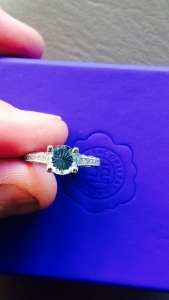
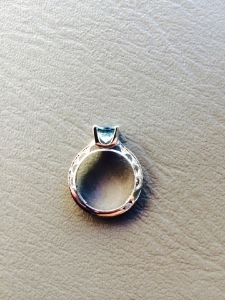
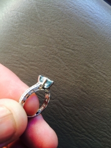
Thank you for all the responses. Yes I feel like the prongs are too chunky and heavy looking. I feel like they need to be thinner and slimmer and rounded. I don't have the ring in my possession so I don't have more pics.
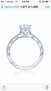
This is what the original version of the ring looks like.
I actually just wanted the brace removed from the original prong design and the stone lowered but Tacori said that it wouldn't be strong enough so they wouldn't do it.

This is what the original version of the ring looks like.
I actually just wanted the brace removed from the original prong design and the stone lowered but Tacori said that it wouldn't be strong enough so they wouldn't do it.
- Joined
- Jun 17, 2009
- Messages
- 14,323
Sounds like the prongs have to be that thick for the structural integrity of the ring - in hindsight maybe it would have been better to leave the brace in but you probably didn't know the prongs would be made thicker - I'm really sorry you are unhappy with it, I'm not sure what recourse you have, others might have some suggestions. Maybe Tacori would be willing to thin the prongs out a little more, if that's possible.
- Joined
- Jan 9, 2008
- Messages
- 8,237
- Joined
- Apr 22, 2004
- Messages
- 38,363
My guess is that the prongs had to be made thicker in order to compensate for the loss of the brace, which was put there to add structural strength. Thinning out the prongs could make them weaker and I'm not sure whether the bench is willing to do so because it increases the risk of the stone falling out.
- Joined
- Sep 17, 2008
- Messages
- 9,411
Chrono|1433792914|3886622 said:My guess is that the prongs had to be made thicker in order to compensate for the loss of the brace, which was put there to add structural strength. Thinning out the prongs could make them weaker and I'm not sure whether the bench is willing to do so because it increases the risk of the stone falling out.
Chrono, I have to agree. I also agree that thinning the prongs without putting braces in is asking for trouble (i.e., a lost stone).
- Joined
- Feb 3, 2008
- Messages
- 7,953
- Joined
- May 11, 2013
- Messages
- 7,570
- Joined
- Jun 17, 2009
- Messages
- 14,323
- Joined
- Dec 17, 2008
- Messages
- 28,090
luv2sparkle|1433872242|3886969 said:To me, the basket is off. Too angularity with the curves of the rest of the profile. I like the original better.
I agree. The fine milgrain arches of the shank seem in such contrast with the modern thick prongs.
I like the original one much better. It has a more congruous look.
- Joined
- Jun 17, 2009
- Messages
- 14,323
- Joined
- May 15, 2013
- Messages
- 10,535
Share:
Past, Present, Future: The Meaning of Three-Stone Engagement Rings
Past, Present, Future: The Meaning of Three-Stone Engagement Rings - 04/14




300x240.png)