You are using an out of date browser. It may not display this or other websites correctly.
You should upgrade or use an alternative browser.
You should upgrade or use an alternative browser.
GSS the color of 24k gold?
- Thread starter lovedogs
- Start date
NY_Resonant
Shiny_Rock
- Joined
- Jan 23, 2023
- Messages
- 450
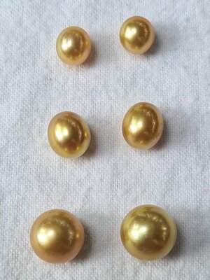
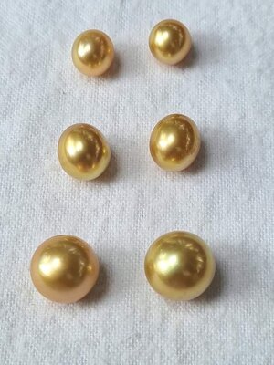
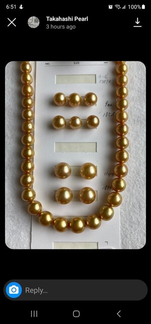
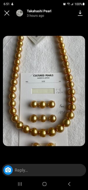
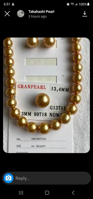
I'm looking for some deep gold pearls (as usual, I was nacre-fluenced by the lovely @yssie )
I dont mind off round ovals, but want the deepst color and best luster
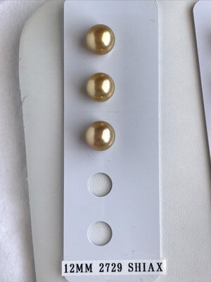
Some options:
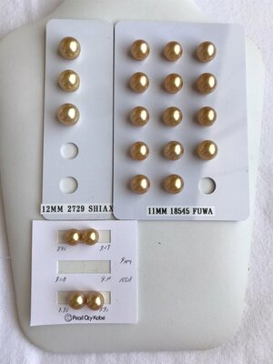
In the 11mm size bracket, my favorite for deeper gold and luster is the middle column, second row from the bottom. my next favorite is the one right above that (OR maybe the one right below that).
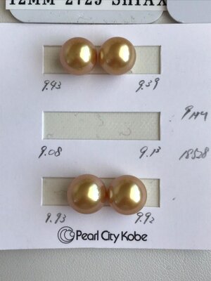
With that said, I think the two 9-10mm options have both better luster and deeper gold color. Compare the body color around the edges and the black reflection luster of the 9.4mm to the favorite 11mm in the picture below.
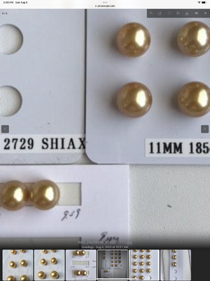
I think the 12mm options shown are lighter gold in color… and so are the first two pictures you posted.
Luster naturally weakens as pearls get larger, even if they are of the same grade and quality. Those look like beautiful deep gold 11mm pearls for you to consider. I think the first step is to decide your ideal size.
Last edited:
- Joined
- Jul 31, 2014
- Messages
- 20,000
In the 11mm size bracket, my favorite for deeper gold and luster is the middle column, second row from the bottom. my next favorite is the one right above that (OR maybe the one right below that).
With that said, I think the two 9-10mm options have both better luster and deeper gold color. Compare the body color around the edges and the black reflection luster of the 9.4mm to the favorite 11mm in the picture below.
I think the 12mm options shown are lighter gold in color… and so are the first two pictures you posted.
Luster naturally weakens as pearls get larger, even if they are of the same grade and quality. Those look like beautiful deep gold 11mm pearls for you to consider. I think the first step is to decide your ideal size.
I honestly don't have an ideal size in this case. Anything 8-11mm works for me, so the deep color and luster is my 1st priority. So you think the 9.5ish ones (the top of the 9-10mm size options) are deeper gold than the 11mm ones?
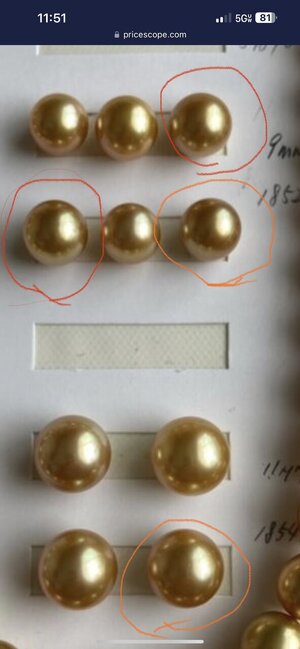
I circled my favorites in different colors to make it easier to tell the difference between them.
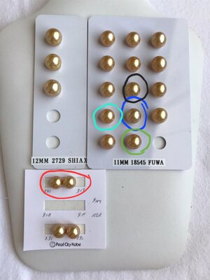
Ps. Can I ask why you say that the oval options in the first few pics are less of a deep gold? To my eye they looked deeper in color, but I trust you more than me on color haha
NY_Resonant
Shiny_Rock
- Joined
- Jan 23, 2023
- Messages
- 450
I honestly don't have an ideal size in this case. Anything 8-11mm works for me, so the deep color and luster is my 1st priority. So you think the 9.5ish ones (the top of the 9-10mm size options) are deeper gold than the 11mm ones?
I circled my favorites in different colors to make it easier to tell the difference between them.
Ps. Can I ask why you say that the oval options in the first few pics are less of a deep gold? To my eye they looked deeper in color, but I trust you more than me on color haha
Based on that picture, to my eyes, the 9.5mm looks like a slightly deeper gold than your blue circle Pearl. However, you should request two things IMO:
1) Get pictures of your 6 circled pearls next to each other, from different angles and light positions. They are a bit far apart which increases the light impact on the way the pearls look.
2) Ask Yy to inquire with Kan (Mr. Seki) about if the 9.5mm is deeper in gold color. Nothing beats seeing it with your eyes and they are very honest. Ask them to rank them in deepest gold color?
note: My comment on the ovals was due to the colors on the edges of the pearls. Much lighter edges.
Last edited:
- Joined
- Aug 14, 2009
- Messages
- 27,486
I’m always thrilled to nacrefluence 
Are you looking for a pair @lovedogs? Or a bracelet lineup? How important is matching for your project?
I’ve got some preferences but I want to look at your pics on the computer to verify before posting!
Are you looking for a pair @lovedogs? Or a bracelet lineup? How important is matching for your project?
I’ve got some preferences but I want to look at your pics on the computer to verify before posting!
- Joined
- Jul 31, 2014
- Messages
- 20,000
I’m always thrilled to nacrefluence
Are you looking for a pair @lovedogs? Or a bracelet lineup? How important is matching for your project?
I’ve got some preferences but I want to look at your pics on the computer to verify before posting!
I don't need a pair or an entire bracelet. A pair is convenient to find uses for, but one nice pearl would also work, especially if it's 11mm+ and would work as a pendant
- Joined
- Aug 14, 2009
- Messages
- 27,486
My personal rankings - gold arrows have most saturated colour, white arrows are most lustrous (gloss, contrast, all the #lusters) to my eyes on my computer. My faves with black arrows. I should add that I don't care for strong pink in GSS without correspondingly strong green - makes the pearl look orange rather than gold, to my eyes, so that factors into my faves.
Trick with colour is to disambiguate "saturation" from "darkness"/"tone"... Funny thing about golds, cameras seem to behave better than with pretty much any other pearl type/colour - my experience thus far has been that you can actually judge golds pretty reasonably from pics, comparatively...
The 9.9 pair looks well matched! I can't judge colour compared to the 11s though. 12s are all more pale.
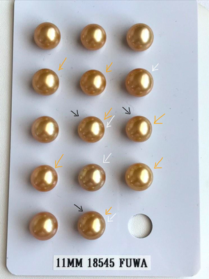
(I also like bottom of rightmost column a lot, in terms of richness of colour saturation, but the body is a touch lighter than the others.)
Of these options I like the middle pair best but my favourite singleton is bottom right. I'm a sucker for green!
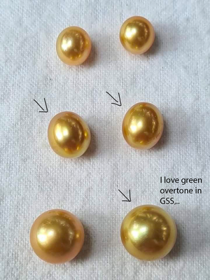
Trick with colour is to disambiguate "saturation" from "darkness"/"tone"... Funny thing about golds, cameras seem to behave better than with pretty much any other pearl type/colour - my experience thus far has been that you can actually judge golds pretty reasonably from pics, comparatively...
The 9.9 pair looks well matched! I can't judge colour compared to the 11s though. 12s are all more pale.

(I also like bottom of rightmost column a lot, in terms of richness of colour saturation, but the body is a touch lighter than the others.)
Of these options I like the middle pair best but my favourite singleton is bottom right. I'm a sucker for green!

Last edited:
NY_Resonant
Shiny_Rock
- Joined
- Jan 23, 2023
- Messages
- 450
My personal rankings - gold arrows have most saturated colour, white arrows are most lustrous (gloss, contrast, all the #lusters) to my eyes on my computer. My faves with black arrows. I should add that I don't care for strong pink in GSS without correspondingly strong green - makes the pearl look orange rather than gold, to my eyes, so that factors into my faves.
Trick with colour is to disambiguate "saturation" from "darkness"/"tone"... Funny thing about golds, cameras seem to behave better than with pretty much any other pearl type/colour - my experience thus far has been that you can actually judge golds pretty reasonably from pics, comparatively...
The 9.9 pair looks well matched! I can't judge colour compared to the 11s though. 12s are all more pale.
(I also like bottom of rightmost column a lot, in terms of richness of colour saturation, but the body is a touch lighter than the others.)
Of these options I like the middle pair best but my favourite singleton is bottom right. I'm a sucker for green!

Would you agree that amongst the ovals, the middle pair and bottom right are significantly lighter in golden color than bottom left singleton?
- Joined
- Aug 14, 2009
- Messages
- 27,486
Would you agree that amongst the ovals, the middle pair and bottom right are significantly lighter in golden color than bottom left singleton?
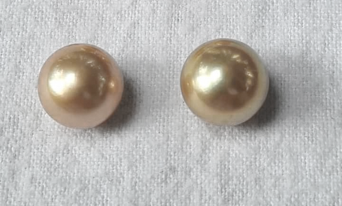
Bottom right and bottom left are about the same tone IMO (darkness), but bottom right is more saturated in body colour - bottom right will look more "rich gold" in-person. Bottom left has strong pink overtone which is creating "orange/bronze" which reads darker (tone) on first glance, but if you mentally strip that pink away (like in the "halo" around the light spots) - the tone really isn't visibly different. And the overtone won't be visible in most lighting, for me with GSS body colour saturation beats any overtone.
- Joined
- Aug 14, 2009
- Messages
- 27,486
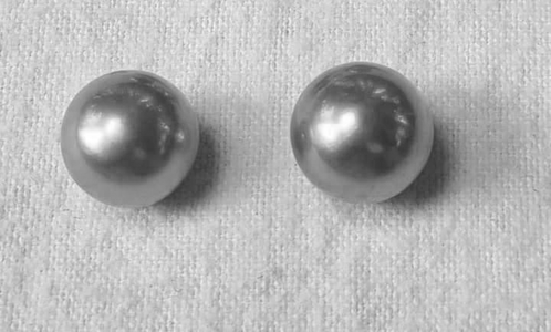
Here's what I mean. It's easier to see with some photoshop help. I spent wayyyy too long photoshopping GSS couple years ago teaching myself how to predict what would happen 
If I dial vibrance down - just across the whole cropped pic - bottom right's increased body saturation becomes more obvious. Bottom left looks more grey.
And if I dial saturation down - to remove all the body colour and just show tone - it's easier to see that the "darkness" really isn't different. It's just the overtone pulling strong and confusing the eyes in the pics.
If I dial vibrance down - just across the whole cropped pic - bottom right's increased body saturation becomes more obvious. Bottom left looks more grey.

And if I dial saturation down - to remove all the body colour and just show tone - it's easier to see that the "darkness" really isn't different. It's just the overtone pulling strong and confusing the eyes in the pics.

NY_Resonant
Shiny_Rock
- Joined
- Jan 23, 2023
- Messages
- 450
Bottom right and bottom left are about the same tone IMO (darkness), but bottom right is more saturated in body colour - bottom right will look more "rich gold" in-person. Bottom left has strong pink overtone which is creating "orange/bronze" which reads darker (tone) on first glance, but if you mentally strip that pink away (like in the "halo" around the light spots) - the tone really isn't visibly different. And the overtone won't be visible in most lighting, for me with GSS body colour saturation beats any overtone.
Interesting. I can see the pink overtone on the bottom left pearl but I did not think that would impact the color of the border of the pearl so strongly? It almost looks like a caramel color border versus a yellow gold color for the bottom right pearl.
In Akoya, I usually try to use the outside border areas to compare the body color of the pearl --- Does it work a bit differently for GSS?
- Joined
- Aug 14, 2009
- Messages
- 27,486
For me the area around the lightspot is usually the most honest for GSS, because the thing I care about most is body colour. But when overtone takes precedence then I mentally "move" what I look for more toward the edges of the pearl too... Like Tahitians... I have to think about this though because TBH I'm not even sure exactly how I break my decisions down anymore!
- Joined
- Jul 31, 2014
- Messages
- 20,000
My personal rankings - gold arrows have most saturated colour, white arrows are most lustrous (gloss, contrast, all the #lusters) to my eyes on my computer. My faves with black arrows. I should add that I don't care for strong pink in GSS without correspondingly strong green - makes the pearl look orange rather than gold, to my eyes, so that factors into my faves.
Trick with colour is to disambiguate "saturation" from "darkness"/"tone"... Funny thing about golds, cameras seem to behave better than with pretty much any other pearl type/colour - my experience thus far has been that you can actually judge golds pretty reasonably from pics, comparatively...
The 9.9 pair looks well matched! I can't judge colour compared to the 11s though. 12s are all more pale.
(I also like bottom of rightmost column a lot, in terms of richness of colour saturation, but the body is a touch lighter than the others.)
Of these options I like the middle pair best but my favourite singleton is bottom right. I'm a sucker for green!

Thank you, especially for the explanation about overtone. So between the 2 options that are 11mm and have all of your colored arrows, and the black arrow options from the ovals + the green singleton, which would be your pick(s)?
- Joined
- Jul 31, 2014
- Messages
- 20,000
NY_Resonant
Shiny_Rock
- Joined
- Jan 23, 2023
- Messages
- 450
my favorite if you want a pair, considering matching (and sizes are similar) are the pearls surrounded by red.
If you want a bigger 11mm singleton, I like the one in orange. I think its the most saturated and the luster looks to be there but slightly masked by the darker background from saturation?
My favorite single pearl is the 9mm in orange.
GSS morph a lot depending on angles and lighting. All these pictures are looking straight down which IMO does not give you a full picture.

Last edited:
Share:
Past, Present, Future: The Meaning of Three-Stone Engagement Rings
Past, Present, Future: The Meaning of Three-Stone Engagement Rings - 04/14




300x240.png)