shape
carat
color
clarity

GRS Royal Blue vs. just "Blue" Sapphires

geolion

Rough_Rock
Joined
Apr 1, 2014
Messages
1
Hi all,

Thank you everybody for the positive contributions on this board. I am looking for a 5-6 carat blue sapphire to set into an engagement ring for my fiance, oval shaped, preferably unheated, with the best colour and cut that I can afford. My budget ceiling is ~32K USD, but I've quickly realized that there is no market price for these gems and (maybe) I could even get one I really like with spending less!

I've looked at a range of stones from 2500 USD / carat all the way up to 8000 USD / carat. I honestly couldn't believe the cost of a few stones I didn't like at all, so quality doesn't seem to necessarily correlate with price.

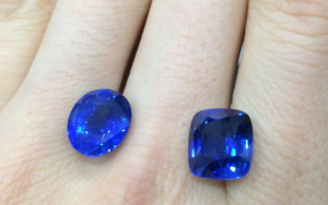
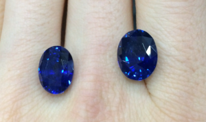
Out of the 10 or so stones I've viewed, I'm now comparing the 4 stones that I like best. Two of them are oval shaped, 5.71 carat heated (A) and 6.34 carat unheated (B), both from Sri Lanka. The GRS certificates state these to be "vivid blue (GRS type 'royal blue')". I find them quite lively, especially the heated one on the left, but I also suspect they are a bit dark / opaque.

On the other hand, there are two stones that are classified as just "blue", one blue oval (C) and a cushion (D). I understand that Royal Blue should be the bar for quality, but somehow I prefer the lighter colour. I'm not sure if it's the lighter hue or more transparency of these stones that make them more attractive.

(A) 5.71 carat heated oval stone goes for 2750 USD / carat: I think very lively, but a bit dark
(B) 6.34 carat unheated oval stone goes for 4900 USD / carat: Almost as lively as (A), but also a bit dark -- twice as much for unheated!
(C) ~6 carat unheated oval stone, unknown price: it's the lightest of all 4, very lively but too "electric" shade of blue
(D) ~6 carat unheated cushion stone, unknown price: same as (C), but with more dark bands

Any advice on these GRS colour ratings... are they just throwing me off? What about my reads on these few stones (I know, based on crappy pictures)?

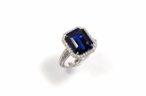
I'm also curious to know what shade Slksapphire's gorgeous emerald cut blue sapphire is...

Thanks for all your help
a__amp__b.png

c__amp__d.png
 
I believe 'royal blue' is just how they market darker sapphires to make them sound more appealing, since the trade ideal colour for sapphire is medium vivid blue. I'm sure that the two lighter sapphires you posted cost more than the darker ones.
 
My eyes are more drawn to C, which is lighter but with more intense saturation. From what I have gleaned over the years (unless this has changed recently) is that GRS seems to only consider hue and saturation in the colour descriptor and there is little information on how tone is evaluated in the overal colour quality. Secondly, I do not know the lighting condition the stones were photographed in but I would presume it must be quite bright unless your hands are naturally very pale.

The trade ideal is medium dark tone, very slightly violetish blue hue with vivid saturation. I believe SilkSapphire's sapphire hits the mark with her stone.
 
The photographs aren't great, but the 1st 2 stones look too dark to me. I don't think they would maintain their color in low light. The 3rd one is the most attractive, color-, tone-, & saturation-wise, but I'd want to see more & better photos. Is the vendor's return policy a good one? It might be helpful to see it in person & if you don't like it, you can send it back.
 
Stone C for me too, as the colour just "pops" at me.

DK :))
 
C looks best to my untrained eyes. 8)
 
I never understood those GRS color designations, which are clearly unscientific and marketed towards vendors, rather than consumers. I more highly prefer the AGL prestige report which has true scientific and meaningful data regarding color quality.

Have you seen the stones in person? I suspect they're darker than the photos because the skin on the hand looks like it belongs to a dead person. If the skin is that white, I suspect the white balance of the photo is adjusted to make the stones appear lighter. I could be wrong, and perhaps that is just a very pale skinned hand.
 
i wanted to try to answer some of your questions.

first, my sapphire, according to grs, is vivid blue (GRS type royal blue).

second, i think GRS' determination of color (royal blue, pigeon's blood red) is useless. i have looked all over grs' website and there is no explanation of how they come up with their color descriptions. apparently, they have just introduced 2 new ones: kashmir blue and magnificent red. :roll:

that being said, i believe that their color description refers to hue (blue) and saturation (vivid) but completely ignores tone (light to dark) and makes no mention of extinction, which is more a function of cut, i believe. i have attached a sample of a sapphire i considered that was also determined to be "vivid blue" but looked very dark except under very strong lighting.

regarding the sapphires you are considering, i defer to others who are much more experienced at evaluating online photographs. but to my untrained eye, given the skin color background, i think the sapphires were photographed under extremely strong lighting. as a result, sapphires a and b are likely to be very dark in tone (though they could very well be vivid blue in saturation and hue).

i think the reason everyone is attracted to sapphire c is its tone -- the color and saturation are fine but it is really the only one that isn't overly dark (in my opinion, it looks a bit light for my tastes in the photograph but could very well be ok in real life). sapphire d seems to show color zoning and/or extinction. sapphires usually look a touch darker after setting (of course, this depends on the setting design), so you should take that into account, too.

for color grading, i think agl is the way to go. they provide grades for tone (0-100; 50-65 being medium, 65-90 medium dark), hue (1-10, 1 being excellent) and a color scan that shows the percentage of blue, violet, green, etc, cut. They also grade clarity, finish and total quality. i believe trade ideal tone is 70-80.

cj-01336_1_.jpg
 
slksapphire|1396360761|3644970 said:
second, i think GRS' determination of color (royal blue, pigeon's blood red) is useless. i have looked all over grs' website and there is no explanation of how they come up with their color descriptions. apparently, they have just introduced 2 new ones: kashmir blue and magnificent red. :roll:

Seriously :shock: , "magnificent red and kashmir blue?" :roll:

If they would at least give some sort of explanation of their color acronyms, it would help, but they don't. Like you, I couldn't find any. If anyone can, please comment.

I totally agree with you on the AGL presitige report designations for color and tone. I guess its harder to sell gems if you're giving too much information, so a lot of vendors go with GRS which uses these flowery acronyms which are pretty useless, especially to a novice.
 
slksapphire|1396361476|3644984 said:
i am totally serious. it is almost so silly so as to be unbelievable. but here it is:

http://www.gemresearch.ch/news/NewColor/NewColor.htm

That's why I cannot recommend GRS for colored gems, especially for the prices they charge, to consumers. Vendors have a lot to gain with these reports however, which is why I probably see way more of them, than AGL prestige reports, in vendor hands.
 
SS is correct; Kashmir Blue and Magnificent Red are indeed new and true.
http://www.gemresearch.ch/certs/certalbm.htm

I understand the intent is to make it easier for the buyer to know instantly which one is better but to me, it is a throwback to the dark ages where the names sound much too subjective and flowery.
 
Chrono|1396361689|3644989 said:
SS is correct; Kashmir Blue and Magnificent Red are indeed new and true.
http://www.gemresearch.ch/certs/certalbm.htm

I understand the intent is to make it easier for the buyer to know instantly which one is better but to me, it is a throwback to the dark ages where the names sound much too subjective and flowery.

The problem is that I've seen lots of "pigeon blood red" rubies of all kinds of qualities. They seem to have lots of overlap in quality for each grouping, and unfortunately, color in gemstones is not like that, and is quite more complex.

Sorry for the threadjack to the OP, but to really determine the color quality of those sapphires, I wouldn't go by GRS designations.
 
TL,
I agree with you. I've seen some very nice looking GRS PG rubies and some very dark and not as attractive GRS PG rubies. Hence, I also advice anyone considering stones with GRS lab reports to look at the stone and not the colour designation.
 
I cannot take those descriptives seriously at all. I just have no understanding of what "royal blue" vs. "kashmir blue" would even mean. As others have indicated, it is important to understand the tone you want (where on the lightness to darkness scale), how saturated the color you seek (the more saturated, the more expensive) and what, if any, modifiers you want, such as violet, etc. These criteria, along with clarity, treatments, cut, etc, are how I would go about it.

One thing that bares repeating here is that while you might be influenced by what are the most popular or which are the trade ideals, it is most important to get what you like best, and what, over the years to come will continue to appeal to you.

I would not hazard a favorite of the stones you've shown without seeing them in various lighting circumstances first.

Would you be willing to work with online vendors as well, or are you just working with a local retailer?
 
I have to say that as someone new to gems, descriptive colors such as cornflower blue and pigeon blood are much too subjective and arbitrary! It would help me so much if gems came with concrete Hue, Saturation, and Value/Luminosity numbers instead! ::)
 
GET 3 FREE HCA RESULTS JOIN THE FORUM. ASK FOR HELP

Featured Topics

Top