You are using an out of date browser. It may not display this or other websites correctly.
You should upgrade or use an alternative browser.
You should upgrade or use an alternative browser.
gemfix montana sapphires--thoughts?
- Thread starter DecoDaze
- Start date
DecoDaze
Shiny_Rock
- Joined
- Oct 13, 2010
- Messages
- 205
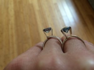
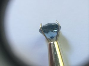
Profiles of cushion (left) and round (right):
And inclusions: The round--
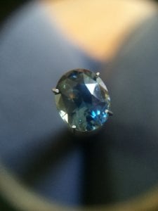
And the oval--
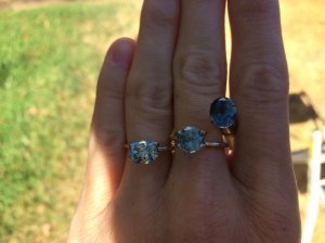
The are all lovely, especially in indirect sunlight. The inclusion on the oval bothers me, though--it sparks a bright orange, and was the first thing I noticed when I pulled the gem box out of the bag. I love the color on the round, but it seems kind of... murky? in low light. Almost brown. So I'm not totally thrilled about that. What do you all think? Apologies for the quality of the photos. I'll try to do more later on, but have to run to a meeting right now!


- Joined
- Sep 20, 2008
- Messages
- 25,221
DecoDaze|1410977994|3752582 said:The are all lovely, especially in indirect sunlight. The inclusion on the oval bothers me, though--it sparks a bright orange, and was the first thing I noticed when I pulled the gem box out of the bag. I love the color on the round, but it seems kind of... murky? in low light. Almost brown. So I'm not totally thrilled about that. What do you all think? Apologies for the quality of the photos. I'll try to do more later on, but have to run to a meeting right now!
For $1K/ct, I would not want brown.
I'm sorry, but for a heated and included stone, with poor color, the round is overpriced. I would completely skip that one.
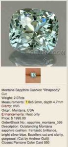
I like the elongated cushion the best, because although it lacks saturation of blue color, it doesn't black out in sunlight like the oval, or is highly included and deep like the round. It also has a nice face up for its carat weight. It's also pretty clean and well cut. With Montana sapphires, you're not really looking for blue saturation, but nice sparkle and durability.
pregcurious
Ideal_Rock
- Joined
- Mar 18, 2009
- Messages
- 6,724
Please reconsider using those ring holders. They can chip the girdle of a stone.
I have both a ring holder, and the regular gem holder (on the right of your picture), and the regular gem holder puts a lot less force on the gemstone.
I agree with you about the orange inclusion on the oval.
As for the other 2 stones, they are underwhelming. Can someone who has a Montana sapphire share if this is what a lot of them look like?
FrekeChild
Super_Ideal_Rock
- Joined
- Dec 14, 2007
- Messages
- 19,456
I'm underwhelmed by all three of them. The only one that I might consider is the cushion, but I thought that you didn't want something pastel?
FrekeChild
Super_Ideal_Rock
- Joined
- Dec 14, 2007
- Messages
- 19,456
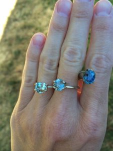
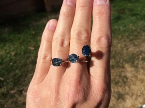
Every gemstone looks dark under a single direct source of light. The source of light can only be reflected by a few facets all of the time since they are all at different angles. So, you trade color for spectacular flashes of fire, but only in direct sun, and things like pot lights, halogens or LEDs.prynceszh|1410987337|3752674 said:I am quite new to the whole colored stones business. Is it characteristic for Montanas (or any other sapphire, for that matter) to look so dark under direct sunlight?
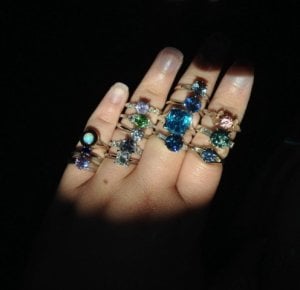
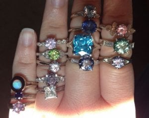
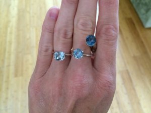
Here is a pic with a bunch of my rings in it - sapphires, garnet, topaz, diamond (princess on my ring finger), spinel, opal, tourmaline.
Second pic is the same rings, but slightly less direct light. I don't like taking pictures in direct sunlight - it makes the stones appear dark and lifeless, except for a good fire shot.
EDIT: I shouldn't say ALL stones, because I have some stones that don't totally black out under direct sun, but that's because they have inclusions that diffuse the light and scatter it. The principle is still the same though. It doesn't matter what variety of stone, if it's a clean specimen, it'll black out under direct light. Just a fact of physics.
DecoDaze
Shiny_Rock
- Joined
- Oct 13, 2010
- Messages
- 205
Thanks for the feedback everyone. On the ring holders, I specifically asked gemfix if it was ok to use them, and they said they use them all the time. But I'll stop now!
Agreed about the round, which is disappointing, since I would still prefer a round for this project. It's weird that it appears brown sometimes, because I don't see brown in the body from the underside. So I don't know what that's about, just that I'm not happy with it.
The oval is perhaps a little too dark for me for this project, but regardless, since the inclusion bothered me right off, I can't see that improving.
I think I'll play around with the cushion some more and see how I feel about it. FrekeChild, you're right that I didn't want a pastel, but it is pretty in person.
pregcurious
Ideal_Rock
- Joined
- Mar 18, 2009
- Messages
- 6,724
FrekeChild|1410987875|3752682 said:EDIT: I shouldn't say ALL stones, because I have some stones that don't totally black out under direct sun, but that's because they have inclusions that diffuse the light and scatter it. The principle is still the same though. It doesn't matter what variety of stone, if it's a clean specimen, it'll black out under direct light. Just a fact of physics.
This is why stones with a small bit of "silk" can command a high price.
A small amount of fine rutile inclusions, or "silk" will diffuse the light from one direct source. If there is only a small amount of "silk", as to not negatively affect the brilliance of the stone, the stone will look good in both indirect and direct light sources.
Here's an article about this:
http://www.ruby-sapphire.com/the-silk-road-rutile-in-corundum.htm
S
SparkliesLuver
Guest
FrekeChild said:I'm underwhelmed by all three of them.
Chrono said:Sounds like none of the three are the right one for you. I'm sorry that the search continues.
Admittedly, I feel the same and agree.
Starzin
Brilliant_Rock
- Joined
- Sep 26, 2011
- Messages
- 1,850
I have to say that I think they all look good in the first photo... and then things go a bit downhill don't they?
But my eye was immediately drawn to the cushion and stayed with it because the colours on the other two didn't attract me.
How are you feeling about it today? If you didn't immediately go "Wow!" then it probably isn't for you. Your stone is out there, it's just a matter of finding it
So... light or dark?
indigoblue
Shiny_Rock
- Joined
- Dec 7, 2012
- Messages
- 344
If you don't go WOW, send them back. Don't settle.
DecoDaze
Shiny_Rock
- Joined
- Oct 13, 2010
- Messages
- 205
I agree with everyone about the cushion. It's definitely my favorite of the three, to my surprise. I really thought I'd like the darker colors better, but the cushion just has so much more life! However, I'm going to take your wise advice and send them all back, because although the cushion is really nice, it's not my WOW stone. Thanks for all the input!
Did You Miss the April 2024 Jewels of the Weeks? Did You Miss the April 2024 Jewels of the Weeks? - 04/26

Did You Miss The Throwback Thursdays For April 2024?
Did You Miss The Throwback Thursdays For April 2024? - 04/25



300x240.png)