You are using an out of date browser. It may not display this or other websites correctly.
You should upgrade or use an alternative browser.
You should upgrade or use an alternative browser.
FCD CAD assistance request
- Thread starter chrono
- Start date
gregchang35
Ideal_Rock
- Joined
- Sep 11, 2012
- Messages
- 3,416
I like it.
comments:
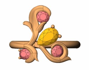
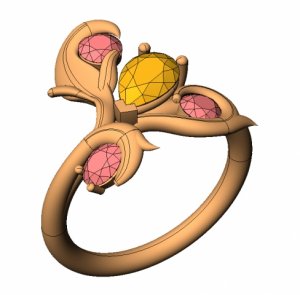
the leaf with the points in shank of the lower 2 diamonds are quite sharp and this could be softened. Soften only because i think it will catch and potentially scratch.
could the prongs that hold the pear at the top end be smaller or pointy like a claw? i think that may work better/ in sync with the angulation of the pear.
i just had another thought which may stray away from your original idea... the top diamond and leaf, have it sit closer to the main body of the ring. currently it is sitting in the 12 oclock position, flip it so that it sits at the 9oclock position. This will reduce the finger coverage though.
LoversKites
Brilliant_Rock
- Joined
- Nov 16, 2013
- Messages
- 1,733
gregchang35 said:comments:
the leaf with the points in shank of the lower 2 diamonds are quite sharp and this could be softened. Soften only because i think it will catch and potentially scratch.
Instead of simply softened, maybe the pieces of metal pointing outwards could be carved into leaves. Not sure you're going for an organic look like that, however.
What kind of direction do you want to go in Chrono?
Otherwise, I personally like the proportions and placement of the FCDs!
- Joined
- Apr 14, 2013
- Messages
- 877
Chrono........ don't take this as anything but what you wanted (unfiltered opinions) as I really don't know what the background on the design is.
So,.........I would also prefer to see the tendrils end with claw prongs on all the stones vs regular prongs. With that in mind, the tendrils would end up being held closer to the band and not as heavy as they appear. The one that goes north (in your pic's) just seems disproportionately 'heavy' to me--and I don't know the FCD dimensions so don't know how much room there is to play with that structurally...........I would prefer to have the gems stand out more than the metal and some of them seem hidden by the wrapped metal. Just my opinion and I always tend to pick apart things and do the 'what if' routine.......
So,.........I would also prefer to see the tendrils end with claw prongs on all the stones vs regular prongs. With that in mind, the tendrils would end up being held closer to the band and not as heavy as they appear. The one that goes north (in your pic's) just seems disproportionately 'heavy' to me--and I don't know the FCD dimensions so don't know how much room there is to play with that structurally...........I would prefer to have the gems stand out more than the metal and some of them seem hidden by the wrapped metal. Just my opinion and I always tend to pick apart things and do the 'what if' routine.......
VapidLapid
Ideal_Rock
- Joined
- Feb 18, 2010
- Messages
- 4,272
First I have to say I already wasn't up to date on what you were doing. I thought you were still wanting a forged and fabricated ring.
Si I was surprised to see CADs. The chevron prong at the point of the pear looks like an afterthought and like is sticks up as the highest point on the ring. Since it is also the center it takes all my attention. It juts up like a pylon. I would rather see it integrated in the design using the nexus of the branching of the 12 o'clock and 8 0'clock as the prong. Yes they would need to be shifted slightly and sculpted. While doing that I would like to see the 12 o'clock slide over up against the side of the pear and have the adjacent prong come from there or be replaced by a notch in the edge of that shoot as the shoot would then be cradling the pear just as it does the round.
I also think the pointy horns on the two rounds are too pointy, and a little awkward. They might make more sense if the terminus of the fronds were pointy and gestural too.
- Joined
- Apr 22, 2004
- Messages
- 38,364
I admit that it is unfair to post this for comments because many PSers/CSers may not know the origins of the design. When I opened the email this morning and saw the CADs, I was floored and didn't know what to think. It is such a huge departure from what I had in mind. I still don't know what to think and don't know where to start. The design has lost the any and all the Russian Romanov vibe/feel and looks like just any other organic ring. 
http://www.romanovrussia.com/Jewelry.html#RINGS
http://www.romanovrussia.com/Jewelry.html#RINGS
LoversKites
Brilliant_Rock
- Joined
- Nov 16, 2013
- Messages
- 1,733
Chrono|1395242448|3637297 said:I admit that it is unfair to post this for comments because many PSers/CSers may not know the origins of the design. When I opened the email this morning and saw the CADs, I was floored and didn't know what to think. It is such a huge departure from what I had in mind. I still don't know what to think and don't know where to start. The design has lost the any and all the Russian Romanov vibe/feel and looks like just any other organic ring.
Oh, if you want the Romanov look this is surely not it
gregchang35
Ideal_Rock
- Joined
- Sep 11, 2012
- Messages
- 3,416
Sorry that it isn't what you has originally planned. And bad of me not to review the stages that this design went through.
Is there a way of getting the jeweller to review the notes or change the way they have done the cad to make it more Romanov styling?
Is there a way of getting the jeweller to review the notes or change the way they have done the cad to make it more Romanov styling?
- Joined
- Apr 14, 2013
- Messages
- 877
Chrono, when I opened the Romanov link there were a lot of rings and the Art Nouveau one's seemed the most similar to the CAD--is that what you wanted? This is the part of creation that always seems to move around........sorry you were disappointed in the CAD.....
- Joined
- Apr 22, 2004
- Messages
- 38,364
DigDeep,
The CAD design feels very bare-boned or an oversimplified Art Nouveau ring. It doesn't have the wow or intricacy I was expecting. The lines are too straight and stiff. This is the original I sent to the jeweller.
http://romanovrussia.com/Art_Nouveau_Ring.html#.UynQOvmIDAQ
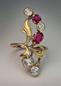
The CAD design feels very bare-boned or an oversimplified Art Nouveau ring. It doesn't have the wow or intricacy I was expecting. The lines are too straight and stiff. This is the original I sent to the jeweller.
http://romanovrussia.com/Art_Nouveau_Ring.html#.UynQOvmIDAQ

VapidLapid
Ideal_Rock
- Joined
- Feb 18, 2010
- Messages
- 4,272
I am wondering about the type of work the vendor is planning to do on the piece. By which I mean is there an expectation that after casting the piece will require a good amount of hand finish work in sculpting the nuances of form? Since the piece doesn't come out of the mold ready to go, and putting fine detail into the cad for a one off may be more laborious than doing some good old fashioned hammer and gauge work, they may be generating a slightly less defined and more voluminous form for cad to work from by hand later. Something like when diamonds are cut and one person cut the rough form and then another puts the facets on. Even so there needs to a drawn rendition of that final so that they know what you want and you approve their goal. And the design needs some twerking, I mean tweeking.
LoversKites
Brilliant_Rock
- Joined
- Nov 16, 2013
- Messages
- 1,733
VapidLapid|1395251130|3637384 said:. And the design needs some twerking, I mean tweeking.
Lol VL
- Joined
- Apr 22, 2004
- Messages
- 38,364
The vendor did say that they will finish the piece by engraving/sculpting the ring but I have no idea how much "tweaking" will be done. Unfortunately, the designer is out the rest of the week, leaving me in a state of anxiety until then.
- Joined
- Jan 27, 2006
- Messages
- 268
I love the antique Russian style, so I was looking forward to how your ring turns out.
I think the first CAD looks too triangular to me. It seems that the original Russian design started with drawing the leafs into an elegant shape and then placing the stones around them to form another fluid line. And the CAD looks like the stones were placed in a triangle and the leafs drawn around them. That seems like a backwards way to do it and it ends up with a more geometric look rather than the free flowing look of the original. Plus, the stones would be almost in semi-bezels with the leafs around them, is that what you wanted? Maybe if you could add a few more little OECs, the design can be spread out a little bit more, like the original? Anyways, I look forward to how this progresses, seems like a nice start.
I think the first CAD looks too triangular to me. It seems that the original Russian design started with drawing the leafs into an elegant shape and then placing the stones around them to form another fluid line. And the CAD looks like the stones were placed in a triangle and the leafs drawn around them. That seems like a backwards way to do it and it ends up with a more geometric look rather than the free flowing look of the original. Plus, the stones would be almost in semi-bezels with the leafs around them, is that what you wanted? Maybe if you could add a few more little OECs, the design can be spread out a little bit more, like the original? Anyways, I look forward to how this progresses, seems like a nice start.
- Joined
- Nov 19, 2003
- Messages
- 1,290
Chrono,
I wouldn't stress over it, since this design is seems to be just a touch of miscommunication. I would suggest that you tell the designer very specifically what you like in the Romanov styled pieces. For instance, removing the stones from inside the curled ends of the scrolls would give the metalwork more contrast and look more like the style you prefer. Another trait which your preferred style seems to have is that most of those rings have a fairly distinct symmetry, (or at least a balance), which seems to be lacking in the CAD and is easily remedied. I think that you're 90% there and a few tweaks will get you right where you want to be. Maybe take the original and sketch over it with the changes that you'd like to see?
I wouldn't stress over it, since this design is seems to be just a touch of miscommunication. I would suggest that you tell the designer very specifically what you like in the Romanov styled pieces. For instance, removing the stones from inside the curled ends of the scrolls would give the metalwork more contrast and look more like the style you prefer. Another trait which your preferred style seems to have is that most of those rings have a fairly distinct symmetry, (or at least a balance), which seems to be lacking in the CAD and is easily remedied. I think that you're 90% there and a few tweaks will get you right where you want to be. Maybe take the original and sketch over it with the changes that you'd like to see?
klewis
Brilliant_Rock
- Joined
- Dec 21, 2008
- Messages
- 871
When I compare the CAD design and the image you have used as a reference I can see how one, the design in your reference photo, looks so much more elegant than the other. The CAD design is a bit lumpy. In your reference photo none of the leaves/tendrils surround the stones which allows them them to look more delicate and the whole shape of the piece looks as though it sits north/south on the finger. The CAD design is a round shape made more so by some of the stones being encircled by the leaves.
sonyachancs
Shiny_Rock
- Joined
- Aug 6, 2013
- Messages
- 427
just a note, as I figured from the comments that this isn't quite the look you are going for, but I think if you angled the top bit away from 90deg, it would look much better. it's too straight and not very elegant that way..
hippi_pixi
Brilliant_Rock
- Joined
- Nov 25, 2010
- Messages
- 639
I agree with what everyone else has said but something is bothering me
that design is a capital L ...
that design is a capital L ...
Vidalia
Shiny_Rock
- Joined
- Jan 18, 2013
- Messages
- 109
Chrono,
I really hope you find this comment helpful rather than upsetting. And I'm only saying this because once I saw it, I couldn't "unsee" it, IYKWIM... To my eye it looks like there is an >ahem< male member growing out of what some people have called to the 12 o'clock prong. Guessing that is NOT what you're going for.
I agree with the comments re asymmetry and moving the FCDs so they are not nestled in each frond.
- Joined
- Apr 22, 2004
- Messages
- 38,364
Julia,
You are spot on with my thinking. In the inspiration piece, you can tell that it started with the leaf that is soft, curvy and detailed, then the gems were arranged to fit in a pleasing manner. The CAD, on the other hand, has too much emphasis on the gems and then trying to "leaf" then together. I am open to prongs or semi-bezels but not full bezels. My preference is prongs only. I am also open to the addition of a few single cuts here and there.
Size reference: the pear is 6 x 4 mm and the oval is 4 x 3 mm
Michael,
I thought it was very clear that I wanted the piece to look very Romanov since I've sent the designer pictures of the ring below, including the link to show the details and underside. I also shared the mockup several PSers put together for me which looks more Romanov-like. He said that the stones were a bit bigger than he expected, hence the rearrangement but I did tell him I don't mind the ring being elongated since it is for the 3rd finger. Anyway, this is what CADs are for - best to work it out now rather than be surprised by the final result. I will definitely go through these with him again and I'm confident we'll be on the same page again.
KLewis,
Your observations are correct. I think removing the stones away from the leaves will allow a more delicate look.
HippiPixi,
Love the "L" comment. You are so right!
Vidalia,
Your comment is the funniest yet. No offense taken at all. If anything else, it's another point to share with the designer why this design is NOT it.
You are spot on with my thinking. In the inspiration piece, you can tell that it started with the leaf that is soft, curvy and detailed, then the gems were arranged to fit in a pleasing manner. The CAD, on the other hand, has too much emphasis on the gems and then trying to "leaf" then together. I am open to prongs or semi-bezels but not full bezels. My preference is prongs only. I am also open to the addition of a few single cuts here and there.
Size reference: the pear is 6 x 4 mm and the oval is 4 x 3 mm
Michael,
I thought it was very clear that I wanted the piece to look very Romanov since I've sent the designer pictures of the ring below, including the link to show the details and underside. I also shared the mockup several PSers put together for me which looks more Romanov-like. He said that the stones were a bit bigger than he expected, hence the rearrangement but I did tell him I don't mind the ring being elongated since it is for the 3rd finger. Anyway, this is what CADs are for - best to work it out now rather than be surprised by the final result.
KLewis,
Your observations are correct. I think removing the stones away from the leaves will allow a more delicate look.
HippiPixi,
Love the "L" comment. You are so right!
Vidalia,
Your comment is the funniest yet.
klewis
Brilliant_Rock
- Joined
- Dec 21, 2008
- Messages
- 871
Vidalia|1395337974|3638041 said:Chrono,
I really hope you find this comment helpful rather than upsetting. And I'm only saying this because once I saw it, I couldn't "unsee" it, IYKWIM... To my eye it looks like there is an >ahem< male member growing out of what some people have called to the 12 o'clock prong. Guessing that is NOT what you're going for.
I agree with the comments re asymmetry and moving the FCDs so they are not nestled in each frond.
Vidalla, now that you've mentioned it I can see a few of them but the lines on the CAD won't appear on the finished piece.
Chrono, did you specify that the pear shaped stone should be oriented that way? I think it would look more pleasing to have the pear FCD with the point facing out which would be in keeping with plant-like design especially if the form is tweaked to be a more elegant shape.

Upgradable
Ideal_Rock
- Joined
- Aug 15, 2004
- Messages
- 5,537
Chrono, I've been wondering where you were on this project. I know I haven't been around in a while, but I've been keeping an eye out for it.
I think the design is quite pretty (though I don't like the v-prong or the thick upper tendril) and organic, but NOT based on what you wanted. You're describing the style as Russian. I always had the thought of belle epoque. Is this the same type of style you were wanting? The existing piece is way too bulky and maybe "too" flowy? Imagining a thick flowing liquid instead of sweet pea tendrils.
That's no help at all, I know. I just wanted to chime in and let you know what an interesting project I always thought this was, and will be continuing to peek over the wall to see how it is going.
- Joined
- Apr 22, 2004
- Messages
- 38,364
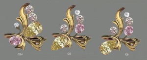
KLewis,
The bench gave me a quote based on this design below (C2r) but I also told him to feel free to around with the design, rearranging the stones as he feels fit since I am open to changes/ideas.
Uppy,
Yes, I think a more accurate description of the design is Belle Epoque but I'm not sure if most people have even heard of it. It should be picturesque whilst delicate. Think a wispy thin tendril, not a tree branch.

davi_el_mejor
Brilliant_Rock
- Joined
- Mar 8, 2010
- Messages
- 1,947
Thoughts on tweaking:
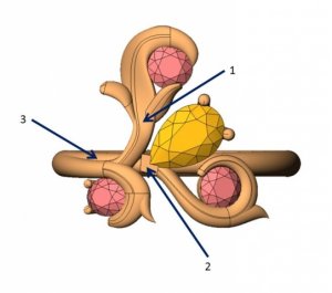
1. To make it more organic (in CAD) I'd have the side leaves peeled off from the center vein in the drawing if that makes sense. You said they'd be carving, so that will take the bulk out, but it would probably be easier to visualize this way.
2. At the point where the v prong sits, have the rest of the design shifted downward at about 6 degrees.
3. Major Tweak coming here- So, the CAD has a full round shank with the stones/tendrils just plopped right on top of it. It would feel far more organic if the shank was the tendril. This plays into 2. Where it's shifted down/separated it can the shank can be reattached at a slight twist just under the last curve in round. Less bulk and more fluid.
Just my thought

- Joined
- Aug 5, 2010
- Messages
- 12,816
Again, a first start to get your thoughts going, but I know that this CAD would need a lot tweaking to be close to your vision and standards, Chrono. I see that the whole stem/vine is too thick and not nearly as delicate and well vine-like as your inspiration. If you look at nature, stems/vines are almost always thicker at the base and get thinner and more delicate the more outward they grow. This is what you would like and what your inspiration shows. You also want a clear delineation/distinction between leaves and stems. I agree with Davi that the leaves should be more defined and coming off a more delicate stem. There is also something about the proportions of the metal to the stones. Proportions are very important to all of us, and it almost looks bread dough surrounding a raisin, rather than a bit of solid but intricate metal holding a true treasure in place if that makes sense, so I see the proportion of metal to stone as off, especially when it comes to right around the stones. The same would then be true of the prongs and with a little imagination, there should be a way that the prongs mimic nature too, maybe with a petal feel, like the flower (the stone) is still opening up? Just thoughts, but we are close enough that you are good at reading and interpreting my comments. I hope this helps, as you deserve exactly what your mind's eye sees. 
LoversKites
Brilliant_Rock
- Joined
- Nov 16, 2013
- Messages
- 1,733
minousbijoux|1395420642|3638817 said:Proportions are very important to all of us, and it almost looks bread dough surrounding a raisin, rather than a bit of solid but intricate metal holding a true treasure in place if that makes sense, so I see the proportion of metal to stone as off, especially when it comes to right around the stones.
That is a perfect comparison! You guys are so good at noticing these types of details.
- Joined
- Apr 22, 2004
- Messages
- 38,364
Time to put on your gloves for Round 2 of CADs. Ding! Ding! Ding!
These are still incomplete but lays down the basic structure of the ring. There will either be one large leaf covering most of the vines or several small leaves. I don't know what to make of the design. Can I get cold feet and just chicken out of this project?
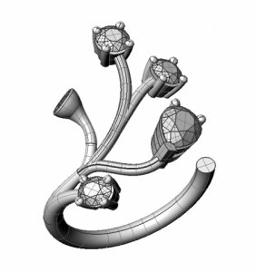
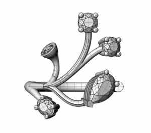
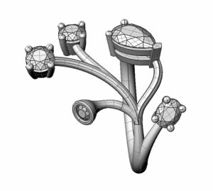
These are still incomplete but lays down the basic structure of the ring. There will either be one large leaf covering most of the vines or several small leaves. I don't know what to make of the design.




300x240.png)