shape
carat
color
clarity

Engagement ring CADS.

Sanks13

Rough_Rock
Joined
Sep 30, 2016
Messages
7
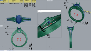
I'm designing an engagement ring with David Klass and have received CAD drawings of the ring and would like some input. I believe we are close but feel it seems like its missing something.

We don't like how the prongs attach down the the ring, but are unsure about how to design that differently.

If anyone has any opinions or suggestions on any part of the ring it would be greatly appreciated.
36034.png
 

Gypsy

Super_Ideal_Rock
Joined
Aug 8, 2005
Messages
40,225
I don't understand what you mean?

What is the problem?
 

tyty333

Super_Ideal_Rock
Premium
Joined
Dec 17, 2008
Messages
27,238
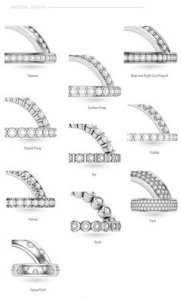
Looks like you are going with bead-set/bright cut pave? Is that what you're not liking?

different_pave_0.jpg
 

Sagefemme

Shiny_Rock
Joined
Oct 8, 2015
Messages
290
Overall I like this design very much. But I could see trying to integrate the prongs, especially as they get lower toward their attachment at the shank, a bit better. They may need to be more decorative, or scroll-like, rather than perfectly plain. They currently look a bit out of place in this more intricate design. But remember they always look more stark and noticeable in the CAD version than in real life. Ask DK to make the prongs PART of the decorative look the ring has from the side, as opposed to the stuck-on-top look.
 

Sanks13

Rough_Rock
Joined
Sep 30, 2016
Messages
7
Gypsy- I'm not a fan of the prongs right now. I don't like how they attach down the the ring near the two "s". I feel it looks boxy. I'm also concerned that in the area that I do have the "s" is is to plain. Do you think so as well?

tyty333- I ended up choosing a U setting, and I saw that in person, so I'm not to concerned about that. mostly what I wrote above to Gypsy.

Sagefemme- I Think that is a good starting place. Thanks for the advice. I was unsure of how to word what I didn't like, but I think you hit the nail on the head. Same question to you, do you feel the area with the "s" looks plain? should I add more to that area?
 

farrahlyn

Brilliant_Rock
Premium
Joined
Sep 22, 2015
Messages
1,170
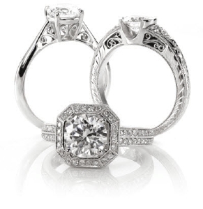
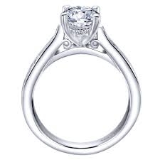
what about a slightly more ornate basket? similar to this one on the left


ornate_basket.jpg

or have the prongs form a "V" vs a box at the bottom of the basket and lengthen the scrolls for a simpler look similar to this

simpler_basket.jpg
 

tyty333

Super_Ideal_Rock
Premium
Joined
Dec 17, 2008
Messages
27,238

Sagefemme

Shiny_Rock
Joined
Oct 8, 2015
Messages
290
I think in a size 7.5 ring the two little s-scrolls could get lost (lots of shank vs smallish decorative element). I like what farrahlyn posted A LOT. All three of her examples are a little more fancy and the fanciness is noticeable. It also occurred to me that with rounded shapes like the s-scrolls, the very square-edged shank you currently have may be a mistake. In farrahlyn's first pic, on the left, you can see how the rounded shank fits better with the rounded decorative elements. That's just my opinion.
 

Sagefemme

Shiny_Rock
Joined
Oct 8, 2015
Messages
290
PS: I don't know how much the shank edge can be rounder and still accommodate the pave.
 

Elepig

Rough_Rock
Joined
Mar 16, 2016
Messages
57
I'd bring the prongs more to a 'v' at the bottom. I like the scrollwork as it is. Or maybe put a diamond at the top of each 's' ?
 

Sanks13

Rough_Rock
Joined
Sep 30, 2016
Messages
7
Thank you for the ideas everyone! I like a lot of the ideas given, so I've sent in my request in and we will see where it goes from there. I'll post the pictures when they come in. I think I'm going to try and integrate the prong bars down into the "s", and if not then I'm going to have the prongs come down into a V.

Thank you for the help everyone!
 
Be a part of the community Get 3 HCA Results
Top