shape
carat
color
clarity

Does this CAD match this design? - Opinions wanted!

kris10d

Rough_Rock
Joined
Apr 28, 2016
Messages
10
Hey guys,

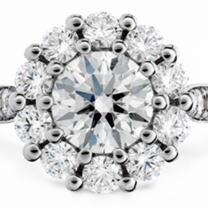
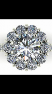
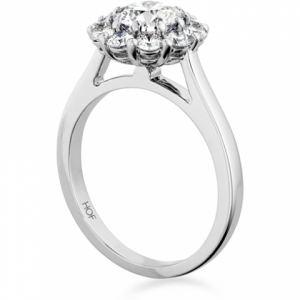
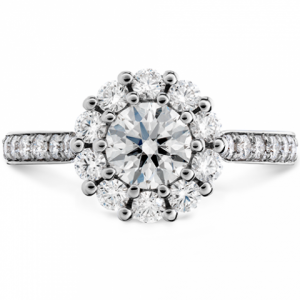
I have been working on designing a ring similar to a HOF ring I saw, and I just got the CAD back today. It's difficult to tell if the CAD matches the design I want perfectly. I am looking for as many opinions as I can get! Attached are the pictures, here are my concerns:

1. I want to avoid the "flowery" look as much as possible. I know this isn't entirely possible with large melees. Does the CAD look more "flowery"? I can't tell if it's the setting or the difference in diamond colors used
2. In order to minimize the floral pattern, I am thinking of asking to get the prong size increased. Do you guys think that will help?

Any opinion is greatly appreciated. Thanks!
beloved-open-gallery-engagement-ring-diamond-band-1.png

screenshot_2016-05-05-18-32-05-1-1.png

screenshot_2016-05-06-13-01-04.png

beloved-open-gallery-engagement-ring-2.png
 
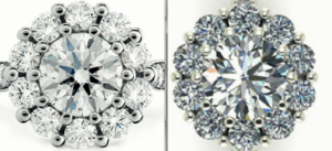
I am not an expert here by any means, but my first instinct when looking at the original vs. CADs is that the ratio of center stone to halo stones is different in the original. It looks like in the CAD the center stone is bigger compared to the halo stones, whereas in the original the difference between center and halo stones is less large.

I think the bigger the center stone compared to halo stones (unless they are small melee in a "traditional" halo) will increase the "flower" look.

Maybe what you want is for the halo stones to be slightly larger to avoid it looking too "flower-y"? For what it's worth I really love the CADs and think the proportions look great, but just commenting on the differences I noticed in proportions. :wavey:

ETA: somehow the placement of the stones is also different on the two versions (perhaps because of halo stone size differences). In the original there's 1 stone at the clear "top" and "bottom" of the center (but no one stone "exactly" at the side point where the shank meets halo). In the CAD there are two stones that look to be on the "top" and one clear "middle" stone on each side. So that might also contribute to differences you are observing.
 
I tried to accurately show them in a side by side view.

side-by-side.png
 
It's similar. But I like your CAD much better than the HOF.
 
Your stones are tucked under the center stone a little more than the HOF which appears to have a very slight line around the
center stone (which probably isnt noticeable in person).
 
another vote for the CAD being way nicer and more delicate than the HOF! I like the larger centre stone and while the look is still flowery, I think it's very pretty.
 
I think the outside prong needs to be tucked in a little more to get the look you want. The HOF outside prong doesn't sit on the edge, it is pushed in a little giving it more of a flower look. Without doing that it will look round rather than scalloped. I would specify a little under lap of your stones to the center as well. Sometimes this are just the cad difference from real life but if that is the look you want I would specify it.
 
I think your CAD looks better than the HOF ring as well. :))
 
Can you further explain this? I want to be able to explain it to the jeweler when I make suggestions. Thanks so much for your help!
 
I am sorry. I read your post wrong. Since you are trying to avoid the 'flowery' look, your cad is perfect. I wouldn't change anything.
 
I would ask them to raise the center stone a tiny bit. It will make the center slightly more prominent and get it more light too.

I like your CAD better than the HOF.
 
GET 3 FREE HCA RESULTS JOIN THE FORUM. ASK FOR HELP
Top