shape
carat
color
clarity

Do you like the color association?

Lunean

Rough_Rock
Joined
Feb 26, 2024
Messages
15
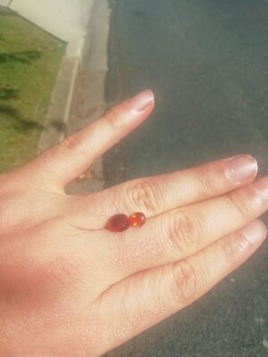
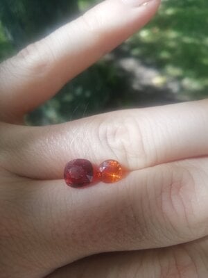
So I had asked for advice a few days ago about buying a tsavorite pair for a three stones ring and got good advice, thanks! It happens I had in my small collection a small sparkly spessartite and I'm wondering if you find the colors matching with the red spinel for a toi et moi ring. I find the sparklier orange tone helps make the red shine What do you think (once again taking decent pictures is such a pain)? Mandarin garnet is 1.6 carats, red spinel 2.9. IMG_20240303_152628.jpg IMG_20240303_152535.jpg
 

mellowyellowgirl

Ideal_Rock
Premium
Joined
May 17, 2014
Messages
6,244
I think they’re pretty and yes the colour scheme does work! I personally would like to throw in a scatter of diamonds for the bling factor but that’s up to you!

What colour gold are you thinking?
 

Daisys and Diamonds

Super_Ideal_Rock
Joined
Apr 30, 2019
Messages
22,827
i think it could look rather spectacular
with colours anything goes
i really love orange
i very much look forward to seeing the finished piece on your finger
 

Lunean

Rough_Rock
Joined
Feb 26, 2024
Messages
15
Thanks for your encouragements ! I was thinking yellow gold but maybe pink gold ?
 

dk168

Super_Ideal_Rock
Premium
Joined
Jul 7, 2013
Messages
12,499
Colour preferences are very personal, and I would prefer a stronger contrasting colour combination myself.

Each to their own and all that.

DK :))
 

Avondale

Brilliant_Rock
Joined
Oct 31, 2021
Messages
1,051
Try cleaning the camera lens of your phone. Should help with the overall quality of the photos. Most people don't realise their lenses get dirty from handling their phone and that's the reason their photos start dropping in quality.

Red and orange are complementary, so it could definitely work. You can still have contrasting colours integrated into the ring by including melee stones in the design, if you so wish.
 

T L

Super_Ideal_Rock
Premium
Joined
Sep 20, 2008
Messages
25,218
Colour preferences are very personal, and I would prefer a stronger contrasting colour combination myself.

Each to their own and all that.

DK :))

Yes, I also prefer opposite colors for better contrast like red and blue or orange and green.
 

Garnetgirl

Ideal_Rock
Joined
Dec 7, 2014
Messages
2,168
I like it.
And actually, I prefer this combination to red and green, which, to me, as opposite colours, is too much contrast. Also, red and green tend to look too “Christmasy” to me.

Yes, I also prefer opposite colors for better contrast like red and blue or orange and green.

On a colour wheel, red and green are opposites, as are blue and orange. I DO like your suggestion of red and blue, or green and orange, however. Just enough contrast to bring out the colour of the main stone.
 

JewelledEscalators

Brilliant_Rock
Joined
Mar 30, 2019
Messages
856
I think the colour scheme works, but from your photos, it looks like the spess is too bright for the spinel and would drown it out. However, it's hard to say for sure as your photos aren't very clear - perhaps take another set with the lens cleaned as somebody suggested?
 

Daisys and Diamonds

Super_Ideal_Rock
Joined
Apr 30, 2019
Messages
22,827
Try cleaning the camera lens of your phone. Should help with the overall quality of the photos. Most people don't realise their lenses get dirty from handling their phone and that's the reason their photos start dropping in quality.

thanks for the tip
i wish i had thought of that ages ago
 

LilAlex

Ideal_Rock
Premium
Joined
Mar 3, 2018
Messages
3,655
They seem to differ in brightness and that's what's holding me back. The orange looks much more vibrant. For a toi et moi, I think of two co-equals fighting for attention!
 

Lunean

Rough_Rock
Joined
Feb 26, 2024
Messages
15
They sparkle equally but the spinel is darker in tone I agree
 

Lisa Loves Shiny

Ideal_Rock
Premium
Joined
Nov 1, 2007
Messages
4,729
The ring will be pretty but I prefer two contrasting color stones for what you have planned.
 

Pomelo

Brilliant_Rock
Joined
Oct 20, 2015
Messages
544
@Lunean what a fun thought exercise!

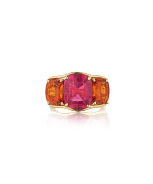
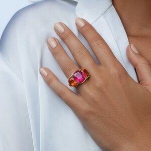
I personally like the orange and red combo - to my eye, it looks like one cohesive design with added visual interest because the colours are close but not the same.

This is not mine (sadly haha) but I’ve been thinking a lot about Verdura’s three stone rings and the different colour combos recently. It’s citrine and tourmaline.

IMG_6778.jpeg

IMG_6777.jpeg

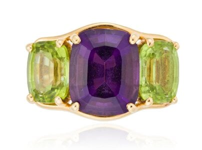
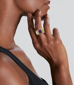
But on the other hand, I also like it when the colours aren’t closed matched - then, it becomes a distinct three-stone look and you appreciate each stone for itself more. These are amethyst and peridot.

So… of course I am no help :mrgreen2:
IMG_6781.jpeg
IMG_6780.jpeg
 

Lunean

Rough_Rock
Joined
Feb 26, 2024
Messages
15
@Lunean what a fun thought exercise!

I personally like the orange and red combo - to my eye, it looks like one cohesive design with added visual interest because the colours are close but not the same.

This is not mine (sadly haha) but I’ve been thinking a lot about Verdura’s three stone rings and the different colour combos recently. It’s citrine and tourmaline.

IMG_6778.jpeg

IMG_6777.jpeg

But on the other hand, I also like it when the colours aren’t closed matched - then, it becomes a distinct three-stone look and you appreciate each stone for itself more. These are amethyst and peridot.

So… of course I am no help :mrgreen2:
IMG_6781.jpeg
IMG_6780.jpeg

Hahaha that's exactly my hesitation! Thanks for sharing those designs, I love the first one!
 

Dreamer_D

Super_Ideal_Rock
Joined
Dec 16, 2007
Messages
25,527
That spinel is very special I sort of wAnt to see it with diamonds so the color really stands out!
 
Be a part of the community Get 3 HCA Results
Top