shape
carat
color
clarity

Diamond Color D-Z

Status
Not open for further replies. Please create a new topic or request for this thread to be opened.

aarikacareese

Rough_Rock
Joined
Dec 2, 2009
Messages
2
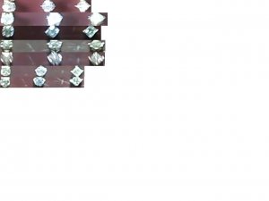
Ok after looking at these posts for a while i noticed alot of people asking if you could see the difference in the color grades. at rokstok.com there''s this cool app where you can compare 2 different grades at a time. I combined them all or almost all (I decided to skip some at the end) and post them all here so you can see the difference!!!
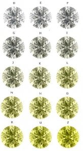
diamond colors6.JPG
 
Those colour charts are probably reasonable for viewing a stone face-up in good lighting, but if the lighting changes, or you view the stone from an angle, they can sometimes show one or two levels lower (on that chart) of greater tint.
 
I would say exactly the opposite. The colours in this example are grossly exaggerated. I think that the L in this example already is very close to ''light fancy''.

Now this could be due to my monitor, but it only shows that such ''virtual'' examples are close to useless.

Some aspects of a diamond can only be judged in real life, I am afraid, and when considering face-up-colour, one needs to remember that both the environment and the cut-quality will influence the perceived colour.

Live long,
 
yap, on my monitor, z color looks just like a fancy deep yellow to me. No way that is accurate.
 
my S-T very well cut looks more like the K
3.gif
Highly inaccurate
 
HORRIBLE^^^^^^^^

I think that will scare lots of newbies such as myself away from shopping higher colors. As I have recently posted, I couldnt see the differences between G''s and J''s in certain lighting conditions when put side by side at a local B&M. The best was when we were outside, I asked the SA to compare the J (that she told me would have a noticeable tint) to her ring and she was speechless
emembarrassed.gif
 
hmmm...I have an "M" and it doesn''t look that yellow
6.gif


fjiaemewamawemrejreje99993484.jpg
 
Ditto the others. My wife's I color E-ring stone look like a colorless in that line up on my monitor. It is obvious they are just adding yellow tint to the same diamond picture rather than using actual photos of graded stones.

Good Old Gold's video is much better at showing true color http://vimeo.com/3288695
 
Well, you can do a save-as, open up your copy, and color correct it, lol. Thanks for doing the work of assembling all those, aarikacareese.
 
Date: 12/3/2009 10:26:53 AM
Author: HVVS
Well, you can do a save-as, open up your copy, and color correct it, lol. Thanks for doing the work of assembling all those, aarikacareese.
I second that.. However I strongly argue the accuracy. I''ve seen M''s that have only the slightest body color
 
Date: 12/3/2009 10:07:43 AM
Author: jet2ks
Ditto the others. My wife''s I color E-ring stone look like a colorless in that line up on my monitor. It is obvious they are just adding yellow tint to the same diamond picture rather than using actual photos of graded stones.

Good Old Gold''s video is much better at showing true color http://vimeo.com/3288695
GOG''s color video is awesome - much better than any of these charts which I''m thinking were created to convince you to buy a colorless diamond to avoid the "dreaded yellow tint."

When I saw this, the first thing that came to mind is Maisie''s beautiful M. I hope she doesn''t mind me posting it. As you can see, it looks NOTHING like the M color on that chart:

maisiem.jpg
 
The problem with many photos and videos is that the lighting needs to be dazzling in order for the camera to work. In dazzling light, everything looks white - bleached.
But when the light isn't dazzling, or the stone is viewed from an angle, or the side, the colour can start to show.

That's exactly what this thread I've linked below describes - and it refers to the owner seeing colour in a super-super-ideal cut I-colour stone that was clearly of high enough quality that GOG were happy to offer it. Would anyone like to try to label the topic-starter as a liar?
https://www.pricescope.com/community/threads/need-to-make-decision-please-help-one-last-time.130759/

Readers can draw their own conclusions. I wonder how many people who swear that their M colour stone is brilliant white have ever seen a D colour? Maybe they hate to think that someone else has a whiter stone. Maybe - like a footbal fan - they insist that their team (or stone, in this case) is the best. Maybe they try to deny that their stone is tinted. I belong to some other internet sites (nothing to do with diamonds) and people will aggressively defend their choice - almost like rioting footballs fans attack each other.

I actually own several ideal-cut 1ct stones that I can compare (may I ask; do you?), covering most of the colourless (D-F) and near colourless (G-J) colours.
Telling the D/E/F apart is very difficult. Telling H/I or I/J apart is difficult. Telling F from H - even when mounted and face-up - is easy. In some lights, the H/I colour is very obvious, even to an untrained eye.

I really don't care what people buy - and budget will play a part - but stating that lower colours are always going to appear white to every viewer is a lie - or maybe a fantasy of the D-flawless "wannabe" crowd.
I thought that this site was about education and honest replies. It seems more like a "buy a big, low-colour stone because that's what we like here".
If you follow my "return of the steep/deep" thread, a few people have now been bold enough to stand up and state that they actually prefer steep/deep due to Tolk stones dark arrows. But on this board, anyone who likes a steep/deep would be persecuted and driven away.

Next year, I plan to have a better camera and will try to provide some pictures that show just how the "near colourless" stones can vary a lot, in certain lighting conditions.
 
My "L" RHR doesn't look as fancy as the one posted either, sorry.
39.gif


Date: 12/3/2009 11:19:14 AM
Author: lucyandroger

GOG's color video is awesome - much better than any of these charts which I'm thinking were created to convince you to buy a colorless diamond to avoid the 'dreaded yellow tint.'
Yeah the chart's not even close to accurate and the GOG video is way better (and what I show to my friends who are trying to learn about diamonds). I own a D, an F, an I and a misgraded J that's really more of a K/L. This chart is incredibly exaggerated (not to mention badly executed, as jet2ks said: it's transparently the same picture with more yellow added on each shot). The most tinted diamond I own shows about as much color as what they're calling an "H."

And fwiw, as I said in my thread in SMTR, I like warm colors and would never ever try to "praise" one of my own diamonds by calling it "white," because (and admittedly I am a crazy outlier on this one and will not pretend otherwise) to me that's basically saying something is more beautiful if it's white, which is ahahaha lol no. So I'm not gonna lie to myself or anyone else about the degree of tint I see in my stones.
 
I apologise for the poor quality of these pictures (and I expect some criticism, but it's the best that I can offer to support my argument). I plan to get a camera that can produce good close-up images. Suggestions for a suitable camera would be appreciated.
These pictures were the same three stones in a variety of everyday lighting conditions and have had no enhancement or special illumination. The centre stone is D colour. The stones on either side are H and I colour. All are just above 1ct and VS clarity. They are GIA-certified and attain AGA 1A or 1B cut grade.


In some lighting, the H/I "face up" just as white as the D. In other lighting, the H/I have noticeable tint.

d v hi 010x.jpg
 
I'm not saying that lower colours are bad. But I also hate to see people claim that D-F colours are a waste, when everyone has their specific ability to recognise colour and their ability to "live" with a stone that shows some warmth. If you've ever seen a strong blue fluor D-F, you will know how fantastic they can look (if that's to your taste). Put one of those "blue-whites" next to a non-fluor "white" and the non-fluor stone will - in certain light conditions - look like it's a lower colour grade.

In fact. I have a 1ct, I-J (or lower) colour pencilled-in for a purchase in the next few weeks - set in platinum or WG. The "bright autumn golden sunshine" look will be fantastic for use in certain lighting conditions. But I'm under no illusions that the stone will always appear brilliant white.
 
Date: 12/3/2009 5:13:53 AM
Author: FB.
Those colour charts are probably reasonable for viewing a stone face-up in good lighting, but if the lighting changes, or you view the stone from an angle, they can sometimes show one or two levels lower (on that chart) of greater tint.
Indeed, FB, we cannot say that you claim that lower colours are bad.

But you do say that these charts are reasonable and that, in lower lighting, the stones will show even greater tint.

That claim is incorrect by a huge extent.

Live long,
 
Date: 12/3/2009 12:30:00 PM
Author: FB.
The problem with many photos and videos is that the lighting needs to be dazzling in order for the camera to work. In dazzling light, everything looks white - bleached.

But when the light isn''t dazzling, or the stone is viewed from an angle, or the side, the colour can start to show.


That''s exactly what this thread I''ve linked below describes - and it refers to the owner seeing colour in a super-super-ideal cut I-colour stone that was clearly of high enough quality that GOG were happy to offer it. Would anyone like to try to label the topic-starter as a liar?

https://www.pricescope.com/community/threads/need-to-make-decision-please-help-one-last-time.130759/


Readers can draw their own conclusions. I wonder how many people who swear that their M colour stone is brilliant white have ever seen a D colour? Maybe they hate to think that someone else has a whiter stone. Maybe - like a footbal fan - they insist that their team (or stone, in this case) is the best. Maybe they try to deny that their stone is tinted. I belong to some other internet sites (nothing to do with diamonds) and people will aggressively defend their choice - almost like rioting footballs fans attack each other.


I actually own several ideal-cut 1ct stones that I can compare (may I ask; do you?), covering most of the colourless (D-F) and near colourless (G-J) colours.

Telling the D/E/F apart is very difficult. Telling H/I or I/J apart is difficult. Telling F from H - even when mounted and face-up - is easy. In some lights, the H/I colour is very obvious, even to an untrained eye.


I really don''t care what people buy - and budget will play a part - but stating that lower colours are always going to appear white to every viewer is a lie - or maybe a fantasy of the D-flawless ''wannabe'' crowd.

I thought that this site was about education and honest replies. It seems more like a ''buy a big, low-colour stone because that''s what we like here''.

If you follow my ''return of the steep/deep'' thread, a few people have now been bold enough to stand up and state that they actually prefer steep/deep due to Tolk stones dark arrows. But on this board, anyone who likes a steep/deep would be persecuted and driven away.


Next year, I plan to have a better camera and will try to provide some pictures that show just how the ''near colourless'' stones can vary a lot, in certain lighting conditions.

FB,
Your perspectives are appreciated just as much as the next guy or gal''s even when there is disagreement. Plus, they make for more interesting and thought provoking threads.
2.gif

I believe you may be overreacting and a bit too defensive here.
I loved the "supporting your team" concept and see that many times as well. I also see you have made some gross generalizations about PS members at large that appear grossly inaccurate and insulting.
7.gif
Likely you didn''t mean to come off that way I imagine.
As with any community, discussions can sometimes get heated. We could all do well to keep the newest PS members in mind when we post. FWIW
 
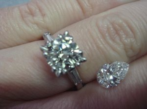
I've transplanted the picture because of it's direct relevance to this thread:

0 0 0 0 0  J round v E pear.jpg
 
They are nice examples of tinting, but as has been said before, the colors I see on my monitor are exaggerated. The Z would be a Fancy vivid yellow. I could only wish the color scale was so distinct from one grade to the next. I do think it portrays some good perspective in the HIJ range where to different eyes and with different cuts, the slightest tints become somewhat eye apparent to most individuals within these color grades although exactly at which grade does vary indivdually according to the viewer''s eye sensitivity and lighting. The contrast in color between the pear shape and the round in the shot just above this posting is a good one showing variance in color and how that looks to our eyes. All by itself, the round would not be particulary yellow looking, but compared to the pear, it does have some sort of body color going on.
 
Date: 12/3/2009 3:47:10 PM
Author: FB.
For those who would like more ''hard evidence'' of perception of colour, the following thread shows a picture of a J colour E-ring stone compared to an E colour pear.
E vs J.
Fact.
Can you see the ''golden autumn sunshine'' appearance of the E-ring stone? I certainly can.

https://www.pricescope.com/community/threads/strong-blue-pear-the-eagle-has-landed.130959/
I can see a tint in the J colored stone as compared to the E colored stone, but it is nowhere near a "golden autum sunshine" tint. That would imply quite a bit of yellow, and that''s not evident in the picture. I own an F colored stone and a J colored stone, and my J is definitely more tinted than the F, particularly in bright sunlight. I can see some yellow in certain lights in my J, and in other lights it looks very white. My F shows very little color no matter what the light. I have never claimed that my J looks like a D, and I never would. I do still think for people on a budget that a J is a good choice if it''s cut well. I will probably go higher in color when I trade my J in because J is near the upper limit of my tolerance.

(Also, I consider myself a pretty color sensitive person. In one of the jobs I worked at I had to match color standards and mix paint to match color standards, a much more challenging job than people might imagine. I scored well on the Munsell Color Test, so I can see slight differences in color shades.)
 
Date: 12/3/2009 6:47:59 AM
Author: Paul-Antwerp
I would say exactly the opposite. The colours in this example are grossly exaggerated. I think that the L in this example already is very close to ''light fancy''.

Now this could be due to my monitor, but it only shows that such ''virtual'' examples are close to useless.

Some aspects of a diamond can only be judged in real life, I am afraid, and when considering face-up-colour, one needs to remember that both the environment and the cut-quality will influence the perceived colour.

Live long,
I agree with you that chart is rather useless. This video is better http://www.vimeo.com/3288695 but really none really can accurately portray what can be seen in realy life under various ligting conditions.
 
Date: 12/3/2009 12:30:00 PM
Author: FB.
The problem with many photos and videos is that the lighting needs to be dazzling in order for the camera to work. In dazzling light, everything looks white - bleached.
But when the light isn't dazzling, or the stone is viewed from an angle, or the side, the colour can start to show.

That's exactly what this thread I've linked below describes - and it refers to the owner seeing colour in a super-super-ideal cut I-colour stone that was clearly of high enough quality that GOG were happy to offer it. Would anyone like to try to label the topic-starter as a liar?
https://www.pricescope.com/community/threads/need-to-make-decision-please-help-one-last-time.130759/

Readers can draw their own conclusions. I wonder how many people who swear that their M colour stone is brilliant white have ever seen a D colour? Maybe they hate to think that someone else has a whiter stone. Maybe - like a footbal fan - they insist that their team (or stone, in this case) is the best. Maybe they try to deny that their stone is tinted. I belong to some other internet sites (nothing to do with diamonds) and people will aggressively defend their choice - almost like rioting footballs fans attack each other.

I actually own several ideal-cut 1ct stones that I can compare (may I ask; do you?), covering most of the colourless (D-F) and near colourless (G-J) colours.
Telling the D/E/F apart is very difficult. Telling H/I or I/J apart is difficult. Telling F from H - even when mounted and face-up - is easy. In some lights, the H/I colour is very obvious, even to an untrained eye.

I really don't care what people buy - and budget will play a part - but stating that lower colours are always going to appear white to every viewer is a lie - or maybe a fantasy of the D-flawless 'wannabe' crowd.
I thought that this site was about education and honest replies. It seems more like a 'buy a big, low-colour stone because that's what we like here'.
If you follow my 'return of the steep/deep' thread, a few people have now been bold enough to stand up and state that they actually prefer steep/deep due to Tolk stones dark arrows. But on this board, anyone who likes a steep/deep would be persecuted and driven away.

Next year, I plan to have a better camera and will try to provide some pictures that show just how the 'near colourless' stones can vary a lot, in certain lighting conditions.
FB,

You can buy a set of 10 half carat Cubics like those used by an appraisor http://www.ottofrei.com/store/product.php?productid=5623&cat=1049&page=1 (I'm sure some appraisors have real sets or larger ones) and they should snap a picture, far better than comparing different cuts and sizes.

Even then diamond color is very dependant upon the lighting environment and also the picture taking conditions. Much more accurate are videos and even then Video cameras aren't always the best for slight differences in color.

All of this to say color has to viewed in person and its going to be extremely tough to support any color argument from photographs. I should also add the perception of color is much different depending on what is near the stones. The background matters(without a white background one or two color grades may not even be easily noticed), as Jon does in his comparison video http://www.vimeo.com/3288695.
You will also notice that the color difference in well cut rounds are much less faceup than how they are graded which is looking at the body from the side this makes a huge difference.

I did a comparison of a D and an H same branded cut on my Fiance's hand alone in Jewelry lighting they were both white and I couldn't tell much difference, put them side by side and there is a huge difference, the H had a distinct yellow tint beside the D. You just don't get that kind of information from a static image chart, this will likely do more damage than it helps.

Sure there seems to be a movement here on PS towards the G-H-I colored stones as you get more bang for your buck in the near colorless range. There is also another trend in the B&M world toward D E F colored stones as they are less likely to be rejected by customers and carry a higher premium(thus more profit) for the store. Neither movement is particularly wrong or right but I see PS as at least trying to balance that biased B&M trend and highlight to consumers to not be afraid to consider lower colors. I doubt too many consumers doubt how icy white a D colored diamond is, but they may have other wrong impressions about lower colored stones because of some poorly educated Maul clerk.

We aren't diamond racists here we don't descriminate on the basis of color
9.gif
.

CCL
 
I wish my S WERE as yellow as the R in that chart. It isn''t. It''s more like the color of the J. This is not wishful thinking or cheerleading--I''m not pretending my S is a D, for heaven''s sake. I already own an F the same size. I bought the S for its pretty pale yellow tone (and its gorgeous cut).

That chart is really off.
 
What worries me most about those images is that in the D-G range the diamonds get less bright looking on top of gaining a slight tint. It gives the impression that a G is duller in light return than a D, a property that is not related to colour.

I have a G and you know what, it is white enough for me. I looked at D stones in my search and was even told by a vendor that only a D stone would look good against my pale skin
32.gif
. When I look at my stone I don''t feel regret about not going for a D even though when they were all in a line I could tell slight differences between colour grades.

I don''t think anyone is arguing that an M will look identical to a D but that when taken out of a line up with higher coloured stones an M can be adequately white if the person who owns the ring deems it to be. I haven''t seen people on pricescope say ''you should get an x colour and a bigger carat size'', I''ve seen people explain that by dropping a few colour grades a buyer can get the size they want or larger within budget but it is almost always followed up with comments such as ''colour is a personal thing'', ''go out and look at colours in person before you make that decision'', etc.
 
Those range from white to yellow.

I believe the lower colors can be not just yellow, but brown too. No?
 
My W to X is sorta similar - not as vivid though.

If they are more brown, then the diamond could be classified in the "C" category...
I think the D to Z scale is for colorless to Yellow.
 
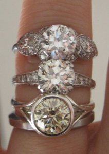
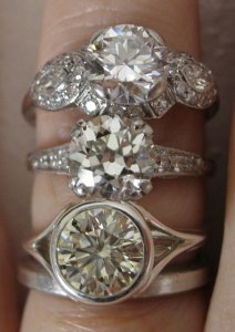
Here are my Infinity S on the bottom; my OEC L in the middle; and my transitional cut F on top. On my screen anyway, this is a quite accurate representation of how I see the colors in bright, filtered daylight.

All three stones are in the 1.5 carat range.

I1S12.jpg
 
Here''s another, in better focus.

I1S14.jpg
 
Status
Not open for further replies. Please create a new topic or request for this thread to be opened.
GET 3 FREE HCA RESULTS JOIN THE FORUM. ASK FOR HELP
Top