shape
carat
color
clarity

Deteriorating Gold?

I feel like I see the gap in both CADS, but maybe I'm just seeing the part that connects to the shank?

I do too. Kk, I hope it gets resolved to your satisfaction. Pitfalls of custom design, I don't think it ever turns out exactly as we envision.
 
I think your ring is gorgeous as it is. Maybe my eyesight is failing or the photos don't show it well, but I don't even see what you refer to as an issue. But of course, you do, and if you aren't happy, I'm guessing DK and Amy will make it right for you, if the design allows. Sorry that you are not thrilled with the ring. That must be disappointing. Please let us know how this is resolved.
 
I enlarged the images on my ipad - I don't see gaps in the final CAD. I do see them in the earlier one (10/31).

I'm going to be honest and say that I feel it doesn't take away from your ring at all, but it seems to be really bothering you so I hope you can get this resolved KK. it really is a beautiful ring.
 
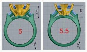
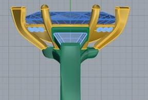
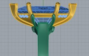
@KKJohnson There’s something very odd about the N/S view in last version of CADs you posted. That is the image on the left, with the previous version (same view) on the right. The latest image (left) looks like the cup was super-imposed or copy/pasted over the original. And the positioning of the cup does not center-align properly to the donut either whereas the previous CAD did. I’ve never seen a final CAD mock-up like that. :confused:

Did you post this latest CAD on PS after you got it from DK? I’d be very surprised someone wouldn’t notice that (not that it’s any PSer’s ‘fault’). I just find that VERY bizarre.

3D751ACF-C7D5-4A7C-9513-C22324396512.jpeg
 
An (enlarged) picture is worth a 1000 words! Like @junebug17 , I now see what you mean, @KKJohnson, so heaps of thanks for drawing our attention to how the CADs did differ in the profile views & here's enlargements for the convenience of others:
mold CAD
KK Johnson mold CAD.png

last CAD
KKJohnson final CAD.png
 
Thanks @KKJohnson there is a lot of confusion about that final cad ... the super-imposed cup, the missing diamonds on it but they were on it on the other views on the right, etc. I wish I’d have been following your journey more closely.

I don’t want to suggest any ‘blame’ in either direction ... was just trying to figure out what I was seeing. But I will wish you luck on getting it worked out to your satisfaction. :wavey:
 
Guess I will just do better in the future when I have the ring remade because at this point it going to happen. I have been keeping notes for the future over the things I don’t find appealing about the current design, it’s just another costly mistake that should have been avoided.

What are the other things you don't find appealing about the current design?
I think it's pretty, but I don't have to wear it and of course haven't seen it in real life to know how it performs.
You aren't the first to come to the conclusion ( after the first blush wears off) the setting you had commissioned is not right for you. You won't be the last. I think there's a few examples on PS of a poster having the same design being repeated/tweaked a few times to get right?
Your ER ring is important enough to keep at it to get it right for you. It's important enough that it evoked a strong enough reaction for the thread title. Best wishes for an outcome beneficial to all.
 
What are the other things you don't find appealing about the current design?

I wish the shank was thinner and more rounded, right now it’s a bit blunt and I want the center stone set higher as the wedding band is eating at the cup. I asked for the center to be set as low as possible so that is my fault but of course after wearing the rings it’s a bit more important to have it set higher so as to avoid damaging the rings. David has already drawn up a spacer ring to help with the rubbing but it would alter the design a bit more than I liked and I’m not wanting to add more rings to my short fingers. He also didn’t do the miligraining I asked for so I may ask for that again, it sure yet.
 
I am one of those PSers @Rfisher refers to - one who has had the same design iteratively tweaked. I certainly understand and sympathize with "learning as you go" :))

@the_mother_thing is spot on regarding that CAD - it really does look like a copy/paste hackjob. What on earth happened there? :confused2:
 
I too think the ring is amazing but am glad you reached out to David because I am sure he will make any changes that you would like.
 
Sending oooodles of dust your way with the wish that you and DK are soon able to reach a positive resolution that results in a ring that no longer disappoints but rather feels right to you, brings you much pleasure!!
cropduster.jpg
 
David emailed me saying he can close the holes or I can have the ring recast at a decent price,
I am heavily leaning towards recasting to have the other issues addressed so most likely that will happen next year.
 
GET 3 FREE HCA RESULTS JOIN THE FORUM. ASK FOR HELP
Top