shape
carat
color
clarity

David Klass Pendant

Josh_loveofjewels

Rough_Rock
Joined
Dec 7, 2019
Messages
67
Hey Pricescopers,

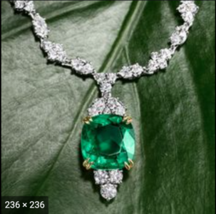
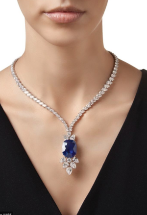
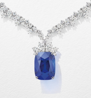
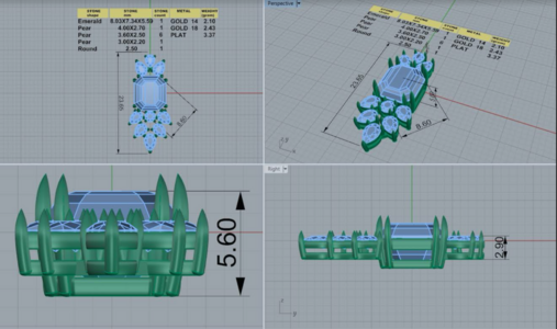
Im hoping this is the right space to be posting in. I just had David Klass restore my grandmothers diamond cluster ring and I am beyond impressed. I am having him start on an emerald and diamond pendant for my mother, and I just received the CAD back. I am shooting for something Harry Winston-ish. Im wondering how you all feel about the layout. I don't like the space between the round diamond at the bottom of the pendant, nor do I like the arrangement of the pears at the top of the pendant. Im wondering if any of you would give me some feed back, or even some ideas for my emerald. :)
 

Attachments

  • Screen Shot 2021-07-06 at 11.55.17 AM.png
    Screen Shot 2021-07-06 at 11.55.17 AM.png
    1.2 MB · Views: 49
  • Screen Shot 2021-07-22 at 2.15.11 PM.png
    Screen Shot 2021-07-22 at 2.15.11 PM.png
    996.9 KB · Views: 46
  • Screen Shot 2021-07-22 at 2.15.47 PM.png
    Screen Shot 2021-07-22 at 2.15.47 PM.png
    760.5 KB · Views: 44
  • Screen Shot 2021-07-26 at 8.17.12 PM.png
    Screen Shot 2021-07-26 at 8.17.12 PM.png
    891.1 KB · Views: 48
This will be such a beautiful pendant! I would flip the pear at the top, so that all of the points face outwards. I would also then swap the round at the bottom for a pear to better fit the space. Hope this helps!
 
I actually like the design the way it is, though perhaps you could ask him to put in a pear at the bottom instead of a round if you’d like to fill the gap better. I like the arrangement of pears at the top the way it is though. This pendant will be gorgeous!
 
What an amazing gift!! It‘s so thoughtful and beautiful. And, it seems very close to the second inspiration piece you were looking at, but is perhaps challenged by the different geometry between the original inspiraation cushion and your step cut? Perhaps that is why there is that space you note in the CADs? I like the idea of swaping a pear from the top with the round to fill that space, and it gives a bit of a reason for a bale or connection point to the chain or collar this is going to go on?
 
Another option is to use smaller diamonds, which will even out the gap below the round a bit.
 
In the second inspiration pic the stones are more angled so that the overall triangle shape at the bottom is curved inward as it flows from the point up. Your CAD stones (the first two up from the bottom-most one) are angled differently so that the curve is straightened (almost bowed out) and that is contributing to the space you don't like.
 
I wonder if you need smaller stones on the bottom? The bottom seems to overwhelm the middle stone moreso than the sapphire example.

I think this piece is going to be exquisite once you have perfected the design. Lovely gift!
 
Which of your inspiration pics would your mom like best?
 
Hey everyone,
I sort of lost track of this post. Anyway, after reading your recommendations, ive come up with this design. Let me know your thoughts :) I feel like the two pears flanking the larger pear at the top of the emerald need to be smallerScreen Shot 2021-09-07 at 1.53.24 PM.png
 
Last edited:
If you are going for the same proportions as the blue sapphire above (second picture), the top pears need to be smaller.
I think the bottom pears and marquise need to go just a tad shorter in length also. I did some measuring on-screen and
in the second picture (blue sapphire), the bottom diamonds seem to be about the same height as the blue sapphire. In your
CADs, the bottom diamonds seem to be longer than your center stone. If you like that look, then its fine but if you are trying
to get more towards the proportions of the second picture I would go smaller on the bottom diamonds too.

In your CADs
East/West, or widthwise, the diamonds on the bottom seem good. However, the diamonds on the top are sticking out too far
beyond the sides of the middle stone. Going smaller will help (hopefully fix) this.

If you're just trying to capture the gist of the second picture above, then you can ignore what I've posted above.:)

I agree that the pears at the top are too large. Its making the pendant look top heavy.
 
GET 3 FREE HCA RESULTS JOIN THE FORUM. ASK FOR HELP
Top