- Joined
- May 17, 2014
- Messages
- 7,207
I’m so sorry @moneymeister . Sending dust and prayers that your daughter’s SO has a mild case and everyone else remains healthy and virus free. Is your area being hit hard by the virus?
ugh very good friends of mine, their son in law is positive with possible exposure for others in the family some of whom are very very high risk. So far 2 negatives thank God.
last I heard he was on the way to recovery and was the only one that got it Thank God!@Karl_K I hope their son-in-law has a mild case...and your friends remain negative..
 apple.news
Doctor called them back - flu tests negative/ Both running 99.5 now


 www.npr.org
 www.npr.org
Coronavirus updates today from NPR. I copied and pasted as best I could but charts and graphs didn't post so if you're interested you can click onto the links.
AstraZeneca Trial Promises 'Highly Effective' COVID-19 Vaccine
The pharmaceutical company made the announcement on Monday, saying that one dosing regimen showed the vaccine was 90% effective in preventing infection.
"
U.K.-based pharmaceutical company AstraZeneca has developed a vaccine that initial results show to be "highly effective in preventing" COVID-19, the company announced Monday.
The vaccine, developed with the University of Oxford, showed an average efficacy of 70% in preventing the coronavirus, according to the company. However, that is an average of two dosing regimens — one involving two full doses at least a month apart that proved to be 62% effective. A second regimen, involving a half dose followed by a full does at least one month later was 90% effective, the company said.
The analysis of clinical studies of the vaccine trial showed no hospitalizations or severe cases in participants receiving the drug.
British Prime Minister Boris Johnson tweeted his excitement early Monday after AstraZeneca and Oxford announced their results.
"Incredibly exciting news the Oxford vaccine has proved so effective in trials. There are still further safety checks ahead, but these are fantastic results," he said."
Tracking the coronavirus around the U.S.: See how your state is doing
View NPR's maps and graphics to see where COVID-19 is hitting hardest in the U.S., which state outbreaks are under control and where cases are still spreading.
"
This page is updated regularly.
More than 12 million people in the U.S. have had confirmed coronavirus infections and more than 250,000 have died of COVID-19. Tens of thousands of new cases are reported daily nationwide. In the graphics below, explore the trends in your state.
View the data via a heat map (immediately below), curve charts, a table of state-by-state trends over four weeks, or a map of total cases and deaths.
The map above shows the risk of infection in each state based on new daily cases per capita. The consortium of researchers and public health experts who developed these risk levels advises states in the red category to issue stay-home orders. They advise orange states to consider stay-home orders, along with increased testing and contact tracing. Yellow states need to keep up social distancing and mask usage, and all states should continue testing and contact tracing.
To compare state outbreaks, the chart above graphs trend lines for average new daily cases and deaths against each state's totals to date. This type of visualization highlights a state's daily growth or decline relative to the overall size of its outbreak.
When both new and total case and death counts grow quickly, the curves bend upward. As new cases and deaths slow, the curves level or bend down. In New York, the curve rose sharply before reaching over 170,000 total cases in April. New cases fell from about 10,000 per day in mid-April to under 900 a day most of the summer, before starting to rise in the fall.
Explore the map above to see totals and per capita figures around the country for both new confirmed cases and reported deaths from COVID-19. New York was the original epicenter of the pandemic in the U.S. As of mid October, California, Florida and Texas surpass New York for total cases to date, though New York still has the highest death total.
Click here to see a global map of confirmed cases and deaths.
To show trends, the table below shows the change in average new cases per day in each state, week over week for the last 28 days. States marked in shades of red have growing outbreaks; those in shades of green, are declining.
"

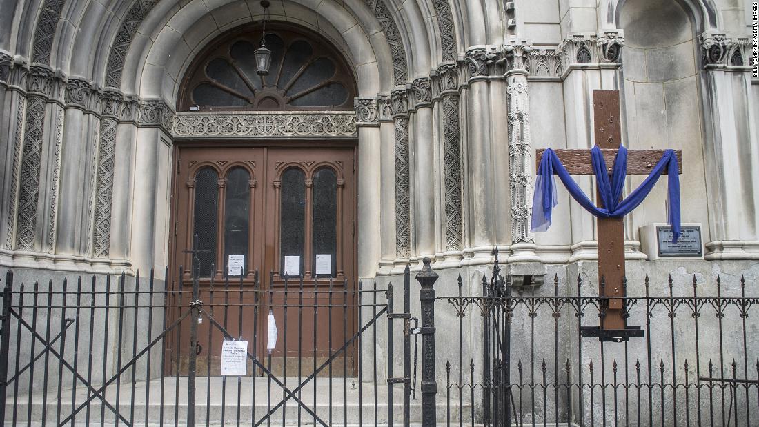
The Supreme Court knocked down a NY safety measure.
In a 5-4 ruling, Supreme Court sides with religious groups in a dispute over Covid-19 restrictions in New York
In a 5-4 ruling, the US Supreme Court sided with religious organizations in a dispute over Covid-19 restrictions put in place by New York Gov. Andrew Cuomo limiting the number of people attending religious services.www.cnn.com
I saw it this morning, UGH.
Hey, church provides immunity to large crowds!
So does protesting")
Indoor settings tend to be more dangerous than outdoor settings.
Saying that, I promise I get why this makes people upset, uneasy and frightened. Anything that brings people together to swap breath seems like it is against the best interest for society.
how are you and your's feeling today ?
Knocking on wood. Besides being over warm from cooking, feeling fine. Making dinner for myself and son who lives with us. Hubby is working today. We won't have family in this year, but will do a Thanksgiving meal after things are relatively safe. This is day 6.
Daughter and her s/o feel fine, if only slightly tired.
Thanks for asking

300x240.png)
