shape
carat
color
clarity

Color Contrast

Status
Not open for further replies. Please create a new topic or request for this thread to be opened.

ringplease

Shiny_Rock
Joined
Jan 18, 2007
Messages
130
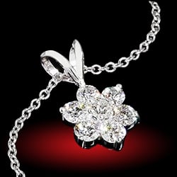
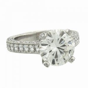
I think (and hope) that my boyfriend and I are in the final stages of choosing a setting for my old family diamond. It is a 1.5 ct RB VVS2 that was recut to ideal proportions. As it is an older diamond, it was graded as a K color. I don't sem to notice the color except when compared side to side against whiter stones of the same size. I am really in love with this halo (www.jackkelege.com). I love the cushion around the round stone and I think it is very classic. I think that it is "the one" we are going to go with, except I am concerned about how the color will look with the halo. Kelege uses VVS E/F/G stones in the halo and won't go any lower in color. I love the style but I am concerned with how such a big difference in color will look. Therefore, I am starting to look at other settings by kelege (see below) without halos, but my heart is really set on the halo.

Any pictures of warmer diamonds in halos of different colors? Suggestions?
Kelege simple.jpg
 
::covering my eyes about recutting old stones::

I do have only one piece of advice - make sure you are explicit and clear in your expectations of fitting a round stone in a square hole.
 
I think the halo setting is perfect as it is designed, so I wouldn''t be telling him to change anything about it!

I don''t necessarily see a problem with some color contrast, particularly since it is an antique style setting. I think the little diamonds in the setting will be sparkly, but their color probably won''t be all that apparent. But Dee Jay on here has a halo Jack Kelege setting, so she''d be the best one to tell you how she thinks a K color stone would look in the setting. Hopefully she will see this!
 
Thanks Sara :) I actually was not the one to recut the diamond, my aunt and uncle had it done in the early 90''s and it was well done. It may have been nice to have the original version but it''s too late now!!!

I know what you mean about being careful with the mismatched shapes of a stone and the halo. I have seen a few real versions of the ring and they turned out very well. No spaces between the center stone and the halo, low set, well done as it should be. Thanks for the word of warning. We will be sure it gets done right :)
 
I think the key is to send the stone to Jack Kelege to set. Don''t do it any other way.
 
Honestly, I''d get the setting you want despite the K color of your stone (both are gorgeous BTW!). I have an F colored center stone and lower color/clarity sidestones and it is *very* difficult to tell the difference. Another nice thing about halos for warmer colors is that this setting will cover the side of the stone more and that is where you see the most warmth. Also, I think warmer stones look awesome in antique style settings.
 
That setting is gorgeous!!!!
30.gif
 
Hmmm - that is quite a jump in color from F melee to a K center. Have you looked at Fay Cullen (www.faycullen.com) - they have quite a few rings with center stones that have lower color - most have sapphire or ruby halos but there may be some with diamonds - take a look and see what you think about it.
 
Thanks so much for all of your input.

I checked out the Fay Cullen site and that is the first time I have seen the contrast between different colors. Although I can see the difference between some of the lower colored center stones and the lighter melee, I think I we are going to go for the halo. The diamond faces up pretty much as white as a K can and I love the setting. As some other PSers have mentioned, most of the white comes from the side (or so I think) so the halo may actually help with that.

I think if I change my mind again my bf is going to give up!!!
 
Status
Not open for further replies. Please create a new topic or request for this thread to be opened.
GET 3 FREE HCA RESULTS JOIN THE FORUM. ASK FOR HELP
Top