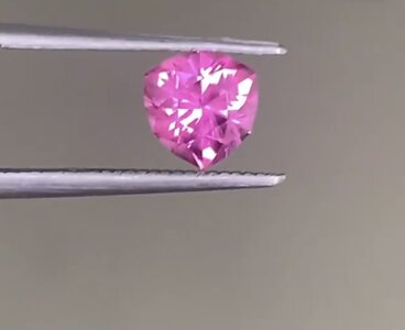
shape
carat
color
clarity

Anyone grab Gene’s latest pad sapphire?

Double E

Brilliant_Rock
Joined
Jun 23, 2018
Messages
959
A light tone one, disappeared so quickly!AACF1B39-0D0B-4005-8E00-A10C79D43EE4.jpeg
 
Last edited:
For goodness sake I miss everything! Do you recall how much it was? Very pretty.
 
For goodness sake I miss everything! Do you recall how much it was? Very pretty.

I believe it was a little over 2,200. It’s strange, usually it would be marked as sold, but it’s removed from his website completely…
 
Maybe he or the buyer didn’t want it second guessed and dissected like pads from a previous recent thread

I, too, would love to see more shots of it :)
 
Last edited:
I believe it was a little over 2,200. It’s strange, usually it would be marked as sold, but it’s removed from his website completely…

Yes around $2300 for abut more than 2ct, which is lower than a vivid pink of 1.6ct before.
 
How do you folks think about a pad with such colour saturation? It will be attractive for a pad given this price tag.
 
How do you folks think about a pad with such colour saturation? It will be attractive for a pad given this price tag.

I think you need the right skin tone for some padparadchas. That stone would “disappear” on my pasty skin, but on others, it would pop more.
 
Also depends on the setting. If there’s a ‘buffer’ like a halo/cluster between the stone and the skin tone that it might blend in with.

was there a video on the listing? If so did anyone grab a screenshot of that?
 
Last edited:
Also depends on the setting. If there’s a ‘buffer’ like a halo/cluster between the stone and the skin tone that it might blend in with.

was there a video on the listing? If so did anyone grab a screenshot of that?
I should have done it….
 
Maybe he or the buyer didn’t want it second guessed and dissected like pads from a previous recent thread

I, too, would love to see more shots of it :)

I must have missed that thread. I can understand that!

He did have a video. It was beautiful. Probably too pale for my pale skin, but beautiful nonetheless!
 
I must have missed that thread. I can understand that!

He did have a video. It was beautiful. Probably too pale for my pale skin, but beautiful nonetheless!

It’s quite pale really, just far more affordable than darker ones :)
 
I would have called it a pale pink sapphire based on that one photo ... Gene doesn't usually get lab reports on his stones ... did he really call it a pad sapphire?
 
I would have called it a pale pink sapphire based on that one photo ... Gene doesn't usually get lab reports on his stones ... did he really call it a pad sapphire?

I can see why you think that way. However considering how he price the stone, I would rather think the characteristics of pad is more subtle on the photo. Could this be the situation here?
 
Also depends on the setting. If there’s a ‘buffer’ like a halo/cluster between the stone and the skin tone that it might blend in with.

was there a video on the listing? If so did anyone grab a screenshot of that?

Yes, like a mint green melee halo.
 
I normally take a listing down when a stone is sold to a jeweler.
Same
Sincerely meant no harm/no hard feelings
Thank you for the explanation.
 
Last edited:
How do you folks think about a pad with such colour saturation? It will be attractive for a pad given this price tag.

This colour (perhaps with a little more saturation) was the ONLY colour that was considered to be a Pad in days gone by. Now more vivid gems are being considered as a Pad. Personally I dislike the vivid stones and I don’t see them as pads but others will disagree. I trust Gene’s eye and if he says this would be designated as a Pad I would believe him. It’s a shame we can’t see a video because I would love to see this stone.
 
This colour (perhaps with a little more saturation) was the ONLY colour that was considered to be a Pad in days gone by. Now more vivid gems are being considered as a Pad. Personally I dislike the vivid stones and I don’t see them as pads but others will disagree. I trust Gene’s eye and if he says this would be designated as a Pad I would believe him. It’s a shame we can’t see a video because I would love to see this stone.

I believe I might have also read some info online suggesting that a pad is not supposed to be too saturated, but looks more often said now there’s no universal standard for a gem to qualify as a pad.

nevermind I think as long as the owner love what colour they have in hand:)

I do wonder in what way is the combination of orange and pink for a pad. E.g. showing the two colours when ts viewed from different angle? Or both should be notable to our eyes whatever direction we look at it?

I also saw some with the two hues separated more obviously but still beautiful. But I think it should be categorised as Parti right?
 
This colour (perhaps with a little more saturation) was the ONLY colour that was considered to be a Pad in days gone by. Now more vivid gems are being considered as a Pad. Personally I dislike the vivid stones and I don’t see them as pads but others will disagree. I trust Gene’s eye and if he says this would be designated as a Pad I would believe him. It’s a shame we can’t see a video because I would love to see this stone.

And same here~
 
Just examples further to my last two posts:


more separate colours. Is it colour zoning actually?
72E1C377-C39D-4EEF-9E42-38F587A5B9F7.jpeg

more saturated and vivid one
1206DD9B-AAED-415C-BCEB-7682C2504F99.jpeg

I don’t actually see two colours actually for this one, but rather the orange and pink fully mixed and blended as a result of one colour(which is pleasant though)
913AE403-3732-478E-BB21-F4F43EFF9878.jpeg
 
Last edited:
Just examples further to my last two posts:


more separate colours. Is it colour zoning actually?
72E1C377-C39D-4EEF-9E42-38F587A5B9F7.jpeg

more saturated and vivid one
1206DD9B-AAED-415C-BCEB-7682C2504F99.jpeg

I don’t actually see two colours actually for this one, but rather the orange and pink fully mixed and blended as a result of one colour(which is pleasant though)
913AE403-3732-478E-BB21-F4F43EFF9878.jpeg

First picture could be zoning and if it is it would not be designated a pad. Would need to see more photos. If it’s not zoning then it would be a pad.

second photo I definitely see orange and pink and although this is too saturated for my taste I think that would get the pad designation.

third photo - no orange at all. I wouldn’t call that a pad.

Thanks~!

It looks like stone with lighter pink body colour makes the orange hue pops more obviously.
 
Thanks~!

It looks like stone with lighter pink body colour makes the orange hue pops more obviously.

Not necessarily. There’s no perfect formula.
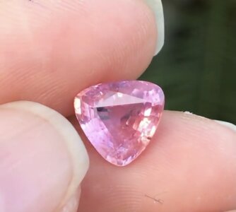
 
More examples:


can this be a slightly more saturated version of Gene’s stone, colour wise only, not in terms of cut, the standard not comparable. This one is not precision cut and with a window.
0065FFF2-16C1-485F-9660-48197C8330BD.jpeg

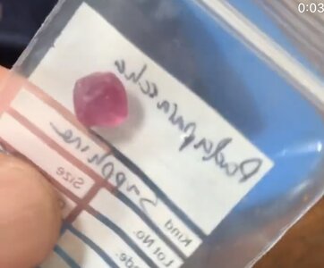
Another one from one of the vendor mentioned in previous posts. Not sure if it’s the problem of lighting, I can’t see orange or even peach, but still claimed to be a pad. Nice colour and cut though ~I attach also a pic when it’s still a rough.
222D6824-7B8B-4184-B7E8-CCF8D9B762D3.jpegD1FEF83C-4E3E-434A-8452-C2ACA0CFA6D5.jpeg
 
GET 3 FREE HCA RESULTS JOIN THE FORUM. ASK FOR HELP

Featured Topics

Top