shape
carat
color
clarity

3.22 pink tourmaline from RDG sellout -how to set?

Yellow gold brings out the warmth of the stone. White really does nothing for it IMO.
 
GlamMosher said:
OK. We had a little mini GTG today with Chel and Susimoo. They had some coloured gold chains etc, so I could play around with colour.
So do you have a clear favorite?

Can you do one more mockup and replace the centre stone with the one in the first pic in the thread please? (vendor photo) It will give us all a more realistic idea :))
 
It's such a beautiful stone irl. The depth of color and cut are fantastic. To my eyes it popped with the yellow gold as it's very similar in color to rose gold.

I think it would look really pretty Glam, in that last setting you photoshopped. Such a pretty stone doesn't need much adornment.
 
Thanks for having us Chel! I love your baby Annie. Tell her she is always welcome at Aunty Glam's house for extra nibbles. I'll turn her into a fat beagle in no time.

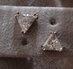
I think I will go with the yellow gold now. I am so indecisive. I am seriously considering buying ForteKitty's trillion earrings as side stones. What do we all think? Yes or no?

1836362.jpg
 
Starzin|1409492861|3742381 said:
GlamMosher said:
OK. We had a little mini GTG today with Chel and Susimoo. They had some coloured gold chains etc, so I could play around with colour.

So do you have a clear favorite?

Can you do one more mockup and replace the centre stone with the one in the first pic in the thread please? (vendor photo) It will give us all a more realistic idea :))

I am at work Starzin but will have a go tonight at home. What do you think of the trillions? They are about 7mm sides.
 
Trillions would be stunning with it but, do you need to spend more on those when you have the 6 round diamonds unworn? Just being devil's advocate here.

ETA: what colour gold is most of your jewellery? Are there things you don't wear because they are one colour or the other? I note your wedding set is WG/plat remember you can always have a WG ring with just the head and claws for the tourmaline in yellow gold (the diamonds would also be WG).
 
It was lovely to catch up Glam.

I actually think the cluster of three rounds would be prettier- softer looking than the trilliants. -IMHO.
 
Starzin|1409539723|3742724 said:
Trillions would be stunning with it but, do you need to spend more on those when you have the 6 round diamonds unworn? Just being devil's advocate here.

ETA: what colour gold is most of your jewellery? Are there things you don't wear because they are one colour or the other? I note your wedding set is WG/plat remember you can always have a WG ring with just the head and claws for the tourmaline in yellow gold (the diamonds would also be WG).

Most of my jewellery is white gold/platinum but I do wear a yellow and white gold RHR at the moment so YG wouldn't bother me.

thanks for being devil's advocate - are you sure my husband hasn't been in touch?

Chel you may be right about the rounds being softer. I think I will speak to my man and see if he can do a cad with claws on the main stone and the 3 side stones bezelled. Maybe into a triangle shape.
 
Oh well no need to decide on the trillions any longer as someone bought them... ;(

Never mind.
 
Starzin|1409492861|3742381 said:
Can you do one more mockup and replace the centre stone with the one in the first pic in the thread please? (vendor photo) It will give us all a more realistic idea :))

Here it is in the white gold.

wg_with_pt.jpg
 
Here it is again in yellow gold with the vendor photo.

ygring_copy.jpg

I think the yellow gold is a winner, yes?
 
or a bit of both?

both_0.jpg
 
Most of my jewellery is white gold/platinum but I do wear a yellow and white gold RHR at the moment so YG wouldn't bother me.
That's good then!
thanks for being devil's advocate - are you sure my husband hasn't been in touch?
:lol: :shock: :lol:

Thanks for the new photos, it helps enormously and I think it probably helps you to visualise it a little better too. As you said - and I agree - the all YG is a winner, but if you did want to do a bit of both, I would stick to the prongs and head (basket) in YG for the tourm and keep the diamonds in WG.

I think it will be a stunning ring :))
 
2 toned! :))
 
Hi Chrono (did I mention I am indecisive?) I am liking the 2 tone too now! I think it will blend better with what I wear now. I have emailed my "man" and am waiting for him to get back to me. I will post what he sends!
 
I am not a fan of two toned metals. I am also not a fan of rose gold. But for the color of the stone you have-and I know computer colors vary, I think rose gold would beautiful. But I am not a fan of rose gold with diamonds... so I am at a loss. I love a touch of diamonds as accents but if you have three on each side that means more setting/prongs and more metal than a three stone ring with a diamond on each side...as in your trillions suggestion. I am not a fan of trillions and would think half moons or bullets would look pretty. Again, I can't wait to see what you do as I think that stone is so pretty-color and cut.
 
Any news GlamMosher?
 
No, no news yet Starzin. I will chase him up early this week.
 
Good-oh :appl: Can't wait to see this beauty set!
 
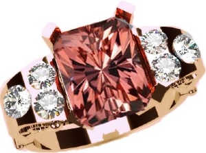
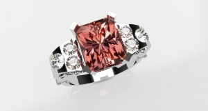
OK Cads are in! Surprisingly my jeweller said white gold would be much better for the colour of the stone. I actually really like it as a first go! Obv it is chunkier than it will be but I like the detailing.

See what you think - any suggestions/comments gratefully accepted.
alyson_coloured_stone_ring_3d__01_rendering_3.jpgalyson_coloured_stone_ring_3d__01_rendering_2.jpgalyson_coloured_stone_ring_3d__01_rendering_1.jpgalyson_coloured_stone_ring_3d_01.jpg
 
Bumpity bump.

Anyone?
 
Hmmm,I still think yellow or rose gold would be best for this stone - trust your own instinct, not necessarily the jewellers... :think:

The CAD you've posted is a nice idea, although the shoulders look very chunky/award to me... personally I'd go with a more streamlined Art Deco look keeping in line with the sharp angles of the stone. I like the use of diamonds on the side but think the shank needs to be narrower?
 
Not loving it in white gold, to be honest. I liked the yellow gold and the two tone. That setting - well, better qualified with CAD should chime in - but I am not loving it but that is probably because I'm not really very good with interpreting CAD.

I am looking forward to seeing what you decide on tho.
 
Yeah, I think white metal would be the last choice I'd consider.

As far as the CADs go, I'm not really sure what you want out of them, so do you have inspiration pictures or anything that would give us an idea of where you are wanting to go with this concept? Is this a local jeweler or someone we might know? How big are the stones on the shoulders?
 
Thanks all for the input.

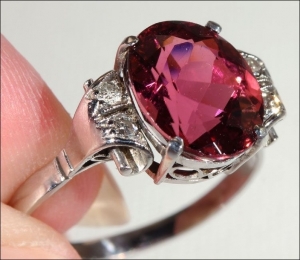
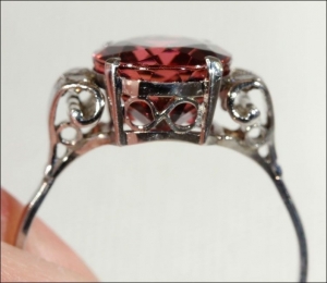
I sent him the pics of the ones we played with above and also this one.

pt_ring_4.jpg
pt_ring_2.jpg

The side stones are between 12 and 15pts.

It is a local designer so not anyone you would know.

I played around (badly) with the colours below using the pic of my stone.
dv_yg.jpgdv_rg.jpgdv_wg.jpg

If we disregard the gold colour, what suggestions do you guys have for the design? I did ask for a comfort fit, so that's probably why the shank looks chunkier. More slim lined shoulders? Or is it just the cads that look chunky? I don't really like the little scroll in the basket, maybe a heart or something there?
 
Is it possible to do the whole ring in white gold, and just the part of the basket/head holding the tourmaline in rose gold? Or yellow for that matter?

It does look pretty chunkariffic, are the stones going to be set into the band? I have a hard time interpreting CADs :rodent:

It's a stunning stone, I love the colour.
 
As everybody has said, it's a really nice stone -- has its own personality. I don't see how a comfort fit makes it necessary to have the setting so chunky. The examples you posted that you liked are graceful; the CAD is not. It's what you like that matters, of course -- if this is the look you're going for, super. But compare the last inspiration ring you sent to the jeweler with the CAD -- looks like he tried to emulate it but didn't quite get there.

I am also not blown away by white metal with that stone. I think it deadens the lovely depth of color, but it's probable that you see more in it than I do -- and in the end not important at all what I think! It's your happiness that counts.

--- Laurie
 
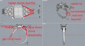
If you stick with that design, I would cut it down to 2 accent stones on the shank, like the inspiration pic, the 3rd stone makes the shank stick out too much, making the entire top half of the ring look very square.

You could use those two extra stones and put them in a bezel in the basket, instead of the figure 8 design, if you still wanted to use them

The curvature with the stones, once cut down to 2, wold need to drop down to the shank much more quickly.

The curve connected to that accent stone area in the inspiration does not touch the shank, in the cad it does.

Also the extra curve next to the O shape could probably go, that is, if you want it to look like the original.

heres my terrible attempt to visualize what i was saying. Just some suggestions, but i think it would reduce the bulk, which i think is part CAD, but also a lot because of the design


Also i agree with everyone i would put the stone in a different color basket. Ive done that before with rings and i find the two tone to be subtle and hard to notice in the design, but certainly noticeable when considering the color of the stone
please pretend i spelled "lose" correctly :doh:

alyson_coloured_stone_ring_3d_01.jpg
 
Well it's certainly a high, wide and handsome ring!

The choice of white or yellow gold is very much a personal preference (and the jeweller is entitled to his opinion), however I also think that the white is washing out your lovely stone a little and IMHO a yellow gold basket and prongs would complement your stone more, no need to go all yellow.

I like the little roll the jeweller has put on the side where the top joins the shank but wonder if in fact this will be comfortable since it may be between your fingers?

Niel's suggestions are very good if you want a way of slimming it down a little. You could even keep the three on the top but adopt her suggestion of losing the air space or "gap" (bottom left) and let it slant more rather than have "padded shoulders" :))

While CADs typically make anything look chunkier than it will be in reality, I think this would still be a fairly heavy ring and only you can decide if that's a look you are happy with.
 
Good feedback guys!

To be honest I quite like the side view, with the straighter top, and even where the shoulders join the shank. I have quite big fingers (right hand is size 7) so can carry a bigger design. I don't like the "s" thing as I have a thing about things being symmetrical.

So! I have asked for another option showing it in yellow gold, with more slimline shoulders (maybe a bit of a curve), diamonds closer together and different design in the basket.

It will probably after Tuesday as it is a long weekend here.
 
GET 3 FREE HCA RESULTS JOIN THE FORUM. ASK FOR HELP

Featured Topics

Top