shape
carat
color
clarity

which way?

Which way would you set this diamond?

  • #2 East/West

    Votes: 1 100.0%

  • Total voters
    1
Status
Not open for further replies. Please create a new topic or request for this thread to be opened.
wow this is so close... it was 60/40 for e/w most of yesterday and now n/s has taken the lead, but only barely - so basicall you guys think either way will work just about equally well? LMAO!
 
I like N/S... It certainly softens the look & elongates your fingers. Maybe the split prong & NS might be enough width to cover more of the top of your finger?

You made me laugh about the pipe cleaner & clay thing. Back in Jan. when I was trying to figure out my RHR, I was printing off pics & then colouring them in to the sapphire/diamond sequence I thought I would want. Then I would cut a hole in the shank & slip it on my finger. LOL LOL I know, I''m an idiot, but somehow you know, I did get an idea of what I liked. LOL

Judy
:-)
 
Okay, let me brainstorm some pros and cons of each, just to get it out there and maybe get some more input from you guys...

Pro for NS
Flattering to finger
More beautiful and classic look
Very feminine
Gives an oval illusion which could be good for a weird looking stone

Con for NS
More classic = more ordinary/typical/boring
fat fingers = big stone looks small lol
gives an oval illusion which takes away from unique nature
Haven''t found a setting that works yet
more fragile/exposed on the long e/w sides

Pro for EW
Wont stick out as much, less likely to catch on things (bonus points)
Setting practically designs itself - very easy
very modern
most people would view it in its more beautiful horizontal way
Unique setting for unique cut - flattering to diamond

Con for EW
Makes stone look smaller
weird setting for weird cut = very weird ring

can you think of any others?
 
Date: 9/15/2006 11:40:31 AM
Author: ccuheartnurse
I like N/S... It certainly softens the look & elongates your fingers. Maybe the split prong & NS might be enough width to cover more of the top of your finger?

You made me laugh about the pipe cleaner & clay thing. Back in Jan. when I was trying to figure out my RHR, I was printing off pics & then colouring them in to the sapphire/diamond sequence I thought I would want. Then I would cut a hole in the shank & slip it on my finger. LOL LOL I know, I''m an idiot, but somehow you know, I did get an idea of what I liked. LOL

Judy
:-)
yes I made actually THREE models. One out of green clay with a bell for a stone, one out of pipecleaners with white clay as a stone and a small one totally out of clay that I could wear on my finger with a clay stone the dimensions of the stone I was going to get but didn''t actually recieve for a week lol! Once I got the stone the little one bit the dust but i still have the other two, I should share pictures LOL
 
Date: 9/15/2006 12:01:03 PM
Author: Cehrabehra

Date: 9/15/2006 11:40:31 AM
Author: ccuheartnurse
I like N/S... It certainly softens the look & elongates your fingers. Maybe the split prong & NS might be enough width to cover more of the top of your finger?

You made me laugh about the pipe cleaner & clay thing. Back in Jan. when I was trying to figure out my RHR, I was printing off pics & then colouring them in to the sapphire/diamond sequence I thought I would want. Then I would cut a hole in the shank & slip it on my finger. LOL LOL I know, I''m an idiot, but somehow you know, I did get an idea of what I liked. LOL

Judy
:-)
yes I made actually THREE models. One out of green clay with a bell for a stone, one out of pipecleaners with white clay as a stone and a small one totally out of clay that I could wear on my finger with a clay stone the dimensions of the stone I was going to get but didn''t actually recieve for a week lol! Once I got the stone the little one bit the dust but i still have the other two, I should share pictures LOL
btw all 3 models have the stone set e/w
BUT
my husband likes it better n/s
SO
it''s still a tossup

a local jeweler is having one of those mounting blowouts today so I''ll go and see what I can see and if nothing pops out then I''ll go e/w because I already have that design 95% done in my head.
 
I have to disagree with your cons on E/W setting:

1.It does not make the stone look smaller.

2. It''s not a weird stone (it''s a beauty!) .

3. Have you chosen a final setting? If it complements the cushion E/W, it will not = a weird ring.

I think I''ve made my point.
9.gif
 
Date: 9/15/2006 2:45:57 PM
Author: isaku5
I have to disagree with your cons on E/W setting:


1.It does not make the stone look smaller.


2. It''s not a weird stone (it''s a beauty!) .


3. Have you chosen a final setting? If it complements the cushion E/W, it will not = a weird ring.


I think I''ve made my point.
9.gif

I agree that e/w does not make your stone look smaller. I think it compliments your finger more than the n/s
 
Date: 9/15/2006 2:45:57 PM
Author: isaku5
I have to disagree with your cons on E/W setting:

1.It does not make the stone look smaller.

2. It''s not a weird stone (it''s a beauty!) .

3. Have you chosen a final setting? If it complements the cushion E/W, it will not = a weird ring.

I think I''ve made my point.
9.gif
LOL
::sigh:: I''m having such a tough time with this stone! I was 100% set when I went to look at settings today and when I got there the guy I spoke with a couple weeks ago reminded me that I''d asked him to bring in a big well cut round so he showed it to me and it was a 2.26k and they had NO info on it because it was "so newly cut it wasn''t certed" LOL but visually it was very wow, it honestly was the only stone that has actually beat mine by a distance in scint, but it was all very very uniform. The LGF looked to be VERY long like 90% or something crazy like that, and while the scint was better, it was very boring, all the same. And the color was gross!! I mean I thought I''d love a k, but I don''t know what was up with this... it wasn''t a lemony yellow, it wasn''t an ivory yellow (like mine) it wasn''t a brownish yellow... it was a *greenish* yellow - I swear it looked like moissenite (sp?) and it sparkled like it too, if someone said they switched it out I wouldn''t be surprised. And not a pretty greenish yellow like Mt Dew... a drab olivey color. Really weird. Very dark. The stone had very little brilliance but a lot of fire. It also had a culet I noticed right away in the loupe. Very weird for a RB to have one I thought. not big but still...

Anyway this woman was a snob for her diamond and I let her get to me
7.gif
First she tried to tell me that my stone had fewer facets than her round and I said mine has one more, oh no wait, they''re both 58 since your round has a culet (hehe) and she got a cushion and said "this is a cushion that has been cut correctly" and I looked at it and it was soooooo ugly inside with a huge feather inclusion right at the top of the table in the middle. So I louped it and it just wasn''t good, you could tell the sym wasn''t great. but that "cut correctly" part still *bothered* me! Later she said something about a "properly cut" stone. So then I started getting really critical of my stone again @@ but later after lunch on my way home I was like, Sara - it''s a fancy cut. Yes, you''re going to have issues like when it''s dirty it won''t do those tricks as well as a dirty round will. And yes, it''s going to be funky and that''s what you love about it too. And yes, it won''t do this and that that a round can but it does other things better than rounds, especially sitting on your finger in shape other than a circle!

So my conclusion is this... yes there are better stones out there I''m sure, but I can''t afford them LOL And when in the land of big facets, the bigger the stone the better :D I also have decided that a stone with 6 facets on a shallow pavillion and a 25% crown and 25% table would be lovely ROFL!!!
 
so on to the settings... I looked at a ton of them (NONE for e/w) and I only liked one but it was way overpriced and had a couple things I''d want different. Maybe someone here has seen one like this... ?

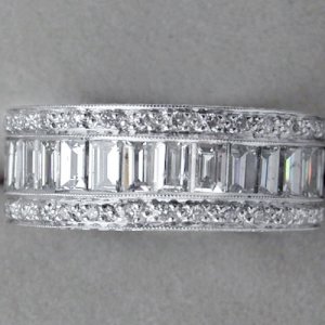
It was 6mm wide tapering to 4mm wide and it had two rows of little tiny diamonds with a row of stacked baguettes in the middle. My stone sitting on top of that setting looked perfect but they couldn''t get a basket in there, just a 6 prong head and the little rounds were in some kind of 4 prong setting that was kinda rough like a zipper or something, I didn''t like that... made me long for my channel set diamonds. I''d like to know what my options are on that one - is there a good site that shows different types of melee settings?
 
"Cut correctly"? puh-leeeze. a) this woman is trying to SELL you something ... and b) as you VERY WELL KNOW "correctly" is a REEE-diculous way to phrase anything about such a magnificent, mysterious beast as CUSHIONS.

Tell that to Widget! That her MAGNIFICENT HEIRLOOM asscher isn''t cut "correctly". She''ll just laugh at you. And you should laugh at anyone who PRETENDS to be an expert on cushions.
20.gif


Pity them actually. How depserate/delusional/misinformed must they be?
38.gif


Oh ... and I totally agree with Isuku & Tacori ... E/W DOES NOT make your stone look smaller to my eye. And I think that direction FLATTERS & is complementary to the soft silohuette of your hand .. where the N/S tends to fight the softness, yet emphasizes it ... rather than blends in with it. I''m not making sense....
3.gif
 
I''m a bit late to the poll but wanted to vote east west. I think it makes the stone look so beautiful and I actually think it looks better on your hand.
 
I usually don''t care for e/w orientation............but on your hand with that stone, I much prefer e/w.
 
Date: 9/15/2006 9:56:00 PM
Author: diamondsrock
I''m a bit late to the poll but wanted to vote east west. I think it makes the stone look so beautiful and I actually think it looks better on your hand.
Oh you''re not late :) I''m sitting firmly on the fence LOL
 
Date: 9/15/2006 7:45:08 PM
Author: decodelighted
''Cut correctly''? puh-leeeze. a) this woman is trying to SELL you something ... and b) as you VERY WELL KNOW ''correctly'' is a REEE-diculous way to phrase anything about such a magnificent, mysterious beast as CUSHIONS.

Tell that to Widget! That her MAGNIFICENT HEIRLOOM asscher isn''t cut ''correctly''. She''ll just laugh at you. And you should laugh at anyone who PRETENDS to be an expert on cushions.
20.gif


Pity them actually. How depserate/delusional/misinformed must they be?
38.gif


Oh ... and I totally agree with Isuku & Tacori ... E/W DOES NOT make your stone look smaller to my eye. And I think that direction FLATTERS & is complementary to the soft silohuette of your hand .. where the N/S tends to fight the softness, yet emphasizes it ... rather than blends in with it. I''m not making sense....
3.gif
I know what you mean :) I was playing with both today and I think the e/w makes my finger look longer/thinner because it covers so much in girth and then it''s like but there''s still allllll this finger atop it, where as the oval is like oh look how fat her finger is and it''s like a bigger version of the same shape as the stone LOL!

About the first part, you''re right... I got what I wanted. I wanted a long stone, I wanted an OMC, I wanted big facets, I wanted a new cut, I wanted it to have tons of fire and I got all of that. PLUS I got a bigger stone than I imagined, I got pinfire that I never knew I''d like, and I got scint that really holds its own which I also didn''t expect. Oh and did I mention I got fire? LOL So it''s funky, *I* am funky too so we deserve each other.

boy, not sure on the setting though... I was all set to go e/w and almost posted that and wore it around like that for a few hours then started thinking nah, n/w and changed it and I was like oh but that''s so elegant and lovely and now that I know what setting I''d want for that too... but the settings are *totally* different. I wish I was good at explaining things so I could try to explain them. Every time I''ve tried it sucked though!!!
 
You may not care about this, but I also think e/w will look less "engagementy", since I think I remember that you are just doing one ring?

ETA: I know n/s is supposed to be more flattering, but I just don't see that in your picture.
 
Date: 9/16/2006 2:51:21 AM
Author: Christa
You may not care about this, but I also think e/w will look less ''engagementy'', since I think I remember that you are just doing one ring?

ETA: I know n/s is supposed to be more flattering, but I just don''t see that in your picture.
LOL on that last comment

but yeah, I am doing one ring and you''re right... though the setting I found that looked good with it n/s is essentially three bands in one... or looks like it with round/baguette/round hehehe it pulled it off but I''ve not decided yet... my husband insists it looks better and I will like it longer n/s. Yeah until I catch it on something or knock it hard from the side! ::eeeeeks::
 
When I posted this poll I was firmly on the fence if not leaning toward doing it e/w again... there are real, serious advantages to that... then I decided to do it e/w and now I''m leaning toward n/s - coincidentally exactly what the numbers did leaning one way then the other LOL

Part of why I''m leaning n/s again now is because I found a band I like (*no* idea what head I''d use in there, but likely a basket of *some* sort) and now the setting I was wanting for e/w seems too ornate etc.

I love taking pictures of the stone e/w and I think it''s best viewed that way for strictly fire performance. But as a whole package, as a ring, as a general and vague shape when dirty and white (it gets really white when dirty lol) on my actual finger, I think it looks better n/s. And if I''m frank with myself, MOST of the time it''s just going to be on my finger sitting pretty and not ''performing'' its tricks for me. And even more honestly - hehehe - if I wear it n/s then when I look at it in a most comfortable position (hand across body) the stone is horizontal to me. The e/w setting really plays up the funky nature of the stone - which is great! But not totally me. It''s like a cycle... fall in love with the stone, think oh it''ll look better e/w, fall out of love with the stone, put it n/s as a last ditch, fall in love with the stone again, think it''ll look better e/w... it''s a pattern lol My husband insists that I will regret it e/w and wish I''d gone for elegance and deep down I suspect he''s right. I love the idea of it being novel and even more subtle (size) in the e/w setting... but I also love the idea of it being elegant and sophisitcated and lovely. It''s one thing to fully accept the truly funkadelics of this stone, but it might be too much to put it in a setting that accentuates that, even for me. If I had an oval or marquise there''s no doubt I''d set it e/w. And then there is that HE likes it better n/s and I have to let him at least have SOME input in this, right? hehehe ;)

So... this might seem incredibly boring compared to what I''ve described in the past... but I think this is what I want to do...

the band below in 6mm wide (the one below is 8mm) and not full eternity with a basket stuck in the middle of it of some as yet to be determined shape lol At 6mm the stone (9.5mm) hangs over nicely still without looking ridiculously perched on a perilous rod LOL I think the overall look will look in proportion with my finger and hand. I was thinking around 1-2 ctw melee, delicate, and in white gold of course. Non-rhod plated wg. If I can afford it. My husband kinda put his foot down about the ring since I went a little nuts with the diamond ;)

Now about that head... oy!

3asdfew.jpg
 
Okay I''m really not good at photoshop, but the ratio of the length of the ring and the length of the stone IS accurate lol The ring would be just under 2/3 the length of the stone.

playring24.jpg
 
> I was playing with both today and I think the e/w makes my finger look longer/thinner because it covers so much in girth and then it''s like but there''s still allllll this finger atop it, where as the oval is like oh look how fat her finger is and it''s like a bigger version of the same shape as the stone LOL!

Well, you''re awfully hard on yourself! But (and I say this as someone with short, wide, decidedly non-elegant fingers) I *was* thinking the E-W setting was more flattering to your finger/hand shape AND that it would be beautiful in and of itself! Another way to think of it may be that you have the finger shape to do justice to a more *unusual* setting...nothing wrong with that!

All in all, though, it''s hard to go wrong with that stone.
 
CB,

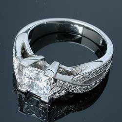
I couldn''t help myself and I constructed this to give you sense of the ring with the proportions that you specified, and I threw in some double claw prongs just for fun. Hope you like this!
2.gif


cbomccomp.jpg
 
31.gif

Date: 9/16/2006 9:31:19 PM
Author: Scott 00
CB,

I couldn''t help myself and I constructed this to give you sense of the ring with the proportions that you specified, and I threw in some double claw prongs just for fun. Hope you like this!
2.gif
oh scott I do I do!!!! LOL That looks so cool with the funky under the trees on a cloudy day colors!!!! And how did you DO that? OMG I''m lucky to even get things the right size let alone cropping it so it looks good and adding prongs!!! you *rock* now who''s gonna make this for me?

And scott - what does the basket look like, while you''re at it?
31.gif


(thank you
1.gif
)
 
I am happly to oblige when I can for a fellow OMC lover
1.gif
As far as my photoshop, it is an aquired skill of LOTS AND LOTS of photomanipulating to try to construct the perfect home for my Iceberg heheheh. Any how I like this basket, perhaps you could get something similar for Gemini (that is the name right?) but with a split prong modification. Personally, I also prefer the split and intertwined shank that this ring is sporting, gives the ring some flow. The ring is from www.sholdtdesign.com and lucky lucky lucky you they are based in Wa state, so you ought to have access to view them easily. I like this basket because its easy to see the stone from the side for viewing pleasure and ease of cleaning
4.gif


cbbaskproposal.jpg
 
And here is a rough approx of Gemini in that setting...

cbbaskproposal2].jpg
 
Date: 9/16/2006 9:51:50 PM
Author: Scott 00
I am happly to oblige when I can for a fellow OMC lover
1.gif
As far as my photoshop, it is an aquired skill of LOTS AND LOTS of photomanipulating to try to construct the perfect home for my Iceberg heheheh. Any how I like this basket, perhaps you could get something similar for Gemini (that is the name right?) but with a split prong modification. Personally, I also prefer the split and intertwined shank that this ring is sporting, gives the ring some flow. The ring is from www.sholdtdesign.com and lucky lucky lucky you they are based in Wa state, so you ought to have access to view them easily. I like this basket because its easy to see the stone from the side for viewing pleasure and ease of cleaning
4.gif
ooops I forgot to mention nixing the split shank on this one LOL You see... I saw a ring like this yesterday but it had a 6 head prong setting that could only be traded out for another head like that and not only is that setting not gonna work with my stone, it would end up sitting *way* too high!!! So I nixed it but I really like the three band round/baguette/round look and it looks so gorgeous with my stone... the baguettes gave such a soft and timeless look... anyway I know I need a basket of some sort to do the job and I figure I can set it lower *between* the rows of stuff so it is as low as possible and yet not blocking light, though I guess if I could sink a good head down in the baguettes and continue the round rows that would be even better (for the 3 ring illusion).

I''m still trying to decide if I''m going to drive up to greenlake tomorrow... I have an appointment but since this is diamond heavy and not metal work heavy it might be nice to let a vendor do it. The truly unique stuff I was contemplating would have been too far out of the box for the vendors here I think.
 
Status
Not open for further replies. Please create a new topic or request for this thread to be opened.
GET 3 FREE HCA RESULTS JOIN THE FORUM. ASK FOR HELP
Top