PumpkinOrange
Rough_Rock
- Joined
- Sep 21, 2017
- Messages
- 47

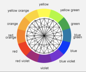
A complimentary color is located on the opposite side of the color wheel, or 180 degrees away.
On the color wheel 180 degrees away from Yellow Orange is Blue Violet.
But Yellowish Orange is closer to Orange than Yellow Orange is. (moving a bit CCW on the above wheel)
So 180 degrees from Yellowish Orange is Violet-ish Blue ... a stratospherically expensive and rare hue in fully natural FCDs.
Time to rob a bank for an Argyle Tender FCD.
Welcome to the maddening world of FCDs.

Tiny nit pick.
Your FCD's compliment is Violetish Blue, not Bluish Violet.
There's a difference.
The later has more Violet, the former more Blue.
Here's how GIA grades color when more than one hue is present ...
The last hue listed appears strongest, and the first appears weakest.
If 3 hues are mentioned the same is true.
Next, a hue followed by 'ish' means less of that hue than without the 'ish'.
The following are listed in order of increasing strength of the Green component:
Greenish Blue
Green Blue
Blue Green
Bluish Green
Green (of course having no blue)
I suspect an FCD that GIA graded fully natural and Violetish Blue would be very pricey, especially if there is none of that pesky gray in it.

.I doubt you could match the intensity of orange in the blue range of diamond colours ...
You also don't have brown. HahaNo Black, Gray, or Fancy White, only colored.
Does that make me racist?
So a vivid orange will look stronger than a vivid blue?I doubt you could match the intensity of orange in the blue range of diamond colours ...
Vivid never seems to mean the same thing for orange as for blue WWW ...
Opinion: I's match a very dark tinted gray against a fine orange, simply because dark gray / transparent black works with orange WWW - at least in my mind, that is. This radiant WWW comes closest to the type of material I am thinking of.
2C
Ps.
A deep purple WWW may be possible ! Not close. Not far.