shape
carat
color
clarity

Wedding What do you think of these invites?

Status
Not open for further replies. Please create a new topic or request for this thread to be opened.

sunnygirl

Shiny_Rock
Joined
Apr 9, 2007
Messages
342
So I decided against the invites I had chosen earlier (long story) and now I am having a hard time choosing another set. I am feeling so indecisive these days!

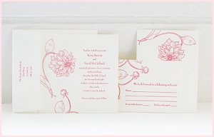
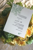
What do you all think of these? They are letterpressed and the paper feels really nice. The flowers would be in a berry color and the text in either brown or burgungy...
44157.jpg
 
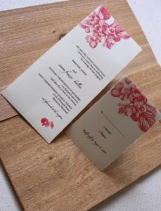
or these?

(32)-dahlia.jpg
 
Hi! I like the second ones. The first ones are sort of bland.. generic... The second ones bring something new to the table.

p.s. I''m a graphic designer btw
4.gif
 
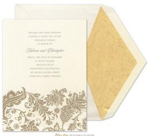
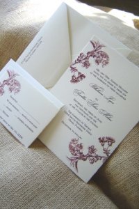
or these?? Again, the design would be in berry. I''m really wanting to do letterpress because I just love the way it feels. These are engraved so I''m not sure but I think the design is pretty cool...

66647.jpg
 
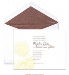
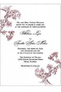
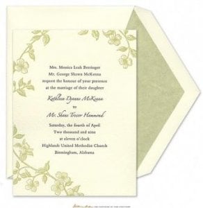
one more!

60933.jpg
 
What type of wedding are you having? There are different types of formality that are coming through your invites. For example, the third set is much more formal than the second one that feels more modern and simple?
 
So what do you all think?

Thanks for the reply That Special Someone!
 
Yes, that is the only problem I am having with the second one - seems less formal...

I guess I don''t know how to define the wedding. We will be having two ceremonies - one formal Greek Orthodox ceremony. Another outdoor Persian ceremony. Our colors are deep pink/berry and orange.
 
hmm as for the third one, I don''t know if i can change the color of the design...but I do really love it!
 
I like the third one. I agree the first one is more generic (though it''s in that in between formal and informal) and the second and fourth too informal.
 
I''d like the fourth if it were full size.
 
I actually like the first ones, not a fan of the second or fourth.
 
I like the third one, but am concerned about you not being able to change the color if you wanted to.

Have you seen this website - they seem to do a lot of designs like the ones you like, and they offer tons of color choices plus letterpress or engraving. I really like the Venice for you, possibly. Anyway, if you get a chance, take a look.
 
Thanks for the replies girls!

That_someone_special and heranderson - I sort of agree that the first one is generic. But I think part of that is the green color. I have a feeling that in the berry color, it might look less generic.

Heranderson - Thanks so much for your thoughts! The fourth one is a full-sized 5.5 x 7.5 but in different orientation. It is acutally really growing on me and I think that flower would look beautiful in the berry. In person, that flower looks really dramatic in the letterpress.

Sabine - Thanks for your reply! It seems like everyone has different faves!

AmberGretchen - Thanks for the link! They do have some really beautiful designs. I think I am starting to lean more toward the floral theme than the flourish theme. I love the "Botanical" on that site!
 
I LOVE the first one! I love it in the color you posted, too, although you mentioned that you''d change it to a berry color. I think that would look lovely.
 
I lile the design elements of the third invite you posted. It seems to convey both the formal and Persian aspects of your wedding ceremonies. I''m not as crazy about the overall layout, however.
 
I vote for the last one you posted, simple and beautiful!!
 
The first one gets my vote!
 
Thanks for all the replies! To make things more complicated, what do you think of these two? (in a magenta-ish color)
 
Maribelle:

1-1-06%20052.jpg
 
Maribelle #2:

Maribelle2.jpg
 
Blossom #1:

blossom 001.jpg
 
Blossom #2:

december_2007 107.jpg
 
Oops maribelle #1 didnt work:

Maribelle1.jpg
 
The new ones are pretty but I still like the first one the best out of all the ones you''ve posted.
 
I like the fourth one best. I think they''re all very pretty.

None of them are formal invitations, though--I would think that you were having an informal wedding if I received any of these invites from you. If that is what you''d like to portray, then I think you can''t go wrong with any of them as they''re all lovely.
 
What is really defined as formal? I think that all the invitations shown look fairly formal. I guess i just think you should pick what speaks to you, not try to impress someone else.
 
Date: 5/3/2008 11:45:45 PM
Author: happyfeet1988
What is really defined as formal? I think that all the invitations shown look fairly formal. I guess i just think you should pick what speaks to you, not try to impress someone else.
Technically, formal invitations are white or cream, of a particular size, and the only decoration they have is either a family crest or a small flourish of some design at the very top. The font is written in black or gray, and the only color would be in the crest. They can be folded cards (with text only on the front, of course) or unfolded cards of heavier stock. Since invitations are the first indication your guests have as to the formality of the event, it is very important that brides understand what they are communicating with them. (You can refer to any resource on correspondence, etiquette, form, stationery, etc. for more information.)

happyfeet--I''m not sure if you were responding to my post, but you misunderstood me if you thought I was suggesting sunny should try to impress someone else. That is never the case. I was simply giving some input as to the formality of her invites, as there was already a discussion about the formality of each.

Sunny--I said it before and I''ll say it again: I don''t think you can go wrong with any of these invites, they''re all quite beautiful. (Of course they are--you have FABULOUS taste, honey!)
 
Status
Not open for further replies. Please create a new topic or request for this thread to be opened.
GET 3 FREE HCA RESULTS JOIN THE FORUM. ASK FOR HELP
Top