shape
carat
color
clarity

URGENT HELP!! Setting Design

NewDiamond81

Rough_Rock
Joined
Aug 10, 2012
Messages
6
Hi all - I am trying to get whiteflash to mimic the design of the setting from birks below.

http://www.birks.com/en/featured/Engagement/Fancy-Diamond-Rings/g64-728/914122

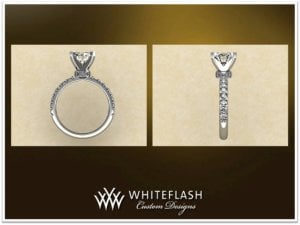
They have sent some CAD images which do not do the birks setting justice in my opinion. I'm fine with the band in the images (it's a harmony band). They did state that the image will make it look bulkier, but some things I noticed that are off include:

1) Even if bulky, the prongs look very wide
2) The collar under the diamond also looks wide in the side view
3) There are metals studs on the collar beside the diamond that stick out which I don't like

Any other suggestions on what may need modifying? Or if I should be as worried as I am.

Thanks
_648.jpg

_649.jpg
 
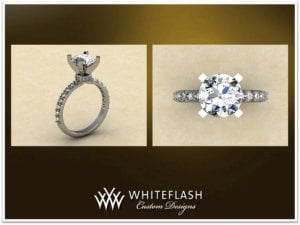
I think the donut sticks out more on this because the band is thinner than the Birks?
 
I'd want the prongs thinned out some at the base because I think it is making the diamond sit a little high.
 
Thanks for the feedback. I've called and told them my concerns, including the thinning of the prongs near the base. I agree that it looks very bulky at the bottom - you can barely see the diamond!! That is the part that bothers me most as the diamond in the Birks image is quite clean near the bottom with the diamond clearly more visible - it looks much more dainty.

Any other comments on the design are welcome and appreciated!
 
Apart from what others have said, you do realize you have a different style of pave on your band?

The inspiration looks like it has brightcut pave on both the band and donut, it looks like you have the correct pave on the donut (donut looks like it needs to be ever so slightly smaller) but then a different style of pave on the band.
 
Mike - thanks for the feedback. Yes - I noticed, but I didn't think that it would be terribly noticeable. The donut/collar is very small, so I think it will be difficult to differentiate. I will bring it up also though. Thanks!
 
The difference I see is that it looks like the Birks has made the ring and prongs as one continuous wire, pinched at the base of the head. WF's version looks like a head attached to a band. It's hard to see because the Birks photo is so light. But it looks to me like that's the reason the WF head is so thick right under the diamond.
 
Birks has 6 prongs, WF has 4 - did you request less prongs? The CAD does seem bulky, but isn't that the nature of CAD's? Aren't they usually much bulkier then the finishing process trims things down?

I prefer the WF pave on the shank vs the channel design of the Birks one, but what kind of WB are you planning? That may make a difference as to which style you go for.
 
The Birks diamond only has 4 prongs also. As for the WB, I haven't thought that far ahead to be honest. I figured a matching one from whiteflash. But to completely honest - i'm not sure.
 
Oops! Sorry I thought there was 6 prongs! Maybe I was thinking there COULD be 6 in there.... So that's a thought ;))

A matching band would be perfect, or you could go with a 7 or 9 stone in .03-.05 size stones. Or pick up a few stackers o see what you prefer and switch things around!

What, if any, changes would you like to see on the CADs?
 
GET 3 FREE HCA RESULTS JOIN THE FORUM. ASK FOR HELP
Top