shape
carat
color
clarity

Update & Invite proof - is everything okay?

Status
Not open for further replies. Please create a new topic or request for this thread to be opened.

sunnygirl

Shiny_Rock
Joined
Apr 9, 2007
Messages
342
Hi girls! Sorry have been MIA lately - things have been really busy with work and various end of (academic) year events. And I''m going to be a bridesmaid in a wedding this weekend up in Calistoga - so excited! It is my first time and i couldn''t be more thrilled to stand up there for her! Also, to add to wedding planning stress - my hair/makeup person who I booked SIX months ago just emailed me (after I emailed her twice with no reply) to tell me she has to be out of the country during my wedding and can''t do it. ARGH!

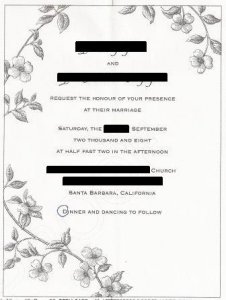
So I got the proofs for the invites and need some PS eyes to tell me if everything looks okay!! The card will be ecru, the flowers berry-colored and the text in a dark burgundy/deep purple (hard to describe but really pretty.)

Sorry the scans are so bad - they are from a printed copy. Also, I already circled the one part I sort of had an issue with. (I think that D should be a small cap not a large cap - what do you think?)

Also, do you think the spacing looks okay and general layout looks okay?

Sorry for the black bars - I am to afraid to put names for some reason!

I would totally appreciate any opinions from you gals!
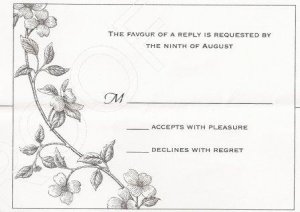
proofreply.jpg
 

sunnygirl

Shiny_Rock
Joined
Apr 9, 2007
Messages
342
uhhhh is there any way I can unattach a file? I accidentally uploaded wrong image (without the rest of black boxes!)
 

noelwr

Brilliant_Rock
Joined
Mar 21, 2008
Messages
1,961
usually you can hit the button Edit Topic, but not sure how long that stays available
 

newbie124

Brilliant_Rock
Joined
Aug 23, 2007
Messages
584
I was just reading a really great knot bio that someone linked to and according to this guy, you don't really need "and" in the year. Also, "afternoon/evening" should only be used when the time could be confusing to people (like 8 or 9 o'clock) otherwise it's just wordy.

Apparently it's also more proper to use "half after" rather than "half past" since "past" was traditionally used for funerals/wakes since it sounds like "passed" or "passed away." He also notes that "parents who were unhappy about the wedding would use “past” to indicate they wouldn’t accept the man as their son-in-law and their daughter would be dead to them once she married him." (How 'bout that?)

I think you're totally fine, though, just going w/ what you have. I just thought these tips were pretty interesting, so that I'd pass along! (The rest of his tips are also worth reading through if you get a chance).
 

swimmer

Ideal_Rock
Joined
Nov 9, 2007
Messages
2,516
It looks lovely, the dogwood blossoms will be fantastic in berry.
 

sunnygirl

Shiny_Rock
Joined
Apr 9, 2007
Messages
342
Here is the invite! Thanks for the replies noel, newbie, and swimmer! Does it look weird that the text is shifted toward the top?

proofinvitePS2.jpg
 

Dreamgirl

Ideal_Rock
Joined
Mar 25, 2008
Messages
5,070
I think it looks beautiful! I think the text looks good right where it is.
35.gif


I also like how you said dancing to follow. I have been to way to many weddings where nobody dances and that bugs the heck out of me!
 

newbie124

Brilliant_Rock
Joined
Aug 23, 2007
Messages
584
I'm super nitpicky about spacing so I'd probably try to play around and see how it looks if you bump it down just a smidge.

Or, maybe try moving everything down so that Santa Barbara is where "Dinner and Dancing" currently is. Then move "Dinner and Dancing" off center to the right of the leaf or the 2nd flower from the bottom...somewhere there. (I'm trying to imagine this in my head so it may not work at all :razz: but maybe try and see how you like that?)

Correction: Meant 3rd flower from the top or maybe in line with the leaf above the 3rd flower (argh, wish this form would let you view images while you're typing a response!)
 

karasue91

Brilliant_Rock
Joined
Aug 27, 2007
Messages
904
It''s gorgeous!! I like the spacing as is too, I love the asymmetrical branch around the text, and the text is just snuggled up in the middle.
 
Status
Not open for further replies. Please create a new topic or request for this thread to be opened.
Be a part of the community Get 3 HCA Results
Top